Page 10 of 15
Posted: Sat Mar 10, 2007 11:55 pm
by Nikolai
Definitely not the camo... too hard to read the numbers. I'm not fond of the others either, although I don't mind the idea... perhaps some sort of gray camo? My other thought was a texture of some sort colored gunmetal... I think the old straight grey isn't bad.
Posted: Sun Mar 11, 2007 12:31 am
by BelJoDoe
I quite like the colour scheme being Blue, like the old Connect 4 but I guess if it creates difficulties seeing the armies, it needed to change. How about this kind of thing, Keyogi?

Posted: Sun Mar 11, 2007 12:28 pm
by Bad Speler
Is it just me or has other people posted more maps then KEYOGI? Anyways, i think the camo texture wouldnt be to bad as long as the colours were changed to look more CC-ish
Posted: Sun Mar 11, 2007 1:19 pm
by AndyDufresne
I like the original CC style Keyogi posted, but Wisse's first texture is alright also.
--Andy
Posted: Sun Mar 11, 2007 1:56 pm
by Wisse
qwert wrote:Wisse you have very interesting textures

Second its better
i am just good at effects and texture options

Posted: Sun Mar 11, 2007 6:55 pm
by KEYOGI
I still prefer the original clean CC style image without texture, but since everyone's having fun with texturing my map I thought I'd do the same.
I also added a Sherman Tank diagram in the background from
http://en.wikipedia.org/wiki/Image:M4A4_cutaway.png.
I've removed the Bonus Guide and game description because I'm considering redoing these to try and help clarify the gameplay and bonus system.


Posted: Sun Mar 11, 2007 7:00 pm
by Qwert
You can put simple bonuses like 2-4-6-8, bigger bonuses dont have sence like 10-12-14-20.
Posted: Sun Mar 11, 2007 8:01 pm
by Bad Speler
Well, since everyone else is helping Keyogi with map images, i guess i will too
. Just something i quickly did in paint. I basically tried to make it look like the games page. Is it any good?
Posted: Sun Mar 11, 2007 10:02 pm
by KEYOGI
Interesting idea Bad Speler, I kind of like it, but I prefer the original layout. I'm kind of not sure where I should be looking with that setup.
Posted: Sun Mar 11, 2007 10:05 pm
by Bad Speler
im not exactly sure either, just throwing an idea out there.
Posted: Mon Mar 12, 2007 1:21 am
by Teya
I think its best without any textures.
Posted: Mon Mar 12, 2007 1:26 am
by Captain Crash
I liked it best when it looked like the plastic connect four 'board', except grey to give it the army feel.
I don't see the need for texture, but if I had to pick 1 I'd pick the first one that Wisse put up.
I think the tank outline detracts from that simple plastic frame look.
Of your two textures Keyogi, I like the first one more.

Posted: Mon Mar 12, 2007 3:38 am
by KEYOGI
Captain Crash wrote:I liked it best when it looked like the plastic connect four 'board', except grey to give it the army feel.
I completely agree.
Posted: Mon Mar 12, 2007 4:02 am
by yeti_c
I think clean "plastic" is best...
C.
Posted: Mon Mar 12, 2007 4:43 am
by Wisse
option 2
Posted: Mon Mar 12, 2007 8:44 am
by Bad Speler
i vote clean without texture.
Posted: Mon Mar 12, 2007 2:15 pm
by Coleman
I think everyone prefers the CC style way back towards the start. I know I do anyway, Andy seems to, the author likes it best.
Posted: Tue Mar 13, 2007 5:58 pm
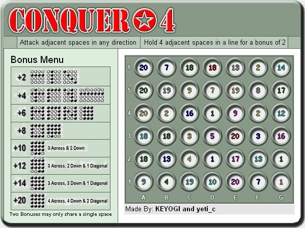
by KEYOGI
Update - March 14
 Changes made this update:
- Back to the old clean CC style
- Changed Bonus Guide
- Changed attack description
- Removed bonus description from under title
Comments:
I hate the new Bonus Guide with a passion, I just thought I'd offer something new to try and clear up the confusion. The saying goes that "a picture is worth a thousand words" and I tend to think that theory worked well for the Bonus Guide. I've taken an alternative option of trying to explain the system in plain English, but now we don't have the space to demonstrate a wide range of bonuses. I feel this is just going to create more problems.
Posted: Tue Mar 13, 2007 6:04 pm
by Qwert
Simple, and normal bonuses, these good
Posted: Tue Mar 13, 2007 6:08 pm
by KEYOGI
You're still going to get a bonus of +20 for a 4x4 block, it's just not shown in the Bonus Guide.
Posted: Tue Mar 13, 2007 6:10 pm
by DiM
the old bonus guide is much better

Posted: Tue Mar 13, 2007 6:40 pm
by Kupo666
The old bonus guide is better in my opinion, plus you made a mistake on the new one. The 1 vertical, 1 diagonal has a dot in the wrong place.
Posted: Tue Mar 13, 2007 6:44 pm
by DiM
yup second column dot should be one row down
Posted: Tue Mar 13, 2007 6:47 pm
by EvilOtto
KEYOGI wrote:I hate the new Bonus Guide with a passion, I just thought I'd offer something new to try and clear up the confusion. The saying goes that "a picture is worth a thousand words" and I tend to think that theory worked well for the Bonus Guide.
I agree you should use graphics, but you still need to simplify. You have just two rules: 1) you need four-in-a-row to get a bonus. 2) two bonuses cannot share more than one territory.
I had something like this in mind:
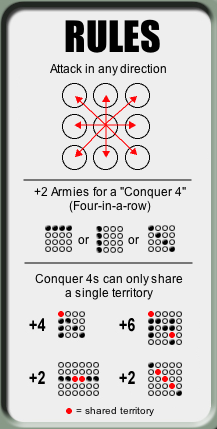
It is important that you show examples of how NOT to get a bonus.
Maybe someone can improve on this further?
Posted: Tue Mar 13, 2007 7:50 pm
by oaktown
i like what otto has done. Giving the bonus a name adds clarity, and the arrows make attack routes obvious at a glance.
The line about how two lines may intersect but only have one common circle is odd, in that two intersecting lines would only be able to share one point anyway. It's really only there to explain how two groups of four on teh same line can't overlap, so it's redundant to also have the piece at the bottom about no bonus for 5 or 6.
Maybe this has already been discussed, but will every bonus and negative have the same name in the xml? It would be great to knock the bonuses down to just one line. You know...
Keyogi receives 2 armies for holding Conquer-4s
or
Keyogi receives 16 armeis for holding Conquer-4s.