Page 9 of 12
Posted: Fri Feb 29, 2008 11:34 am
by FreeMan10
Tieryn wrote:Thanks for all the commentry freeman

Here's a few responses tho I won't make any graphics changes just yet until I hear a few more voices over the weekend hopefully.
Happy to help. Holding off on the changes makes sense - I'm not the expert or final voice...
Tieryn wrote:CC Logo I'd still like to have as it plays a small role in the gameplay, as well as helping identify its position in the control key map below.
Cool...
Tieryn wrote:The difference in bonuses is because the right hand keys is 7 territories, includes backspace - has 11 attackers. Left has 6 territs and 9 attackers. Left does not include escape.
Looking at your 'continent maps' at the bottom where the bonuses for the control keys are listed they don't show all the keys in the continent - therefore, I picked up the wrong keys. You should probably either include all the keys in the graphic, or eliminate the graphic entirely and just list them as text.
Tieryn wrote:The eye is just a random knot from the wood grain texturiser. It can be removed easily enough, but I like it there.. looking.... at you! and your strategy!
OK. Odd looking, but I'm fine with it.
Keep up the great work! You'll get some more feedback and this will end up looking pretty good!
Posted: Thu Mar 06, 2008 5:49 am
by Tieryn
Hi folks,
I'm going on holiday for 10 days on Tuesday. Not abandoning this, but I'll be away for a bit. Still, if anyone wants to make suggestions/show support while I'm gone that'd be tops

Posted: Thu Mar 06, 2008 6:13 pm
by paulk
on the white keyboard I would like to see the big square chunc of explaining bonuses on top of the map instead of the bottom. This b/c it would make the keyboard come closer to the dropdowns where you decide what armies goes where.
Posted: Thu Mar 06, 2008 6:59 pm
by Qwert
If you want to create real border,then its better black tastature,because pen can be border,so i dont like white tastature,but these is only mine opinion.
Can background bee Computer desk,and that why will be more realistic,because you now have real tastature,and not real background,also you can put some open book down to present bonus box.
You will have a lot work here,because you create some realistic here, and all non realistic thing will not look good on map.
Posted: Sun Mar 09, 2008 4:10 am
by Tieryn
Okay, here's the next stage...
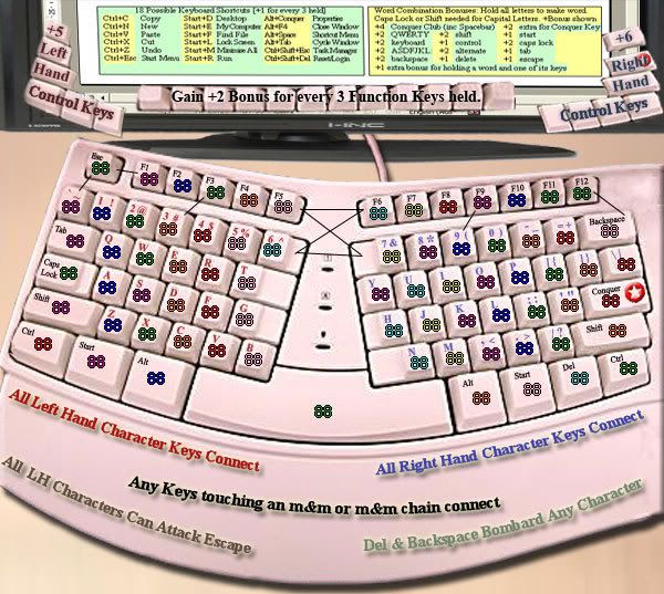
I've put a monitor up the top to hold bonuses info (not sure if it's big enough/readable. comment please). How does it look? how does it feel? Am I on the right track?
Removed m&m's as corny, still looking for something realistic or valid to make the passable connections shown. Ideas?
Posted: Sun Mar 09, 2008 4:30 am
by whitestazn88
monitor cramps stuff up a bit, i prefer the desk legend
thank god you got rid of the m&ms, but you didn't take it out of the info at the bottom.
still upset that white won...
and, i think thats about it
Posted: Sun Mar 09, 2008 5:13 am
by Tieryn
There could be a resurgence for black if enough noise is made ...
I'm more than happy to work either, I just like the middle-barrier that the ergo-keyboard gives.
Posted: Sun Mar 09, 2008 7:50 am
by mibi
please use the black keyboard. I used to have that MS ergo piece of shit and would rather not bring up any repressed memories.
Posted: Sun Mar 09, 2008 8:05 am
by Tieryn
When I get back from my trip (20th) I'll develop both up to a standard, and then we can make the choice?
Posted: Sun Mar 09, 2008 8:09 am
by bryguy
mibi wrote:please use the black keyboard. I used to have that MS ergo piece of shit and would rather not bring up any repressed memories.
mines locked away in a deep dark hole..... i think
Posted: Mon Mar 10, 2008 12:28 pm
by Keredrex
You should change the font in the legend..... make it a NON-Serif typr (A Font That has straight lines no little ticks at the ends) Serif types are easier to read - When you are reading a book or long paragraphs...
For Legends and Information .. Non Serifs Work Better
Posted: Mon Mar 10, 2008 12:34 pm
by Hotdoggie
new board is ugly...i liked some of the older versions.
Posted: Mon Mar 10, 2008 12:38 pm
by Qwert
mibi wrote:
please use the black keyboard. I used to have that MS ergo piece of shit and would rather not bring up any repressed memories.
100% agree with that.
Also i think that you need to take max px(630x600)because bonus box is so small and dificulty to read.
Posted: Tue Mar 11, 2008 7:46 pm
by oaktown
whitestazn88 wrote:monitor cramps stuff up a bit, i prefer the desk legend
I agree that it is hard to read now... it's almost like background noise now rather than gameplay information.
Maybe this has already been discussed - in which case you can all tell me to shove it - but doesn't it seem messy that all left hand character keys connect? It seems like have of the fun of playing this map will be trying to move across the keyboard and trying to protect an area, but this will be an open battle in which everything can attack everything.
Essentially, the winner of a game on this map will be the player that spends the most time trying to maximize key combinations. I continue to urge further simplicity.
Posted: Wed Mar 19, 2008 3:03 am
by sharpie129
First of all, this is looking great Tieryn... I agree that both the black keyboard and the desk legend are much clearer. The pencil makes just as good of a barrier as the center of the ergo keyboard. I think that part of the reason the ergo keyboard doesn't look as clean is due to the skewed angles of the keys (the flat-on perspective of the black keyboard makes it much easier to read and a lot less daunting).
My main concern is, as oaktown said, with everything so interconnected... I think it'd take away from a lot of the fun. My first instinct would be to make some of the keys one-way. Perhaps have shift able to attack all of the keys like it is now, but the letters can't attack the non-letter keys unless they're bordering them. That would put a lot more pressure on the non-letter keys but it would also make things at least a little bit more directional.
Posted: Thu Mar 20, 2008 2:56 am
by Tieryn
Okay, so I've got some time off over easter and I'm going to go back to the black keyboard. It's easier to work with and I tend to agree. I've always preferred black hardware anyway.
I'll integrate some of the things I"ve come up with on this white map, as well as include some suggestions made, and have a draft sometime later this week.
I'll have a think about gameplay oak, and thanks for the suggestions sharpie. The main problem with lots of specific rules is describing them to the player without making it overly complex or taking up too much room. I might look at simplifying bonuses, maybe even scrapping key combo's altogether? or reducing it to just a few for each "control" key.
Cheers for all the comment so far.
Posted: Thu Mar 20, 2008 5:49 pm
by Ditocoaf
I think having random junk like candy lying on the keyboard just makes the map look messy and unprofessional. If there's any way you can avoid that, please do.
Posted: Fri Mar 21, 2008 8:40 am
by Tieryn
Yep, Already been there and done that... what do you think of the pencil tho as an impassable?
Posted: Fri Mar 21, 2008 2:46 pm
by laci_mae
Any chance we can see a black ergo? I like this style much better than the pencil. However, I believe the monitor would fit in the map better with the standard keyboard.
Best,
LMR
Posted: Fri Mar 21, 2008 2:49 pm
by AndyDufresne
On another note (no pun intended), I'd consider using something like Post-It Notes, one or two of those on the keyboard seems more fitting than paperclips. You could always write something interesting on them too.
--Andy
Posted: Fri Mar 21, 2008 3:05 pm
by InkL0sed
oaktown wrote:whitestazn88 wrote:monitor cramps stuff up a bit, i prefer the desk legend
I agree that it is hard to read now... it's almost like background noise now rather than gameplay information.
Maybe this has already been discussed - in which case you can all tell me to shove it - but doesn't it seem messy that all left hand character keys connect? It seems like have of the fun of playing this map will be trying to move across the keyboard and trying to protect an area, but this will be an open battle in which everything can attack everything.
Essentially, the winner of a game on this map will be the player that spends the most time trying to maximize key combinations. I continue to urge further simplicity.
I agree... However, I do think something beyond simple attacks is called for... Maybe something like the cavalry attacks in Waterloo?
Posted: Fri Mar 21, 2008 8:45 pm
by Tieryn
AndyDufresne wrote:On another note (no pun intended), I'd consider using something like Post-It Notes, one or two of those on the keyboard seems more fitting than paperclips. You could always write something interesting on them too.
--Andy
The relative size issue is a bit hit and miss.. It might just have to be little colour stick-it things rather than whole notes... Probably couldn't fit much on them either... but a good idea, better than paperclips... I'll try.
I had a black ergo template somewhere, I'll see if I can dig it up and restart this map for the 7th time

heh.
Posted: Fri Mar 21, 2008 8:58 pm
by Tieryn
InkL0sed wrote:I agree... However, I do think something beyond simple attacks is called for... Maybe something like the cavalry attacks in Waterloo?
There'd be space to put a little symbolic legend on each key.. and include something like that... In fact... a better idea, incorporating one of my very first ideas (see original draft on p1) of each finger being a territory, rather than territory, these could define attack directions, rather than whole hand, each finger individually could attack all of its own, plus horizontal border territs.
Eg, "3-e-d-c" would be the left middle finger. They could all attack each other, and 3 could attack 2&4, e -> w&R, d -> s&f and c -> x&v&space
With no bonus for holding the territory, I think it becomes a non-gameplay issue, but provides better structure for attack routes. Another rule like Consonants cannot attack vowels would provide some interesting one way options, while still not making those territs invulnerable, as 3 could attack e. caps and 1 could attack a, 7 could attack u, 8 and < attack i and 9 and > attack o
Perhaps all vowels could also be interconncted to make up for their easy defence?
All vowels could be a valid territory bonus. We could also have "streak" bonuses, ie, C-D-E-F-G-H-I (7 streak worth +3 or something) I dunno... there's a few ideas. This would be quite a bit of XML and could cause slow-map-play problems like conquerman..? But could also be a good bonus to replace "word" bonuses. with only "Conquer Club" being a bonus.
If balanced with the short-cut keys (with some shortcut keys removed, and the bonuses restructured) this could provide a couple of avenues of gameplay to unfold. Throw in the function keys as an x-required type bonus, and the left and right "controller" keys (esc/tab/caps/shift/ctrl/start/alt) and (alt/start/del/ctrl/shift/conquer/backspace) as continents. Make space do something special (maybe launch a game on the space map with the same players!!! no, j/k, really) or maybe not do anything special at all?
Keep Esc/Del/BkSp bombarding "character (letter or number or symbol) keys on their hand. more keys on the right anyway so 2 bombarders isn't too bad.
How is this sounding gameplay-wise oak... think we can pull it off?
Posted: Sat Mar 22, 2008 9:32 am
by Kaplowitz
What about no impassables, but a line of neutral killers that could act as almost impassables?
Posted: Sat Mar 22, 2008 11:10 pm
by Tieryn
Okay here's the newest in the QWERTY range of fashion, brought to you each month by Tieryn. This months model features a well respected logitech base, rather than previous microshaft models. This model tends to eat and work better, rather than collapsing in a slight wind.
You will notice the sleek lines and curves shown off in sensuous detail along the sides, and the way that the monitor baseplate so nicely follows the line of the "radio" bar up the top of the keyboard. I will be adding those keys into gameplay as well. [Note: I haven't been able to find a high res photo of this keyboard... if anyone has one could you let me know what the keys up the top are? Otherwise I'll just make them up from the standard set... no major biggie]