Page 9 of 34
Posted: Sun Mar 09, 2008 8:13 am
by Tieryn
paulk wrote:gimil wrote:Well give me a visual example and prove to me that it will be harder to understand. Right now im not convinced.
This is version18:

Okay, so in my understanding, one of the things gimil would like to see is the outer circles themselves in a different colour.. I think he means the vertices, (which are currently white) rather than the outer circle around the army space (which is currently grey on the outers). Try making the outer framework grid with brown balls or whatever...? chocolate salty balls.
Also, I'd like to see the colours as Red opposite Orange, Green opposite Lime and Purple opposite Blueish. ? or would this be worse? anyone with colourblind experience can shed some light on this?
Of course, unless he meant that each face ball (like a2x,a2y,a3x,a3y) be the red colour, to show the face? It wouldn't work with edge balls as you'd have to merge colours, and we don't want people starting to get the idea that these are "continents"...
Posted: Sun Mar 09, 2008 8:26 am
by Tieryn
I've jsut done this up very rough : did you mean something like this gimil?
Posted: Sun Mar 09, 2008 3:48 pm
by paulk
Tieryn wrote:we don't want people starting to get the idea that these are "continents"...
that's what I'm a little afraid of.
Posted: Sun Mar 09, 2008 4:10 pm
by paulk
I have been pondering if all territories should start with 5 instead of 3, exept neutrals that would start with 3.
Posted: Sun Mar 09, 2008 4:24 pm
by gimil
I put some time aside to made this to show my point:
Posted: Sun Mar 09, 2008 4:29 pm
by paulk
ooooooo, I can assure you, that will be hard to differentiate when you have the additional vertexes, background and all.
BUT I will make you a special map, since you are the graphics stamp guy.
Posted: Sun Mar 09, 2008 4:39 pm
by gimil
paulk wrote:ooooooo, I can assure you, that will be hard to differentiate when you have the additional vertexes, background and all.
BUT I will make you a special map, since you are the graphics stamp guy.

thats all I want, an example.
Posted: Sun Mar 09, 2008 4:56 pm
by paulk
gimil wrote:paulk wrote:ooooooo, I can assure you, that will be hard to differentiate when you have the additional vertexes, background and all.
BUT I will make you a special map, since you are the graphics stamp guy.
thats all I want, an example.
Version 19. As you wish:

Posted: Sun Mar 09, 2008 5:26 pm
by gimil
I can the potential of this working if some thought is put into it. Let me do a little thinking in it

Posted: Sun Mar 09, 2008 6:38 pm
by Mr_Adams
it makes me go cross eyed that way
Posted: Sun Mar 09, 2008 11:38 pm
by paulk
Mr_Adams wrote:it makes me go cross eyed that way
To me, version 1 and version 19 are quite similar.
The easiest to lay your eyes on is probably version 18, but it has the disadvantage that people will wonder if the colors are bonuses.
But with a little tweaking (like color blind proof it and adding shadows to the bars).
I think that version 18 is the one that will prevail.
The most estetical map is probably version 17, where you also avoid the bonus thoughts that will come with version 18.
Posted: Mon Mar 10, 2008 2:16 am
by paulk
letuce wrote:letuce likes the hyper cube more then the cuboid, but would like to have both versions if that is a possiblity
letuce should do everything he can to influence his friends to comment on the hypercube so it gets done first, and then hope that it will result in other maps of the same character.

Posted: Mon Mar 10, 2008 2:22 am
by paulk
InkL0sed wrote:I'd prefer this map to get finished first – to let the 3D awesomeness sink in and whatnot.
This map could be played right now, only there seems to be little interest in it. Everyone wants bigger, more... but I personally think this map would be quite enough to play on - less moving around, more concentrating on building and holding bonuses.
But maybe if the hypercube would be finished then this one would get some more interest.
Or if anyone interested do what they can to promote it.
Posted: Mon Mar 10, 2008 2:59 am
by Ditocoaf
paulk wrote:Mr_Adams wrote:it makes me go cross eyed that way
To me, version 1 and version 19 are quite similar.
The easiest to lay your eyes on is probably version 18, but it has the disadvantage that people will wonder if the colors are bonuses.
But with a little tweaking (like color blind proof it and adding shadows to the bars).
I think that version 18 is the one that will prevail.The most estetical map is probably version 17, where you also avoid the bonus thoughts that will come with version 18.
I think version 18 is by far the best. I figure that even if people have misconceptions about the map based on the colors, they'll understand soon enough, considering there's nothing about color bonuses in the key. And version 18 is
by far the easiest to visualize; it readily forms itself into a cube in your mind, whereas the others seem to be a mess, working like some sort of optical illusion where you have to adjust your sight to the right mindset. What probably makes it easier in 18: The very edges of the whole map are clearly defined with the white lines; no other lines are white. The other colors are clearly grouped by their position in space.
I reccomend simply taking version 18, moving like colors away from eachother, and then it'd be perfect. Of course, gmil has to approve, as well.
I really think that v19 isn't very clear, no offense gmil. Having the entire outside of the cube one color gives a bad impression to me.
I think this should be moved into the final forge as soon as possible (based on v18); I really want to play this map.
Posted: Mon Mar 10, 2008 6:41 am
by Tieryn
Yeah, having seen that, I really agree. I think the whole outside face being one colour is too much. I like the way in v18 that all internal lines on a face, and all lines projecting directly from that face inwards, are a single colour. And that this colour is different for each face.
I really like the way the single-white-line element defines the cube. It makes it much easier to see.
I also add my vote to the "eager to play this map" list.
Posted: Tue Mar 11, 2008 2:19 am
by paulk
according to the votes at least 70 people want this cube to be finished so they can play it.
Posted: Tue Mar 11, 2008 2:19 pm
by paulk
gimil wrote:I can the potential of this working if some thought is put into it. Let me do a little thinking in it
still waiting for the result of that thinking...
Posted: Tue Mar 11, 2008 3:29 pm
by gimil
There seems to be support for the other way your doing it, so im not going t ocontribute time to thinking about it.
Posted: Tue Mar 11, 2008 5:29 pm
by Ditocoaf
so, what needs to be done before this can move to the final forge?
Posted: Tue Mar 11, 2008 5:34 pm
by paulk
how do I get it checked for color blindness?
Posted: Tue Mar 11, 2008 6:30 pm
by oaktown
Alright, perhaps somebody with a better understanding of the recent Start Position update to the XML can help clarify something for me here... please note the words I've highlighted in red:
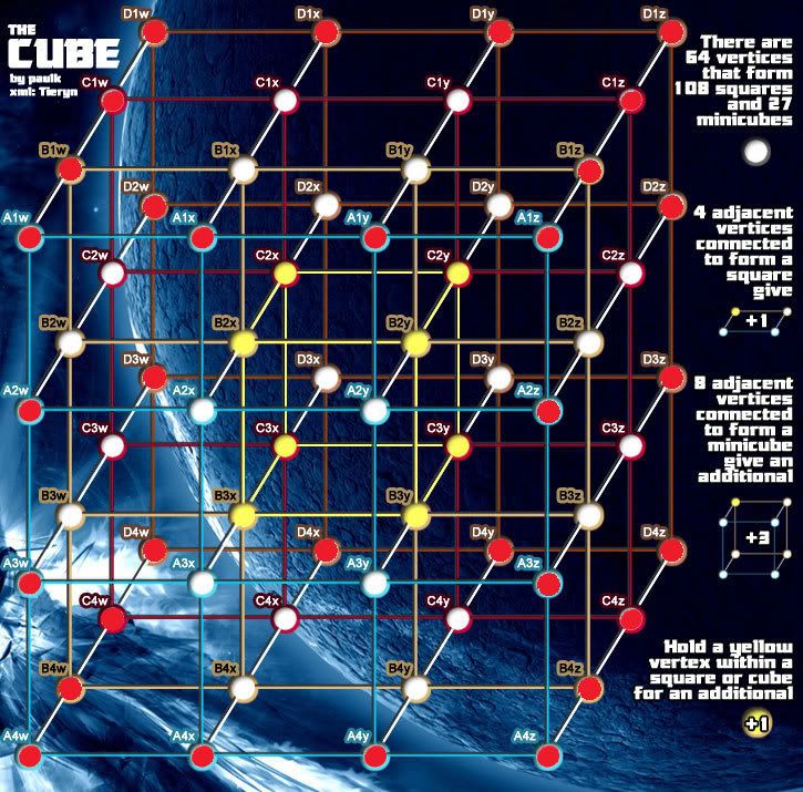
paulk wrote:each player get 2 (in 2, 3 and 4 player games) or 1 (in 5, 6, 7 and 8 player games) yellow vertex (and left over yellow verices are neutral), and the rest of the (white) verices are randomly divided.
Paulk writes that the center vertices are going to be split evenly among the players to start, and that any left over will start neutral. However, I'm not certain the the Territory Start tag works that way.
Let's say there are three players in a game. The yellow center vertices will be distributed first, as per the XML, so that each player gets two, which accounts for six of the eight center vertices. Then, however, I believe that the remaining two yellow vertices will be thrown into the pot and distributed with the rest, and will NOT automatically go neutral. One player could well end up with four, while the other two players have only two. This isn't in itself a bad thing, but since those center vertices now start with 5 each you're handing one player a four-army bonus to start the game.
Am i right or wrong?
The XML tutorial has this to say about Start Position territories:
In a game players will get one or more of these depending on how many people are playing and the rest of the territories are distributed normally.
Not sure if this means that the rest of the start position territories are distributed normally, or if the rest of the non-start position territories are distributed normally. It's worth confirming.
Also, I still think that many of the lines bleed together... the lightest stroke or glow would remedy this.
Posted: Tue Mar 11, 2008 6:37 pm
by gimil
Im 99.99999% Sure that this is completly possible. Im sure that each "player position" is evenly devided with the remaining "player positions" turning neutral. Then the remaining non designated terrs are randomly handed out.
Posted: Wed Mar 12, 2008 2:27 am
by paulk
Version 20:
Tweaked colors slightly.
Defined rods with black.
Rods connect with vertices in a 3D manner.

Posted: Wed Mar 12, 2008 3:06 am
by Ditocoaf
I think the map is actually easier to read without the borders on the lines.
also, a 3D connection would have the rods coming towards us sticking out of the center of the vertices, instead of the bottom.
Posted: Wed Mar 12, 2008 4:25 pm
by paulk
Ditocoaf wrote:I think the map is actually easier to read without the borders on the lines.
also, a 3D connection would have the rods coming towards us sticking out of the center of the vertices, instead of the bottom.
The 3D connection would make the numbers harder to read if it protruded all the way to the middle, and when the numbers get there you don't notice it as much either.
The borders on the lines, I can work on an alternative with "pure" shadow.
But I would like to know if more people than Ditocoaf think the black borders make the map harder to read. (Go to page1, post1, to compare both map versions)