its not difficult, but pointless imo. yes, the colors are similar, but they are able to be differentiated (prob spelled that wrong lol) between, and i assumed thats all that was needed, correct? the whole map could be different shades of brown, but if the regions can be told apart from each other then whats the difference?
if its gonna hold the map back then we'll obviously make a change, but if its not lets close the book on this...
New Jersey [Quenched]
Moderator: Cartographers
Forum rules
Please read the Community Guidelines before posting.
Please read the Community Guidelines before posting.
-
chaos32679

- Posts: 340
- Joined: Fri Sep 03, 2010 6:02 am
- Gender: Male
- Location: PA
-
DiM

- Posts: 10415
- Joined: Wed Feb 14, 2007 6:20 pm
- Gender: Male
- Location: making maps for scooby snacks
Re: New Jersey [UPDATE 05.01.2012, p13]
if it's easy to do and it helps the map look better then why not simply do it?
“In the beginning God said, the four-dimensional divergence of an antisymmetric, second rank tensor equals zero, and there was light, and it was good. And on the seventh day he rested.”- Michio Kaku
-
chaos32679
- Posts: 340
- Joined: Fri Sep 03, 2010 6:02 am
- Gender: Male
- Location: PA
Re: New Jersey [UPDATE 05.01.2012, p13]
DiM wrote:if it's easy to do and it helps the map look better then why not simply do it?
i dont think it will make the map look better, i kinda like the colors right where they are...
to each his own i guess...

Re: New Jersey [UPDATE 05.01.2012, p13]
I ran the small through vischeck and these are the results:

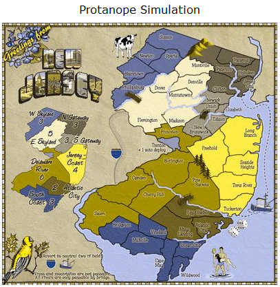
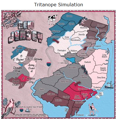
As you can see the Atlantic City and Delaware River on the Deuteranope result, the playable area colors are close together, while on the minimap, you can see the difference.
As you can see the Atlantic City and Delaware River on the Deuteranope result, the playable area colors are close together, while on the minimap, you can see the difference.

Re: New Jersey [UPDATE 05.01.2012, p13]
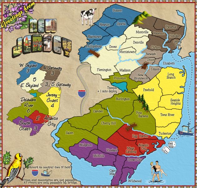
This is the current image.. I did adjust them the page before..
and they are not in the 1st page update, because I wanted to check if this was a good enough change.
I'd say it's not the same image you are working with Isaiah40
The colors are where I want them for a reason, they aren't randomly placed.. and they are easy to change, but there isn't a reason to change them.. other than someone doesn't like two "brown" colorblind colors next to each other..
Updated Images:
[bigimg]http://i29.photobucket.com/albums/c282/Tisha1276/NewJerseyLG-1.jpg[/bigimg]
and they are not in the 1st page update, because I wanted to check if this was a good enough change.
Tisha wrote:I effed with them.. I think they are more obvious than they previously were

Tisha wrote:so you're telling me that I have to switch colors around so that in the colorblind image two "browns" are not next to each other... even though they are noticeably different?
I'd say it's not the same image you are working with Isaiah40
isaiah40 wrote:I ran the small through vischeck and these are the results:
As you can see the Atlantic City and Delaware River on the Deuteranope result, the playable area colors are close together, while on the minimap, you can see the difference.
The colors are where I want them for a reason, they aren't randomly placed.. and they are easy to change, but there isn't a reason to change them.. other than someone doesn't like two "brown" colorblind colors next to each other..
Updated Images:
[bigimg]http://i29.photobucket.com/albums/c282/Tisha1276/NewJerseyLG-1.jpg[/bigimg]
-
chaos32679
- Posts: 340
- Joined: Fri Sep 03, 2010 6:02 am
- Gender: Male
- Location: PA
Re: New Jersey [UPDATE 05.01.2012, p13]
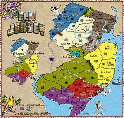
I updated the first post with the new large and small images, and the colorblind one...

Re: New Jersey [UPDATE 05.01.2012, p13]
Hello, I am just one color blind guy giving his opinion. There are different people with different color limitations but here is how I see this map.
Love the map, would play it all day. The boundaries are well defined. the regions are easy for me to see. The regions are easily defined by colors and I can see the key to know the values to the regions. I like the fact you have made key that explains the values for the regions a small map that mirrors the big map. Sometimes this is just in writing hoping the color will be enough to tell you the value. Your map makes this very easy.
As for the red/green area, nice job with a boundary. Generally if there is a boundary you can see the difference. the best example is a stop sign. They place the white around the stop sign to highlight the red. Otherwise if there is a tree behind the sign it would just be gone. I can see a cardinal (a red bird) and it looks red, it flies into a tree and the red is gone, looks just like a drab bird. So, nice job, easy to see. Better than the different shades of a same color.
Again, this is just one color blind guy but this map looks very friendly for me to play!
Thanks
bob
-
chaos32679
- Posts: 340
- Joined: Fri Sep 03, 2010 6:02 am
- Gender: Male
- Location: PA
Re: New Jersey [UPDATE 05.01.2012, p13]
Thanks for the reply here in response to my PM, much appreciated!
Re: New Jersey [UPDATE 05.01.2012, p13]
Onward and upward!!

-
chaos32679
- Posts: 340
- Joined: Fri Sep 03, 2010 6:02 am
- Gender: Male
- Location: PA
-
chaos32679
- Posts: 340
- Joined: Fri Sep 03, 2010 6:02 am
- Gender: Male
- Location: PA
Re: New Jersey [UPDATE 05.07.2012, p14, XML]
XML posted a month ago foundry people, maybe someone could look at it sometime? That would be swell...
I know i'm a mapmaking virgin, but a month seems a little excessive to check a few lines of code... Just sayin...
I know i'm a mapmaking virgin, but a month seems a little excessive to check a few lines of code... Just sayin...
-
AndyDufresne

- Posts: 24935
- Joined: Fri Mar 03, 2006 8:22 pm
- Location: A Banana Palm in Zihuatanejo
- Contact:
Re: New Jersey [UPDATE 05.07.2012, p14, XML]
Look forward to this, and hope to see it moving along soon.
--Andy
--Andy
-
Anthrax821
- Posts: 386
- Joined: Thu Sep 02, 2010 1:14 pm
- Gender: Male
- Location: Dirty Jersey
Re: New Jersey [UPDATE 05.07.2012, p14, XML]
Sorry for the long delay.
I have checked the XML and the small looks good. The large on the other hand has three minor things to be fixed.
1 - Elizabeth, move the name up a bit as there will be a problem with the double digits plus color code covering the name.
2 - Atlantic City, the coordinates need to be moved down and to the left a tad bit, and lastly
3 - Wildwood can be moved a tad bit to the left.
Get these done, post the test results here and we can finally get this stamped!
-
chaos32679
- Posts: 340
- Joined: Fri Sep 03, 2010 6:02 am
- Gender: Male
- Location: PA
Re: New Jersey [UPDATE 06.10.2012, p15, XML Fixes]
*** UPDATE ***
Made XML/Graphics corrections requested above. New files/images below, and in first post of thread...
XML
https://sites.google.com/site/jcbelangerjr/filecabinet/NJ.xml
Large
[bigimg]http://i29.photobucket.com/albums/c282/Tisha1276/NewJerseyLG-2.jpg[/bigimg]
Small
[bigimg]http://i29.photobucket.com/albums/c282/Tisha1276/NewJerseySM-3.jpg[/bigimg]
-
Anthrax821
- Posts: 386
- Joined: Thu Sep 02, 2010 1:14 pm
- Gender: Male
- Location: Dirty Jersey
Re: New Jersey [UPDATE 06.10.2012, p15, XML Fixes]
so now that this is updated do i get to wait another month in a half for someone to say "it looks like two of the pines trees are bending and mays landing should be centered" and then wait another month?
-
AndyDufresne
- Posts: 24935
- Joined: Fri Mar 03, 2006 8:22 pm
- Location: A Banana Palm in Zihuatanejo
- Contact:
Re: New Jersey [UPDATE 06.10.2012, p15, XML Fixes]
Anthrax821 wrote:so now that this is updated do i get to wait another month in a half for someone to say "it looks like two of the pines trees are bending and mays landing should be centered" and then wait another month?
1. I like the bending trees. This map has a bit of whimsy to it.
2. I don't think the name needs to be centered, but I don't really care either way.
The only thing graphical element about the map I am not as fond of are the mountains since they don't quite fit the style of execution you have going with the cow and the bridge and trees and the bird, etc, but they're good enough probably.
I didn't think I'd want to play on a New Jersey map when development first started, but I'd probably add this map to my rotation.
--Andy
-
Anthrax821
- Posts: 386
- Joined: Thu Sep 02, 2010 1:14 pm
- Gender: Male
- Location: Dirty Jersey
Re: New Jersey [UPDATE 06.10.2012, p15, XML Fixes]
our grocery store have plenty of bannannas andy....


Re: New Jersey [UPDATE 06.10.2012, p15, XML Fixes]
You've come a long way! I remember looking at the very first version of this.

“Life is a shipwreck, but we must not forget to sing in the lifeboats.”
― Voltaire
― Voltaire

Re: New Jersey [UPDATE 06.10.2012, p15, XML Fixes]
This is really coming along! I like the 1950s beach couple. It fits in well with the postcard theme.

There is no fog rule and I am no gentleman.
Robinette wrote:Kaskavel wrote:Seriously. Who is the female conqueror of CC?
Depends on what metric you use...
The coolest is [player]squishyg[/player]
-
chaos32679
- Posts: 340
- Joined: Fri Sep 03, 2010 6:02 am
- Gender: Male
- Location: PA
Re: New Jersey [UPDATE 06.10.2012, p15, XML Fixes]
Dukasaur wrote:You've come a long way! I remember looking at the very first version of this.
i did the first map, then Tisha started helping, lol, so that explains the 180 this map did
NJ is all Tisha, she deserves all the credit for the map getting this far. you're all thinkin it, im jus sayin it lol.
Thank you Tisha
Re: New Jersey [UPDATE 06.10.2012, p15, XML Fixes]
chaos32679 wrote:Dukasaur wrote:You've come a long way! I remember looking at the very first version of this.
i did the first map, then Tisha started helping, lol, so that explains the 180 this map did
NJ is all Tisha, she deserves all the credit for the map getting this far. you're all thinkin it, im jus sayin it lol.
Thank you Tisha
STFU.

Re: New Jersey [UPDATE 06.10.2012, p15, XML Fixes]
This map looks good, I like it. I'd definitely play it once it's ready.

-
DiM
- Posts: 10415
- Joined: Wed Feb 14, 2007 6:20 pm
- Gender: Male
- Location: making maps for scooby snacks
Re: New Jersey [UPDATE 06.10.2012, p15, XML Fixes]
1. there's a vertical crease in the paper that mysteriously manages to hide behind the continents and then reappear.
2. as andy said, the mountains don't fit with the style of the map or the style of the other icons.
3. some borders are fuzzy and "dirty". for example in the image bellow chech out the river ending, or to the right, in the little golf at the edge, the black border is thick then it suddenly narrows. or 5px SE of the word city, there seems to be some "dirt" on the border.
4. an itsy bitsy bump in the border:

5. the river in the upper right corner continues far outside the playing area but the river in philipsburg ends abruptly.
6. the title while being awesome in itself (gotta love those old postcards), doesn't really fit with the map at all. first, everything is flat but the title is 3D, second, everything on the map has a cartoony hand drawing feel while the title has sharp straight letters with actual photos in it. wavy flat hand drawn cartoons and sharp crisp 3d photorealism in the same image...
2. as andy said, the mountains don't fit with the style of the map or the style of the other icons.
3. some borders are fuzzy and "dirty". for example in the image bellow chech out the river ending, or to the right, in the little golf at the edge, the black border is thick then it suddenly narrows. or 5px SE of the word city, there seems to be some "dirt" on the border.
4. an itsy bitsy bump in the border:
5. the river in the upper right corner continues far outside the playing area but the river in philipsburg ends abruptly.
6. the title while being awesome in itself (gotta love those old postcards), doesn't really fit with the map at all. first, everything is flat but the title is 3D, second, everything on the map has a cartoony hand drawing feel while the title has sharp straight letters with actual photos in it. wavy flat hand drawn cartoons and sharp crisp 3d photorealism in the same image...
“In the beginning God said, the four-dimensional divergence of an antisymmetric, second rank tensor equals zero, and there was light, and it was good. And on the seventh day he rested.”- Michio Kaku
-
Anthrax821
- Posts: 386
- Joined: Thu Sep 02, 2010 1:14 pm
- Gender: Male
- Location: Dirty Jersey
Re: New Jersey [UPDATE 06.10.2012, p15, XML Fixes]
"again this is something that could have been brought to my attention YESTERDAY!!!"