Page 9 of 28
Posted: Wed Dec 19, 2007 9:05 pm
by rgbubba
AndyDufresne wrote:Agreed with Coleman's post. If it's just compression troubles, then no real problem there. But if it's a little more try to spruce up the grainy areas. It's coming along Rgbubba! I remember when you started this map so long ago...
--Andy
Thanks Andy!
Here Is the PNG format: ( it could be that I use a photobucket to make my IMG )
Posted: Wed Dec 19, 2007 9:28 pm
by AndyDufresne
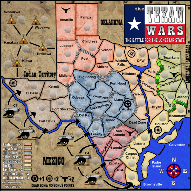
Looks like the compression was the problem, not the map! The map seems to pop with zest now (sounds delicious, doesn't it?).
As for the dead zone, is it really serving any purpose (also it looks strange without any texture. The water also kind of does...)?
Also, is there some other way you can make the dashed attack routes...hm, fit with the map more? Right now, the black dashed lines seem out of place.
But I like the way the map is looking overall.
--Andy
Posted: Thu Dec 20, 2007 12:42 am
by rgbubba
AndyDufresne wrote:
Also, is there some other way you can make the dashed attack routes...hm, fit with the map more? Right now, the black dashed lines seem out of place.
--Andy
Do you have any suggestion from other maps? I would be glad to change it to fit the map.
Posted: Thu Dec 20, 2007 1:25 am
by Ogrecrusher
For one thing I'd make the dashes actually touch the islands in the sea.
Posted: Thu Dec 20, 2007 5:13 am
by Skittles!
I think the colours of this map would be too light (even with the shadows) with the new pink and orange. It will be distracting.
Posted: Thu Dec 20, 2007 7:27 am
by madsanders
Couldn't you come up with some more interesting names for the continents than East, West, Central etc. Texas?
Posted: Thu Dec 20, 2007 4:13 pm
by AndyDufresne
madsanders wrote:Couldn't you come up with some more interesting names for the continents than East, West, Central etc. Texas?
Back in the days of the early Foundry, I always use to harp about 'Directional' named continents. But on this map they might serve a purpose in easily locating the area on the map. Though if there are some more unique names, I'd be interested to see what you can come up with.
--Andy
Posted: Thu Dec 20, 2007 4:43 pm
by bspride
madsanders wrote:Couldn't you come up with some more interesting names for the continents than East, West, Central etc. Texas?
You could name them for the various regions of Texas...coastal,forest,plains,mountains,hill
Posted: Fri Dec 21, 2007 7:38 pm
by rgbubba
Incandenza wrote:The dead zone seems kinda extraneous.... none of the surrounding continents are easier or harder to hold with it there...
It looks way better, rg. Thanks for taking the time to address my concerns.

I put it there due to that both the Hill Country and Central Teaxs were going to be the same bonus points. I needed a way to take the point down. So this was my resolve.
Posted: Fri Dec 21, 2007 7:43 pm
by rgbubba
madsanders wrote:Couldn't you come up with some more interesting names for the continents than East, West, Central etc. Texas?
Let me see what I can come up with after Christmas!
Thanks for your continued support with this project!
MERRY CHRISTMAS!!!
Posted: Sat Dec 22, 2007 6:49 pm
by AndyDufresne
---
The Texan Wars Map has reached the
‘Final Forge’ Stage. I've revived this thread from the pits of the Foundry Furnace (okay, maybe not) and have examined the contents. Nearly every major concern has been addressed. If there are any other current concerns, please make your voice heard. If after a reasonable amount of time there has not been any objection or protest, the map will be deemed finished with the 'Foundry Brand' of approval and will be submitted for live play. As long as there is still discussion or posts that have yet to be commented on, the map will remain in
Final Forge until said discussion has reached the conclusion that the map has reached its final and polished version.
Post questions and concerns if any.
--Andy
Posted: Sat Dec 22, 2007 10:21 pm
by lanyards
Nice job on the map, it looks great. Congratulations on your map making Final Forge.

Posted: Sat Dec 22, 2007 10:28 pm
by Elijah S
Congrats on FF... Nice work!
Posted: Sun Dec 23, 2007 6:01 am
by Skittles!
Map 16 reminds me of denim pants

Pretty cool.
Posted: Wed Dec 26, 2007 11:37 am
by Blitzaholic
map 16 looks a little better in my opinion
Posted: Fri Dec 28, 2007 10:53 pm
by tim02
dude, you need lines to the island
Posted: Mon Dec 31, 2007 8:50 am
by rgbubba
tim02 wrote:dude, you need lines to the island
HERE YOU GO!

Posted: Mon Dec 31, 2007 8:59 am
by rgbubba
THANKS GUYS FOR ALL YOUR HELP IN MAKING THIS MAP A GREAT ONE. I HOPE THAT EVERYONE HAS A GREAT NEW YEAR.
Bonus points
Posted: Mon Dec 31, 2007 1:20 pm
by rgbubba
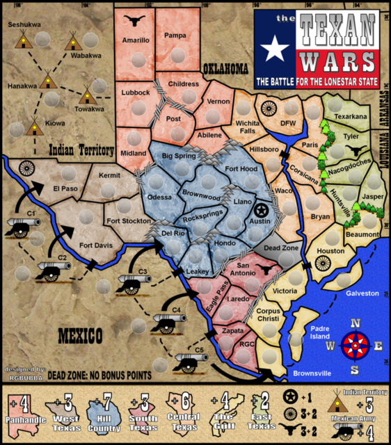
BONUS POINTS FOR THE TEXAN WARS
PANHANDLE +6
West Texas + 5
Hill Country + 8
South Texas + 6
Central Texas + 6
The Gulf + 5
East Texas + 3
Indian Territory + 3
Mexican Army + 4
Lone Star +1
Wagon Wheel + 2
Long Horn +2
Dead Zone -0 (I put it in to make central Texas have less points. It had the same as the Hill country, but it also adds a twist in the came.)
Cannon: You can only attack by arrows or cannon to cannon. That's the Idea any way?
Posted: Wed Jan 09, 2008 8:35 pm
by rgbubba
Does the Map have to be 630x600 or just around it? Same goes with the larger map.
Posted: Wed Jan 09, 2008 8:43 pm
by pepperonibread
rgbubba wrote:Does the Map have to be 630x600 or just around it? Same goes with the larger map.
It can be 630x600, but the mods might prefer less, unless you can show them a good reason for needing the space. I think max for the large is 840x800.
Posted: Wed Jan 09, 2008 10:55 pm
by rgbubba
pepperonibread wrote:rgbubba wrote:Does the Map have to be 630x600 or just around it? Same goes with the larger map.
It can be 630x600, but the mods might prefer less, unless you can show them a good reason for needing the space. I think max for the large is 840x800.
My Board will be 600x637 and the large around 800x854.
I will try to get it down!
Posted: Fri Jan 11, 2008 11:36 pm
by lanyards
Try moving the text "Oklahoma" up so it is equal distance from the northern and southern borders of the state.
--lanyards
Posted: Sun Jan 13, 2008 12:23 pm
by rgbubba
lanyards wrote:Try moving the text "Oklahoma" up so it is equal distance from the northern and southern borders of the state.
--lanyards
Check out the new board do you like this one better than the last one.
800x800
Posted: Sun Jan 13, 2008 3:20 pm
by bonobo`s son
I like the legend in the 2nd post on this page more then the one posted before my post and i think the water colour must be lighter blue, for the rest it is a super map!