Archipelago [Quenched]

Care to peruse completed maps? Take a stroll through the Atlas.

Moderator: Cartographers

Forum rules
Please read the Community Guidelines before posting.
Mjinga
Posts: 251
Joined: Fri Sep 14, 2007 2:36 pm

Re: Archipelago v6 (Pg. 1&11) - UPDATED MAY 11 - NEW POLL [I]

Post by Mjinga »

All right! The poll ended and... 12 to 3 in favour of Title B. I guess we'll go with that. :)

5-4-5 split in the mountains section. I will use mapmaker's discretion to decide that mountains A won. Mountains B didn't voting-wise, and to me mountains C seem too dark and contrasting with the general brightness of the map. Not compositionally my favourite choice. :) If anyone strongly dislikes mountains A and has a suggestion that I can clearly imagine (like Mr Squirrel's legend suggestion), I'd be willing to give another go at making more mountains.

And legend island B was the winner of the legend islands section. Since I'm currently working on Mr Squirrel's legend island as well, I'll run another poll on that versus legend island B and pamoa's idea. But the next update will have legend island B in it. :)

Any thoughts on the gameplay changes in Zeak's last post?
Reputation cleared. :) Never let it be said that Team CC don't investigate fairly.
Although they take bloody forever to do it...
User avatar
Mr. Squirrel
Posts: 157
Joined: Fri Nov 02, 2007 3:18 pm
Location: up a tree

Re: Archipelago v6 (Pg. 1&11) - UPDATED MAY 11 - NEW POLL [I]

Post by Mr. Squirrel »

ZeakCytho wrote:Okay, here's what I came up with doing a quick sketch of new territories and continents based on v6 in MS Paint. Red x's represent removed attack lines, green lines are added attack lines. I added three new territories and split Biceror into two continents, each getting its own black circle.

[bigimg]http://i5.photobucket.com/albums/y176/ZeakCytho/v6potentialnewcontsandbonuses.jpg[/bigimg]

Attack line removed:
Islor Coast <-> Niagis
Niagis <-> Iori Archipelago
Nyard <-> Synkor

Attack lines added:
Odesse <-> New territory 1
New territory 1 <-> Kyson
Niagis <-> Orold
Assad <-> New territory 2
New territory 2 <-> Iori Archipelago
Iori Archipelago <-> New territory 3
Not shown (I forgot to draw a few):
New territory 3 <-> Surubi
New territory 3 <-> Niagis

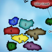
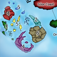
Since Biceror is cleaved, two new continents of five territories each are formed. The northern one is very hard to hold, since it has 5 territories and 5 borders, but the southern one should be easier, as it has 5 territories and 3 borders. Bishan stays at whatever bonus it is now because it still has the same number of defending territories. Adding 3 territories makes a total of 42, which is a nice number.

Thoughts on this?


That looks good, but you should definitely make the center continent with a high bonus. Anyone who is dropped there will have to get REEEEEEALLY lucky or else he is screwed.

With the addition of the smaller bottom continent, you should have three low-bonus continents, which is fine. Why don't you make the bottom continent a nice forest green color. That will fit in with the rainbow style of the map. :mrgreen:

Mjinga wrote:All right! The poll ended and... 12 to 3 in favour of Title B. I guess we'll go with that. :)

5-4-5 split in the mountains section. I will use mapmaker's discretion to decide that mountains A won. Mountains B didn't voting-wise, and to me mountains C seem too dark and contrasting with the general brightness of the map. Not compositionally my favourite choice. :) If anyone strongly dislikes mountains A and has a suggestion that I can clearly imagine (like Mr Squirrel's legend suggestion), I'd be willing to give another go at making more mountains.


I voted for A. While it doesn't fit perfectly with the map, it fits better than the other two, in my opinion.
User avatar
ZeakCytho
Posts: 1251
Joined: Wed Sep 12, 2007 4:36 pm

Re: Archipelago v6 (Pg. 1&11) - UPDATED MAY 11 [I]

Post by ZeakCytho »

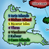
Here are the results I got running what I drew through Oaktown's bonus calculator:
Isris - 4
Bishan - 4
N. Biceror - 4
S. Biceror - 3
Thres - 4
Vienlorre - 6
Kalwar - 2

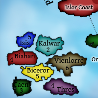
Now, I personally disagree with Isris and N. Biceror. Here's my proposed bonus structure:
Isris - 5
Bishan - 4
N. Biceror - 5
S. Biceror - 3
Thres - 4
Vienlorre - 6
Kalwar - 2
User avatar
t-o-m
Posts: 2918
Joined: Sat Mar 22, 2008 2:22 pm

Re: Archipelago v6 (Pg. 1&11) - UPDATED MAY 11 [I]

Post by t-o-m »

wow those terits on MS Paint look good ;)

i think this will be quite good - i'll take a look when its done in the style of everything else ;)
User avatar
ZeakCytho
Posts: 1251
Joined: Wed Sep 12, 2007 4:36 pm

Re: Archipelago v6 (Pg. 1&11) - UPDATED MAY 11 [I]

Post by ZeakCytho »

t-o-m wrote:wow those terits on MS Paint look good ;)


:lol:

t-o-m wrote:i think this will be quite good - i'll take a look when its done in the style of everything else ;)


If no one else posts any other feedback on the new continents draft and subsequent bonuses that I just posted, then Mjinga will go ahead and do that for v7. So please, if you guys have any problems with it, post now!

The next legend box poll will be up later tonight or tomorrow.

Gimil, could you take down the current poll?
User avatar
t-o-m
Posts: 2918
Joined: Sat Mar 22, 2008 2:22 pm

Re: Archipelago v6 (Pg. 1&11) - UPDATED MAY 11 [I]

Post by t-o-m »

i thought that you can take down ur own poll?

i remember somewhere having an option of "Delete current poll"on the "poll creation" window,

but i dont think i have any problems with the current version, looking forward to the next update ;)
User avatar
ZeakCytho
Posts: 1251
Joined: Wed Sep 12, 2007 4:36 pm

Re: Archipelago v6 (Pg. 1&11) - UPDATED MAY 11 [I]

Post by ZeakCytho »

Well, there won't be an update tonight anymore - Mjinga had real life stuff to attend to. If all goes well, there will be an update tomorrow with all of the following:

1) The Title that won the last poll
2) The Legend Box that won the last poll
3) New territories and attack lines as laid out in the paint map on the last page.
4) New bonuses as laid out on the last page.

Also for tomorrow, if all goes well, will be a new legend box poll with the options explained before.

Mjinga and I would appreciate any other feedback on the bonuses/added territories/continents as soon as possible, because if there's a problem, Mjinga would rather not waste her time drawing an incorrect version.
User avatar
ZeakCytho
Posts: 1251
Joined: Wed Sep 12, 2007 4:36 pm

Re: Archipelago v6 (Pg. 1&11) - UPDATED MAY 11 [I]

Post by ZeakCytho »

New update and poll!

Poll Options
A)
Image
B)
Image
C)
Image
D)
Image
E)
Image

Version 7 (Large)
[bigimg]http://smg.photobucket.com/albums/v238/Rhiannonaecastilla/CC/Maps/Archipelago/ArchMap7.png[/bigimg]

Updates in This Version:
1) Stait between Kalwar and Vienlorre edited
2) Shape of some islands changed to look less jagged
3) New territories added
4) Biceror split into two continents
5) New attack lines

Points of Discussion:
1) Attack lines look good?
2) Continents good?
3) Bonuses good?
4) Title good?
5) Mountains?
User avatar
jiminski
Posts: 5422
Joined: Tue Feb 20, 2007 3:30 pm
Gender: Female
Location: London

Re: Archipelago v7 (Pg. 1&12) - UPDATED MAY 17 -Legend Poll- [I]

Post by jiminski »

E) all the way for the Legend!

Edit:
i just looked at the new map with the extra islands, it will take a little while for me to get used to it but i think it looks great. There is a lot more going on, so it may be the the option E) legend could prove to be too much/distracting with the extra Islands. (i would have to see them together to be sure.)
E) may only work if you were to add a border to ensure that you could differentiate between map islands and legend islands.
Last edited by jiminski on Sat May 17, 2008 7:03 pm, edited 1 time in total.
Image
User avatar
t-o-m
Posts: 2918
Joined: Sat Mar 22, 2008 2:22 pm

Re: Archipelago v7 (Pg. 1&12) - UPDATED MAY 17 -Legend Poll- [I]

Post by t-o-m »

that green is WAY too strong!

the min-map should be E) and you should have it kinda misty so it looks mysterious or put clouds above it
User avatar
jiminski
Posts: 5422
Joined: Tue Feb 20, 2007 3:30 pm
Gender: Female
Location: London

Re: Archipelago v7 (Pg. 1&12) - UPDATED MAY 17 -Legend Poll- [I]

Post by jiminski »

t-o-m wrote:that green is WAY too strong!

the min-map should be E) and you should have it kinda misty so it looks mysterious or put clouds above it


Yes i think the green could be too strong ... it is tough to acclimatise to it straight away.
hmm magical clouds over a mythical isle ... i really like that! or maybe a coral border of something; with the coral-reef breaking the surface of the sea? ... it needs to be discernible from the main map.
Image
User avatar
t-o-m
Posts: 2918
Joined: Sat Mar 22, 2008 2:22 pm

Re: Archipelago v7 (Pg. 1&12) - UPDATED MAY 17 -Legend Poll- [I]

Post by t-o-m »

maybe something a little like...
Image

but less ocpacity

EDIT:

i think that you should put clouds all over the map but very low ocpacity ones, it would give the map more theme like i was talking about much much earlier
User avatar
Mr. Squirrel
Posts: 157
Joined: Fri Nov 02, 2007 3:18 pm
Location: up a tree

Re: Archipelago v7 (Pg. 1&12) - UPDATED MAY 17 -Legend Poll- [I]

Post by Mr. Squirrel »

I know before I said that you would want to put the names of the islands in the legend, but after seeing what it looks like, I think version B looks great.

t-o-m wrote:that green is WAY too strong!


What makes green too strong? it looks fine to me.

Also, Zeak, on the map, it looks like you started to make a border between Basela and Niagis, but you never finished it. You will want to fix that before next update.

By the way, I like the forest green color. I wonder who thought that up. :-k :lol:
User avatar
ZeakCytho
Posts: 1251
Joined: Wed Sep 12, 2007 4:36 pm

Re: Archipelago v7 (Pg. 1&12) - UPDATED MAY 17 -Legend Poll- [I]

Post by ZeakCytho »

jiminski wrote:E) all the way for the Legend!

Edit:
i just looked at the new map with the extra islands, it will take a little while for me to get used to it but i think it looks great. There is a lot more going on, so it may be the the option E) legend could prove to be too much/distracting with the extra Islands. (i would have to see them together to be sure.)
E) may only work if you were to add a border to ensure that you could differentiate between map islands and legend islands.


I like the concept of E, but I think it just turned out weird and I'm not sure that anything can be done. Even with adding a border...

t-o-m wrote:that green is WAY too strong!

I didn't like the green at first, but after a minute it kind of grew on me. I'd rather it be bold than washed out. Let's see what other people think.

t-o-m wrote:maybe something a little like...
Image

but less ocpacity

[...]

i think that you should put clouds all over the map but very low ocpacity ones, it would give the map more theme like i was talking about much much earlier

I don't like clouds. They muddle the area and make it harder to see and really serve no purpose. We're making this map as clear and clean as possible using bright colors and a very easy to read font. Yes, adding clouds would make it more realistic, but it is completely against the theme we're building.

jiminski wrote:hmm magical clouds over a mythical isle ... i really like that! or maybe a coral border of something; with the coral-reef breaking the surface of the sea? ... it needs to be discernible from the main map.

I think a coral border is better. One thing the poll options didn't have that they were supposed to is an island in a neutral color with the word "Legend" or "Bonuses" in it. That would key people in to what the islands actually are, and should help to separate them from the main playing area. If that's not enough, we could add a border, either with a reef or by some other means.

Mr. Squirrel wrote:I know before I said that you would want to put the names of the islands in the legend, but after seeing what it looks like, I think version B looks great.

I agree, though I think the islands could be resized so they don't take up as much room. If this option wins, then that's something to think about.

Mr. Squirrel wrote:
t-o-m wrote:that green is WAY too strong!


What makes green too strong? it looks fine to me.

Yeah, it is a bit strong at first, but I think it gets better after a short time.

Mr. Squirrel wrote:Also, Zeak, on the map, it looks like you started to make a border between Basela and Niagis, but you never finished it. You will want to fix that before next update.

Will fix that, thanks.

Mr. Squirrel wrote:By the way, I like the forest green color. I wonder who thought that up. :-k :lol:

:lol:

Any comments on the new bonuses and attack lines?
User avatar
mibi
Posts: 3350
Joined: Thu Mar 01, 2007 8:19 pm
Location: The Great State of Vermont
Contact:

Re: Archipelago v7 (Pg. 1&12) - UPDATED MAY 17 -Legend Poll- [I]

Post by mibi »

This map looks good except for those mountains. We really need to find out who started people on those blurry smudged up mountains and kick their ass. The C version of the mountains was by far the best and most suitable.
Mjinga
Posts: 251
Joined: Fri Sep 14, 2007 2:36 pm

Re: Archipelago v7 (Pg. 1&12) - UPDATED MAY 17 -Legend Poll- [I]

Post by Mjinga »

Thanks for the comments, guys!

mibi: I'm probably going to be doing another mountains poll sometime, so I doubt that we will end up with these mountains in the long run. I just have to have an idea for something. I was curiously blank on mountains last time.

t-o-m: I could work with clouds over the oceans in the outlying areas, and maybe slightly shrouding the title or something. I'll play with it and see. About the green... that's just the red shade with the slider moved to green. XD

Mr. Squirrel: Oops! Heh, wasn't him, it was me. :/ It was there before, I swear! And yeah, that forest green is nice, isn't it? When I can remember who suggested it, I'll thank him. ;)

jiminski: I'll see if I can't try for coral reefs, but Zeak said my last attempt was hideous before anyone here ever even saw it. :/
Reputation cleared. :) Never let it be said that Team CC don't investigate fairly.
Although they take bloody forever to do it...
User avatar
ZeakCytho
Posts: 1251
Joined: Wed Sep 12, 2007 4:36 pm

Re: Archipelago v7 (Pg. 1&12) - UPDATED MAY 17 -Legend Poll- [I]

Post by ZeakCytho »

So the new gameplay looks good to everyone?
User avatar
jiminski
Posts: 5422
Joined: Tue Feb 20, 2007 3:30 pm
Gender: Female
Location: London

Re: Archipelago v7 (Pg. 1&12) - UPDATED MAY 17 -Legend Poll- [I]

Post by jiminski »

Mjinga wrote:

jiminski: I'll see if I can't try for coral reefs, but Zeak said my last attempt was hideous before anyone here ever even saw it. :/


Maybe you could treat the legend as if it were being viewed through a lens.. like looking with a nautical chart through an eyeglass... ? that would make sure that it is bordered and separate from the main image.

not a good image but it illustrates it a little: ImageImageImage
Image
User avatar
TaCktiX
Posts: 2392
Joined: Mon Dec 17, 2007 8:24 pm
Gender: Male
Location: Rapid City, SD

Re: Archipelago v7 (Pg. 1&12) - UPDATED MAY 17 -Legend Poll- [I]

Post by TaCktiX »

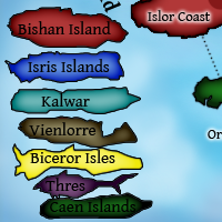
Go with C and drop the continent names from the rest of the map. Right now the Biceror Isles text obstructs the attack line right there, making it very hard to see.
User avatar
Mr. Squirrel
Posts: 157
Joined: Fri Nov 02, 2007 3:18 pm
Location: up a tree

Re: Archipelago v7 (Pg. 1&12) - UPDATED MAY 17 -Legend Poll- [I]

Post by Mr. Squirrel »

TaCktiX wrote:Go with C and drop the continent names from the rest of the map. Right now the Biceror Isles text obstructs the attack line right there, making it very hard to see.

I disagree. It would be annoying in team games to have to refer to every continent as green, blue or red. I like the names and think they should stay. As for the Biceror Name, just move it between Kyson, Surubi, and the Rol Archipelago.
User avatar
ZeakCytho
Posts: 1251
Joined: Wed Sep 12, 2007 4:36 pm

Re: Archipelago v7 (Pg. 1&12) - UPDATED MAY 17 -Legend Poll- [I]

Post by ZeakCytho »

I agree with Mr. Squirrel on the continent names. We can move them around or change the font, though. I agree that Biceror is in the way where it is. Are there any others that you guys think should be moved?

For the legend box, I'm not too font of the lens idea. To do it accurately would mean to warp the text/picture near the edges of the lens. Plus, having a real object sitting on the map would look kind of weird unless the map also had a papery look and a border, or something. When the legend poll is over tomorrow, we'll put one up on borders for it.

Gameplay comments?
User avatar
ZeakCytho
Posts: 1251
Joined: Wed Sep 12, 2007 4:36 pm

Re: Archipelago v7 (Pg. 1&12) - UPDATED MAY 17 -Legend Poll- [I]

Post by ZeakCytho »

I did a quick mock up of version 7 with 88s. I think everything is pretty visible. I had expected the most problems to occur with yellow on Biceror, but if anything, I think blue on Isris is the hardest to read. Anyone have issues with this? Ignore the fact that almost none of them are properly centered, please. Also ignore the large margins I forgot to crop :oops:.

Version 7 (Large) with 88s:
[bigimg]http://s5.photobucket.com/albums/y176/ZeakCytho/Version788s.png[/bigimg]

When Mjinga returns to this world from real-life work, the poll on the legend borders and on mountains will be posted. Any more gameplay comments?
User avatar
Mr. Squirrel
Posts: 157
Joined: Fri Nov 02, 2007 3:18 pm
Location: up a tree

Re: Archipelago v7 (Pg. 1&12) [I] - Updated May 17

Post by Mr. Squirrel »

I am having trouble reading the dark blue. Why don't you make the army circles a faint white like they have on classic. Any color shows up pretty well on there.
User avatar
ZeakCytho
Posts: 1251
Joined: Wed Sep 12, 2007 4:36 pm

Re: Archipelago v7 (Pg. 1&12) [I] - Updated May 17

Post by ZeakCytho »

Mr. Squirrel wrote:I am having trouble reading the dark blue. Why don't you make the army circles a faint white like they have on classic. Any color shows up pretty well on there.

I've been playing around with a few things now. The problem with your suggestion is that the Biceror circles with yellow 88s become almost unreadable with a white background at a low opacity. Turning up that opacity solves the problem on Biceror, but makes every other continent look like crap.

I think the best option would be to make the Isris circles a bit lighter and keep all the other circles as they are now. With 88s on them, it is possible that this inconsistency would "disappear" like an optical illusion; ie if the 88s are equally visible on all circles, and all circles have a black background, the particular shade/opacity of black could become irrelevant. But since Mjinga has the psd file, I can't actually test this theory. Another possible option is recoloring the whole continent of Isris to a lighter shade of blue, though I can't predict how good/bad that will look.

Now that the legend poll is over, here's how Mjinga and I feel about things. Since there are a tie, she and I are going to act as the tiebreakers, taking a few things into account. First, the single vote for option C will be counted as "in the style of option B," since they are fairly similar, and both distinctly not like option E. Second, Mjinga and I both think option B looks better. Option E looks okay in the small cropped section that was posted, but it looks very busy when put in the real map. When there's a border around it, it still looks busy, while option B does not. Thus, Mjinga and I have decided to go with option B.

A new poll will be put up about the mountain choices and the legend islands border as soon as Mjinga finishes the options up. If all goes well, the poll will be up sometime tomorrow. Cross your fingers. For now, I'm taking down the legend poll.

Any other gameplay comments :?:
User avatar
pamoa
Posts: 1242
Joined: Sat Sep 01, 2007 3:18 am
Gender: Male
Location: Confederatio Helvetica

Re: Archipelago v7 (Pg. 1&12) [I] - 5/17 - Gameplay Comments?

Post by pamoa »

Blue armies are allways unreadable on dark background. Not only on Isris islands but also on Vienlorre. But you cannot do much about as it's font problem. The blue isn't enough contrasted with the black outline so when you put it on a dark background it blured itself in the background. Saddly their only one way to solve this problem it's to have clear background for army circle. So you have to choose either changing the graphic all over the map or accepting blue armies have an advantage beeing camouflaged into the backgorund like in classic map.

About gameplay, I think Biceror is way too exposed. Beeing at the center of the map with all territories attackable it's like saying no one would ever get this bonus. For me you could remove one of the two link with Caen so there is at least one "safe" territory.

Would really be a nice map to play!
De gueules à la tour d'argent ouverte, crénelée de trois pièces, sommée d'un donjon ajouré, crénelé de deux pièces
Gules an open tower silver, crenellated three parts, topped by a apertured turret, crenellated two parts
Post Reply

Return to “The Atlas”