Page 7 of 25
Posted: Mon Sep 10, 2007 6:11 pm
by unriggable
The rails aren't very pleasing to the eyes, especially those that overlap.
Posted: Mon Sep 10, 2007 6:32 pm
by cairnswk
unriggable wrote:The rails aren't very pleasing to the eyes, especially those that overlap.
naturally....i'm sure that WM will make some great lines.
v14 Smnall Updates.
Posted: Mon Sep 10, 2007 7:02 pm
by cairnswk
Here is
V14 updates with some fixes suggested by Gnome.

Posted: Tue Sep 11, 2007 3:31 am
by onbekende
Who wanted double tracks? may I kill said person
if you want to make it railroady, try these things perhaps:

(okay, its paint, so sue me)
Posted: Tue Sep 11, 2007 4:00 am
by cairnswk
onbekende wrote:Who wanted double tracks? may I kill said person
if you want to make it railroady, try these things perhaps:
(okay, its paint, so sue me)
obekende....i'll not sue you over using paint...especially when u present a brilliant idea that will cover nicley for those double lines.
let's see what i can do in a short few hours.

very nice thank you.
Posted: Tue Sep 11, 2007 1:46 pm
by Unit_2
i love that! its awsome! keep the lines the same.
v15 update.
Posted: Tue Sep 11, 2007 4:02 pm
by cairnswk
Unit_2 wrote:i love that! its awsome! keep the lines the same.
Thanks unit 2.
Below is V15 for WM to work with for the rail lines.
Posted: Fri Sep 14, 2007 7:11 pm
by Gozar
Having seen Rail USA in action now, I am keen on seeing different railways of the world maps, cairnswk. (Although Rail Canada would probably be boring

)
Posted: Fri Sep 14, 2007 7:18 pm
by cairnswk
Gozar wrote:Having seen Rail USA in action now, I am keen on seeing different railways of the world maps, cairnswk. (Although Rail Canada would probably be boring
)
Gozar...thanks for comment as always.
Rail Australia is already in development on my puter, and Rail Asia will be started in a couple of months. As for Africa....i have not even visited that one yet.
However, i think there will be some other maps come out before Rail Australia. I'm keeping hush on those...

V16 update
Posted: Fri Sep 14, 2007 8:25 pm
by cairnswk
V16 Update
This is a small change:
* Title bar starting to take shape - heading for something in European Grand style, maybe like antique carved swirls etc.
* WM (who away this weekend) provided a "rough" version in blue of the rail lines for preview....apologies for them all being blue...
this is not the final colour for each line
We have also yet to finalise the colour scheme for the stations and lines.
V16 Small

Posted: Fri Sep 14, 2007 9:04 pm
by d.gishman
The map might ahve to be a little wider (unless that goes against size restrictions) right now it seems a little crowded
Posted: Fri Sep 14, 2007 9:16 pm
by cairnswk
d.gishman wrote:The map might ahve to be a little wider (unless that goes against size restrictions) right now it seems a little crowded
thanks for comment d.gishman....can take it any wider...size restrictions....i don't think it is too crowded...busy yes, but not too crowded...the large version will be more suited to your needs i beleive when i get that done.
Posted: Fri Sep 14, 2007 9:25 pm
by edbeard
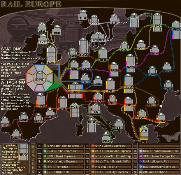
the only problem I have at this point (haven't look at the bonus structure lately) is the colours in the legend and how they are shown on the map itself. very hard to distinguish all around. I've had this problem since you switched the colours from vertical lines to horizontal (under the station letters) but you explained why you had to make that change. And, I believe you said you are working on the colour scheme still so I'll let you know what I think when I see those changes
Posted: Sat Sep 15, 2007 10:42 am
by oaktown
I like it... same potential for color confusion as the USA, but it'll be fun to play.
just for clarification (and I apoligize if this ha already been covered on another page) but some stations that have two lines running through them are multiple territories, such as Prague, while others with multiple rail lines are only one territory, like Venice? Why the difference?
And the tracks around Rome are confusing... looks like Florence could bypass Rome and hit CBA.
Your first poster wanted the graphics to reflect the USA game, but I disagree. European train stations have a grandeur that few American stations have, and I'd like to see that reflected. For instance, when European stations fall out of service they become museums (Paris, Berlin) - when our stations fall out of service they become meth labs, then later are torn down to build a Walmart.
This map has been bumped by the PGD, a mapmaking advocate group.
Posted: Sat Sep 15, 2007 3:03 pm
by Wisse
i think you need the rails as they are now, but then in colours, because it's now confusing wich countries belong into one bonus area
Posted: Sat Sep 15, 2007 4:00 pm
by cairnswk
Wisse wrote:i think you need the rails as they are now, but then in colours, because it's now confusing wich countries belong into one bonus area
yes wisse...they will be in colour
v17 Small
Posted: Sun Sep 16, 2007 2:30 am
by cairnswk
v17 Small
Some frame work going onto the title bar. Suitable?

Posted: Sun Sep 16, 2007 9:37 am
by Kaplowitz
Posted: Sun Sep 16, 2007 9:48 am
by cena-rules
this is sweet. I would make the paris station a bit brighter
Posted: Sun Sep 16, 2007 1:16 pm
by unriggable
cena-rules wrote:this is sweet. I would make the paris station a bit brighter
QFT
Posted: Sun Sep 16, 2007 2:35 pm
by cairnswk
unriggable wrote:cena-rules wrote:this is sweet. I would make the paris station a bit brighter
QFT
do you mean the legs of the octagon, or in the grey areas?
Posted: Sun Sep 16, 2007 2:48 pm
by cena-rules
cairnswk wrote:unriggable wrote:cena-rules wrote:this is sweet. I would make the paris station a bit brighter
QFT
do you mean the legs of the octagon, or in the grey areas?
all of it. It need to stand out like chicago.
Posted: Sun Sep 16, 2007 2:59 pm
by oaktown
cena-rules wrote:all of it. It need to stand out like chicago.
Actually, I'd say it shouldn't look like Chicago; it should make you think of Paris. The ironwork around the title is exactly the kind of look I'd push you keep going after Cairns. Nice work.
Posted: Mon Sep 17, 2007 5:24 am
by cairnswk
oaktown wrote:cena-rules wrote:all of it. It need to stand out like chicago.
Actually, I'd say it shouldn't look like Chicago; it should make you think of Paris. The ironwork around the title is exactly the kind of look I'd push you keep going after Cairns. Nice work.
i'll see what i can do oaktown....but it won't be an Eiffel Tower, OK
Posted: Wed Sep 19, 2007 1:41 pm
by cairnswk
POLL RESULTS
Another Rail Map? Yup - this time Europe's turn! Interested? (14 day poll)
Yes 75% [ 39 ]
No 25% [ 13 ]
Total Votes : 52