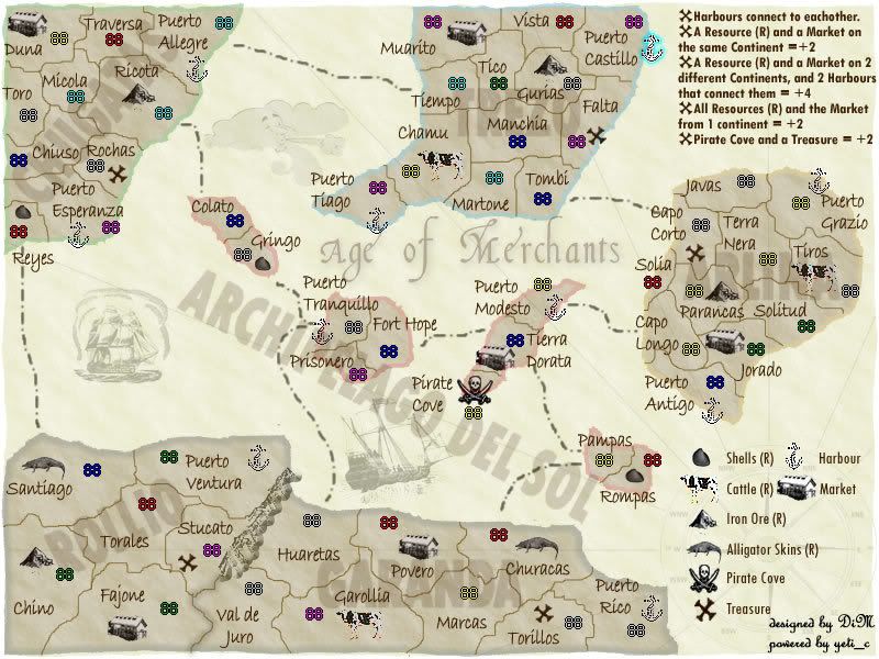
Molacole wrote:Dim have you tried making the whole territory of each resource shaded? If you use really light colors and blend it from light to lighter it might look better than just the outline you've got now
i thought of doing that but after looking at various old maps i never saw this done. they either had outlines on the territories (like i have on the continents) or they had outlines on the important stuff (like i have on the resources) or they had no outlines (the way i really like it). and i only want to use one of these three options.
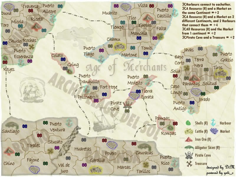
The way the map is now doesn't really work for me. You kind of have to search for each of the resources and such because they don't stand out enough. It seems like it might be easy to accidentally over look something that normally you wouldn't have, if each bonus spot was blatantly marked.
As far as ease of playability goes, I'm all for the verion with highlighted resources and such. In terms of looks, I much more prefer just the outlines. What if you made the actual market itself blue instead? Or again, if you could pull of making the whole terrirtory a different color, but I think that would be very tricky to get just right.
Molacole wrote:Dim have you tried making the whole territory of each resource shaded? If you use really light colors and blend it from light to lighter it might look better than just the outline you've got now
i thought of doing that but after looking at various old maps i never saw this done. they either had outlines on the territories (like i have on the continents) or they had outlines on the important stuff (like i have on the resources) or they had no outlines (the way i really like it). and i only want to use one of these three options.
The way the map is now doesn't really work for me. You kind of have to search for each of the resources and such because they don't stand out enough. It seems like it might be easy to accidentally over look something that normally you wouldn't have, if each bonus spot was blatantly marked.
As far as ease of playability goes, I'm all for the verion with highlighted resources and such. In terms of looks, I much more prefer just the outlines. What if you made the actual market itself blue instead? Or again, if you could pull of making the whole terrirtory a different color, but I think that would be very tricky to get just right.
at the moment i think the outlined resources are very visible. you have 2 criterias to identify a resource:
1. the colour of the outline
2. the icon itself.
i said before i don't want to colour the whole territory of the resource because that would not be accurate to the maps i've seen.
if you want i can try to lose the outline but make the resources coloured instead.
“In the beginning God said, the four-dimensional divergence of an antisymmetric, second rank tensor equals zero, and there was light, and it was good. And on the seventh day he rested.”- Michio Kaku
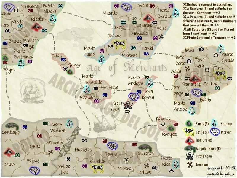
here is how the icons look without the outline but with colour fill.
i only did the legend and left the others the same for comparison.
“In the beginning God said, the four-dimensional divergence of an antisymmetric, second rank tensor equals zero, and there was light, and it was good. And on the seventh day he rested.”- Michio Kaku
the xml is done thanks to a yeti_c.
6708 lines of code
“In the beginning God said, the four-dimensional divergence of an antisymmetric, second rank tensor equals zero, and there was light, and it was good. And on the seventh day he rested.”- Michio Kaku
“In the beginning God said, the four-dimensional divergence of an antisymmetric, second rank tensor equals zero, and there was light, and it was good. And on the seventh day he rested.”- Michio Kaku
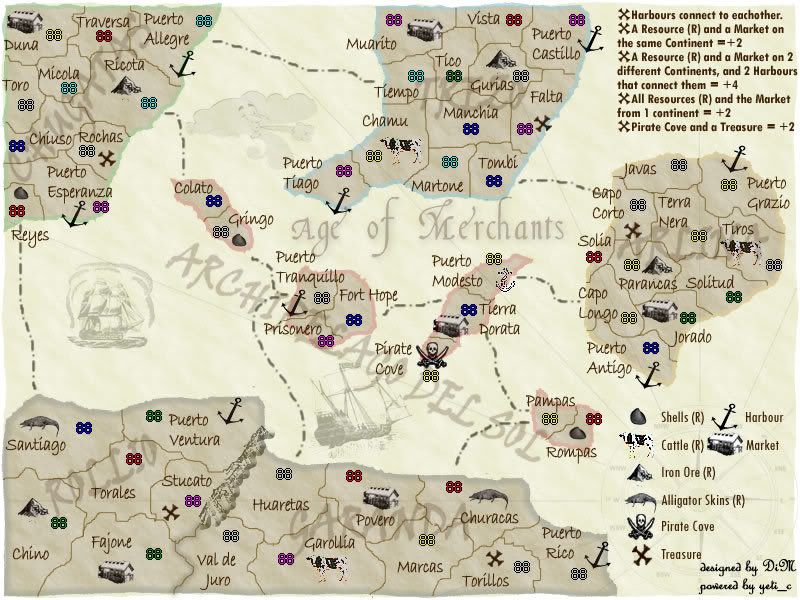
could you add the coloured-in symbols to one of the continents so we could have a better look at them? Also, in my opinion, the font you used to identify the continents looks horrible and out of place.
Highest Score: 2532 Highest Position: 69 (a long time ago)
the font used for continents does not matter i used it just to show you how would the names look.
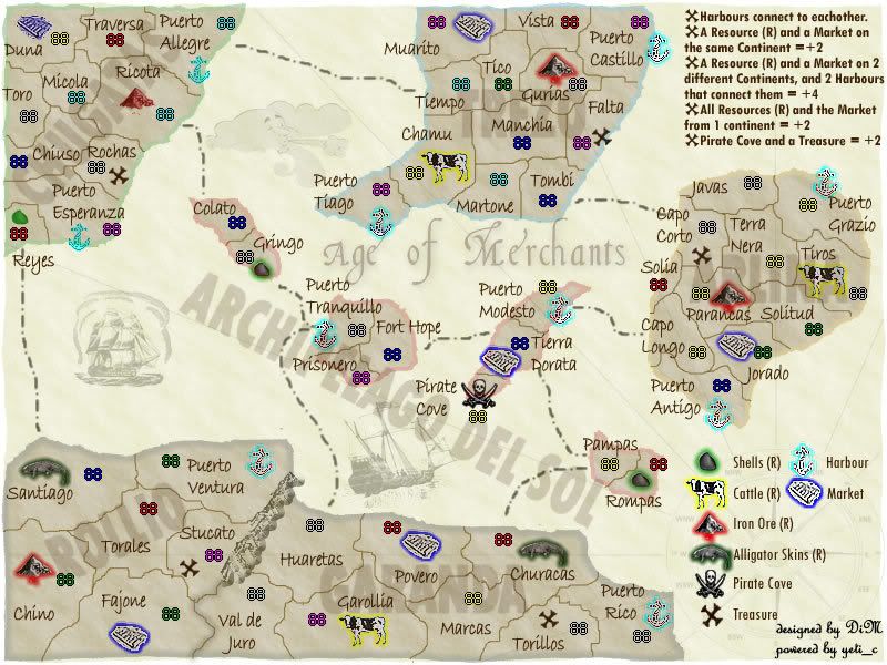
here is a new version. replaced the herd with a single cow and improved the visibility of the symbols. yes even the "ancres" ( ) if you guys can't see the symbols now then you're all blind )))
“In the beginning God said, the four-dimensional divergence of an antisymmetric, second rank tensor equals zero, and there was light, and it was good. And on the seventh day he rested.”- Michio Kaku
here is with colour fill in the top left island. i think the version in the post above is much more clear
“In the beginning God said, the four-dimensional divergence of an antisymmetric, second rank tensor equals zero, and there was light, and it was good. And on the seventh day he rested.”- Michio Kaku
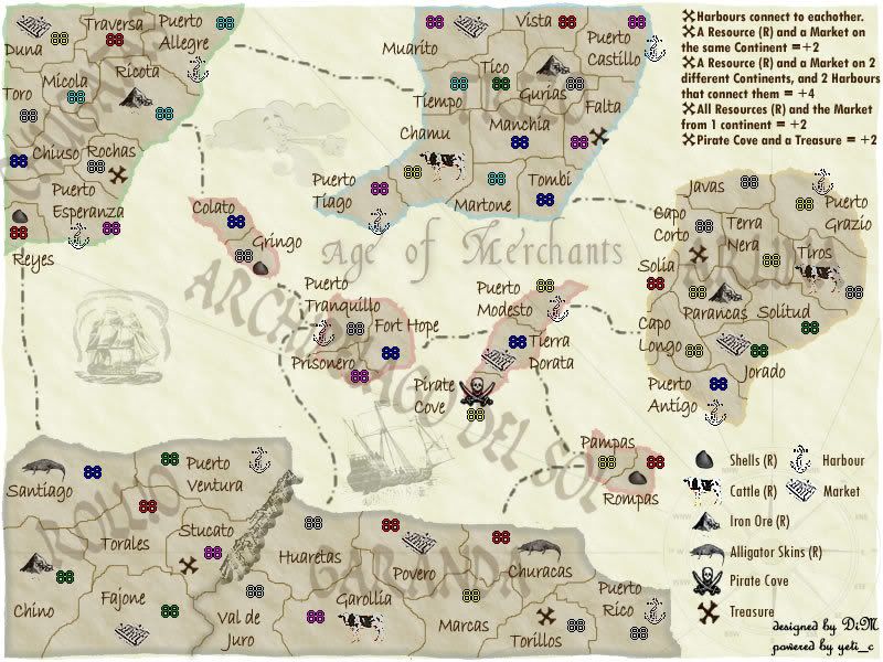
and here is without colour fill or outlines. just plain symbols (which i made a bit more clear)
“In the beginning God said, the four-dimensional divergence of an antisymmetric, second rank tensor equals zero, and there was light, and it was good. And on the seventh day he rested.”- Michio Kaku
Are there any other market icons that could be used, it's not that that one is hard to see, I just have no idea what it's meant to be. I kind of want to suggest using a pound or dollar sign but that would seem out of place, maybe a gold doubloon or something.
you won't know what it is in the first 3 seconds of the game. then you'll look at the legend and see what it means.
“In the beginning God said, the four-dimensional divergence of an antisymmetric, second rank tensor equals zero, and there was light, and it was good. And on the seventh day he rested.”- Michio Kaku
DiM wrote:you won't know what it is in the first 3 seconds of the game. then you'll look at the legend and see what it means.
I do agree though - The icons are meant to represent what they stand for - but no-one can recognise the market - is it meant to be an abacus?
C.
no actually it's really a market with rows of counters and stuff. i'll find a better image.
“In the beginning God said, the four-dimensional divergence of an antisymmetric, second rank tensor equals zero, and there was light, and it was good. And on the seventh day he rested.”- Michio Kaku
Also try out the anchor so it's filled in and just just an outine of an anchor, I think it will look a lot better.
Yeah the market icon issue wasn't that it was hard to see or hard to work out what it was from the legend, just that I couldn't tell even slightly what it actually was.
Sorry for being picky, but it's all for the good of the map
“In the beginning God said, the four-dimensional divergence of an antisymmetric, second rank tensor equals zero, and there was light, and it was good. And on the seventh day he rested.”- Michio Kaku
“In the beginning God said, the four-dimensional divergence of an antisymmetric, second rank tensor equals zero, and there was light, and it was good. And on the seventh day he rested.”- Michio Kaku
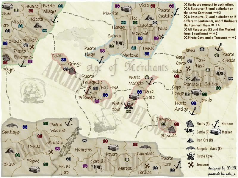
hey it's looking better all the time!
Maybe lose the slight pinkishness on the cows, I don't think it suits the grey/brownness of the rest of the map
Also, maybe the island names would be better as a lighter rather than darker shade; the territory names are already darker, so it might be easier to read (and if they were in a thicker simpler font, maybe...?)
And I vote no outlines, especially now that the icons are twice as clear.
Is it just me, or do the shells look a bit like turds? would one of these http://arthursshells.tripod.com/shellsbw.htm give a better result?
i put the correct anchor in puerto modesto, corrected the spelling error, put a new shell, took out the pinkishness of the cow and modiffied the names of continents to a lighter shade but a bulkier font.
here is the image.
PS: in reyes the army number is overlapping the shell. i'll correct the xml now.
“In the beginning God said, the four-dimensional divergence of an antisymmetric, second rank tensor equals zero, and there was light, and it was good. And on the seventh day he rested.”- Michio Kaku
the pinkness has gone, but so has the whiteness! the cows are disappearing! Also, I was meaning lighter than the ground colour, for the island names, rather than lighter than the words themselves!
DiM, you're not only doing a fine job with the visuals & concept, but also managing to implement ideas from the forum with icredible speed... smart!