Page 6 of 25
Re: POISON ROME V13(P8) - The God's Temples
Posted: Fri Dec 26, 2008 4:28 pm
by ZeakCytho
cairnswk wrote:Zeak...do you read instructions?
If you did, you would see that down the bottom of the map in the One-way Bombardments section, there is a Green fig marked Livia's Poison Figs with a one-way arrow to red figs....does that not tell you something?

That would be the problem. I'm red-green color blind. They figs look identical to me.
Re: POISON ROME V13(P8) - The God's Temples
Posted: Fri Dec 26, 2008 4:39 pm
by cairnswk
ZeakCytho wrote:cairnswk wrote:Zeak...do you read instructions?
If you did, you would see that down the bottom of the map in the One-way Bombardments section, there is a Green fig marked Livia's Poison Figs with a one-way arrow to red figs....does that not tell you something?
That would be the problem. I'm red-green color blind. They figs look identical to me.
Oh dear. Apologies of course. but I'll to change one colour

Re: POISON ROME V14
Posted: Fri Dec 26, 2008 5:53 pm
by cairnswk
Version 14.
1. Some Roman houses/apartments/gardens/terraces
2. Bombardment fig changed to have a stem
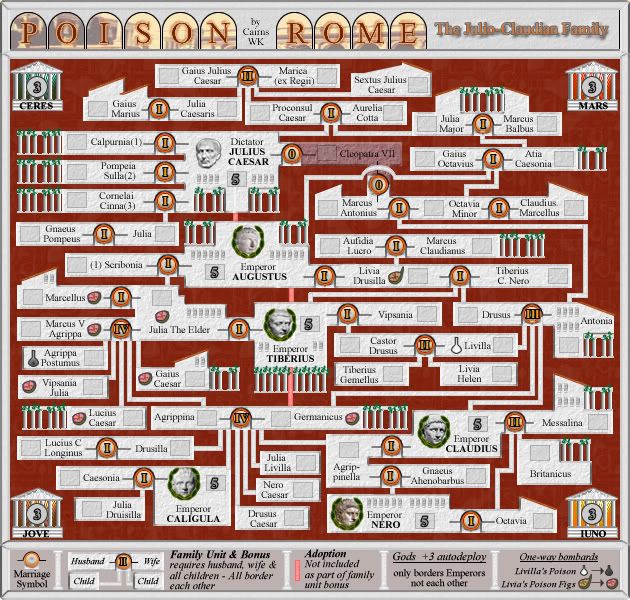
[bigimg]http://i155.photobucket.com/albums/s282/cairnswk/poison%20rome/poison_rome_V14L.jpg[/bigimg]
Re: POISON ROME V14(P9) - The God's Temples & Houses
Posted: Fri Dec 26, 2008 6:41 pm
by cairnswk
And xml written
Re: POISON ROME V14(P9) - The God's Temples, Houses & XML
Posted: Sat Dec 27, 2008 4:38 am
by cairnswk
Mmmmm, i think i still need to add some embelishments to this design to make this look like Rome. Some columns perhaps, triangular rooftops...what do others think. The right side of the map still needs filling up with some stuff.
Re: POISON ROME V14(P9) - The God's Temples, Houses & XML
Posted: Sat Dec 27, 2008 5:09 am
by ZeakCytho
The figs look good now
I agree that the map needs something to fill the empty space and make it feel more Rome, but I think what you have now is just too busy. It makes it harder to focus on the actual gameplay area. The tilted roofs are good, the columns I don't like. But it's late and I can't think of a good suggestion for how to fix this. I'll take another look in the morning.
Re: POISON ROME V14(P9) - The God's Temples, Houses & XML
Posted: Sat Dec 27, 2008 11:02 am
by cairnswk
ZeakCytho wrote:The figs look good now
....
Excellent!
Re: POISON ROME V14(P9) - The God's Temples, Houses & XML
Posted: Sat Dec 27, 2008 11:22 am
by cairnswk
ZeakCytho wrote:The figs look good now
.... the columns I don't like.
Would it help if they were softer and had a whitish background like the rest of the buildings.
Re: POISON ROME V14(P9) - The God's Temples, Houses & XML
Posted: Sat Dec 27, 2008 1:22 pm
by MrBenn

Onwards and upwards

Re: POISON ROME V14(P9) - The God's Temples, Houses & XML
Posted: Sat Dec 27, 2008 4:25 pm
by ZeakCytho
cairnswk wrote:ZeakCytho wrote:The figs look good now
.... the columns I don't like.
Would it help if they were softer and had a whitish background like the rest of the buildings.
Yes, I think that should improve them.
Re: POISON ROME V15
Posted: Sat Dec 27, 2008 6:00 pm
by cairnswk
Version 15.
Rome is on the move.
Buildings are being re-designed especially the big dudes palaces.
Not quite happy with Caesar's Palaces yet, but i'll build on that.
Caligula and Claudius still to do.
Augustus, well that could maybe do with an Italian job also.
I gotta say though, i luv those little statues

[bigimg]http://i155.photobucket.com/albums/s282/cairnswk/poison%20rome/poison_rome_V15S.jpg[/bigimg]
Re: POISON ROME V16
Posted: Sat Dec 27, 2008 9:43 pm
by cairnswk
Version 16.
Additions:
1. Gnaeus Pompey built the Theatre of Pompey. so it represented above his name.
2. The Pantheon has an inscription above its doorway that reads "M Agrippa Built this", so i have a representation of the Pantheon above Marcus V Agrippa's name.
3. Claudius built the Claudian Aquaduct, so i have representation of that each side of Emperor Claudius.
4. I had to re-organise Julia The Elder so that I could fit the Pantheon in...hope this works.
5. I might be able to expand the Tiberius Palace out a fraction.
6. The Augustus Palace is complete.
7. Caligula will be a challenge.
8. Nero will be burning....up in flames
[bigimg]http://i155.photobucket.com/albums/s282/cairnswk/poison%20rome/poison_rome_V16S.jpg[/bigimg]
Re: POISON ROME V16(P10) [D] - Re-designing the Palaces
Posted: Sat Dec 27, 2008 10:49 pm
by Incandenza
Lookin' good, cairns... a couple of graphics things:
The statue next to Aurellia Cotta might be a bit much, and it's a little too close to the neighboring (non-connecting) terit.
The other shaded-out statue off to the right side seems kinda extraneous, I know it's filling up space, but maybe it could fill it a bit more, I dunno, emphatically
The columns and ivy next to Germanicus could be shortened (in general I think you'll want to keep the flourishes on non-bordering terits from coming too close to each other, same applies to the temple next to Gaius Caesar, could be smaller)
The army circle location for Emperor Tiberius is a bit odd, how about integrating it into the temple like you did with Dictator Caesar?
Speaking of the Dictator, there are 4 weird little blocks floating off to the right of him
I think the Gods temples could use more work, specifically I think you could really try and differentiate them with design rather than color, but that's probably a comment for a bit farther down the road
I'm sure there's more, but that's what's sticking out to me at the moment.
Re: POISON ROME V16(P10) [D] - Re-designing the Palaces
Posted: Sat Dec 27, 2008 10:58 pm
by TaCktiX
Good graphical changes while I've been away, must say. The god temples are very nice, and the emperor palaces even more so.
Concerns:
- Pompeia Sulla(2) has the red background behind his columns, Calpurnia (2) and Cornelai Cinnai (3) have a gray background. Germanicus and Lucius Caesar also have the gray background whilst the majority of the other buildings retain the red. Consistency pleasie.

- Marcellus still has his wannabe roof popping out from underneath his lovely columns. I assume "in-transition" graphics, but it might have slipped notice.
- Some of the new Roman numerals aren't centered (Livia Drusilla, Drusus/Antonia, Gnaeus Ahenobarbus, Scribonia).
- Any chance of looking up the Roman symbol for Nothing instead of using Zero for Cleopatra? The concept of Zero was utterly alien to Roman culture (heck, to everyone 'cept the Arabs until nearly the 2nd millennium AD)
Overall theme change: U didn't exist in Roman times, it was all about the V. So Julius Caesar would be more properly inscribed as Jvlivs Caesar. I make this suggestion following your changing of bonuses from Arabic to Roman numerals. Nothing says Romanum like Romanvm.
And once again, your map has been

Have a nice day!
Re: POISON ROME V16(P10) [D] - Re-designing the Palaces
Posted: Sat Dec 27, 2008 11:03 pm
by cairnswk
Incandenza wrote:Lookin' good, cairns... a couple of graphics things:...
I'm sure there's more, but that's what's sticking out to me at the moment.
TaCktiX wrote:Good graphical changes while I've been away, must say. The god temples are very nice, and the emperor palaces even more so.
Have a nice day!
Sorry, guys i gave you a bum steer. You examined V15 instead of V16, and there were some major changes.
However, i look at your comments and see what is relavant to V16.

Re: POISON ROME V16(P10) [D] - Re-designing the Palaces
Posted: Sat Dec 27, 2008 11:12 pm
by cairnswk
Incandenza wrote:Lookin' good, cairns... a couple of graphics things:
The statue next to Aurellia Cotta might be a bit much, and it's a little too close to the neighboring (non-connecting) terit.
The other shaded-out statue off to the right side seems kinda extraneous, I know it's filling up space, but maybe it could fill it a bit more, I dunno, emphatically
The columns and ivy next to Germanicus could be shortened (in general I think you'll want to keep the flourishes on non-bordering terits from coming too close to each other, same applies to the temple next to Gaius Caesar, could be smaller)
The army circle location for Emperor Tiberius is a bit odd, how about integrating it into the temple like you did with Dictator Caesar?
Speaking of the Dictator, there are 4 weird little blocks floating off to the right of him
Sorry incandenze. all of that is now gone in V16.
I think the Gods temples could use more work, specifically I think you could really try and differentiate them with design rather than color, but that's probably a comment for a bit farther down the road
I'm sure there's more, but that's what's sticking out to me at the moment.
Mmmm. I'm not sure about that. They are all modelled on the Temple of Jupiter. So i don't know....
TaCktiX wrote:Good graphical changes while I've been away, must say. The god temples are very nice, and the emperor palaces even more so.
Concerns:
- Pompeia Sulla(2) has the red background behind his columns, Calpurnia (2) and Cornelai Cinnai (3) have a gray background. Germanicus and Lucius Caesar also have the gray background whilst the majority of the other buildings retain the red. Consistency pleasie.
- Marcellus still has his wannabe roof popping out from underneath his lovely columns. I assume "in-transition" graphics, but it might have slipped notice.
Sorry TaCktiX...all of those issues no longer exists.
- Some of the new Roman numerals aren't centered (Livia Drusilla, Drusus/Antonia, Gnaeus Ahenobarbus, Scribonia).
- Any chance of looking up the Roman symbol for Nothing instead of using Zero for Cleopatra? The concept of Zero was utterly alien to Roman culture (heck, to everyone 'cept the Arabs until nearly the 2nd millennium AD)
Overall theme change: U didn't exist in Roman times, it was all about the V. So Julius Caesar would be more properly inscribed as Jvlivs Caesar. I make this suggestion following your changing of bonuses from Arabic to Roman numerals. Nothing says Romanum like Romanvm.
Have a nice day!
OK...is everyone going to be able to read that. It is one thing to place that in a title, but will players be able to comprehend replacing U with V....let's face it, they have enough trouble with my maps following concepts let alone interpreting latin characters. The Zero i will research, but i doubt if the U will stick.
Re: POISON ROME V17
Posted: Sun Dec 28, 2008 6:00 am
by cairnswk
TaCktiX wrote:...
- Any chance of looking up the Roman symbol for Nothing instead of using Zero for Cleopatra? The concept of Zero was utterly alien to Roman culture (heck, to everyone 'cept the Arabs until nearly the 2nd millennium AD)
....
As you say there is no Roman numeral for Zero, the Romans appeared to have used the latin
Nulla or none.
Ref:
http://en.wikipedia.org/wiki/Roman_numerals#ZeroIt appears one clever person used
N to represent none; but herein lies the problem using this.
So i'll use N with a notation in the legend.
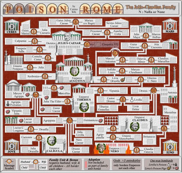
[bigimg]http://i155.photobucket.com/albums/s282/cairnswk/poison%20rome/poison_rome_V17L.jpg[/bigimg]
Re: POISON ROME V17(P10) [D] - Re-designing complete
Posted: Sun Dec 28, 2008 5:01 pm
by InkL0sed
Wow. This map (which was already pretty cool in my nerdy opinion) just got 10 times cooler.
I have to say though, the flames in Nero's palace look pretty bad.
Also, minor spelling complaint again:
If you have Jove, it should be Juno. Or you can switch Jove to Iovus for the Latin spelling. Sorry to be so anal about the spelling...
Re: POISON ROME V17(P10) [D] - Re-designing complete
Posted: Sun Dec 28, 2008 5:02 pm
by InkL0sed
Also, do you plan on keeping that font for the territories? I feel like you could use something a little more... fun. As long as it's legible.
Re: POISON ROME V17(P10) [D] - Re-designing complete
Posted: Sun Dec 28, 2008 5:23 pm
by cairnswk
InkL0sed wrote:Wow. This map (which was already pretty cool in my nerdy opinion) just got 10 times cooler.
pleased you think so InkLOsed
I'm pretty impressed with it myself coz i spent a whole 24 on it and didn't have any idea of what i wanted to do...ah for creativity eh?
I have to say though, the flames in Nero's palace look pretty bad.
Yes, those will be modified
Also, minor spelling complaint again:
If you have Jove, it should be Juno. Or you can switch Jove to Iovus for the Latin spelling. Sorry to be so anal about the spelling...
Iovus - it is - i'll change. I hope you are the authority on latin.
InkL0sed wrote:Also, do you plan on keeping that font for the territories? I feel like you could use something a little more... fun. As long as it's legible.
The font is Times New Roman, but i'll do some experimenting. I don't necessarily agree that the font should be fun.
But legibility is more my main criteria for everyone.
Re: POISON ROME V17(P10) [D] - Re-designing complete
Posted: Sun Dec 28, 2008 11:06 pm
by Incandenza
The N is cute, but I think you're better off with a plain ole' zero. I'm well aware of the history involved,, but why add an extra small layer of complication on an already pretty-damn-complicated map?
I still think the Gods temples could be gussied up a bit, but that's just me, and if you're happy with them, fair enough.
I want to take another look at the bonuses, but I can't be arsed to do so at this late hour. But I shall, I promise.
Re: POISON ROME V17(P10) [D] - Re-designing complete
Posted: Mon Dec 29, 2008 11:57 pm
by InkL0sed
"Authority" might be a stretch, but I do study Latin, so maybe relative to the rest of the site I am.
cairnswk wrote:Also, minor spelling complaint again:
If you have Jove, it should be Juno. Or you can switch Jove to Iovus for the Latin spelling. Sorry to be so anal about the spelling...
Iovus - it is - i'll change. I hope you are the authority on latin.
Hmm, I've just checked this up, and apparently I'm wrong. The Latin for Jove is still Iuppiter, because the English Jupiter and Jove both come from the same word.
So your choice is to either switch Jove to Iuppiter, or Iuno to Juno.
Basically, you should decide on whether you want Latin or English spellings for the gods. If you want the Latin spellings, then it's Iuppiter and Iuno. If not, then it's Jove/Jupiter and Juno.
PS. I suggest you switch Ceres to Neptune, in a reference to this scene from I Claudius:
http://www.youtube.com/watch?v=YfgDPLkMg-w
Re: POISON ROME V17(P10) [D] - Re-designing complete
Posted: Tue Dec 30, 2008 1:55 am
by cairnswk
InkL0sed wrote:"Authority" might be a stretch, but I do study Latin, so maybe relative to the rest of the site I am.
I knew it. i knew it. I thought you studied latin otherwise you wouldn't follow this point so well.
Good on you.
cairnswk wrote:Also, minor spelling complaint again:
If you have Jove, it should be Juno. Or you can switch Jove to Iovus for the Latin spelling. Sorry to be so anal about the spelling...
Iovus - it is - i'll change. I hope you are the authority on latin.
Hmm, I've just checked this up, and apparently I'm wrong. The Latin for Jove is still Iuppiter, because the English Jupiter and Jove both come from the same word.
So your choice is to either switch Jove to Iuppiter, or Iuno to Juno.
Basically, you should decide on whether you want Latin or English spellings for the gods. If you want the Latin spellings, then it's Iuppiter and Iuno. If not, then it's Jove/Jupiter and Juno.
PS. I suggest you switch Ceres to Neptune, in a reference to this scene from I Claudius:
http://www.youtube.com/watch?v=YfgDPLkMg-w
OK. I would like to keep them to 4 or 5 letter words.
So, is:
Jove
Juno
Mars
Ceres
correct?
I understand about I Claudius episode with Neptune...but would rather have Ceres, as i think Ceres would have played a more important part in Romans lives with them praying for good grain harvest rather than good Sea Voyages re Neptune.
What do you think?
Re: POISON ROME V17(P10) [D] - Re-designing complete
Posted: Tue Dec 30, 2008 2:00 am
by cairnswk
Incandenza wrote:The N is cute, but I think you're better off with a plain ole' zero. I'm well aware of the history involved,, but why add an extra small layer of complication on an already pretty-damn-complicated map?
Yes that was my feeling also but someone else wanted A latin Zero if possible.
I still think the Gods temples could be gussied up a bit, but that's just me, and if you're happy with them, fair enough.
I want to take another look at the bonuses, but I can't be arsed to do so at this late hour. But I shall, I promise.
Gussied...this is a term that i found described as being an australian slang....but i've never heard of it.
anyway, i think it suits you well.
What yould you do to have me gussy them up a bit. What would you like to see.
Re: POISON ROME V17(P10) [D] - Re-designing complete
Posted: Tue Dec 30, 2008 2:23 am
by InkL0sed
cairnswk wrote:What do you think?
Sounds good to me.