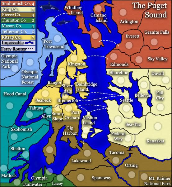
Tisha....i am asking here because someone else will probably ask the same thing later...can you have a look at the placement of your terts names and army shadows, particularly in the small map.
I think there could be some better centering...some names could move a little off the region so that army shadows move over the tert more...i.e Allyn, Bremerton...possibly swap Olympia and its shadow, and look at the same for Lacey...center Duvall...you know do a little fiddling to see if you can make it look slightly tidier.
* Pearl Harbour * Waterloo * Forbidden City * Jamaica * Pot Mosbi
cairnswk wrote:Tisha....i am asking here because someone else will probably ask the same thing later...can you have a look at the placement of your terts names and army shadows, particularly in the small map. I think there could be some better centering...some names could move a little off the region so that army shadows move over the tert more...i.e Allyn, Bremerton...possibly swap Olympia and its shadow, and look at the same for Lacey...center Duvall...you know do a little fiddling to see if you can make it look slightly tidier.
i tried..lol. Kitsap Co. is hard to center. moving the words around without blocking the borders..
The army circles for Gig Harbor and Whidbey Island are too far away from the territory names. Whilst on the territory itself - the armies look a little lost. You already overlap the water anyways with other names, I think you should move the names: (Whidbey above and to the left of the cricle, Gig just to the right of the circle)
The army circles for Gig Harbor and Whidbey Island are too far away from the territory names. Whilst on the territory itself - the armies look a little lost. You already overlap the water anyways with other names, I think you should move the names: (Whidbey above and to the left of the cricle, Gig just to the right of the circle)
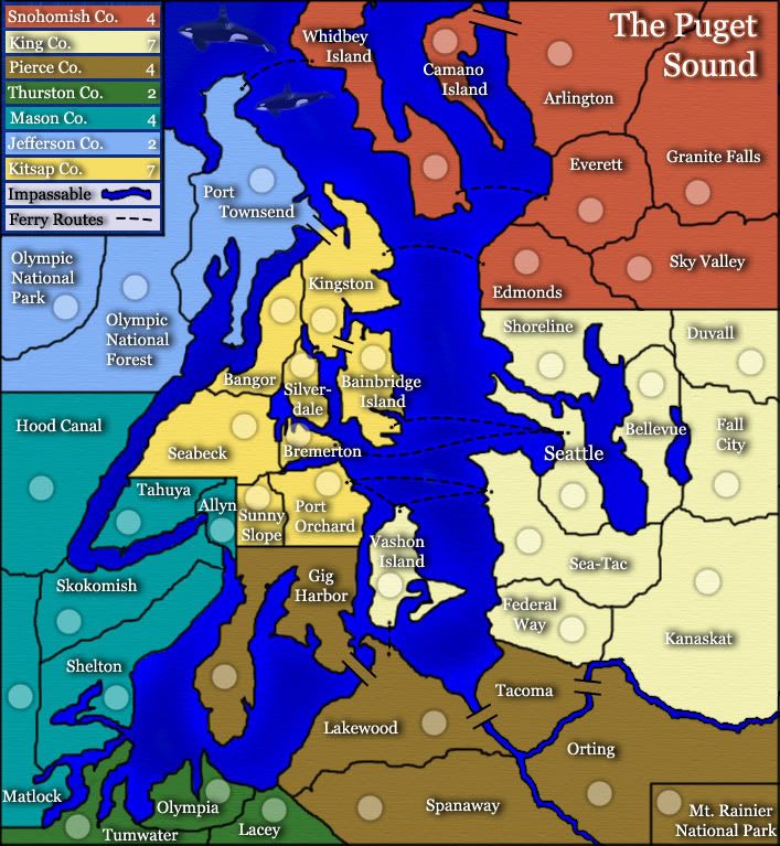
Looking good T! Can't wait to play it!! I will RULZ SHORELINE!
I just noticed Bremerton and Silverdale almost look like they're touching on the small map. Anyway to separate that a bit?
Are you going to put bridges between Seattle & Bellevue, and Seattle & Shoreline? I'm wondering which way would be better, leave it as is, or add bridges?
wicked wrote:Looking good T! Can't wait to play it!! I will RULZ SHORELINE!
I just noticed Bremerton and Silverdale almost look like they're touching on the small map. Anyway to separate that a bit?
Are you going to put bridges between Seattle & Bellevue, and Seattle & Shoreline? I'm wondering which way would be better, leave it as is, or add bridges?
Tisha....this is looking very good....there is one other thing i didn't pick up on before....on the large map it is quite clear, but not to be seen on the small map....the textures of the water and land are spasmodic and only appear in certain places. While i don't think this is a bad thing, i'd like to see just a touch more texture showing through in the maps, particularly if you can make it happen in the small map also.
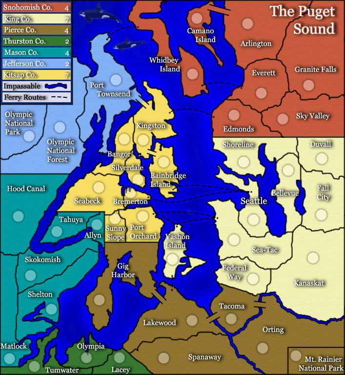
On your next update, can we have the large and small together again, and then i'd happy to consult with Coleman about advancement.
Is your poll finished, btw?
* Pearl Harbour * Waterloo * Forbidden City * Jamaica * Pot Mosbi
cairnswk wrote:Tisha....this is looking very good....there is one other thing i didn't pick up on before....on the large map it is quite clear, but not to be seen on the small map....the textures of the water and land are spasmodic and only appear in certain places. While i don't think this is a bad thing, i'd like to see just a touch more texture showing through in the maps, particularly if you can make it happen in the small map also.
On your next update, can we have the large and small together again, and then i'd happy to consult with Coleman about advancement.
Is your poll finished, btw?
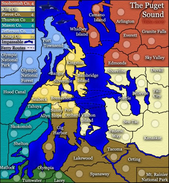
the poll does seemed finished..thank you
Last edited by Tisha on Mon Oct 22, 2007 1:41 pm, edited 1 time in total.