Page 6 of 21
Posted: Thu May 17, 2007 3:34 am
by gimil
icve been aware of teh font probles and have tried all the options you said.
1 ill move the title back to the top right.
2 ill tweek the terr names and add the lines u asked for
ive been working on the damned poor quality of the names or ages lol. ill get it done eventually

Posted: Thu May 17, 2007 4:34 am
by KEYOGI
Does the sky effect for the sea work?
Yes
23% [ 5 ]
No
76% [ 16 ]
Total Votes : 21
Posted: Thu May 17, 2007 8:55 am
by gimil

were slowly getting there lol
and i fixed the problem wth the terr names

Posted: Thu May 17, 2007 2:21 pm
by gimil
bump
Posted: Thu May 17, 2007 2:35 pm
by benjikat
Why don't you call "Island Group" just "Islands" - that way the legend for the bonuses will be a lot neater as all the names will be a similar length.
Posted: Thu May 17, 2007 2:40 pm
by pepperonibread
benjikat wrote:Why don't you call "Island Group" just "Islands" - that way the legend for the bonuses will be a lot neater as all the names will be a similar length.
Yeah, that would sound better. Have the bonuses already been decided?
Posted: Thu May 17, 2007 2:41 pm
by gimil
nope not yet. ill get them finalised when someone shows me how to use the formula lol
Posted: Fri May 18, 2007 3:05 am
by gimil
bump
Posted: Fri May 18, 2007 4:44 am
by KEYOGI
I can't be bothered looking for it, but if you go through WidowMakers threads he has posted a link to the bonus calculator somewhere... probably the Great Lakes thread.
Posted: Fri May 18, 2007 1:38 pm
by edbeard
((( Territories * 1.5 ) + ( Border Territories * 4 ) + ( Neighbor Territories * 0.5 ) + Neighbor Regions)) / 6 ) - 1
Posted: Fri May 18, 2007 1:52 pm
by DiM
here is what you get with the formula:
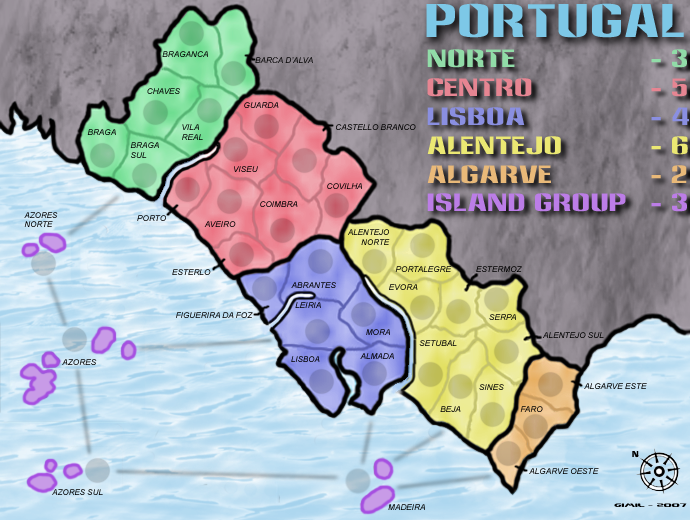
norte 3,17
centro 5,42
lisboa 4,42
alentejo 5,17
algarve 2,42
uslands 3,17
feel free to round the result up or down.
Posted: Fri May 18, 2007 1:53 pm
by gimil
thanks DiM much appreciated . ill have the nxt draft up in 5mins
Posted: Fri May 18, 2007 2:20 pm
by Gilligan
Then I can start the XML update

Posted: Fri May 18, 2007 3:22 pm
by gimil
em gilligan about that ... i kind of done it today since i wasnt busy :\
but it still need a good check over
Posted: Fri May 18, 2007 3:32 pm
by gimil
i touched up the islands and added bonuses
Posted: Fri May 18, 2007 4:01 pm
by DiM
you shouldn't have made alentejo worth 6 because alentejo and algarve can be held with only 3 borders for a total of 8 bonus. so drop alentejo to 5.
i think you should bump centro and lisboa up by 1
Posted: Fri May 18, 2007 4:35 pm
by gimil
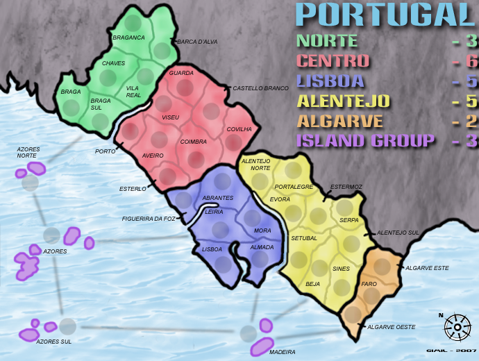
there you go DiM. so would u say thats the graphics complete?
Posted: Fri May 18, 2007 5:22 pm
by Gilligan
The island lines need to be darker, I think.
Posted: Fri May 18, 2007 6:43 pm
by DiM
gimil wrote:there you go DiM. so would u say thats the graphics complete?
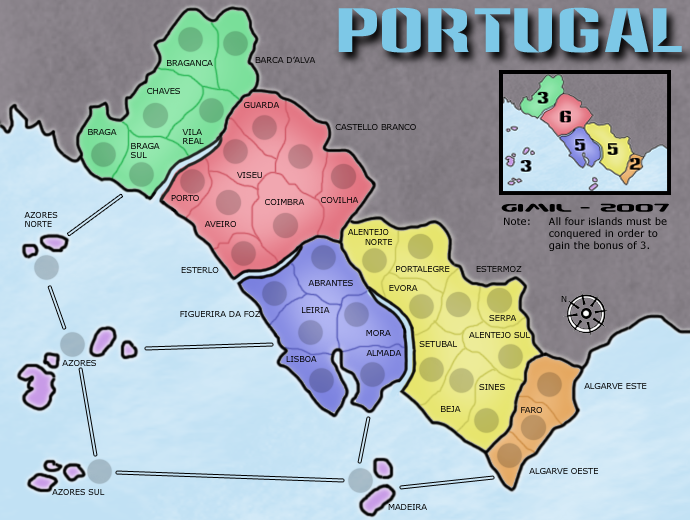
there's still some work to do. first as others said write islandsinstead of island group. the legend will fit better.
then there's the texture problem. this isn't necessarily something bad, i guess it is a matter of taste but i see some clashing between the water and the land. the watter has a very strong texture and it has an angle. it seems like the water is from an isometric point of view.
then there's the clash between the playable and non playable land. the non playable texture is too strong.
and lastly there's the islands borders. they are purple, while all the other borders are black.
you also have the connection lines for some teritory names.
they seem different. maybe they are made with different sized brushes. for example algarve has a skinnier line then alentejo.
you might wanna check on the sizes of the brush.
PS: also you should start working on the small version cause you'll have some problems there, especially with names that won't fit.
Posted: Sat May 19, 2007 4:19 am
by KEYOGI
As promised gimil, I've had a good look over the map and for the most part I like what I see. There are some things that grab my attention though.
I would consider adding another sea connection between Azores and Braga Sul to open up the board a bit more. If that was done, perhaps the bonus for the islands could be bumped up to four since the islands seem like the quickest way around the board and would be hard to hold. That's just my take on it though and I'm hardly a gameplay expert.
The sea connections themselves could probably use work, they're a bit bland at the moment, so see if you can in anyway make them a bit more interesting or at least more pleasing to the eye. In fact, while the map looks good in theory, it just doesn't seem to have that undefinable something that makes it look great. Your colour choice is fine and the textures are pleasing, I'm just not sure what it is.
As was mentioned earlier, you might want to look into a different sea texture. The one you have is nice enough, it's just the perspective thing that makes it look a bit off. Another little thing that might improve the look of the map is to reduce the thickness of your lines around the map. You've got these nice soft gentle colours and then it looks like someone traced around the edges with a thick permanent marker. So perhaps some more delicate lines and I agree about making the islands with black outlines. The coloured territory lines could probably be made a bit darker, especially if you reduce the thickness of them as well.
The title and legend are ok, but again they seem to be missing something. I'm not sure how you can fix this though. My last little issue is the font, again it's that uninspired bland look. It's functional, it's just not overly nice to look at. I realise you're restricted because of size, but it's an area to consider for improvement. Play around with some effects and you might just suprise yourself.
Keep up the good work gimil.
Posted: Fri May 25, 2007 4:42 pm
by Gilligan
gimil wrote:em gilligan about that ... i kind of done it today since i wasnt busy :\
but it still need a good check over
Thats fine
Posted: Thu May 31, 2007 5:28 pm
by gimil
I dived into the pits of hel with in teh foundry, found some things a didnt like and tehn finally i found my thread and added this lovely little update.
-I changed teh island boarders to black.
-I added a brand spanking new legend
-Re did the texture from top to bottom
-i thinned out the continent boards
-and add new sea routes (whixh personally i think are excellent
Posted: Thu May 31, 2007 5:44 pm
by DiM
i like the legend and the borders.
the sea texture is kinda bland. it looks like it has no texture

maybe add some ripples some waves

something gentle.
sorry to burst your bubble about the sea routes but i don't quite like them. they are very pixelated. try some blur or some antialiasing on them. the idea is good and they would look very good if it hadn't been for that pixelization.
Posted: Thu May 31, 2007 6:28 pm
by unriggable
Fix the lines going from the islands to the mainland.
Posted: Thu May 31, 2007 6:45 pm
by Spritzking
make the bleu continent bonus 3. it has the country numbers of the green continent and the borders of the green continent. you could also make them both 4, but it it is impossible that 2 continents with same number of countries/ borders have a 2 difference in their bonus