Page 6 of 9
Posted: Thu Jul 20, 2006 1:06 pm
by Ronaldinho
Ill keep posting lol but ill get called a horrible troll...............but yeah like i said before this is one of the best maps to have came out for a while nice job!!!!!!!!!!!!!!!!!!!!!!!!!!!!!!!!!!!!!!!!!!!!!!!!!!!!!!!!!!!!!!!!!!!!!!!!!
Posted: Thu Jul 20, 2006 2:14 pm
by fluffybunnykins
looks like it's worth a go to me!
I prefer it without the surf boards, personally.
but how about something that will hold all those continent names & bonuses together? como:-

que pensas?
Posted: Thu Jul 20, 2006 3:09 pm
by Marvaddin
I cant see your image, amigo...
Posted: Thu Jul 20, 2006 8:18 pm
by reverend_kyle
I like fluffys addition.. that looks great.
Btw I like that for a small verson.
Posted: Sun Jul 23, 2006 10:23 pm
by Marvaddin
Ok, guys, here are the final versions:
Big:
http://i44.photobucket.com/albums/f44/M ... lipfbg.png
Small:
http://i44.photobucket.com/albums/f44/M ... ipfsm2.png
Fluffy, if you want, you can add that special effect in the legend, after seeing it in the whole map, we will decide by using it or not. But please DONT resize the images, not even a little pixel, because Im going to correct the little errors in the xml.
When will the map be quenched, Andy??

Posted: Mon Jul 24, 2006 12:03 am
by AndyDufresne
Sometime, we'll see when I get around to it.

--Andy
Posted: Mon Jul 24, 2006 2:07 am
by fluffybunnykins
I'll try and do that at lunchtime
and don't worry, what I'm going to do won't even affect the whole map, let alone the size of it!
Posted: Mon Jul 24, 2006 2:15 am
by AK_iceman
i think you should put the continent name first, then the bonus for holding it after that. it looks kinda wierd right now the way you have it.
Posted: Mon Jul 24, 2006 6:35 am
by fluffybunnykins
I did wonder about that myself...
Posted: Mon Jul 24, 2006 7:33 am
by Pedronicus
Marv.
I think this is one of the best looking maps I've ever seen. It looks more like the classic map than anything else around and will be popular.
Posted: Mon Jul 24, 2006 11:23 am
by Marvaddin
Thanks, Pedro... so I hope.
AK_iceman wrote:i think you should put the continent name first, then the bonus for holding it after that. it looks kinda wierd right now the way you have it.
And you appear to talk about this now, when all version had numbers then names?? But, I tried it, and I disliked, it seems more strange. I will mantain this legend since it probably is the better for the most people, unless I return to the old one with ovals (I personally like it more).
Posted: Mon Jul 24, 2006 12:22 pm
by fluffybunnykins
so, here's

and

comments?
this ok Marv?
Posted: Mon Jul 24, 2006 8:50 pm
by Risk_06
...so I'm guessing that you're not going to change "Tagalog"?
Posted: Mon Jul 24, 2006 10:06 pm
by Marvaddin
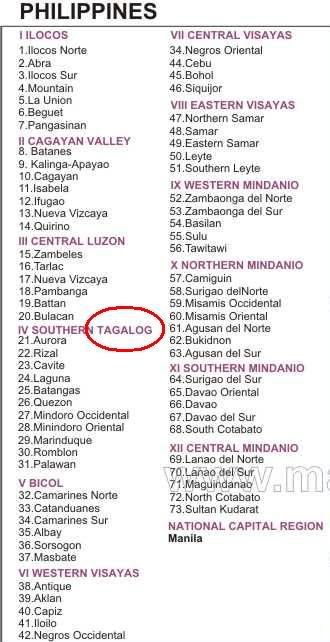
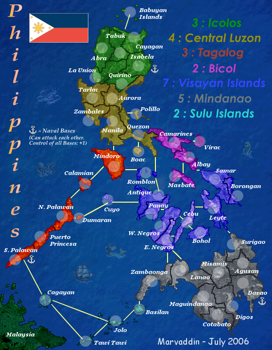
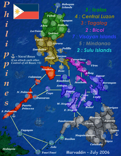
Here is the legend of the map I got almost all names. No, Im not going to change tagalog. I also know here is written Mindanio instead of Mindanao, but several maps had Mindanao, so I assumed its the correct form.
About the legend effect, fluffy, thanks a lot. But I dont know if I like it as it is. The effect in the light blue letters is much more visible, so its not ok to me... Maybe we can await more opinions, or maybe you can decrease a bit the effect over light blue colour, maybe gray, too.
What do you guys think about it??
Posted: Mon Jul 24, 2006 10:17 pm
by motts444
Can't wait to play it
Posted: Tue Jul 25, 2006 2:03 am
by fluffybunnykins
I'm away til sunday, so, depending in the feedback, I could edit it on Monday.
I managed to wind down all my games but one, a circus game that's dragging a bit... I think I might be about to do my first deadbeating

(
[edit] auto-smilies... pah!
Posted: Wed Jul 26, 2006 11:24 am
by Epeus
Great looking map, but as a person that's color blind... I can't tell hardly any of the continents apart. I know I'm coming in waaay late... But in the future, don't stick colors so similar together. You said earlier what the colors are, so I assume the light blue, blue, pink, and gray are the 4 in the center and bottom right of the map. It just looks like a huge blob to me.
Posted: Wed Jul 26, 2006 1:26 pm
by Marvaddin
Is this a problem with your monitor? Because I would never say these colours are alike. Im much worried, in fact, about making things easily distinctive. Because of this I adopted these colours, because I thought this would be the simplest way to realize the continents properly. Sorry, but I couldnt do nothing, because I never knew what you are talking about. I can pm you a list of what countries belong to each continent, if you want.
Posted: Fri Aug 04, 2006 9:56 am
by Marvaddin
Andy, isnt time to this map be quenched? I finished already the xml days ago, the images too. I dont want wait more until fluffy changes the legend. Lets put it alive, then he can change it later if he wants.
Posted: Fri Aug 04, 2006 11:00 am
by reverend_kyle
I agree looks very good.
Posted: Fri Aug 04, 2006 12:32 pm
by Molacole
wow, this map looks like fun to play!
That legend needs a serious makeover though...
Posted: Fri Aug 04, 2006 3:50 pm
by reverend_kyle
Molacole wrote:wow, this map looks like fun to play!
That legend needs a serious makeover though...
NOT that again.. hes done the best he could.
Posted: Fri Aug 04, 2006 4:36 pm
by reaper
they should darken lines cause its hard to see the boarder lines
Posted: Fri Aug 04, 2006 5:18 pm
by AndyDufresne
If you are finished with all the legend tweaking, post an XML image of both the large and small versions, so I can make sure that you've properly centered the army coordinates.
Also (this is a suggestion, not a command), I'd consider perhaps making your name slightly smaller or less conspicuous. Just so it doesn't stand out so much. Of course you don't have to make it so tiny, that it can't be read, but I believe the cartographer's name shouldn't be so prominent. It should just flow with the map, much like how a painter adds his name to a fine piece of artwork.
--Andy
Posted: Fri Aug 04, 2006 6:26 pm
by Fireside Poet
No pictures of Ferdinand Marcos in the corner? Corazon Aquino?