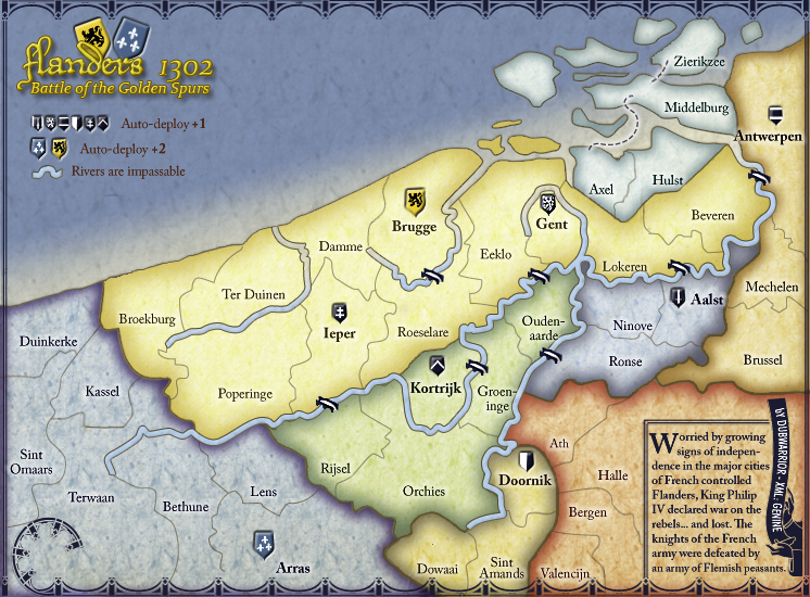
I'm digging the look and style of this map, DubWarrior.
Some of the river areas still seem a little rough...I.E. around Orchies, Gent, Brugge, Antwerpen.
I'm also not sure I like the "Yellow-Yellow" overlap of Kroon and the bottom of the legend.
--Andy
Flanders 1302V15[Beta] major changes! P19
Moderator: Cartographers
Forum rules
Please read the Community Guidelines before posting.
Please read the Community Guidelines before posting.
-
AndyDufresne

- Posts: 24935
- Joined: Fri Mar 03, 2006 8:22 pm
- Location: A Banana Palm in Zihuatanejo
- Contact:
-
alexandrois

- Posts: 35
- Joined: Sat Apr 11, 2009 9:04 am
Re: Flanders 1302- V9.2 [D] [Gp] 10/22/2009
My biggest problem is the rivers they need to be more distinct
-
Industrial Helix

- Posts: 3462
- Joined: Mon Jul 14, 2008 6:49 pm
- Gender: Female
- Location: Ohio
Re: Flanders 1302- V9.2 [D] [Gp] 10/22/2009
This map looks great. Really.
But I have a few tidbits for you to address.
It seems all your blacks have either grown pixelated, like the lines against the rivers, or too fuzzy, like the bridges or the black shields or the upper border. I hope its just save problem to prevent too much trouble.
The border, I think, should just run along the top and the bottom, not along the legend.
Good luck, I hope you're almost there!
Sketchblog [Update 07/25/11]: http://indyhelixsketch.blogspot.com/
Living in Japan [Update 07/17/11]: http://mirrorcountryih.blogspot.com/
Russian Revolution map for ConquerClub [07/20/11]: viewtopic.php?f=241&t=116575
Living in Japan [Update 07/17/11]: http://mirrorcountryih.blogspot.com/
Russian Revolution map for ConquerClub [07/20/11]: viewtopic.php?f=241&t=116575
-
DubWarrior

- Posts: 173
- Joined: Sun May 03, 2009 6:09 am
- Gender: Male
- Location: Belgium
Re: Flanders 1302- V11 [D] [Gp] 11/23/2009
Back with some sort of update...
I skipped the mini-map and army circles because:
-mini map can be replaced by some color-dots, representing the regions (think: Ireland map). it will be easy to place them on the map, considering the leaning curve of my seaborder, and it will make the map look 'softer'...think it's a good idea?
- I think of removing the army circles...don't think there's a need to place them?
-anyone allready checked the border of terwaan? Terwaan is bordering with broekburg and poperinge, but I think it might be confusing with the rivercrossing in the east...see what I mean?
amongst the changes:
-saved as a PNG
-made shields and bridges sharper
-made the rivers a bit bigger and replaced them with sharper version
-removed the 'new' borders for the legend and the minimap


-
Industrial Helix
- Posts: 3462
- Joined: Mon Jul 14, 2008 6:49 pm
- Gender: Female
- Location: Ohio
Re: Flanders 1302- V11 [D] [Gp] 11/23/2009
The graphics looks great. Definitely an improvement. You need to get that legend in there though.
I'd run a test however on whether or not you need army circles. Try all colored numbers on each province to make sure they show up.
I'd run a test however on whether or not you need army circles. Try all colored numbers on each province to make sure they show up.
Sketchblog [Update 07/25/11]: http://indyhelixsketch.blogspot.com/
Living in Japan [Update 07/17/11]: http://mirrorcountryih.blogspot.com/
Russian Revolution map for ConquerClub [07/20/11]: viewtopic.php?f=241&t=116575
Living in Japan [Update 07/17/11]: http://mirrorcountryih.blogspot.com/
Russian Revolution map for ConquerClub [07/20/11]: viewtopic.php?f=241&t=116575
-
AndyDufresne
- Posts: 24935
- Joined: Fri Mar 03, 2006 8:22 pm
- Location: A Banana Palm in Zihuatanejo
- Contact:
Re: Flanders 1302- V11 [D] [Gp] 11/23/2009
Looks good so far. The shields look a little strange to me. I think it is because the shields look as if they are pressed into the landscape a little (the bridges appear to be on the landscape). In the title as well...
Also, there is a thicker brown (ish) border that distinguishes bonus zones from other bonus zones, yes? It seems more prominent in some areas (near Brussel, Kassel, Orchies), and less so by Axel, Hulst, etc.
Keep up the good work.
--Andy
Also, there is a thicker brown (ish) border that distinguishes bonus zones from other bonus zones, yes? It seems more prominent in some areas (near Brussel, Kassel, Orchies), and less so by Axel, Hulst, etc.
Keep up the good work.
--Andy

Re: Flanders 1302- V11 [D] [Gp] 11/23/2009
bonus legend as a list of region is fine
in fact it always fit better
specially in this case where you have it "floating" in the sea
but you have to put the name of the regions also on the map itself
like a larger greyish transparent font
armies circles aren't necessary at all
your territories are large enough to have them inside borders
just watch out when placing them in xml
so none go over a border
I'm not sure about your question on Terwaan border
if it is about gameplay
it is clear although a bit complicated to catch quickly the connections
if it is about colours
then I would say you have a little problem of contrast
try to lower the darkness of the four lower "dark" region
about shield and despite what Andy said
I like the effect of them being like stamped in volume on the paper
but bridge should have some shadow under it
so they look like being drawn on the map
not object set on it
river are very clear
but I don't like the square end
try to make them end round or sharp tip
and oh
png much much more better
De gueules à la tour d'argent ouverte, crénelée de trois pièces, sommée d'un donjon ajouré, crénelé de deux pièces
Gules an open tower silver, crenellated three parts, topped by a apertured turret, crenellated two parts
Gules an open tower silver, crenellated three parts, topped by a apertured turret, crenellated two parts
-
DubWarrior
- Posts: 173
- Joined: Sun May 03, 2009 6:09 am
- Gender: Male
- Location: Belgium
Re: Flanders 1302- V11 [D] [Gp] 11/23/2009
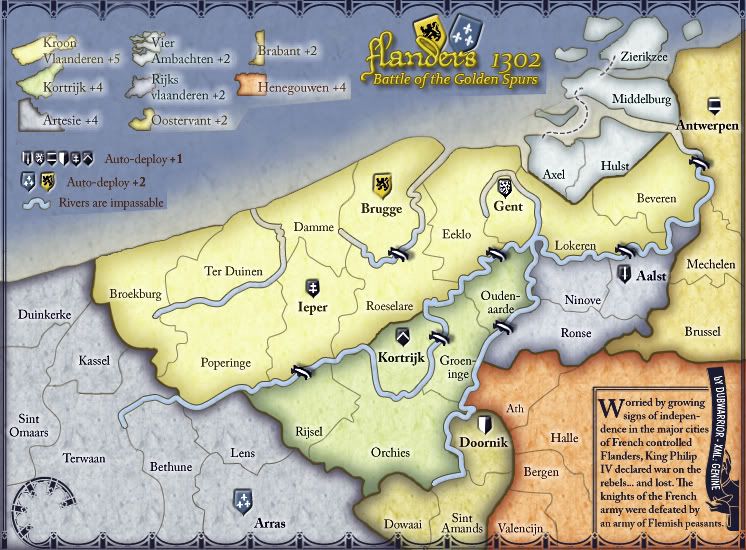
Back with a new draft,
most of the last comments i tried to fix, but essentialy I tried to make a new type of legend,
any thoughts on it or more comments?
grtz
Dub
most of the last comments i tried to fix, but essentialy I tried to make a new type of legend,
any thoughts on it or more comments?
grtz
Dub
-
lt_oddball

- Posts: 364
- Joined: Mon Mar 05, 2007 11:17 am
- Location: Fortress Europe
Re: Flanders 1302- V11 [D] [Gp] 12/7/2009
In the legend "Henegouwen +4" sticks out very far towards the coast of the map.
Shuffle the names:
K. Vla R. Vla Vier Amb
Kortrijk Henegouw Brabant
Artes Oosterv
By the way, what is the frame-curl doing in Terwaan ?
Shuffle the names:
K. Vla R. Vla Vier Amb
Kortrijk Henegouw Brabant
Artes Oosterv
By the way, what is the frame-curl doing in Terwaan ?
Barbarus hic ego sum, quia non intellegor ulli.
Re: Flanders 1302- V11 [D] [Gp] 12/7/2009
lt_oddball wrote:Shuffle the names:
K. Vla R. Vla Vier Amb
Kortrijk Henegouw Brabant
Artes Oosterv
on the contrary it fit geographical order as it is
leave it this way
De gueules à la tour d'argent ouverte, crénelée de trois pièces, sommée d'un donjon ajouré, crénelé de deux pièces
Gules an open tower silver, crenellated three parts, topped by a apertured turret, crenellated two parts
Gules an open tower silver, crenellated three parts, topped by a apertured turret, crenellated two parts
-
DubWarrior
- Posts: 173
- Joined: Sun May 03, 2009 6:09 am
- Gender: Male
- Location: Belgium
Re: Flanders 1302- V11 [D] [Gp] 12/7/2009
pamoa wrote:lt_oddball wrote:Shuffle the names:
K. Vla R. Vla Vier Amb
Kortrijk Henegouw Brabant
Artes Oosterv
on the contrary it fit geographical order as it is
leave it this way
Well I placed the names in this order because it fits geographicaly. A player can fast find his bonus this way; i guess. By mixing the names, the bonusses will become confusing?
It's true the names right come close to the coastline, but that's why i dropped some isles in front of the Vier Ambachten coast...
-the curly border is whats left of the decoration down in the left corner
-
lt_oddball
- Posts: 364
- Joined: Mon Mar 05, 2007 11:17 am
- Location: Fortress Europe
Re: Flanders 1302- V11 [D] [Gp] 12/7/2009
DubWarrior wrote:It's true the names right come close to the coastline, but that's why i dropped some isles in front of the Vier Ambachten coast...
That sucks..Middelburg(vlissingen) without its fat piece of land surrounding it ?
Come on..you should think of ways to fit the legend to the map, not the map subservient to the legend..

There is still room/space for improvement in the sea.
And the legend don't have to fit the actual geography..(you input the small shapes of part(!) of the provinces, but who says that is required to understand the bonusses? - a name is important, a colour helpful, the rest is luxury.. a player only needs to see the legend once).
Barbarus hic ego sum, quia non intellegor ulli.
-
Industrial Helix
- Posts: 3462
- Joined: Mon Jul 14, 2008 6:49 pm
- Gender: Female
- Location: Ohio
Re: Flanders 1302- V11 [D] [Gp] 12/7/2009
The legend I'm not too keen on, but I can live with it. One possible solution is that you can do what Kabanellas did on Third Crusade and put the numbers faded in the bonus region so as to clarify.
Last nitpick is that the text is a bit jagged in the lower right.
Last nitpick is that the text is a bit jagged in the lower right.
Sketchblog [Update 07/25/11]: http://indyhelixsketch.blogspot.com/
Living in Japan [Update 07/17/11]: http://mirrorcountryih.blogspot.com/
Russian Revolution map for ConquerClub [07/20/11]: viewtopic.php?f=241&t=116575
Living in Japan [Update 07/17/11]: http://mirrorcountryih.blogspot.com/
Russian Revolution map for ConquerClub [07/20/11]: viewtopic.php?f=241&t=116575

Re: Flanders 1302- V11 [D] [Gp] 12/7/2009
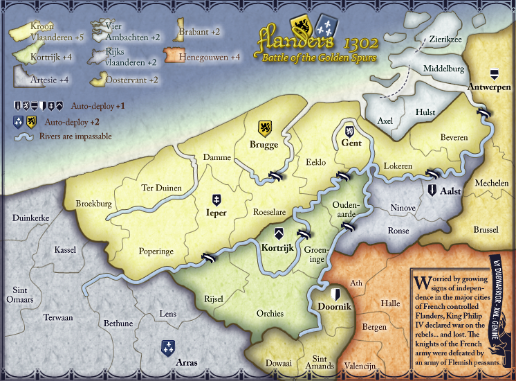
The only thing I'd really suggest is to move things around a little bit:
I think that something like this feels like it's a much more natural use of the space
I think that something like this feels like it's a much more natural use of the space

PB: 2661 | He's blue... If he were green he would die | No mod would be stupid enough to do that
-
DubWarrior
- Posts: 173
- Joined: Sun May 03, 2009 6:09 am
- Gender: Male
- Location: Belgium
Re: Flanders 1302- V11 [D] [Gp] 12/7/2009
WoW Mr.Benn, it's pretty clear you're doing this as the foundry foreman...This easy solution makes us all look like some fools 
congrats, I guess we all agree?

congrats, I guess we all agree?
-
AndyDufresne
- Posts: 24935
- Joined: Fri Mar 03, 2006 8:22 pm
- Location: A Banana Palm in Zihuatanejo
- Contact:
Re: Flanders 1302- V11 [D] [Gp] 12/7/2009
I think MrBenn's order of legend and title does indeed feel more organic.
The only other small thing I'd say is that the shields, with he hard outline, makes them look like they are pressed/stamped into the map strangely, and nothing else on the map seems to fit that style of graphic.
But good work nonetheless.
--Andy
The only other small thing I'd say is that the shields, with he hard outline, makes them look like they are pressed/stamped into the map strangely, and nothing else on the map seems to fit that style of graphic.
But good work nonetheless.
--Andy


Re: Flanders 1302- V11 [D] [Gp] 12/7/2009
it looks as if the river between ter duinen and damme has been blocked so that it doesn't flow into the sea. is this deliberate?
ian.
ian.

-
lt_oddball
- Posts: 364
- Joined: Mon Mar 05, 2007 11:17 am
- Location: Fortress Europe
Re: Flanders 1302- V11 [D] [Gp] 12/7/2009
have a good new year !
(a comment to have a link to this forum/posts)
(a comment to have a link to this forum/posts)
Barbarus hic ego sum, quia non intellegor ulli.
-
RedBaron0

- Posts: 2657
- Joined: Sun Aug 19, 2007 12:59 pm
- Gender: Male
- Location: Pennsylvania
- Contact:
Re: Flanders 1302- V11 [D] [Gp] 12/7/2009
Fortnightly Review:
Once you've got your big map worked out for the most part, get your small map up and running and you'll be close to done!
- Fix river as per iancantons suggestion
- The border bevel or outline, whatever effect you used along the coast could look better with a brighter/more noticeable color. The little bit in Artsie looks great, see if you can something for the rest of the coast to match it.
- Shields - Andy suggestion
- Text legend - Ben suggestion
- Different sea connection between Axel and Middleburg there's space with the new positions. A curved line around the no name island rather then squiggling around to the right of the island.
- Move Lokeren territory name up, there is space there.
Once you've got your big map worked out for the most part, get your small map up and running and you'll be close to done!


-
DubWarrior
- Posts: 173
- Joined: Sun May 03, 2009 6:09 am
- Gender: Male
- Location: Belgium
Re: Flanders 1302- V11 [D] [Gp] 12/7/2009
Hi all,
back with some changes; sorry if things are going slowly, but some studies are taking a lot of time for now.
Best wishes for the coming year. I won't list the changes, because RedBaron did it for me this time
Soon I can present you the XML for the map, Genine is working on it.
Don't you think the sea looks a bit too tropical?
large size
small size
-
AndyDufresne
- Posts: 24935
- Joined: Fri Mar 03, 2006 8:22 pm
- Location: A Banana Palm in Zihuatanejo
- Contact:
Re: Flanders 1302- V12 [D] [Gp] 01/17/2010
The sea color does stand out a bit, but I don't really have an opinion one way or the other on it.
After looking at your signature, I think I'd almost like to see those deeper color represented on the map, than the lighter, softer colors you have now!
But in any case, good work.
--Andy
After looking at your signature, I think I'd almost like to see those deeper color represented on the map, than the lighter, softer colors you have now!
But in any case, good work.
--Andy
-
natty dread

- Posts: 12877
- Joined: Fri Feb 08, 2008 8:58 pm
- Location: just plain fucked
Re: Flanders 1302- V12 [D] [Gp] 01/17/2010
AndyDufresne wrote:After looking at your signature, I think I'd almost like to see those deeper color represented on the map, than the lighter, softer colors you have now!
Oh god no, that would hurt the eyes.
As for the sea, yes, maybe a slightly darker & colder shade would be better. You may also want to reconsider the colour for Artesie and that other bonus area. They're too similar to the sea colour IMO. Although, if you change the sea colour then it might be ok, either way they need to be different enough so that people won't mistake that area for a part of the sea
And the gradient on the sea, near the shore. That green shade between the blue & white is probably what makes the sea look "tropical". If you want my opinion, either make it a colder shade, or just remove it and have it go straight from blue -> white.

-
lt_oddball
- Posts: 364
- Joined: Mon Mar 05, 2007 11:17 am
- Location: Fortress Europe
Re: Flanders 1302- V11 [D] [Gp] 12/7/2009
DubWarrior wrote:Don't you think the sea looks a bit too tropical?
small size
More like Atomic waste radiating
(i think that glow should be less)
Barbarus hic ego sum, quia non intellegor ulli.
-
AndyDufresne
- Posts: 24935
- Joined: Fri Mar 03, 2006 8:22 pm
- Location: A Banana Palm in Zihuatanejo
- Contact:
Re: Flanders 1302- V12 [D] [Gp] 01/17/2010
natty_dread wrote:AndyDufresne wrote:After looking at your signature, I think I'd almost like to see those deeper color represented on the map, than the lighter, softer colors you have now!
Oh god no, that would hurt the eyes.
I'm not sure it would.
--Andy
-
natty dread
- Posts: 12877
- Joined: Fri Feb 08, 2008 8:58 pm
- Location: just plain fucked
Re: Flanders 1302- V12 [D] [Gp] 01/17/2010
AndyDufresne wrote:natty_dread wrote:AndyDufresne wrote:After looking at your signature, I think I'd almost like to see those deeper color represented on the map, than the lighter, softer colors you have now!
Oh god no, that would hurt the eyes.
I'm not sure it would.
--Andy
Too much contrast...