Page 5 of 8
Posted: Mon Aug 27, 2007 2:06 pm
by Awesome
This wouldn't really solve much, and I think would make it worse.
Using this formatting on large maps you wouldn't have to scroll down, but you would have to scroll right. And I think that is much more annoying than scrolling up and down.
This is never a problem for me at home where I have a nice big monitor, but at work I always have to choose smaller map. Which seriously is not much work.. you just click a button.
Posted: Mon Aug 27, 2007 6:39 pm
by sully800
Awesome wrote:This wouldn't really solve much, and I think would make it worse.
Using this formatting on large maps you wouldn't have to scroll down, but you would have to scroll right. And I think that is much more annoying than scrolling up and down.
This is never a problem for me at home where I have a nice big monitor, but at work I always have to choose smaller map. Which seriously is not much work.. you just click a button.
You wouldn't have to scroll right, because he moved the buttons to space that is currently used by text and players names. By swapping the players names to the bottom no one would have to scroll to the right, and no one would have to scroll down to click either.
Also, have you played on larger maps like World 2.1 and North America? Those are the types that most people have to currently scroll for. But even if those currently fit on your monitor, there are other larger maps that have been proposed that wouldn't fit on anyones screen. If the attack button was moved and the screen wouldn't jump to the top of the map, then exceptionally large maps would still probably be playable.
Posted: Mon Aug 27, 2007 6:42 pm
by The1exile
treefiddy wrote:lol, he took two pictures, one before his turn, one after.

That's why he has attack options when it's not even his turn.
I know, I was kidding

Posted: Mon Aug 27, 2007 6:43 pm
by The1exile
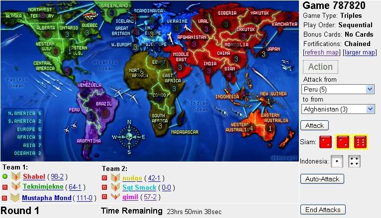
Where would the cards go? Since that's a no cards game, there doesn't appea5r to be any allocated space.
Posted: Tue Aug 28, 2007 12:05 am
by mach
For large maps, I'd rather scroll vertically than horizontally, so I don't want this to become standard, but it is easy to do with greasemonkey, just use document.getElementById and copy the form over.
Posted: Tue Aug 28, 2007 6:59 am
by gimil
another little tweak for you guys

Posted: Tue Aug 28, 2007 11:28 am
by Kaplowitz
I think it would be better if it was like this:

no one will hit "End Attack" by accident
Posted: Tue Aug 28, 2007 12:02 pm
by gimil
kap your not a conquerer

Posted: Tue Aug 28, 2007 6:57 pm
by sully800
mach wrote:For large maps, I'd rather scroll vertically than horizontally, so I don't want this to become standard, but it is easy to do with greasemonkey, just use document.getElementById and copy the form over.
No one wants to scroll horizontally. Fortunately you don't have to now and you won't have to with this suggestion either. If I was suggesting that I'm sure lack would shoot it down because horizontal scrolling would be very unpopular.
We have a strict pixel limit on map width, which I think should remain the same. There is a general guide on map height but no exact limit, and people want to make longer maps beyond what is currently allowed.
Posted: Tue Aug 28, 2007 8:57 pm
by Bad Speler

This is my suggestion. The dice are at the bottom of the map because most people (I think) don't really look at them unless they get really unlucky. I didnt really change much, just moved the action and game info above the map.
Posted: Wed Aug 29, 2007 12:45 am
by 3seven1
Bad Speler wrote:This is my suggestion. The dice are at the bottom of the map because most people (I think) don't really look at them unless they get really unlucky. I didnt really change much, just moved the action and game info above the map.
I think this one. Great set up.
Posted: Wed Aug 29, 2007 12:49 am
by Keredrex
Bad Speler wrote:This is my suggestion. The dice are at the bottom of the map because most people (I think) don't really look at them unless they get really unlucky. I didnt really change much, just moved the action and game info above the map.
Yes awesome ... although i see no reason why you can't tighten up the info on the top right and put the dice there....right above the names... or Game #
Posted: Wed Aug 29, 2007 12:52 am
by Bad Speler
I see only one problem with putting the dice to the right of the gameboard...if theres more then one line of dice, how will the scrolling for the dice work?
Posted: Wed Aug 29, 2007 10:37 am
by 3seven1
Bad Speler wrote:I see only one problem with putting the dice to the right of the gameboard...if theres more then one line of dice, how will the scrolling for the dice work?
I think they'd work the same way they do now. It seems like they are in their own seperate box and when you have more than one or two battles it becomes a scollable box.
Posted: Wed Aug 29, 2007 12:19 pm
by The1exile
The1exile wrote:Where would the cards go? Since that's a no cards game, there doesn't appear to be any allocated space.
Posted: Wed Aug 29, 2007 1:21 pm
by Bad Speler
The1exile wrote:Where would the cards go? Since that's a no cards game, there doesn't appear to be any allocated space.
Forgot about that, i guess cards would go between the game settings and the map.
Posted: Fri Aug 31, 2007 4:16 pm
by gimil
The new AJAX system means this interface change isn't as important as it was when sully suggested it
Posted: Fri Aug 31, 2007 9:22 pm
by AtomicSlug
I like some of these ideas, but would like to see the dice on the top, not the right. This is because on large maps, not only do u have 2 scroll down, but u have 2 scroll right.
I would also like to see a "reserve" dropdown box for "Auto Attack" like on
WaW
Posted: Fri Aug 31, 2007 11:32 pm
by turtle32
i'm too lazy to redo the page, but i think the unneded game info should be tightened on the maps with the buttons on the right side of the map, or moved to the top
Posted: Sun Sep 02, 2007 1:28 am
by mach
sully800 wrote:No one wants to scroll horizontally. Fortunately you don't have to now and you won't have to with this suggestion either.
Actually, I do have to scroll horizontally. On world 2.1 the end of the player names are off the screen. I don't mind that because I don't look at the player names very much, but if I had to scroll horizontally every time I was attacking it would be annoying.
Attack button beside map
Posted: Tue Oct 23, 2007 9:53 pm
by tattooedude
It is very frustrating scrolling up and down to attack and then look at the map. Can the attack and fortify buttons go beside the map, instead of the turn and player order? Or, move the game menu stuff down?
Posted: Tue Oct 23, 2007 10:18 pm
by kwanton
yeah...this doesn't seem too necesary.
If they do implement this (doubtful) it'll be minor and lack has other things to take care of.
Are we still using the form? Been a while since i was bored enough to take a trip here.
Posted: Tue Oct 23, 2007 11:01 pm
by sully800
End Attack/attack button
Posted: Fri Nov 02, 2007 6:53 pm
by KoE_Sirius
Can you move these buttons so they are well away from each other.Like one on the right and one on the left of the screen.Its so annoying when your are playing a speed game and hit end attack by accident.
Posted: Fri Nov 02, 2007 7:10 pm
by Herakilla
it already is!!!
they did this before it used to be RIGHT nxt to each other