The Puget Sound [Quenched]
Moderator: Cartographers
Forum rules
Please read the Community Guidelines before posting.
Please read the Community Guidelines before posting.
-
magneticgoop

- Posts: 851
- Joined: Fri Jun 01, 2007 9:03 pm
- Location: Screaming at the TV as Norv Turner turns the chargers into the worst team in the NFL =(


DiM wrote:4. big river on the left. i don't know the geography in that area but i suppose the lump of water on the left is supposed to be a river starting somewhere in allyn and going into the ocean. well the starting point is too damn abrupt. rivers tend to be small at the creek and later turn become bigger and bigger. your's is big right from the start. also it is supposed to go all the way to the ocean but instead it stops in a limb of land in the kingston - port townsend area thus making it a lake more than a river since it is watter surrounded by land.
Yeah, that bit looks like the mapmaker must have been drunk. On the other hand, it mostly matches the actual geography. I guess the glaciers were drunk.
DiM wrote:6. more rivers. the ones in the matlock shelton area. are those rivers? they sure don't look like it. they look like somebody took an excavator and cut a piece of land. no spring no variation in size no variation in color.
look at mibi's troy map for nice rivers.
Those aren't rivers, either. The glaciers got into the really good stuff.
DiM wrote:1. the borders. OMG the borders are hideous. they look so untidy i can't even begin saying it. some are thiner than others. some don't meet the way they should. some appear to be drawn twice on top of eachother resulting in some weird lines.
i fixed the borders that were obvious... i still don't know what you mean by borders that don't meet the way they should though..
DiM wrote:2. you're inconsistent in the shadows. the land has the light source at the bottom while the text has it at the top.
the land has no light source..
DiM wrote:4. big river on the left. i don't know the geography in that area but i suppose the lump of water on the left is supposed to be a river starting somewhere in allyn and going into the ocean. well the starting point is too damn abrupt. rivers tend to be small at the creek and later turn become bigger and bigger. your's is big right from the start. also it is supposed to go all the way to the ocean but instead it stops in a limb of land in the kingston - port townsend area thus making it a lake more than a river since it is watter surrounded by land.
6. more rivers. the ones in the matlock shelton area. are those rivers? they sure don't look like it. they look like somebody took an excavator and cut a piece of land. no spring no variation in size no variation in color.
look at mibi's troy map for nice rivers.
yes, they are not rivers... that is how the land/water actually is up here..
Last edited by Tisha on Sun Sep 23, 2007 1:52 pm, edited 1 time in total.
-
unriggable

- Posts: 8037
- Joined: Thu Feb 08, 2007 9:49 pm

-
Risky_Stud

- Posts: 297
- Joined: Sun Dec 24, 2006 12:04 am
- Gender: Male
- Location: Recliner Surfing in my living room
complaints
map is just fine, and if anybody has a complaint about the geography look at a map on the net. want to change the geography just to oblidge 1 persons problems with the puget sound is just plain retarded. sry if my words are harsh, but some of you people need to get your facts strait before you start complaining.
-
ghostlygirl

- Posts: 20
- Joined: Thu Sep 20, 2007 4:59 pm
- Location: ontario
- Contact:
-
unriggable
- Posts: 8037
- Joined: Thu Feb 08, 2007 9:49 pm

-
reverend_kyle

- Posts: 9250
- Joined: Tue Mar 21, 2006 4:08 pm
- Location: 1000 post club
- Contact:

reverend_kyle wrote:The army shadows seem really inconsistant.
Right, check the shadow you have in King Co - its not the same as the others.
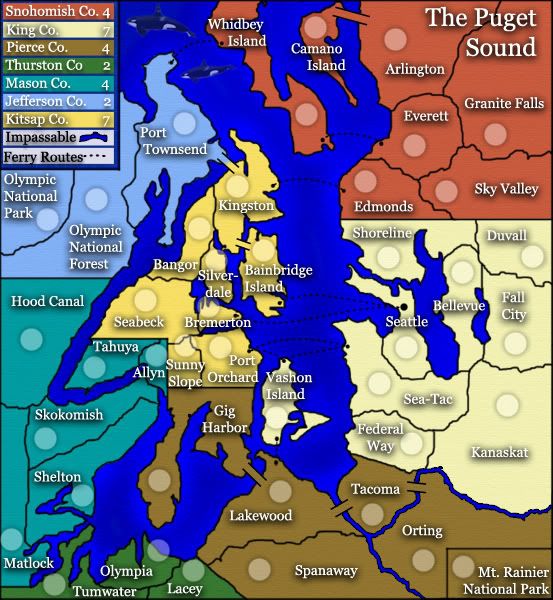
I think the calmer colors are better, and they are still color blind friendly.
I know this is probably true to life, but it seems funny having the square border aroun Mt. Rainier... at first glance i think it is part of a legend and not a territory, though I guess it will be obvious with an army count.
The whales remind me of the opening scene in Hitchhikers' Guide where the dolphins jump out of the ocean and flap their way up to the mother ship. Something needs to be done.
In terms of play, these are going to be some tough bonus regions to hold as every one is made up of over half border territories; 3 of 5, 2 of 3, 6 of 8, 7 of 9, etc. Maybe you can lose a ferry route or two to make it possible to hold a bonus?


Go look at another map and maybe borrow their style of army circles. We are all on the same team so that shouldn't be a problem, although maybe you should ask permission first since it is another person's artwork.
I'd recommend Eastern Front if qwert doesn't mind.
I'd recommend Eastern Front if qwert doesn't mind.
Warning: You may be reading a really old topic.
yes, still alive..
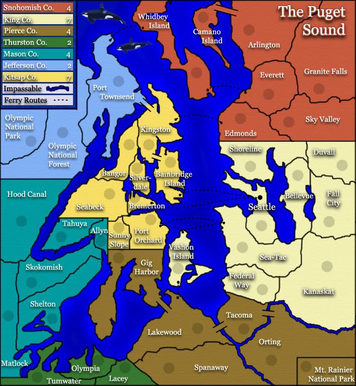
i fixed all name shadows on the territories to be the same. i also changed armies circles...just screwed around with them a bit.
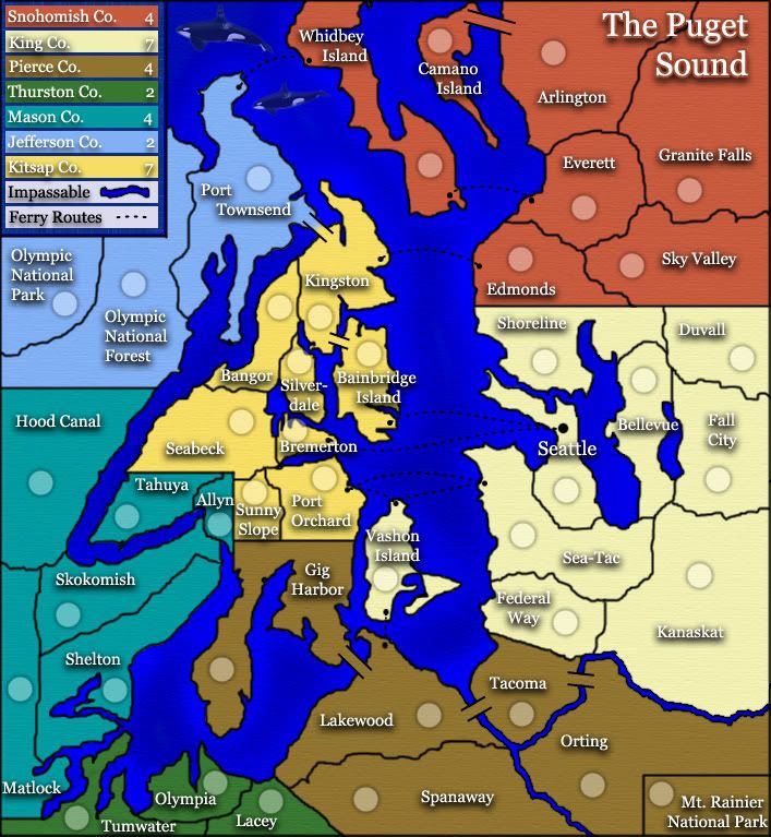
i'm not sure how to do a small map, here's a shot at it...

i fixed all name shadows on the territories to be the same. i also changed armies circles...just screwed around with them a bit.
i'm not sure how to do a small map, here's a shot at it...
Last edited by Tisha on Sun Oct 14, 2007 4:53 pm, edited 3 times in total.
-
cena-rules

- Posts: 9740
- Joined: Sat Apr 28, 2007 2:27 am
- Gender: Male
- Location: Chat
-
insomniacdude

- Posts: 634
- Joined: Thu Nov 23, 2006 1:14 am
-
WL_southerner

- Posts: 314
- Joined: Wed Mar 08, 2006 7:25 pm
- Location: friends :- come and go _ i have loads of them
colour
light i think tisha men numbers tend to show up better on light colours
apart from yellow
apart from yellow
friends :- come and go _ i have loads of them
mates :- go and come back_only have a few
Leatsa, dh'fhàgainnsa...
mates :- go and come back_only have a few
Leatsa, dh'fhàgainnsa...
-
sam_levi_11

- Posts: 2872
- Joined: Mon Dec 11, 2006 2:48 pm
- Gender: Male

