reverend_kyle wrote:what does yellow mean?
American Civil War [Quenched]
Moderator: Cartographers
Forum rules
Please read the Community Guidelines before posting.
Please read the Community Guidelines before posting.

-
The Fuzzy Pengui

- Posts: 2271
- Joined: Mon Nov 27, 2006 6:52 pm
- Gender: Male
- Location: Ohio
It still looks like the borders are pixelated, and unfortunately it would be something that would be addressed later on (in Final Forge if nothing else). Try using a 2 pixel brush instead of using a pencil to draw the lines. Other than that, I really enjoy the map, and hope it progresses quickly through the foundry!
Gilligan wrote:I'M SO GOOD AT THIS GAME
My stepmom locked the bathroom door
So I opened the lock with my shoelace

Elijah...
you have both flags on the title and you have also placed both flags in the background. There is something in design called "overkill". This i think is perhaps an overkill to have both flags in title and in background.
play around with this a little, and centre that sword under the actual title, and perhaps bring back the drums etc to each side of the title. also see what it looks like, but perhaps a drop shadow or similar on the title words. Suggestion!
The legend is improving, but still need work to line everything up...you have a mixture of things happening there...some +numbers in front of text, others behind. See if you can work some consistency in there.
Now...borders....try applying a guassian blur to the outlines of the borders, they are very "pixelated" and jaggered/edgy at present....perhaps could use a little "treatment" to make less jaggered...i think most punters in the foundry would prefer to see less jaggered/pixelated borders on maps.
The yellow needs toning down a little also, it is very contrasting against the other colours you've used, not out of place but simply needs toning down. I quite lilke the colour scheme actually.
Keep up the excellent work!

* Pearl Harbour * Waterloo * Forbidden City * Jamaica * Pot Mosbi
-
The Fuzzy Pengui
- Posts: 2271
- Joined: Mon Nov 27, 2006 6:52 pm
- Gender: Male
- Location: Ohio
Coleman wrote:Yeah, I was going to get to that after I or cairnswk transformed WidowMaker's border pictures into a tutorial, but he may understand what you mean now.
If not, check out one of the later pages of Iwo Jima, it's mostly there.
I should be a CA or something for beating you to mentioning it
Gilligan wrote:I'M SO GOOD AT THIS GAME
My stepmom locked the bathroom door
So I opened the lock with my shoelace
Elijah S wrote:I've made notes of the recent input and will get going on those items...
The one thing I'm wondering about is if one river crossing, between Arkansas and Mississippi, will be enough...
It looks like not providing another crossing may cause play to kindof bottleneck in the north. Any thoughts?
Perhaps do some research to see where the major river crossing were located, or did the soldiers simply wade through shallow river sections to get to the other side. That could also be an option...a shallow croissing on the river.
* Pearl Harbour * Waterloo * Forbidden City * Jamaica * Pot Mosbi
4th Update
4th revision
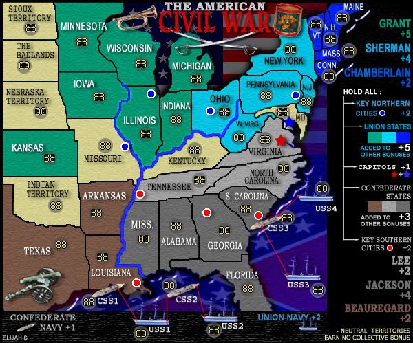
Notable changes:
-The flags at the top were replaced with the bugle and drum.
-The yellow territories have been muted a little.
-The swords have been centered under the title.
-The Legend has been alligned so that all bonus values are along the right side.
I'm saving the tedious job of cleaning up the pixelation for later...
-
ParadiceCity9
- Posts: 4239
- Joined: Thu Feb 15, 2007 4:10 pm
New thread?
Hey guys... to my knowledge I didn't create a new thread.
I've been posting my revisions and comments under this one... the last one being the 4th map revision...
I've been posting my revisions and comments under this one... the last one being the 4th map revision...
cairnswk wrote:Elijah S...your new ideas topic for American Civil War has been moved into the Map Foundry, there is no need to create another topic iun the Map Foundry.
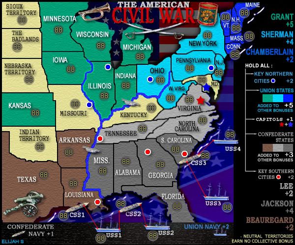

6th update
6th Revision
Notable changes:
-The Legend has been made wider. Thanks for the ideas cairnswk!
-The drum and bugle have been made smaller and moved to the legend area.
-Some more pixelation has been tweaked.
I think this is coming together pretty well...
Everyone's input is very much appreciated. Thanks! -Elijah
Notable changes:
-The Legend has been made wider. Thanks for the ideas cairnswk!
-The drum and bugle have been made smaller and moved to the legend area.
-Some more pixelation has been tweaked.
I think this is coming together pretty well...
Everyone's input is very much appreciated. Thanks! -Elijah
-
insomniacdude

- Posts: 634
- Joined: Thu Nov 23, 2006 1:14 am
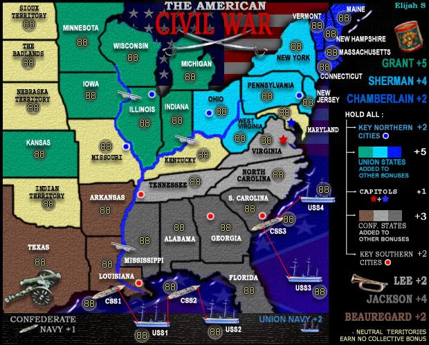
Elijah...OK...your map is coming along nicely.
Some more fixes if you would...
1. the borders around Tennessee and Kentucky are the ones that really need attending to...too jaggered, but still looking for that gaussian blur or similar.
2. a couple of the fonts in the legend appear different sizes i.e. key northern cities and key southern cities, but please check that all of them are the same each side of the legend if that's what u want.
3. Your army circles need centering where possible in the middle of the territory or as close to that as you can get it.
4. Can you investigate a way of speling out Missouri in full please, and look at some of the different sizes of text for each tert, more consistency between them sizewise would be preferred where it is possible.
5. If possible, reduce the size of the "Civil War" in the title to give a little more space between those two first lines.
6. a challenge for you...i'd prefer to see the names of those north eastern states Vermont etc spelled out in full also if possible. While I as an aussie know your states to some degree, other players from other countries might not have the same level of knowledge and this might stop them from playing the map. maybe the top of the legend will need to move down so that those names can be fit in.
7. is there a link between alabama or florida to the css2...i think that is awkward gameplay to have a string of 4 terts off the coast like that as it gives a huge advantage to forting louisianna. think about that one.
8. there is a bit of pixelation happening on the city circles.
Elijah, don't be discouraged by the number of issues that i have targeted here...my object is to make you aware of what people sometimes look for, and these fixes could make your map look so much better.
Good work so far.!
* Pearl Harbour * Waterloo * Forbidden City * Jamaica * Pot Mosbi
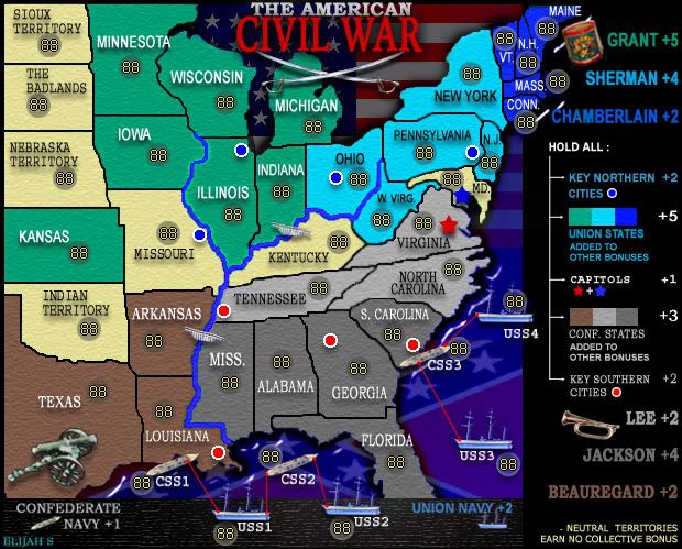
7th Revision
Notable changes:
-Pixelation has been addressed
-Rivers have been changed to follow actual geographical path
-Bridges repositioned and one added
-All states have been spelled out and fonts made uniform
-Legend realligned and fonts resized accordingly
-City circles made smaller and less pixelated
-Army circles placed more center in their territory

It's the first time I look at this map.
I have some advices to give you:
- You made fonts uniform and that's good, but, at least for me, font in 6th Revision was easier to read (for the size, I mean); so, I would suggest to increase a little bit font size.
- In Lousiana I would invert territory name and army circle position, in order-Army circles placed more center in their territory in order to not cover Missisipi river.
"Nature is a temple in which living pillars
Sometimes emit confused words;
Man crosses it through forests of symbols
That observe him with familiar glances."
Sometimes emit confused words;
Man crosses it through forests of symbols
That observe him with familiar glances."

OK...Elijah S....here's the go in the map above.
1. i have gone over your borders with a 2px pen totally black with .5 gaussiuan blur....this is what i was hoping you can achieve....please forgive some areas of smudging...but you will see that it certainly straightens those borders out and removes that jaggered look.
2. some of the left side states need their text centered in alignment
3. some armies could move more towards where i have the red circles.
4. there is a difference in the spacing in the legend where i have marked....you appear to have used two different fonts for the topp and bottom remarks.
5. the northern states maine to connecticut don't appear to have the same texture applied as the other states.
6. the title looks fab, as do the other things that you fixed in the 7th revision....great work!
This is really improving and you are going to be so proud, as will CC....excellent work...keep it up!
* Pearl Harbour * Waterloo * Forbidden City * Jamaica * Pot Mosbi
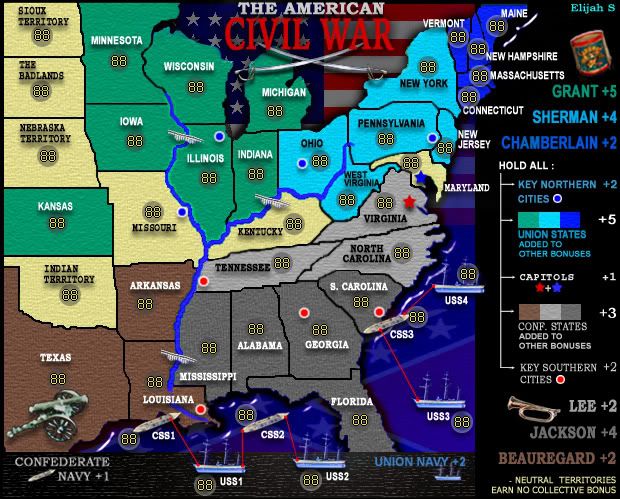
8th Revision
Notable changes:
-Pixelation addressed... again. This time the borders have been made larger using vector lines and a slight gaussian blur.
-Some army circles have been repositioned.
-Legend spacing is more consistent.
-A texture has been added to the blue states.
-An slight overall texture has been added to all states.
-Yellow territory titles have been centered.