edbeard wrote:why don't you call it Mt. Rainier Park then? (Or Mt. Rainier Nat. Park) Makes it clearer so this question won't come up. Though to me it's fine without a change.
As for your bridge from Lakewood to Tacoma, I would extend the ends of the bridge to go into the actual territories. That way it actually looks like a bridge. (see cairns coral coast map)
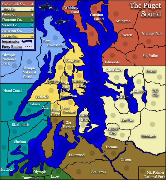
let me give a tip for the killer whales:
you know the tool blur in photoshop?
use it at the borders of the killer whale (where it touches the sea) and it will look better
edbeard wrote:why don't you call it Mt. Rainier Park then? (Or Mt. Rainier Nat. Park) Makes it clearer so this question won't come up. Though to me it's fine without a change.
As for your bridge from Lakewood to Tacoma, I would extend the ends of the bridge to go into the actual territories. That way it actually looks like a bridge. (see cairns coral coast map)
this is a really good map. Guys we need more interest.
I think you need to make this list T (just edit the first post??):
Step 3). Developmental Map Thread——Start a personal thread where your map can be discussed and debated in length by the members of Conquer Club. To start a new map thread, please follow these formal guidelines:
Subject: <Working Title> (describes map at a glance)
Body: <map image> <# of countries> <Comments about specific areas or general points of interest> <Links to any visual resources used>
may i ask what's this map doing in the map foundry? it belongs to the ideas forum
“In the beginning God said, the four-dimensional divergence of an antisymmetric, second rank tensor equals zero, and there was light, and it was good. And on the seventh day he rested.”- Michio Kaku
not really. i was specifically asked to make a small version before i was moved to the main foundry. no small no main foundry.
qwerts ww2 europe is in a far more advanced stage than this map and still isn't moved.
“In the beginning God said, the four-dimensional divergence of an antisymmetric, second rank tensor equals zero, and there was light, and it was good. And on the seventh day he rested.”- Michio Kaku
DIM, the instructions aren't too clear about what steps need to be done to progress from one "phase" to the other. I've PM'd Keyogi to ask for clarification. I'm sure he'll make sure everyone's in the right spot, so no worries.
wicked wrote:DIM, the instructions aren't too clear about what steps need to be done to progress from one "phase" to the other. I've PM'd Keyogi to ask for clarification. I'm sure he'll make sure everyone's in the right spot, so no worries.
T, looks like small map is next step!
then how come i was told either make the small or leave the foudry because i ain't getting AoR moved without a small map?
keyogi said it. so i guess the steps are pretty clear if he was willing to throw me out of the foundry unless i made a small map
also why isn't qwert's map moved it's in a more advanced stage than pudget sound. could it be because he is one of the people that protest against the foundry process? is this how the mods chose to react? by punishing some cartographers?
“In the beginning God said, the four-dimensional divergence of an antisymmetric, second rank tensor equals zero, and there was light, and it was good. And on the seventh day he rested.”- Michio Kaku
Dim you have a lot of knowledge about maps and the map process so know these little unwritten nuances. People new to making maps and other clueless folks like myself who don't spend a lot of time here don't know, hence my PM asking for clarification. Thanks DIM for letting us know a small map is needed!! If you have any comments about the map; it could certainly use your critical and experienced eye.
wicked wrote:If you have any comments about the map; it could certainly use your critical and experienced eye.
well if i had any comments i would have posted them by now but unfortunately the map doesn't attract me in any way neither the theme nor the graphics so i prefer to keep quiet rather than post something negative.
“In the beginning God said, the four-dimensional divergence of an antisymmetric, second rank tensor equals zero, and there was light, and it was good. And on the seventh day he rested.”- Michio Kaku
guys try to keep the map foundry stuff out of people's threads. it's not fair to anyone. we have a thread about it already so direct all your thoughts about it there. going into people's threads saying how it's not fair is very petty.
comments about the map:
well only one thing from me right now, your bridges still need some work. The lines are not parallel and they don't start and stop in the same place. they should look like = except turned to the correct angle. it's easier to just draw one straight horizontal line then copy it and move it appropriately.
I'll come back and look at the bonuses and gameplay later.
Thanks qwert. I read over that and still dont' see what's missing? It's a pretty simple map! And interesting note - it doesn't say a small map is needed to get to the foundry.
You dont need a small map to get out of the ideas sub-forum. But your map does need to meet the size guidelines. Something qwert has been told several times, but refuses to do.
i don't like this map but seeing as some people say it looks great i'm afraid it might actually be moved forward in this stage and i can't be a witness to that. thus i've decided to give my 2 cents worth on the graphics. i will analyze the gameplay later.
Graphics:
good things:
1. font choice and color. i think it's clean and fresh. keep it
2. colors. nice they don't hurt the eye and do a good job differentiating the continents. the only one that could use a bit of improvement is red. perhaps tone it down a bit. otherwise is fine.
3. the legend. plain and simple. love it.
bad things:
1. the borders. OMG the borders are hideous. they look so untidy i can't even begin saying it. some are thiner than others. some don't meet the way they should. some appear to be drawn twice on top of eachother resulting in some weird lines.
2. you're inconsistent in the shadows. the land has the light source at the bottom while the text has it at the top.
3. rivers color. i always had the impression rivers are shallower than the ocean and thus should have a lighter color. on your map is the other way round.
4. big river on the left. i don't know the geography in that area but i suppose the lump of water on the left is supposed to be a river starting somewhere in allyn and going into the ocean. well the starting point is too damn abrupt. rivers tend to be small at the creek and later turn become bigger and bigger. your's is big right from the start. also it is supposed to go all the way to the ocean but instead it stops in a limb of land in the kingston - port townsend area thus making it a lake more than a river since it is watter surrounded by land.
5. the 2 whales. i don't now if they are emblematic for the area or not. if they aren't i say remove them. if they are then blend them better. perhaps make them partially submersed in the watterwith only theyr heads out spitting water from their back.
6. more rivers. the ones in the matlock shelton area. are those rivers? they sure don't look like it. they look like somebody took an excavator and cut a piece of land. no spring no variation in size no variation in color.
look at mibi's troy map for nice rivers.
7. bridges. look at the 2 bridges from tacoma. and now look at the one from lakewood to gig harbor. they are different. make them all like tacoma.
“In the beginning God said, the four-dimensional divergence of an antisymmetric, second rank tensor equals zero, and there was light, and it was good. And on the seventh day he rested.”- Michio Kaku


 are registered trademarks of Backglass Heavy Industries.


