[Official] Indochina REVAMP [Quenched]
Moderator: Cartographers
Forum rules
Please read the Community Guidelines before posting.
Please read the Community Guidelines before posting.
- reverend_kyle
- Posts: 9250
- Joined: Tue Mar 21, 2006 4:08 pm
- Location: 1000 post club
- Contact:
- reverend_kyle
- Posts: 9250
- Joined: Tue Mar 21, 2006 4:08 pm
- Location: 1000 post club
- Contact:
KEYOGI wrote:I'm not sure I understand RK's argument here. The dots capture the feeling of an an older map nicely along with the rest of the map. Maybe it has something to do with how hills and mountains are represented on some topographic maps?
I don't see how the dots capture the old map feel....
My dad collects old maps and globes so I have quite a bit of them around but none of them have dots.
Also, I think you're spot on about the dots reminding me of a topographical map.
I like the dots on the inside of the playable area though.
DANCING MUSTARD FOR POOP IN '08!
- reverend_kyle
- Posts: 9250
- Joined: Tue Mar 21, 2006 4:08 pm
- Location: 1000 post club
- Contact:
cairnswk wrote:.but I like the dots also edbeard. it makes this a mpa look like an old topographic map from the period of the french-indo china
those statements contradict,, if you like how the dots make it look like an old topographic map then why do you endorse them showing(topographically) the water being higher than the land.
DANCING MUSTARD FOR POOP IN '08!
-
WidowMakers
- Posts: 2774
- Joined: Mon Nov 20, 2006 9:25 am
- Gender: Male
- Location: Detroit, MI
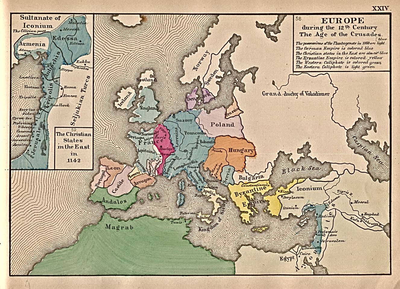
here are some maps that i took a little guidance from
The first one has solid lines that radiate from the land to the sea. They get further apart as they get further from land.
The second shows the same style.
I combined the two and spread them out more because I did not want a massive amount of black dots to fill the water.
That is how I came to where the map is today.


- reverend_kyle
- Posts: 9250
- Joined: Tue Mar 21, 2006 4:08 pm
- Location: 1000 post club
- Contact:
-
WidowMakers
- Posts: 2774
- Joined: Mon Nov 20, 2006 9:25 am
- Gender: Male
- Location: Detroit, MI
OK everyone. I know I found a map out there that used dots. I did not just make it up on my own. I will try to find it and show what I used to base my map on. Plus when I did the map and had the lines instead of dots, it look way to dark on the water and distracted form the map. That is also why I chose to use dots. But mainly because I saw it on another "real" map.
WM
WM

- Fireside Poet
- Posts: 2671
- Joined: Mon Apr 24, 2006 1:49 pm
-
WidowMakers
- Posts: 2774
- Joined: Mon Nov 20, 2006 9:25 am
- Gender: Male
- Location: Detroit, MI
OK here is version 7
I used lines instead of dots but had to turn down the opacity to 40% to make them blend better with the map. Without that they were too overpowering. I hope this si a good compromise for all of the people who did not like the dots.
P.S. I know I found a map with dots. I am not going crazy.](./images/smilies/eusa_wall.gif)
========================================
Large:
http://img413.imageshack.us/img413/3967 ... 07ldl1.jpg
Small:
http://img208.imageshack.us/img208/175/ ... 07skj0.jpg
XML:
http://www.fileden.com/files/2007/6/15/ ... ina_04.xml


I used lines instead of dots but had to turn down the opacity to 40% to make them blend better with the map. Without that they were too overpowering. I hope this si a good compromise for all of the people who did not like the dots.
P.S. I know I found a map with dots. I am not going crazy.
](./images/smilies/eusa_wall.gif)
========================================
Large:
http://img413.imageshack.us/img413/3967 ... 07ldl1.jpg
Small:
http://img208.imageshack.us/img208/175/ ... 07skj0.jpg
XML:
http://www.fileden.com/files/2007/6/15/ ... ina_04.xml


- reverend_kyle
- Posts: 9250
- Joined: Tue Mar 21, 2006 4:08 pm
- Location: 1000 post club
- Contact:
-
WidowMakers
- Posts: 2774
- Joined: Mon Nov 20, 2006 9:25 am
- Gender: Male
- Location: Detroit, MI
- The Fuzzy Pengui
- Posts: 2271
- Joined: Mon Nov 27, 2006 6:52 pm
- Gender: Male
- Location: Ohio
- The Fuzzy Pengui
- Posts: 2271
- Joined: Mon Nov 27, 2006 6:52 pm
- Gender: Male
- Location: Ohio
- reverend_kyle
- Posts: 9250
- Joined: Tue Mar 21, 2006 4:08 pm
- Location: 1000 post club
- Contact:
- AndyDufresne
- Posts: 24935
- Joined: Fri Mar 03, 2006 8:22 pm
- Location: A Banana Palm in Zihuatanejo
- Contact:
I actually like the dots, but the lines look good also.
Lets mix to the two, and make it really awesome! (Or bad).
--Andy
Lets mix to the two, and make it really awesome!
--Andy
Last edited by AndyDufresne on Tue Sep 04, 2007 1:34 am, edited 1 time in total.


