WWII Pearl Harbor - [Quenched]
Moderator: Cartographers
Forum rules
Please read the Community Guidelines before posting.
Please read the Community Guidelines before posting.

-
WidowMakers
- Posts: 2774
- Joined: Mon Nov 20, 2006 9:25 am
- Gender: Male
- Location: Detroit, MI


-
WidowMakers
- Posts: 2774
- Joined: Mon Nov 20, 2006 9:25 am
- Gender: Male
- Location: Detroit, MI

V37 Update Replaced Legend Fonts
This is a return to the old font of Stencil is ued for the legend before, as I looked at the Eras font in V36 above and wasn't satisfied with it.
V37 Small
V37 Large
V37 Small
V37 Large

* Pearl Harbour * Waterloo * Forbidden City * Jamaica * Pot Mosbi


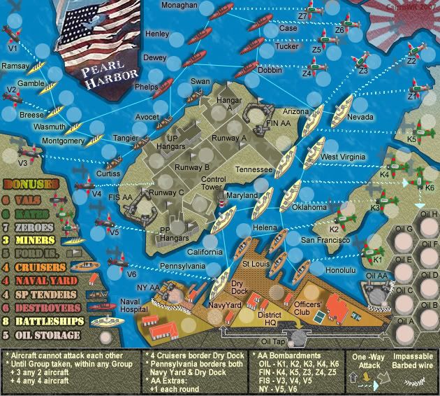
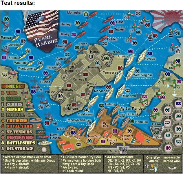
Can Tennessee's army circle be moved to the lower right side of the ship...closer to the Tennessee text? It's just confusing because the circle is on land yet all the other ship's circles are on water. Just think it could be tweaked a little better. As it is I can see people getting Maryland's circle confused with Tennessee since the Tennessee text is so close to Maryland's circle and Tennessee's circle being so far away from the actual text over the land. Other than that it looks great. 
Ok. What about moving Tennessee above the circle and moving FIN AA text above its circle? Maybe even move Arizona text up. I'm just not a fan of having the text so far away from the circles. I just noticed St. Louis as well near the bottom. That text should be to the right of the circle under San Francisco imo.
-
AndyDufresne

- Posts: 24935
- Joined: Fri Mar 03, 2006 8:22 pm
- Location: A Banana Palm in Zihuatanejo
- Contact:
casper wrote:Ok. What about moving Tennessee above the circle and moving FIN AA text above its circle? Maybe even move Arizona text up. I'm just not a fan of having the text so far away from the circles. I just noticed St. Louis as well near the bottom. That text should be to the right of the circle under San Francisco imo.
Casper, thanks for posting.
I'll see what i can do about moving names (not circles) for FIN AA aetc about. However, St Louis is staying in its position otherwise that area of the map becomes too cluttered to the right , and leaves this great gap over the dock area.
To others...
Changing the legend font was a two fold issue, Keyogi had probs with the original, and the map was oversized, so i changed it to the ERAS font on V36, but found i didn't like this. The map is now two versions.
To change the legend font means changing it for all those items on both maps, which I have just done twice already, and is over two hours work. Unless there is absolutely a very necessary reasons to change this font i.e. someone can't read it, then I would prefer to leave it as it is. Please consider this b4 asking me to change it again. Thanks.
* Pearl Harbour * Waterloo * Forbidden City * Jamaica * Pot Mosbi
-
AndyDufresne
- Posts: 24935
- Joined: Fri Mar 03, 2006 8:22 pm
- Location: A Banana Palm in Zihuatanejo
- Contact:
casper wrote:Ok. What about moving Tennessee above the circle and moving FIN AA text above its circle? Maybe even move Arizona text up. I'm just not a fan of having the text so far away from the circles. I just noticed St. Louis as well near the bottom. That text should be to the right of the circle under San Francisco imo.
casper...some adjustments for you...r these OK?
* Pearl Harbour * Waterloo * Forbidden City * Jamaica * Pot Mosbi
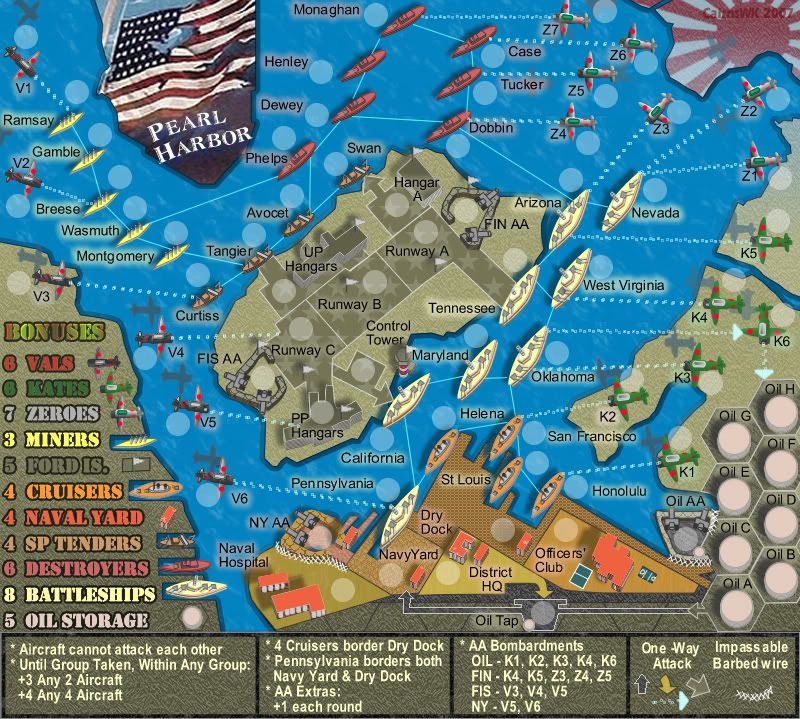
V38 Army Tests
V38 Small Army Test
V38 Large Army Test
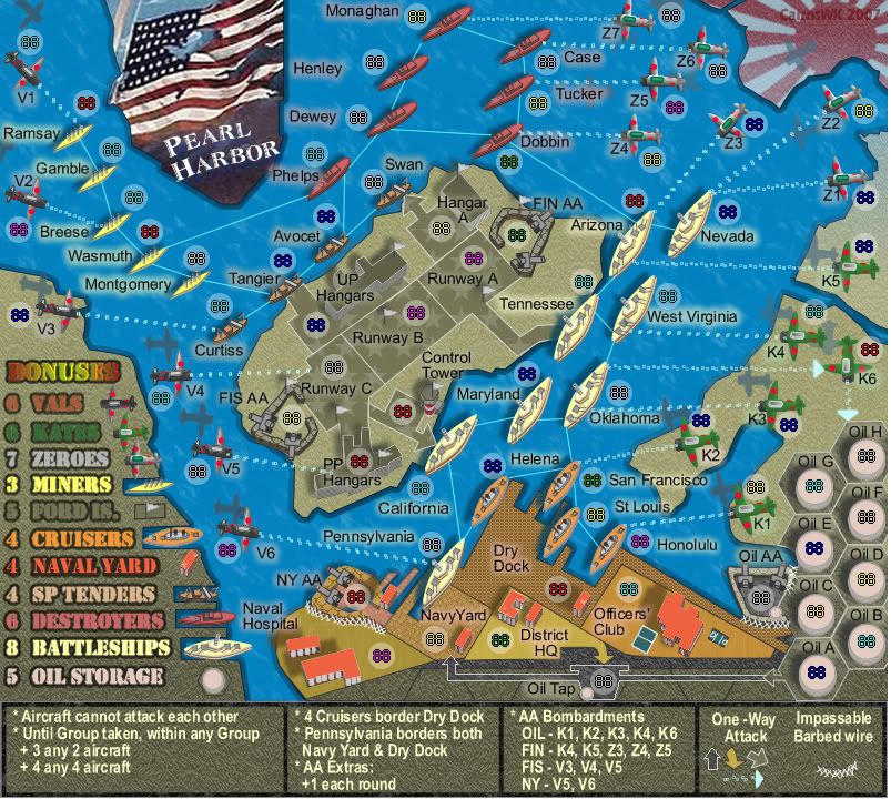
V38 Large Army Test
* Pearl Harbour * Waterloo * Forbidden City * Jamaica * Pot Mosbi
-
AndyDufresne
- Posts: 24935
- Joined: Fri Mar 03, 2006 8:22 pm
- Location: A Banana Palm in Zihuatanejo
- Contact:
AndyDufresne wrote:Mind posting the text links for the large and small maps, along with the XML?
--Andy
Andy...I just took out all three of you - HighC540, lackattack and yourself in our VOTKs game. I'm chuffed.
Andy....requests from above as below....many thanks!
XML
http://www.sendspace.com/file/vuctu1
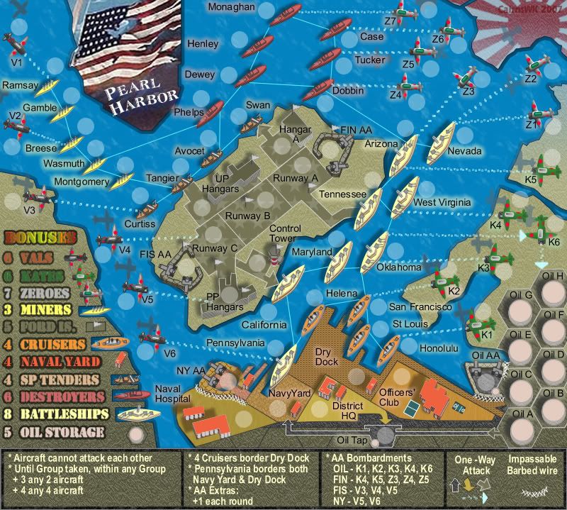
V38 Small
http://i155.photobucket.com/albums/s282 ... urV38S.jpg
V38 Large
http://i155.photobucket.com/albums/s282 ... urV38L.jpg
* Pearl Harbour * Waterloo * Forbidden City * Jamaica * Pot Mosbi
KEYOGI wrote:There's a few coordinates on the large that look a bit out... Dewey and Dobin are the ones I can notice. Small looks good though.
I still don't think the legend does the map justice, but I'm alone on this one so I'll shut up.
Fixed in the image V38 Large above Keyogi...please refresh your browser.
The xml did not need to be changed.
* Pearl Harbour * Waterloo * Forbidden City * Jamaica * Pot Mosbi
-
unriggable

- Posts: 8037
- Joined: Thu Feb 08, 2007 9:49 pm


KEYOGI wrote:There's a few coordinates on the large that look a bit out... Dewey and Dobin are the ones I can notice. Small looks good though.
I still don't think the legend does the map justice, but I'm alone on this one so I'll shut up.
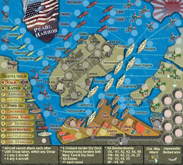
Keyogi
Does this solution look better or worse...it needs tidying up but you get the general idea.
* Pearl Harbour * Waterloo * Forbidden City * Jamaica * Pot Mosbi