Battle of Actium [Quenched]

Care to peruse completed maps? Take a stroll through the Atlas.

Moderator: Cartographers

Forum rules
Please read the Community Guidelines before posting.
Post Reply
User avatar
cairnswk
Posts: 11510
Joined: Sat Feb 03, 2007 8:32 pm
Gender: Male
Location: Australia

Post by cairnswk »

AndyDufresne wrote:Cairnswk, I think you are suffering from over saturation. You've just too many damn maps in production, people don't know where to go to post! ;)

Appreciate your sentiments Andy. I don't think it is from over saturation. Afterall if you can find them once a week, so can others.
I think it's because we have such a variety and large number of maps, and now of course very different styles happening....people growing, foundary growing, Keyogi's role growing, skills being honed....perhaps it would be a good time do to some "menu marketing" for the foundary in the menu system of game play screen. Afterall, many new maps are being developed, but it's still only the marginally few same people that visit the foundary to comment, although sometimes there are many voters who don't comment.

I actually like the dark red, instead of the gold...at least somewhat. The gold seemed to stand out tooooo much, (though that was partly the point of it, correct?)
Yes the gold ade the borders clear.
However, if we use the dark red, it will mean altering Cleopatra's Royal Purple, and that's somewhere I really don't want to go....so I'll investigate another border colour instead of gold.

And on the latest image, Mi and Sd army circles look smaller. I'm not sure if it's in your masterfile, as the map with the gold images doesn't suffer from the problem.
Oops, sorry about that, but those terts army shadows received coloured borders in that version. Fixed.

And just because I'm curious, would you mind posting an image with 3 digit army coordinates? I think the way the coordinates are set up, there shouldn't be any overlapping or interfering with each other, but do any overlap names?
--Andy

Will post something shortly in new version for 3 digit army coordinates
:)
Image
* Pearl Harbour * Waterloo * Forbidden City * Jamaica * Pot Mosbi
User avatar
AndyDufresne
Posts: 24935
Joined: Fri Mar 03, 2006 8:22 pm
Location: A Banana Palm in Zihuatanejo
Contact:

Post by AndyDufresne »

cairnswk wrote:
AndyDufresne wrote:Cairnswk, I think you are suffering from over saturation. You've just too many damn maps in production, people don't know where to go to post! ;)

Appreciate your sentiments Andy. I don't think it is from over saturation. Afterall if you can find them once a week, so can others.
I think it's because we have such a variety and large number of maps, and now of course very different styles happening....people growing, foundary growing, Keyogi's role growing, skills being honed....perhaps it would be a good time do to some "menu marketing" for the foundary in the menu system of game play screen. Afterall, many new maps are being developed, but it's still only the marginally few same people that visit the foundary to comment, although sometimes there are many voters who don't comment.


Hm, slightly off topic, but perhaps you (or one of the other regular Foundry posters) should look into creating a GD topic, to see why only a trickle of new people ever wander into the Foundry. Also perhaps, if someone was interested...they could run a 'Foundry News' topic in the GD, to update people who don't visit the Foundry. Perhaps more people would look at that, and wander in... :)


--Andy
User avatar
cairnswk
Posts: 11510
Joined: Sat Feb 03, 2007 8:32 pm
Gender: Male
Location: Australia

Post by cairnswk »

AndyDufresne wrote:
cairnswk wrote:
AndyDufresne wrote:Cairnswk, I think you are suffering from over saturation. You've just too many damn maps in production, people don't know where to go to post! ;)

Appreciate your sentiments Andy. I don't think it is from over saturation. Afterall if you can find them once a week, so can others.
I think it's because we have such a variety and large number of maps, and now of course very different styles happening....people growing, foundary growing, Keyogi's role growing, skills being honed....perhaps it would be a good time do to some "menu marketing" for the foundary in the menu system of game play screen. Afterall, many new maps are being developed, but it's still only the marginally few same people that visit the foundary to comment, although sometimes there are many voters who don't comment.


Hm, slightly off topic, but perhaps you (or one of the other regular Foundry posters) should look into creating a GD topic, to see why only a trickle of new people ever wander into the Foundry. Also perhaps, if someone was interested...they could run a 'Foundry News' topic in the GD, to update people who don't visit the Foundry. Perhaps more people would look at that, and wander in... :)


--Andy


Good thinking '99! :) I'll investigate!
I still think that "menu marketing" would also drag players in to comment and should seriously be considered, afterall what better point of contact to grab players attention than in the very screen where they are playing, and can link directly to the latest "Final Forges" list or even "Foundary Additions" list. I believe this is already done with links in the Maps in Development page. Head the maps list with "Would you care to comment on the latest map developments below..."
Image
* Pearl Harbour * Waterloo * Forbidden City * Jamaica * Pot Mosbi
User avatar
cairnswk
Posts: 11510
Joined: Sat Feb 03, 2007 8:32 pm
Gender: Male
Location: Australia

Post by cairnswk »

V11 UPDATE

Borders

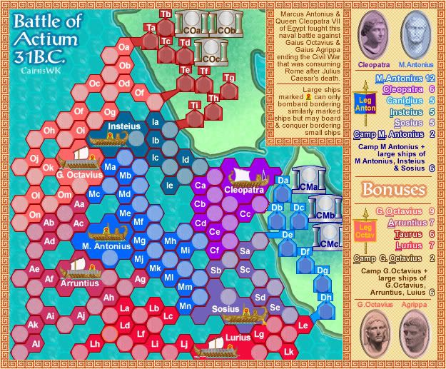
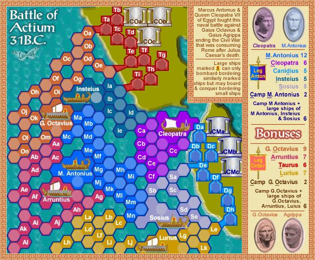
V11a...the first place I said to Andy that I didn't want to go....was to change Cleopatra's Royal Purple and Sosius' colour to a lighter colour, and make the borders all dark Roman red....works very well I think
Image

and this V11b with white borders for all ships but retaining the Royal Purple for Cleopatra.

Image
Image
* Pearl Harbour * Waterloo * Forbidden City * Jamaica * Pot Mosbi
User avatar
edbeard
Posts: 2501
Joined: Thu Mar 29, 2007 12:41 am

Post by edbeard »

To be honest (and sorry for going off topic here) I don't like to comment on a map until I've shown the map maker respect by reading the entire thread. This can be quite difficult, and sometimes time consuming so often I find myself not commenting at all.

That's probably just me, but the length of some threads probably puts some people off. Maybe a thread summary should be encouraged, so people can 'catch up' and see what topics have and have not been discussed?
User avatar
cairnswk
Posts: 11510
Joined: Sat Feb 03, 2007 8:32 pm
Gender: Male
Location: Australia

Post by cairnswk »

edbeard wrote:To be honest (and sorry for going off topic here) I don't like to comment on a map until I've shown the map maker respect by reading the entire thread. This can be quite difficult, and sometimes time consuming so often I find myself not commenting at all.

That's probably just me, but the length of some threads probably puts some people off. Maybe a thread summary should be encouraged, so people can 'catch up' and see what topics have and have not been discussed?


edbeard...whole-heartedly agree...i do the same...so your suggestion is a very valid one and good idea....any improvement is bound to be productive.....i wonder if this would be a good idea to have a summary of what has been discussed and is currently being dicussed at the top of every page along with the current map (all linked to page 1). I have put this up in the Improvements forum before.
Image
* Pearl Harbour * Waterloo * Forbidden City * Jamaica * Pot Mosbi
User avatar
Enigma
Posts: 367
Joined: Mon Jul 03, 2006 10:23 pm
Location: Classified

Post by Enigma »

all i have to say at the moment is that i love the hexagons. they really look like battle formation. id play this map. colours need some work. catch you later :).
Do you need an excuse to have a war? I mean, who for? Can't you just say "You got lots of cash and land, but I've got a big sword, so divy up right now, chop chop."
Terry Pratchet
User avatar
cairnswk
Posts: 11510
Joined: Sat Feb 03, 2007 8:32 pm
Gender: Male
Location: Australia

Post by cairnswk »

Enigma wrote:all i have to say at the moment is that i love the hexagons. they really look like battle formation. id play this map. colours need some work. catch you later :).


Enigma....thanks for your comments.
The colours have been chosen from the colour blind list.
But please, let me know what you preferences are and I'll see if I can accommodate. :)
Image
* Pearl Harbour * Waterloo * Forbidden City * Jamaica * Pot Mosbi
User avatar
unriggable
Posts: 8037
Joined: Thu Feb 08, 2007 9:49 pm

Post by unriggable »

I think the borders should be a dark color - also I may have missed this but whats the deal with the docks? IMHO they should be the same width the whole way through.
Image
User avatar
cairnswk
Posts: 11510
Joined: Sat Feb 03, 2007 8:32 pm
Gender: Male
Location: Australia

Post by cairnswk »

unriggable wrote:I think the borders should be a dark color - also I may have missed this but whats the deal with the docks? IMHO they should be the same width the whole way through.

Ok unrigable....i'll see what i can do about the dock issue. Thanks. :)
Image
* Pearl Harbour * Waterloo * Forbidden City * Jamaica * Pot Mosbi
User avatar
cena-rules
Posts: 9740
Joined: Sat Apr 28, 2007 2:27 am
Gender: Male
Location: Chat

Post by cena-rules »

unriggable wrote:I think the borders should be a dark color - also I may have missed this but whats the deal with the docks? IMHO they should be the same width the whole way through.


I agree especially with the fact that the borders should be dark. The white borders annoy my eyes
19:41:22 ‹jakewilliams› I was a pedo
User avatar
cairnswk
Posts: 11510
Joined: Sat Feb 03, 2007 8:32 pm
Gender: Male
Location: Australia

Post by cairnswk »

cena-rules wrote:
unriggable wrote:I think the borders should be a dark color - also I may have missed this but whats the deal with the docks? IMHO they should be the same width the whole way through.


I agree especially with the fact that the borders should be dark. The white borders annoy my eyes


OK cena-rules...thanks. Looks like people prefer the dark border verion below.

Image
Image
* Pearl Harbour * Waterloo * Forbidden City * Jamaica * Pot Mosbi
User avatar
Enigma
Posts: 367
Joined: Mon Jul 03, 2006 10:23 pm
Location: Classified

Post by Enigma »

ok, i have now at least skimmed the entire thread and have a general idea of whats going on.

Gameplay:
pardon if this has already been explained, but i am trying to grip what the large ships can/cant do.
Can the Insteius attack Og? can it attack Ia? can it attack the G. Ocatavius?
Can Ia, Og, and the G. Octavius attack the Insteius?
What makes the Cleopatra different from the other ships?
What exactly is "bombardment"? (sorry, ive been away from the foundry for a while if this is something i should have heard of)

Graphics:
you like to make maps really busy, cairns :P. i like all of your concepts, but it seems better to keep specifics within a particular concept uniform in order to eliminate confusion. there is certainly a place for historical significance, but keep in mind that a map is supossed to be simplified symbolism.
-for example, i think it would help if the borders across the map were a uniform width (unless the thicker widths indicate impassables). also, have you tried making the borders black? that might give the just enough "pop" to the map.
-another example is on the continent names on the legend. the coloured outlining makes it too busy, perhaps you could try making the letters solid coloured.

other graphic concerns include
-the colours of the octaviun fleets. these are very similar and easy to confuse. maybe add some more orange (yellow) to a couple of the continents?
-the colour of the land. this is very blue, especially under the cleopatrean camp. as andy said earlier, a "grassier" (again more yellow) colour may be better. i think it would also help if it were a bit darker. as of now the lines of the camp borders look too bright on the background. making all these lines black could help with that as well.
-i really like the hexagon texture behind the sea. however, again with andy, the colour and other texture seem a little off. i think it may be because the colour seems too carribean, and mediterranean water has more of a rich blue tint than a green tint.
-m antonius needs a new picture, the present one has a funky dotted texture that is not present in the other bust pictures.
-im not sure about the square spiral border, and the legend/border also seems to abrupt. remember how you changed the legend in CCC to reflect the shoreline? i think this one would be improved by reflecting the hexagon angles which are present over the rest of the map.

as always, all my talk is only meant as constructive criticism. hope it helps and does not offend :).
Do you need an excuse to have a war? I mean, who for? Can't you just say "You got lots of cash and land, but I've got a big sword, so divy up right now, chop chop."
Terry Pratchet
User avatar
cairnswk
Posts: 11510
Joined: Sat Feb 03, 2007 8:32 pm
Gender: Male
Location: Australia

V12 Update

Post by cairnswk »

Enigma wrote:as always, all my talk is only meant as constructive criticism. hope it helps and does not offend :).


Hi Enigma.

This is V12 Update.

I've tried to address some of the issues that you ran with so I hope this does the trick.
I think the colours are now definitely more Mediterranean.

Image
Image
* Pearl Harbour * Waterloo * Forbidden City * Jamaica * Pot Mosbi
User avatar
cairnswk
Posts: 11510
Joined: Sat Feb 03, 2007 8:32 pm
Gender: Male
Location: Australia

Post by cairnswk »

updated as above
Image
* Pearl Harbour * Waterloo * Forbidden City * Jamaica * Pot Mosbi
User avatar
cairnswk
Posts: 11510
Joined: Sat Feb 03, 2007 8:32 pm
Gender: Male
Location: Australia

Post by cairnswk »

updated as above
Image
* Pearl Harbour * Waterloo * Forbidden City * Jamaica * Pot Mosbi
User avatar
Coleman
Posts: 5402
Joined: Tue Jan 02, 2007 10:36 pm
Gender: Male
Location: Midwest

Post by Coleman »

The relative deadness of this topic would seem to indicate to me nobody has problems with it right now. Ready for the next stage maybe?
Warning: You may be reading a really old topic.
User avatar
cairnswk
Posts: 11510
Joined: Sat Feb 03, 2007 8:32 pm
Gender: Male
Location: Australia

Post by cairnswk »

Coleman wrote:The relative deadness of this topic would seem to indicate to me nobody has problems with it right now. Ready for the next stage maybe?


Egypt went this way also Coleman.

There is also the possibility that no-one likes the map enough to comment on it, or it is not warlike enough for player to have opinions on.

I am still in the process of deciding issues....I think the map is also dead because everyone else has other things to concentrate on.

Appreciate your sentiments anyway Coleman. :)
Image
* Pearl Harbour * Waterloo * Forbidden City * Jamaica * Pot Mosbi
User avatar
gimil
Posts: 8599
Joined: Sat Mar 03, 2007 12:42 pm
Gender: Male
Location: United Kingdom (Scotland)

Post by gimil »

Ill be honest i haven't really been interested in this map but none the less i like it and ill contribute :wink:

the new colors are good but there rather strong compared with the legends and surrounding boarders. could you perhaps try and level them out a little?

And like all your maps i find it confusing. Im not really sure how to mend this.

EDIT: nevermind once you give the legends a good read over a couple of times your good to go :wink:
What do you know about map making, bitch?

natty_dread wrote:I was wrong


Top Score:2403
User avatar
cairnswk
Posts: 11510
Joined: Sat Feb 03, 2007 8:32 pm
Gender: Male
Location: Australia

Post by cairnswk »

gimil wrote:Ill be honest i haven't really been interested in this map but none the less i like it and ill contribute :wink:

the new colors are good but there rather strong compared with the legends and surrounding boarders. could you perhaps try and level them out a little?

And like all your maps i find it confusing. Im not really sure how to mend this.

EDIT: nevermind once you give the legends a good read over a couple of times your good to go :wink:


Gimil...please to see your comments. :)

I'm sorry you find my maps confusing. :?
I'd like to think they're simply taken to another level where everything is not straight forward black and white, and one has to use one's brain a little and interpret a gameplan.....not saying that you don't of course...but like u found out, once you had read the instructions a couple of times, it became clearer. Mind you, not all my maps will be this way. There are others in deveopment which compared to these will be very straight forward. But I wanted to see where some of the boundaries of the forum lay and I think I have a small interpretation of that now.

Also i have presented some very concept driven maps here, so they would be very different.
But I'll see about flattening those colours to even them out.
:D
Image
* Pearl Harbour * Waterloo * Forbidden City * Jamaica * Pot Mosbi
User avatar
tim02
Posts: 249
Joined: Fri Mar 16, 2007 7:51 pm
Location: Vancouver

Post by tim02 »

the only think I think is wrong with it is the fact every thing is the same shape
User avatar
cairnswk
Posts: 11510
Joined: Sat Feb 03, 2007 8:32 pm
Gender: Male
Location: Australia

Post by cairnswk »

tim02 wrote:the only think I think is wrong with it is the fact every thing is the same shape

tim02, thanks for commenting... :)
I realise it is a bit "same shape' but that's what the community voted for with regard to hexagons. I feel the two hexagon join makes a good image to represent a ship, so to me it is doesn't look odd. I wasn't there, but there were a lot of ships in this battle from my research.
Image
* Pearl Harbour * Waterloo * Forbidden City * Jamaica * Pot Mosbi
User avatar
unriggable
Posts: 8037
Joined: Thu Feb 08, 2007 9:49 pm

Post by unriggable »

I think its great. Just make the army circles a bit less transparent.
Image
WidowMakers
Posts: 2774
Joined: Mon Nov 20, 2006 9:25 am
Gender: Male
Location: Detroit, MI

Post by WidowMakers »

I have to say, the color changes are really helpful. I also found this map to be a little confusing. However, after you read the text and look over it a bit, the ideas come out and it looks to be an interesting map.

And as far as the map being confusing... well it is, compared to Classic. Many of the new maps coming out are taking advantage of the new XML features or the cartographer is trying to push the limits of gameplay and size of board smashed into the small space of the small map.

Before people just say the map is confusing, read the text and then ask for clarification only when you can't REALLY understand.

I also am not a fan of the hexagons but I realize teh style of the map requires it and therefore I have not said anything prior to this.

Looking good. keep it up.

BTW I really like the new colors :D

WM
Image
User avatar
cairnswk
Posts: 11510
Joined: Sat Feb 03, 2007 8:32 pm
Gender: Male
Location: Australia

V13 Update

Post by cairnswk »

V13 Update

Experiment:
Change the names for the small ships to proper Roman, Egyptian and Greek names.

Does this work?

Image
Image
* Pearl Harbour * Waterloo * Forbidden City * Jamaica * Pot Mosbi
Post Reply

Return to “The Atlas”