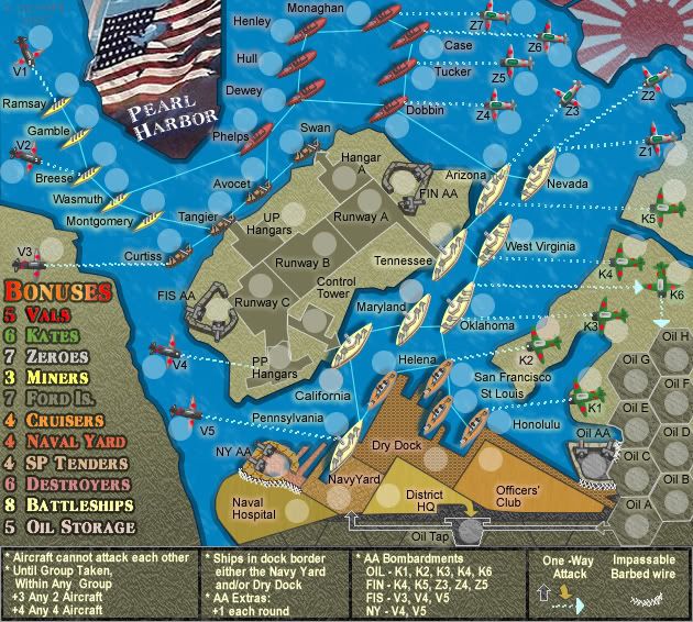
hulmey wrote:Yes it is a tactical option but i feel it does not fit in with the overall graphics and looks odd. You already have the oil drums which are what the photographs show.....The oil tap would have run underground as well and would have been seen by the enemy, who would have attacked the oil drums for maximium damage.
If you want it to stay which is your right i then reverse the question apon to you.
What are you going to do to relieve the clutter and busyness of the map?
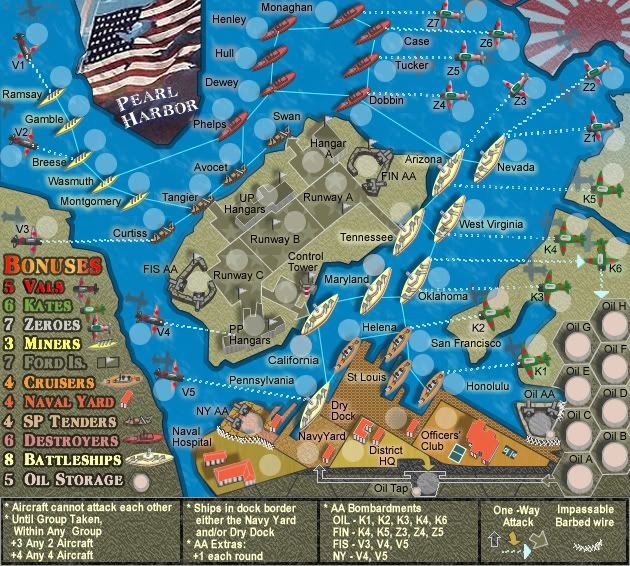
Apart from reducing the terts, this is one solution that I don't think works, because the map loses it "soul"....removed all the 3d buildings, plane shadows and icons in the legend.
I also don't believe the map is too cluttered...perhaps it looks cluttered because it is so evenly spread.
I like this version better. It seems more playable to me. The map has pplenty of 'soul' with out all that extra stuff.
ignore what mibi said. he's possesed. i''l call an exorcist. in the meantime remove the hidous image without soul. it burns my eyes. evil be gone. mibi be gone.
“In the beginning God said, the four-dimensional divergence of an antisymmetric, second rank tensor equals zero, and there was light, and it was good. And on the seventh day he rested.”- Michio Kaku
I like this version better. It seems more playable to me. The map has pplenty of 'soul' with out all that extra stuff.[/quote]
Hey Mibi...thanks for your post!
I don't follow your reason for saying the map is more "playable" without those icons and buildings. I thought the playability would depend on the placement of the terts and regions and anything that affected the attack routes, not on the 'extras'.
* Pearl Harbour * Waterloo * Forbidden City * Jamaica * Pot Mosbi
DiM wrote:ignore what mibi said. he's possesed. i''l call an exorcist. in the meantime remove the hidous image without soul. it burns my eyes. evil be gone. mibi be gone.
DiM...your sense of humour brings delight to the forum...pure evil from time to time, but hillarious! LOL
* Pearl Harbour * Waterloo * Forbidden City * Jamaica * Pot Mosbi
playability for me also means how easy it is to see and visualize the board. with all the extra icons there is more leg work the eye has to go through in order to get a sense of whats happening. this map is perfectly fine without them.
mibi wrote:playability for me also means how easy it is to see and visualize the board. with all the extra icons there is more leg work the eye has to go through in order to get a sense of whats happening. this map is perfectly fine without them.
how did you manage to escape from the exorcist???
i shall take this matter into my own hands.
now where did i put my holy water and cross??
here they are...
now cairns if you could just hold mibi for a sec i'll begin the ritual.
“In the beginning God said, the four-dimensional divergence of an antisymmetric, second rank tensor equals zero, and there was light, and it was good. And on the seventh day he rested.”- Michio Kaku
mibi wrote:playability for me also means how easy it is to see and visualize the board. with all the extra icons there is more leg work the eye has to go through in order to get a sense of whats happening. this map is perfectly fine without them.
Mibi...you're ruining my hard work with trying some new artwork.
* Pearl Harbour * Waterloo * Forbidden City * Jamaica * Pot Mosbi
mibi wrote:playability for me also means how easy it is to see and visualize the board. with all the extra icons there is more leg work the eye has to go through in order to get a sense of whats happening. this map is perfectly fine without them.
Mibi...you're ruining my hard work with trying some new artwork.
i think this is a pretty standard case of less is more.
go away you fiend
“In the beginning God said, the four-dimensional divergence of an antisymmetric, second rank tensor equals zero, and there was light, and it was good. And on the seventh day he rested.”- Michio Kaku
Please choose an option below for the attack lines:
A. Ships - light blue lines; Planes - blue double dash lines
30% [ 8 ] B. Ships - white squares; Planes - black dots
11% [ 3 ] C. Ships - white squares; Planes - white medium dots
7% [ 2 ] D. Ships - blue lines; Planes - red dash double lines
19% [ 5 ] E. Ships - blue lines; Planes - thick yellow dots
30% [ 8 ] F. Ships - white squares; Planes - single black dash lines
0% [ 0 ] G. Ships - light blue squares; Planes - single white dash lines
0% [ 0 ]
“In the beginning God said, the four-dimensional divergence of an antisymmetric, second rank tensor equals zero, and there was light, and it was good. And on the seventh day he rested.”- Michio Kaku
Its there...DiM...you gotta give me some time to get these up, please
it appeared after i posted.
“In the beginning God said, the four-dimensional divergence of an antisymmetric, second rank tensor equals zero, and there was light, and it was good. And on the seventh day he rested.”- Michio Kaku
oh and i didnt vote because i like the areoplane shadows becuse they give character to the map but think the buildings arent necesary and they look odd
“In the beginning God said, the four-dimensional divergence of an antisymmetric, second rank tensor equals zero, and there was light, and it was good. And on the seventh day he rested.”- Michio Kaku
I think no matter what, the icons need to be in the legend on both large and small map. The map is very busy and having those icons in the legend make it that little bit easier to clarify which bonus is which.
As an example: If you take the icons out of the legend, there is nothing saying what plane is what. And that goes for all the bonuses.