Conquer Club Park [Abandoned]
Moderator: Cartographers
Forum rules
Please read the Community Guidelines before posting.
Please read the Community Guidelines before posting.

-
musicman_379

- Posts: 141
- Joined: Sat Apr 07, 2007 2:22 pm
- Location: SW Kansas
- Contact:
GreecePwns wrote:I love this idea. It would be fun to play. However, I would like to see some kind of background. Also, will there be copyright issues with the ESPN space?
Searching http://www.espn.com, I found nothing on "ESPN" being copyrighted except for the "ESPN font" logo. Also, I have not heard of other media outlets being sued for copyright infringement for using the "word" ESPN in their stories.


I think you need an impassable border between Suites & Press box.... Something seems funny about that amount of defending territories for the bonus.. I could be wrong of course... otherwise Awesome... maybe better colors but not bad.. Batter is a little hard to read... try making the font Yellow or White

I'm not really into posting in here, never gotten into the whole map making process (to busy playing all the great maps coming out of here I guess).
But - here, let me throw in my two cents.
The idea is nice. Don't mind it.
But - why have a "CC park"? Why not make a map modelled after a real stadium? That's much nicer, and it gives a sense of reality (in whatever sense playing a Risk-like online game on a board modelled after a ballpark could give a sense of reality). Perhaps the new Shea Stadium? (Which will be an awesome stadium btw, check out the virtual tour on their website.) Naming it New Shea Stadium would also be a proper name (hate it when corporations buy the name of stadiums, God damn annoying).
Gengoldy wrote:Of all the games I've played, and there have been some poor sports and cursing players out there, you are by far the lowest and with the least class.

-
steveontrial

- Posts: 4
- Joined: Sun Jun 03, 2007 9:34 pm
- Location: United States
-
musicman_379
- Posts: 141
- Joined: Sat Apr 07, 2007 2:22 pm
- Location: SW Kansas
- Contact:
Keredrex wrote:I think you need an impassable border between Suites & Press box.... Something seems funny about that amount of defending territories for the bonus.. I could be wrong of course... otherwise Awesome... maybe better colors but not bad.. Batter is a little hard to read... try making the font Yellow or White
Looking closely at that, changing the font color to white makes sense. So does that impassable border, and doing so probably fixes the bonus, too.
alstergren wrote:But - why have a "CC park"? Why not make a map modelled after a real stadium? That's much nicer, and it gives a sense of reality (in whatever sense playing a Risk-like online game on a board modelled after a ballpark could give a sense of reality). Perhaps the new Shea Stadium? (Which will be an awesome stadium btw, check out the virtual tour on their website.) Naming it New Shea Stadium would also be a proper name (hate it when corporations buy the name of stadiums, God damn annoying).
Three things with this:
First, doing so would be a complete rebuild. With the XML file comming up soon, I would rather spend time and effort on this rather than extensive graphics work.
Second, the copyright process did not get me very far. I had planned to base this map on Fenway Park, but the current stadium seating maps on http://www.mlb.com are Flash-based rather than jpegs. Searching another site did net a jpeg, but the site did not own the image. A subsequent inquiry on using the image got me nowhere, and I then decided to turn the map into a "general" baseball stadium.
Third, I personally feel that using a "general" version does not take away from the realism of the map, especially athletic event stadiums. Take a look at CCU. It probably is not based on a specific university, just a "general" one, with aspects found at many universities.
Step 4 comming soon! http://www.conquerclub.com/forum/viewtopic.php?t=1685
Last edited by musicman_379 on Tue Jun 26, 2007 6:55 pm, edited 3 times in total.
-
musicman_379
- Posts: 141
- Joined: Sat Apr 07, 2007 2:22 pm
- Location: SW Kansas
- Contact:

-
musicman_379
- Posts: 141
- Joined: Sat Apr 07, 2007 2:22 pm
- Location: SW Kansas
- Contact:
-
thegeneralpublic

- Posts: 126
- Joined: Fri Mar 09, 2007 9:49 pm
- Location: In front of my computer screen.
- Contact:
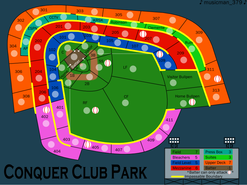
Obviously the graphics are going to need some work, but that's not as important right now. I don't know if it's just me, but the suites seem like they should have one less outlet for a bonus of only two. Maybe close off the 207 border? And the bleachers are much too easy to defend for a bonus of six. Drop it to four or five, at most. The mezzanie, however, could easily be worth six. Upper deck and field level I think are okay. Batter should probably be only -1. Field can be dropped to seven, because if you defend it properly, you'll have the batter as well and it will drop to five. This is just my opinion on the bonuses; someone will find something glaringly wrong with them, I'm sure.
-
musicman_379
- Posts: 141
- Joined: Sat Apr 07, 2007 2:22 pm
- Location: SW Kansas
- Contact:
thegeneralpublic wrote:Obviously the graphics are going to need some work, but that's not as important right now. I don't know if it's just me, but the suites seem like they should have one less outlet for a bonus of only two. Maybe close off the 207 border? And the bleachers are much too easy to defend for a bonus of six. Drop it to four or five, at most. The mezzanie, however, could easily be worth six. Upper deck and field level I think are okay. Batter should probably be only -1. Field can be dropped to seven, because if you defend it properly, you'll have the batter as well and it will drop to five. This is just my opinion on the bonuses; someone will find something glaringly wrong with them, I'm sure.
Thanks for the input. I had a feeing that the bonuses would have to be tweaked. I'll make some changes to the bonuses.
-
gimil

- Posts: 8599
- Joined: Sat Mar 03, 2007 12:42 pm
- Gender: Male
- Location: United Kingdom (Scotland)
musicman_379 wrote:gimil wrote:now it needs some textures. right now its rather flat and boaring
I wish I knew how to do that on Inkscape. Some assistance on that would be helpful.
Textures may require me to use a different program to finish the graphics.
can u download and install brushes in inkspot?
What do you know about map making, bitch?
Top Score:2403
natty_dread wrote:I was wrong
Top Score:2403
-
musicman_379
- Posts: 141
- Joined: Sat Apr 07, 2007 2:22 pm
- Location: SW Kansas
- Contact:
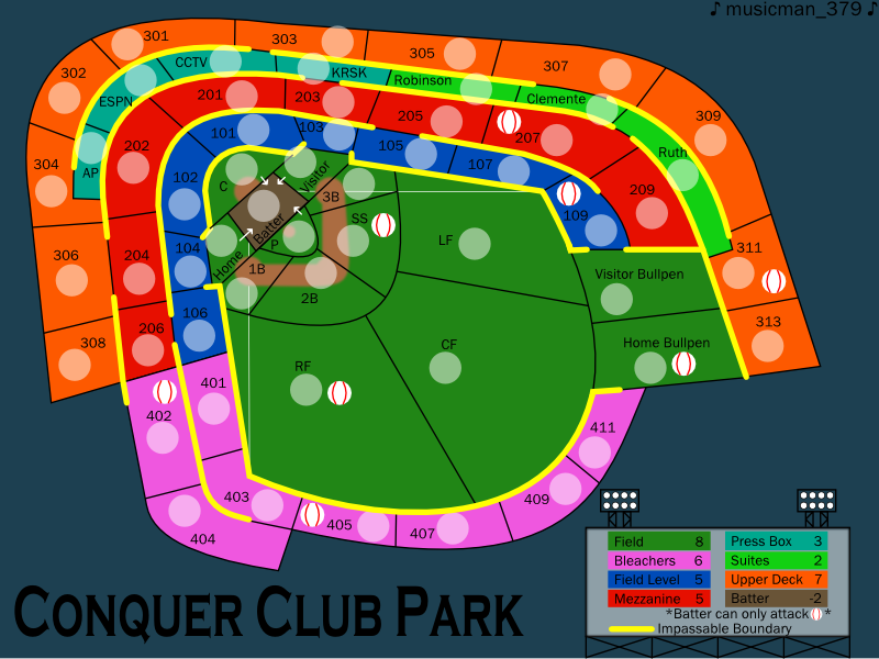
Draft 4:

Changes From Previous Update:
Color on Batter changed to white
Impassable border between press box and suites
307 has passable border with Robinson intstead of Clemente
22px dia. army circles on large map
Bonus Changes-- Suites 2 to 3, Mezzanine 5 to 6, Bleachers 6 to 5, Batter -2 to -1, Field 8 to 7

-
Night Strike

- Posts: 8512
- Joined: Wed Apr 18, 2007 2:52 pm
- Gender: Male
The Bullpens need to be on each end of the outfield instead of together. No baseball field has the bullpens together. They can both be part of the field, just not together.
You also need a colored border around the field instead of just the black lines.
I think the continents would look better if they are blocked (like section A, B, C, etc) instead of rows (100, 200, 300). I'm not sure how that would work, but I think it would make the map better liked.
You also need a colored border around the field instead of just the black lines.
I think the continents would look better if they are blocked (like section A, B, C, etc) instead of rows (100, 200, 300). I'm not sure how that would work, but I think it would make the map better liked.

-
thegeneralpublic
- Posts: 126
- Joined: Fri Mar 09, 2007 9:49 pm
- Location: In front of my computer screen.
- Contact:
I see what draglin3 is saying about the texture and such. However, I think the map WOULD benefit from some field texture. Also, I love how the dirt is present in the field, but it's really awkward to have the batter be just plain brown. I think it would be better just to continue the regular dirt patterns into the batter's box. Highlighting the border or something would be sufficient enough to separate it from the rest of the field.
-
Daring Overlord5

- Posts: 1511
- Joined: Fri Aug 11, 2006 4:13 pm
- Location: KANSAS

-
thegeneralpublic
- Posts: 126
- Joined: Fri Mar 09, 2007 9:49 pm
- Location: In front of my computer screen.
- Contact:
-
reverend_kyle

- Posts: 9250
- Joined: Tue Mar 21, 2006 4:08 pm
- Location: 1000 post club
- Contact: