“In the beginning God said, the four-dimensional divergence of an antisymmetric, second rank tensor equals zero, and there was light, and it was good. And on the seventh day he rested.”- Michio Kaku
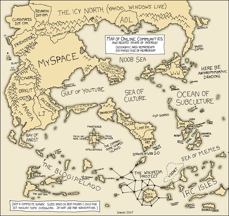
first of all the map layout is very poor. it's too tall without any particular reason. if it was a real coutry then it would have been ok but since it's a product of imagination there's no reason to make it so tall and narrow.
second, the actuall graphics are really poor. i don't even know where to begin. it's better to take a look at the recently quenched maps and then at this one. for sure you'll notice a huge difference.
“In the beginning God said, the four-dimensional divergence of an antisymmetric, second rank tensor equals zero, and there was light, and it was good. And on the seventh day he rested.”- Michio Kaku
gilligan...i think it's a great concept and a huge change for FUN. Of course the graphics and map size need a lot of work but....onya...for attempting something completely wild...reegardless of whose map it is!
* Pearl Harbour * Waterloo * Forbidden City * Jamaica * Pot Mosbi


 are registered trademarks of Backglass Heavy Industries.


