iancanton wrote:this is a good move, but it's the 4-region bonuses that need the neutrals. move the neutrals from sherwood and olive trees to trout bay and brimstone? the gameplay is looking sound otherwise and, in fog or trench, this map has the potential to produce some intriguing strategies.
ian.
Consider it done.
Also, do you think some of the bonus values are too low? eg. +2 for Copper, which has 5 regions and 4 borders to defend.
I still like this map, and I'm glad I voted for it.
On of the things I really like is the non-closed borders, which suggest to me a medieval/fantasy setting, where the world hasn't been mapped with satellites and laser levels and a lot of the borders are still a matter of opinion.
“Life is a shipwreck, but we must not forget to sing in the lifeboats.” ― Voltaire
Dukasaur wrote:I still like this map, and I'm glad I voted for it.
On of the things I really like is the non-closed borders, which suggest to me a medieval/fantasy setting, where the world hasn't been mapped with satellites and laser levels and a lot of the borders are still a matter of opinion.
Thanks Dukasaur.
I knew right from the start I wanted to have nice curved borders, almost like free-hand, and not perfect. The jagged lines you see around the mountains and coasts are partly inspired by old rough sketches, but have evolved beyond that into the current image.
ManBungalow wrote:Also, do you think some of the bonus values are too low? eg. +2 for Copper, which has 5 regions and 4 borders to defend.
u mean that u didn't deliberately use consistently low bonus values to make stronghold a comparatively more attractive way to win? in that case, it's possible to make gargoyle +5 and crown plains +4, while increasing by 1 each of the other bonus values except nexus. i also suggest reducing the stronghold neutrals from n20 to n5: this is a medium-sized map where it's relatively easy to attack the enemy and, if decent-sized bonuses are available, then killing the enemy directly will usually be a more successful strategy than going thru 23 neutrals for the win.
Stronghold reduced from n:20 to n:10. I don't want to go lower than that or it will be too easy to take early on with lucky flat rate/escalating spoils.
My comment on graphics is that the stronghold doesn't need the two inner circles behind the stronghold title. Also, the wall with the three entrances could use some shadows.
ABout the water texture: lakes are already in line with other textures. Seas, mountains and forests could be less pixelated indeed. Maybe the mountains can have peaks, snow caps and other mythical proportions?
About the water, the main problem with it is that it is not consistent. You have a very grainy texture for the larger areas but the rivers and lakes look the same but blurred (much better). Try to get them consistent with each other.
koontz1973 wrote:About the water, the main problem with it is that it is not consistent. You have a very grainy texture for the larger areas but the rivers and lakes look the same but blurred (much better). Try to get them consistent with each other.
koontz1973 wrote:About the water, the main problem with it is that it is not consistent. You have a very grainy texture for the larger areas but the rivers and lakes look the same but blurred (much better). Try to get them consistent with each other.
Sure thing.
When you thing about it, it should be the other way round as the river would be shallow water and the sea deep. Got a few other fixes for you but not really wanting to overwhelm you at the moment.
Fire them at me sir, I will probably do several updates in one go, as it's not often I get time to sit down and get on with it.
ManBungalow wrote:Fire them at me sir, I will probably do several updates in one go, as it's not often I get time to sit down and get on with it.
OK, here is a short list to look at then. Bonus Borders
These are the thicker lines. You have a soft glow underneath the lines set onto a setting other than normal. This is giving widely different results as you do not have the same colour underneath. Instead of using a setting, use a colour to get the same result but uniform over the entire map.
Some of these lines go right to the edge of the borders (under mountains etc), others do not. Whilst I am happy for these to be either or, try to get them more uniformed. Either away from the borders or go right to the edge.
All of these lines are solid apart from the one by Olive Trees. Make that a solid line without the gap.
Last one for these ones. The lines have a variation in thickness to them.
Region Borders
These are the same as above but I have one major gripe over these ones. The lines are too fine. If you look at the image below, you will see the lines are not fine but very rough. Try to get the same effect on this.
All of the above should give you something that is far better than what you have now. A more realistic look and a more uniformed look over the entire map. Impassables
Water - this is pretty nice. But you are working on it.
Mountains - these really look like brown lumps of (you know what I am saying so no need to type it). You made them too fine around the bottoms. Repeat the process you used for these ones but use the spread feature and turn of the fine setting. This will give a jagged look to the bottom. This will get lost under the black lines but the top will be far more natural. (Not one long peak but a multiple of them). You can then use a white in over lay to draw on some snow onto some of the peaks. Add some grey to simulate rocky areas. But overall the mountains are pretty solid.
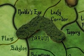
Forests - This is by far the worst part of the map. A jpeg of ferns. Two choices here then, add more mountains and I would suggest this or redraw them. You had an effect from GIMPS brushes on the first island map that you used to simulate the forests, that would work here.
ManB, I know it looks a lot but it really is not. Most of it is just tweaking what you already know.
I'm thinking of spicing up the geography a little bit.
For instance, I could make the top-left bit nice and snowy, then have some rocky areas, some grassy areas, badlands etc. It wouldn't look hyper-realistic in geographical terms, but I think it'll play up the fantasy theme of the map (and the GCCM criteria) a little more. And furthermore, it'll make a more interesting way of distinguishing the bonuses.
I like green for sure, however you are going to need to keep an eye on the color blind test since green in a part of the most common type of color blindness.
This update doesn't show everything I want to update right now, but it'll do to be going on with.
Brief summary of changes: All borders have been refined and should hopefully appear more uniform now. Water basically smoothed over. Mountains rounded off and shaded differently. Different look for forests - I'm not happy with these...will have another look later.
ManBungalow wrote:...Different look for forests - I'm not happy with these...will have another look later.
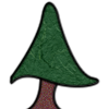
Have you tried using real trees? I made this in a few minutes with a screen capture from the birds-eye view of bing maps. Kind of reminds me of those tilt-shift videos. A satellite view might also work, or It might look better if you lined it up with the edge of a forest.
The trees in previous versions of this map were actually a composite of a birds-eye image of a real forest, like you're saying. I think the scale was a little off though.
EDIT: the bonus values shown in the legend of the current image are incorrect (see the previous page of this thread for correct values). will change this in the next update.
A drawn tree wouldn't look bad either, something generally uniform but with slightly different shades of green for the color of the tree, Something like this maybe:


