[phpBB Debug] PHP Warning: in file [ROOT]/viewtopic.php on line 1091: Undefined array key 0 [phpBB Debug] PHP Warning: in file [ROOT]/viewtopic.php on line 1091: Trying to access array offset on null [phpBB Debug] PHP Warning: in file [ROOT]/viewtopic.php on line 1098: Undefined array key 0 [phpBB Debug] PHP Warning: in file [ROOT]/viewtopic.php on line 1098: Trying to access array offset on null [phpBB Debug] PHP Warning: in file [ROOT]/viewtopic.php on line 1098: Undefined array key 0 [phpBB Debug] PHP Warning: in file [ROOT]/viewtopic.php on line 1098: Trying to access array offset on null The Discworld Map.. - Page 2 - Conquer Club
The above is way badass... but comon guys.. lets just make our own maps instead of going after old maps to get medals. If you got the skills... make your own map, unless our maps have a serious problem and are un-playable because of some old graphic glitch... leave em alone.
grifftron wrote:The above is way badass... but comon guys.. lets just make our own maps instead of going after old maps to get medals. If you got the skills... make your own map, unless our maps have a serious problem and are un-playable because of some old graphic glitch... leave em alone.
-griff
+1
fac vitam incredibilem memento vivere Knowledge Weighs Nothing, Carry All You Can
grifftron wrote:The above is way badass... but comon guys.. lets just make our own maps instead of going after old maps to get medals. If you got the skills... make your own map, unless our maps have a serious problem and are un-playable because of some old graphic glitch... leave em alone.
grifftron wrote:The above is way badass... but comon guys.. lets just make our own maps instead of going after old maps to get medals. If you got the skills... make your own map, unless our maps have a serious problem and are un-playable because of some old graphic glitch... leave em alone.
-griff
+1
+2
-3 bitches.
I highly doubt ManB is doing this for a medal. I think it's more likely he realizes what a good map this is to play on, but it sucks graphics wise. You know, like North America did, and that's why they revamped it.
So what if he chooses to spend his time making a map with fine gameplay better? It's his choice, not yours. People are harping about how the aesthetic of this website is very 1996 still, so why don't we focus on the maps that look like they were made back then and correct them so they look nice?
I didn't like also the revamp of NA map. True, that the aesthetic of the website is very 1996. But new maps come, and they will look more modern. But if you feel more nostalgic than you can play this old maps.
We have many maps, and not every map should be equal. Game play is different, image is different, style is different, why should we have the same "modern" aesthetics. It should be more variate. In 3 years, you'll say the same of the new maps, and you'll be revamping all the maps.
Why start with this map then? Why not start with the maps that actually look like crap on this site... I can name at least 10 that should be revamped before this one... some made within the last couple years! Do those first.
I don't think a revamp is vital. It wouldn't hurt, however. I STRONGLY oppose the "example" graphic. It's a beautiful PICTURE, but a crummy map. MUCH more contrast needed for my old eyes.
Please remember, the purpose of a CC map should be first and foremost to be a CLEAR DEPICTION OF THE GAME IN PROGRESS. Looking "stylish" is a DISTANT secondary concern.
Currently Running Tourneys: -none- Tourney Winner: "You're Eliminated" III; Keep It Simple Quads - Team Generation One
grifftron wrote:The above is way badass... but comon guys.. lets just make our own maps instead of going after old maps to get medals. If you got the skills... make your own map, unless our maps have a serious problem and are un-playable because of some old graphic glitch... leave em alone.
-griff
+1
+2
-3 bitches.
I highly doubt ManB is doing this for a medal. I think it's more likely he realizes what a good map this is to play on, but it sucks graphics wise. You know, like North America did, and that's why they revamped it.
So what if he chooses to spend his time making a map with fine gameplay better? It's his choice, not yours. People are harping about how the aesthetic of this website is very 1996 still, so why don't we focus on the maps that look like they were made back then and correct them so they look nice?
Lets revamp the site to not look 1996, then we can look at the maps.
fac vitam incredibilem memento vivere Knowledge Weighs Nothing, Carry All You Can
grifftron wrote:Why start with this map then? Why not start with the maps that actually look like crap on this site... I can name at least 10 that should be revamped before this one... some made within the last couple years! Do those first.
Thanks
-griff
Go ahead and propose some revamps. Joe and his staff probably wouldn't be opposed to it if the graphics were stale and needed a refresh.
In no particular order... and I am sure I missed some.
These are just maps I think would need revamp before DISC world... and just the ones I think people enjoy playing on... haven't even mentioned the bad looking maps that I don't think make good maps at all.
Just goes to show how subjective this kind of thing is.
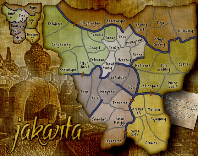
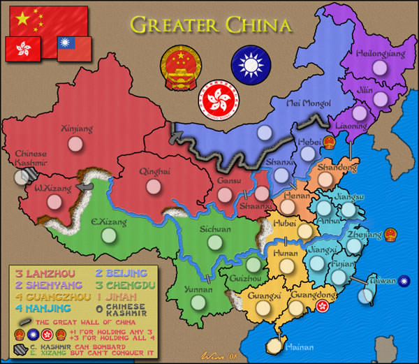
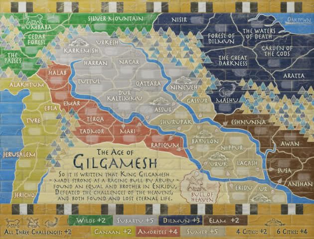
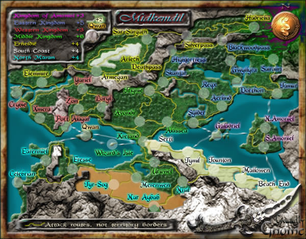
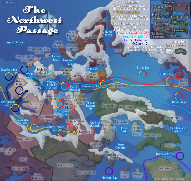
3/4 of the maps on Griff's list are maps I really like the look of. Midkemdil is positively beautiful, all those bright colours, like a walk through a botanical garden. Jakarta is very nice. Northwest Passage is one of my all-time favourites. Greater China is excellent. None of the others are particularly awful. Gilgamesh looks ancient, but it is supposed to -- that's the whole point.
If we wanted to slam maps, I could provide my own hate list. (OH IT"S SO DAMN TEMPTING, BUT I WON'T) Really it would be an unproductive exercise. Graphics are so incredibly subjective. You obviously hate some things that I like, and vice versa. Pick 10 people and get 10 different lists, I'm sure. Okay I just can't help saying something about those disgusting First Nations maps... all those multiple shades of brown look like feces and vomit swirled together.
The question here is not whether Discworld is the worst map on the site, but whether a person who has stepped forward and volunteered to improve it should be allowed to try. And I believe he should, not because the map is particularly in need of it, but because in a volunteer situation one has to give the volunteers a great deal of latitude in where they want to spend their energy.
“Life is a shipwreck, but we must not forget to sing in the lifeboats.” ― Voltaire
Wow, there is nothing wrong with most of those maps posted by grifftron. Some of them just aren't eye candy, but at the same time well done.
This is an ugly map. Bevel and Emboss is never a good combination.
There are a few others like this.
Oh and Beta map Philadelphia... I absolutely hate it. Cannot read it and won't play it. I mean, most of the maps done by that artist are great, but that one is hideous imo and it's part of the so called "new and better." Where do you start with something like that, when taste is so subjective?
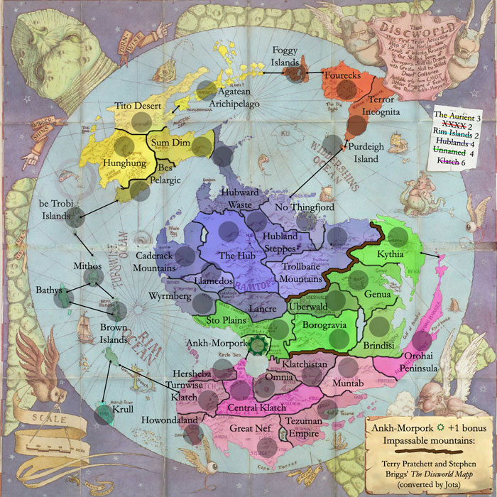
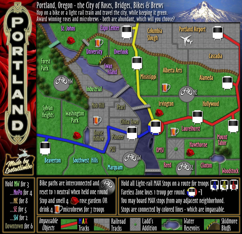
BTW, I like Manbungalow's Discworld. Looks nice.
00:33:53 ‹riskllama› will her and i ever hook up, LLT??? 00:34:09 ‹LiveLoveTeach› You and Shannon? 00:34:20 ‹LiveLoveTeach› Bahahahahahaha 00:34:22 ‹LiveLoveTeach› I doubt it 00:34:30 ‹LiveLoveTeach› I don't think she's into farm animals
OK ok... maybe I shouldn't of brought up the maps I thought needed revamp over disc world because that is kinda irrelevant.
What I should of went with is, map artists go through weeks and weeks of work onto their maps, and those that have done it before realize that the process can take up to a year if not longer. Is it fair to have all of that work go to waste just to be replaced by another revamped version of their map? UNLESS it is unplayable for some graphic reason or one cannot read the old passed writing on the map? Ill leave you all with that thought because I don't honestly care if you revamp this map or not, I just like stating my opinion and that is all.
I tend to agree with you. It seems a bit harsh to throw away someone's hard work just because tastes have changed. I would rather see the site implement a "skins" system on maps so that different versions of graphics could be used by different players on the same map. This could allow old versions and new versions to coexist, as well as specialized ones (more colour-blind friendly, perhaps?) or extra sizes.
ender516 wrote:I tend to agree with you. It seems a bit harsh to throw away someone's hard work just because tastes have changed. I would rather see the site implement a "skins" system on maps so that different versions of graphics could be used by different players on the same map. This could allow old versions and new versions to coexist, as well as specialized ones (more colour-blind friendly, perhaps?) or extra sizes.
i would like a skins system for the entire site, like what PokerStars has.
I think you need to capture more of the spirit of Terry Pratchett's writings and perhaps have a few "magical" links from Ahnk to other parts of the map - and perhaps the linkages across the seas and some other parts of the map carry a -1 or more "bonus"
Funny, Wisse (developer of Greater China) stopped in live chat just now to see if we thought he should revamp his map. I said yes, but he doesn't see an issue with his graphics.
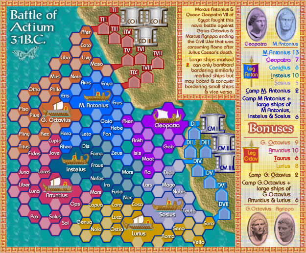
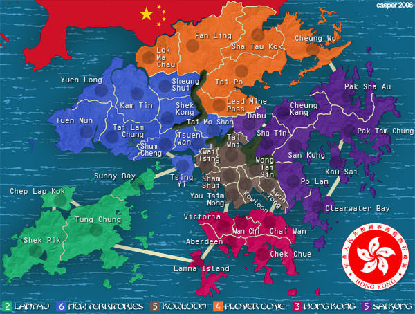
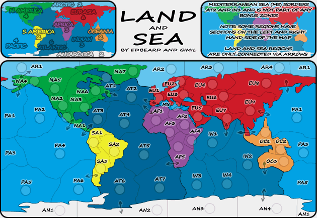
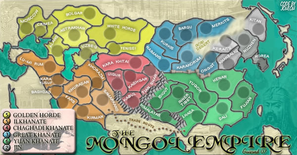
I agree with griff that some of the newer maps are ugly but that's subjective. What I like to see revamped are ones that are flat or hard to follow because of the gfx choices made. Of the ones Griff posted, I would say the ones needing revamp are Actium (hard to follow), Greater China (BORING), Hong Kong (1996 era graphics), and Land and Sea (designed by a first year art student). Some of the others you may not like but at least they have graphics instead of flat looking colors thrown onto a map.
I'm fine with CMC being removed. The gfx are nice, gameplay sucks though.
I voted yes. From an administrative standpoint, holding work for the sake of work is backwards thinking. If we can assert ourselves to aim to provide our users with a more top-notch experience in every aspect of the site (yes, yes, things haven't been perfect, I know), then I believe that we certainly should! The perfect solution would be ender's skins idea, but that is something that would take quite a bit of time to setup and complete.