Doodle Earth [Quenched]
Moderator: Cartographers
Forum rules
Please read the Community Guidelines before posting.
Please read the Community Guidelines before posting.
-
wiggybowler
- Posts: 1414
- Joined: Wed Feb 21, 2007 9:40 pm
-
max is gr8

- Posts: 3720
- Joined: Sat Jan 21, 2006 6:44 am
- Location: In a big ball of light sent from the future


-
Evil DIMwit

- Posts: 1616
- Joined: Thu Mar 22, 2007 1:47 pm
- Gender: Male
- Location: Philadelphia, NJ

I saw the methods for adding more countries, they weren't bad and would stick with the theme of 'Doodle Earth' which I also now like more then World 0.5.
Example From Way Back:

I think sometimes with all our debate, editing, and voting a lot of us loose sight of what the creator wants. The way I see the map now it could work. He knows a lot of people like it the way it is, he knows just about as many wouldn't mind the higher territory versions so I think it's really up to him.
(Besides, I've ignored poll results before.)
So anyway, if you want to add more go for it, if you like that everyone said stay with 18 that's cool too.
Example From Way Back:
I think sometimes with all our debate, editing, and voting a lot of us loose sight of what the creator wants. The way I see the map now it could work. He knows a lot of people like it the way it is, he knows just about as many wouldn't mind the higher territory versions so I think it's really up to him.
(Besides, I've ignored poll results before.)
So anyway, if you want to add more go for it, if you like that everyone said stay with 18 that's cool too.
Warning: You may be reading a really old topic.


-
DiM

- Posts: 10415
- Joined: Wed Feb 14, 2007 6:20 pm
- Gender: Male
- Location: making maps for scooby snacks
Spockers wrote:This map is a blight on conquer club.
It looks pathetic. and will look even worse when up against all the other better looking maps.
There should be a rule against "novelty" maps such as this.
the whole kiddy theme is stupid and irritating.
nobody is forcing you to play it. so go whine somewhere else.
“In the beginning God said, the four-dimensional divergence of an antisymmetric, second rank tensor equals zero, and there was light, and it was good. And on the seventh day he rested.”- Michio Kaku
-
DiM
- Posts: 10415
- Joined: Wed Feb 14, 2007 6:20 pm
- Gender: Male
- Location: making maps for scooby snacks
Spockers wrote:f*ck off with the whole telling me not to whine thing.
The whole foundry process is about giving your opinion about maps.
Thats the whole problem with this map. Only the people who like it and giving positive opinions are being listened to.
Thats why this whole thread is such a joke.
no need to curse.
anyway the whole foundry process is about giving feedback. do you know what feedback is? google it.
or google constructive criticism.
coming here and saying this is crap i won't play is simply stupid. or retarded or moronic, or you.
if you don't like the map, state your concerns suggest some improvements, try to make it better. ofcourse this requires some intelligence. prove me wrong and try being constructive. or just shut up and go away. i have nothing personal against you, but i hate people that come and say: "it's crap i won't play" without reading the thread, without trying to show they do have more intelligence than a retarded amoeba.
“In the beginning God said, the four-dimensional divergence of an antisymmetric, second rank tensor equals zero, and there was light, and it was good. And on the seventh day he rested.”- Michio Kaku

-
DiM
- Posts: 10415
- Joined: Wed Feb 14, 2007 6:20 pm
- Gender: Male
- Location: making maps for scooby snacks
Spockers wrote:Try reading my posts properly next time.
It looks pathetic, it has an extreme novelty factory and not much effort has gone into it at all.
They only way to improve this would be to start again.
For the sake of assuring the quality of future maps this should not go up looking as it does.
ok i'll read your post again:
Spockers wrote:This map is a blight on conquer club.
this is an insult. no constructive criticism here.
Spockers wrote:It looks pathetic. and will look even worse when up against all the other better looking maps.
an insult again. 2 in a row.
Spockers wrote:There should be a rule against "novelty" maps such as this.
could it be another insult? yes. and we have a 3 insult combo. damage 99 intelligence 0.
Spockers wrote:the whole kiddy theme is stupid and irritating.
and when we thought it can't get any worse. here comes insult number 4. a new record i belive. 4 phrases 4 insults. 100% success rate.
so i analyzed your post. care to argue and prove me wrong? i see only insults and absolutely nothing helpful. maybe i'm the stupid one and i can't see the genius behind your intricate posting style. maybe i should read between the lines. or maybe i'm simply right.
“In the beginning God said, the four-dimensional divergence of an antisymmetric, second rank tensor equals zero, and there was light, and it was good. And on the seventh day he rested.”- Michio Kaku
You really summed up the whole mindset of this thread.
If the the comment isn't pro-small world, then it must be an insult.
Good one.
I told you why the map isn't good, I told you why it shouldn't be on conquer club.
If you choose to be insulted by that, then it's your problem.
I stand up so much against this map, because i fear for the drop in the quality of future maps that is to come if this gets through.
-
max is gr8
- Posts: 3720
- Joined: Sat Jan 21, 2006 6:44 am
- Location: In a big ball of light sent from the future
-
DiM
- Posts: 10415
- Joined: Wed Feb 14, 2007 6:20 pm
- Gender: Male
- Location: making maps for scooby snacks
Spockers wrote:You really summed up the whole mindset of this thread.
If the the comment isn't pro-small world, then it must be an insult.
Good one.
I told you why the map isn't good, I told you why it shouldn't be on conquer club.
If you choose to be insulted by that, then it's your problem.
I stand up so much against this map, because i fear for the drop in the quality of future maps that is to come if this gets through.
"irritating", "stupid", "blight on CC", "pathetic", "rule against maps as this"
all sound like insults to me.
here's how you should rephrase your post.
i'm not too fond of this map. mainly because of the kiddy theme. while some people seem to enjoy it i don't. because CC is supposed to be about wars and conquering not about coloured crayons and 7 year old kids. while the map is really well done technicaly speaking, i think the artistic theme could have an adverse reaction regarding future maps. others might copy the idea and we could have an abundance of kiddy style maps, which really disturbs me.
now one more thing, tell me what exactly don't you like about the graphics. it has a kiddy theme and technically speaking it is very well realized, i don't see any technical flaws like pixelization or over blurring or stuff like this. so i don't see how it could affect future maps. yes if a map with real technical flaws gets quenched it is indeed a problem, but this map has no technical flaws.
“In the beginning God said, the four-dimensional divergence of an antisymmetric, second rank tensor equals zero, and there was light, and it was good. And on the seventh day he rested.”- Michio Kaku
-
Ruben Cassar

- Posts: 2160
- Joined: Thu Nov 16, 2006 6:04 am
- Gender: Male
- Location: Civitas Invicta, Melita, Evropa
Okay to be honest I don't care if this map is going to get quenched or not. I just don't like it and I will never play it. I don't mean to be disrespectful or anything by these statements. I am just expressing my opinion.
But seriously 18 territories? Come on...36 is the minimum number to get a decent map that is playable for 6 player games.
Also after what we have put through qwert's Eastern Front map (for a couple of trivial graphic updates) which technically is a brilliant visual job when compared to this do you think that it would be fair for map makers to see this quenched and maps like Eastern Front, Benelux and Netherlands being continuously put off for minor stuff?
It obviously does not work playability wise and neither does it make the grade visually. Isn't this what the whole 'foundry process' should be about? To get the best looking and most playable maps on CC? And come on we already have 2 world maps. Honestly I cannot believe it has got this far.


thats great you translated it to some verbose mumbo-jumbo. I'd rather just get to the point.
I'm not talking about technical flaws. As you can see I have created no maps. I have no eye for graphical design... that will be picked up by others so does not really concern me.
The map is, firstly, on an extremely low standard graphically. Compare it to some of the others.. the last few most recently published for example are far better.
If a map like this gets through, it will set a lower standard for future maps.
The kiddy theme, as a separate issue, is just silly. no other maps have such themes, novelty maps such as this are really just embarrassing and i hope such maps will not happen again in the future
Last edited by Spockers on Sat Apr 21, 2007 8:13 am, edited 1 time in total.
While Spockers is rather blunt with his comments, I tend to agree with some of his points. I'm not sure how you're supposed to fairly compare this map to any other in development. For example, Eastern Front has been subject to some intense scrutiny as any map does in the final stages of development. Yet, in it's current state Eastern Front clearly surpases any sort of graphical and gameplay achievement this map could ever hope to accomplish.
It's just my opinion, but I still feel there are some serious issues with the map.
It's just my opinion, but I still feel there are some serious issues with the map.
-
DiM
- Posts: 10415
- Joined: Wed Feb 14, 2007 6:20 pm
- Gender: Male
- Location: making maps for scooby snacks
this post is for ruben spockers and keyogi.
while i'm not a fan of this map, and probably i'll play it just once, i do think the graphics are very good.
i'm talking strictly about technical issues here. DIMwit has a theme and the graphics do a perfect job to describe that theme.
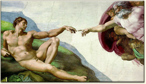
it's like comparing dali to michelangelo. can you say one is crap and one is genius? NO. they're both geniuses but with different styles. dali can afford do do a wobbly clock because that's the way his theme goes, but michelangelo can't afford to do a crooked arm for adam because that's not the way his theme goes. both are flawless pieces of art. now let's say DIMwit is dali and qwert is michelangelo ( ). DIMwit can afford to do wobbly borders because that's how a kid would draw but qwert must have perfectly shaped ones because that's how a realistic battlefield map would be.
dali:

michelangelo:
while i'm not a fan of this map, and probably i'll play it just once, i do think the graphics are very good.
i'm talking strictly about technical issues here. DIMwit has a theme and the graphics do a perfect job to describe that theme.
it's like comparing dali to michelangelo. can you say one is crap and one is genius? NO. they're both geniuses but with different styles. dali can afford do do a wobbly clock because that's the way his theme goes, but michelangelo can't afford to do a crooked arm for adam because that's not the way his theme goes. both are flawless pieces of art. now let's say DIMwit is dali and qwert is michelangelo (
dali:
michelangelo:
“In the beginning God said, the four-dimensional divergence of an antisymmetric, second rank tensor equals zero, and there was light, and it was good. And on the seventh day he rested.”- Michio Kaku