Vvardenfell Map [Abandoned]
Moderator: Cartographers
Forum rules
Please read the Community Guidelines before posting.
Please read the Community Guidelines before posting.
-
CaptainPlanet
- Posts: 132
- Joined: Wed Feb 14, 2007 6:21 pm
- Location: Bankhead

-
CaptainPlanet
- Posts: 132
- Joined: Wed Feb 14, 2007 6:21 pm
- Location: Bankhead

-
CaptainPlanet
- Posts: 132
- Joined: Wed Feb 14, 2007 6:21 pm
- Location: Bankhead

-
freezie

- Posts: 3901
- Joined: Fri Apr 06, 2007 12:18 pm
- Gender: Male
- Location: Somewhere between here and there.
I think though some colors are too similar. I tried for a few minutes to figure out everything.
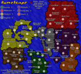
I also think some bonuses are too small. Like ascadian isles ( not too sure if I got the right ones ) have 4 borders, 7 territories, and +2?
West cash, 3 borders, 6 territories. Only +2?
I think ashlands and grazelands bonuses should be switched around.
Would wait for others oppinions on those before changing them, but that's my oppinion.
Last edited by freezie on Sat Apr 14, 2007 3:05 pm, edited 1 time in total.

-
CaptainPlanet
- Posts: 132
- Joined: Wed Feb 14, 2007 6:21 pm
- Location: Bankhead
-
CaptainPlanet
- Posts: 132
- Joined: Wed Feb 14, 2007 6:21 pm
- Location: Bankhead


-
CaptainPlanet
- Posts: 132
- Joined: Wed Feb 14, 2007 6:21 pm
- Location: Bankhead
Gilligan wrote:Why is the bonus right in the middle of the map? It should be somewhere towards one of those empty corners.
I put it in the middle because I didn't feel like making a box in a corner and I wanted to see how it looked in the middle. The middle looked bad being empty, so I thought I would make it look better by putting the legend there
Stopper wrote:I voted Kid_A. I don't why they have the Ku Klux Klan in their avatar, but I like the name.

-
PimpCaneYoAss

- Posts: 185
- Joined: Fri Feb 16, 2007 3:04 pm
- Location: Connecticut
-
PimpCaneYoAss
- Posts: 185
- Joined: Fri Feb 16, 2007 3:04 pm
- Location: Connecticut
-
CaptainPlanet
- Posts: 132
- Joined: Wed Feb 14, 2007 6:21 pm
- Location: Bankhead
-
PimpCaneYoAss
- Posts: 185
- Joined: Fri Feb 16, 2007 3:04 pm
- Location: Connecticut
-
CaptainPlanet
- Posts: 132
- Joined: Wed Feb 14, 2007 6:21 pm
- Location: Bankhead
-
CaptainPlanet
- Posts: 132
- Joined: Wed Feb 14, 2007 6:21 pm
- Location: Bankhead
I've been really busy lately, so I haven't gotten much done. I added a compass make the map look better. Let me know what you think:

I also want to get some feedback on the mountains. Any ideas on how to make them better?
I also want to get some feedback on the mountains. Any ideas on how to make them better?
Stopper wrote:I voted Kid_A. I don't why they have the Ku Klux Klan in their avatar, but I like the name.
Few things I can think of:
- The borders are still too thick.
- It's ugly to have this text with information about the bonuses in the middle, in my opinion.
- The picture on the left does simply not work, at least with this background. Perhaps it is because how you pasted it on.
The graphics are not good, the last picture still looks like just a draft. You have a long way to go.
-
PimpCaneYoAss
- Posts: 185
- Joined: Fri Feb 16, 2007 3:04 pm
- Location: Connecticut