Demons & Angels [7/2] Vacation please.

Have an idea for a map? Discuss ideas and concepts here.

Moderator: Cartographers

Forum rules
Please read the Community Guidelines before posting.
User avatar
koontz1973
Posts: 6960
Joined: Thu Jan 01, 2009 10:57 am

Demons & Angels [7/2] Vacation please.

Post by koontz1973 »

Map Name:Devils and Angels
Mapmaker(s):koontz1973
Number of Territories:120+
Special Features:None at the moment
What Makes This Map Worthy of Being Made:My first foray into fantasy map making and original. ;)
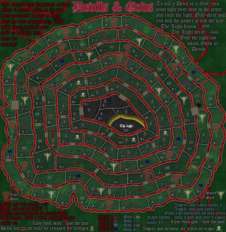
Map Image:
[bigimg]http://i1050.photobucket.com/albums/s410/koontz1973/devilsandangels-5.jpg[/bigimg]
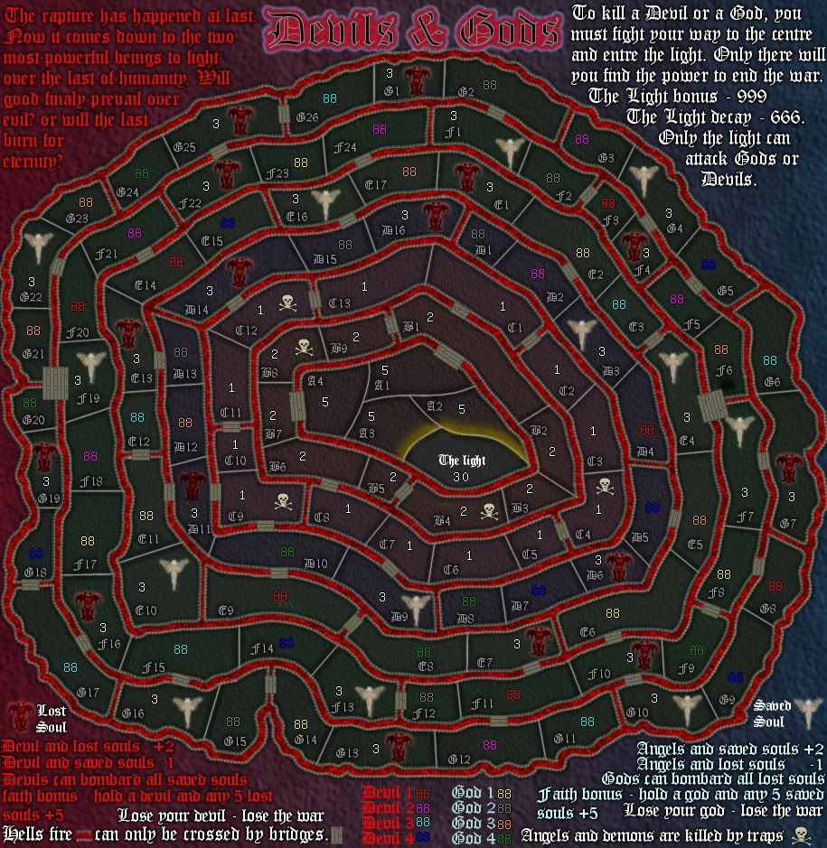
[spoiler=past images]big map
[bigimg]http://i1050.photobucket.com/albums/s410/koontz1973/devilsandangels-3.jpg[/bigimg]
http://i1050.photobucket.com/albums/s410/koontz1973/devilsandangels-1.jpg
http://i1050.photobucket.com/albums/s410/koontz1973/devilsandangels.jpg
http://img651.imageshack.us/img651/4362/devilsandangels.jpg[/spoiler]

[spoiler=gameplay notes]54 starting territs and 8 special territs.
54 starting neutral.
2 players - 27 territs - 9 deployable troops
3 players - 18 territs - 6 deployable troops
4 players - 13 territs - 4 deployable troops
5 players - 10 territs - 3 deployable troops
6 players - 9 territs - 3 deployable troops
7 players - 7 territs - 3 deployable troops
8 players - 6 territs - 3 deployable troops
For the smaller games that are played, a max on reinforcements will be set at a max of ten.

Each player gets one of a devil or god. this territ is set as a starting position with a max of one. this territ can not attack anything but can bombard either saved or lost souls on the playing board. The kill the devil or god, a player must fight to the light territ at the centre. this territ gives a huge bonus but also a huge decay. Once held, it is possible to end the game so it needs a huge neutral to start with.[/spoiler]

Thoughts?
Last edited by koontz1973 on Mon Feb 27, 2012 11:18 am, edited 8 times in total.
Image
sannemanrobinson
Posts: 255
Joined: Mon Dec 20, 2010 6:35 am
Gender: Male

Re: Devils and Angels [29/1]

Post by sannemanrobinson »

The title sounds like Angels and Demons ;).
User avatar
natty dread
Posts: 12877
Joined: Fri Feb 08, 2008 8:58 pm
Location: just plain fucked

Re: Devils and Angels [29/1]

Post by natty dread »

Well, the theme is interesting... the graphics are, and I am sorry to say this... awful. I'd think you could do a bit better by now...

The general style of the map just looks like a bunch of christmas lights and pixelation. It's like all of the elements of the map are just clashing against each other... I know it's just an early draft, but I really think you could do a whole lot better if you just put some time into it.
Image
User avatar
koontz1973
Posts: 6960
Joined: Thu Jan 01, 2009 10:57 am

Re: Devils and Angels [29/1]

Post by koontz1973 »

In what sense clashing? I can understand the title is a little garish and it will change as I need to make it smaller. In the way of pixelation, I do not see that as big a problem as I cannot see where it looks really bad (apart from the light territ). A small refinement of areas yes, but no way the overall look is pixelated. The icons for the lost and saved souls need to change as these ones are copyrighted. I tried to come up with a way to show them but it kept coming out cartoony which I do not want. Any ideas?

I love the Christmas lights comment, maybe we can get this as the sites new xmas map. :P
Image
User avatar
thenobodies80
Posts: 5400
Joined: Wed Sep 05, 2007 4:30 am
Gender: Male
Location: Milan

Re: Devils and Angels [29/1]

Post by thenobodies80 »

I thought about Escher when I read the title

http://www.hnorthrop.com/escher.html
User avatar
natty dread
Posts: 12877
Joined: Fri Feb 08, 2008 8:58 pm
Location: just plain fucked

Re: Devils and Angels [29/1]

Post by natty dread »

No, seriously... take this the best possible way... but I think you can do a LOT better on the graphics.

The graphics are just all around garish. The elements on the map don't fit together at all. You have the red-blue background with a knobbly textured look, then you have the photorealistic icons that look so pasted on it hurts. On top of that, you have region borders that looks like whipped cream from a can that went seriously wrong at some point... and then, the pixelation.

There definitely is no way to make pixelation look good, unless it's a consistent thematic effect on your map, kind of like on Conquer man. Here... no.

The dissolve effect on the devil and the angel? Scrap that. There's no way you're going to make it look good. It looks like pixel porridge. The "passable" parts of the region borders... that doesn't work either. Look, I know it's fun to experiment, and also important - without experimentation you can't develop as a graphician. But this is one experiment that went horribly wrong. Why not just cut holes in them instead of... whatever that is you have now.


Now, I realize a lot of this may sound overly harsh and I truly apologize for it. I just think, someone like you who already has one map in beta and two others on their way there, you should be well capable of creating much better quality of work. I'm only saying this because I know you have the potential, and I want to see that potential realized. All the more so since I think, thematically, this map could work and you could create an interesting map out of this.

I also realize this is just a first draft, but I believe in pointing out problems early.
Image
User avatar
koontz1973
Posts: 6960
Joined: Thu Jan 01, 2009 10:57 am

Re: Devils and Angels [29/1]

Post by koontz1973 »

natty_dread wrote:No, seriously... take this the best possible way... but I think you can do a LOT better on the graphics.

The graphics are just all around garish. The elements on the map don't fit together at all. You have the red-blue background with a knobbly textured look, then you have the photorealistic icons that look so pasted on it hurts. On top of that, you have region borders that looks like whipped cream from a can that went seriously wrong at some point... and then, the pixelation.

There definitely is no way to make pixelation look good, unless it's a consistent thematic effect on your map, kind of like on Conquer man. Here... no.

The dissolve effect on the devil and the angel? Scrap that. There's no way you're going to make it look good. It looks like pixel porridge. The "passable" parts of the region borders... that doesn't work either. Look, I know it's fun to experiment, and also important - without experimentation you can't develop as a graphician. But this is one experiment that went horribly wrong. Why not just cut holes in them instead of... whatever that is you have now.


Now, I realize a lot of this may sound overly harsh and I truly apologize for it. I just think, someone like you who already has one map in beta and two others on their way there, you should be well capable of creating much better quality of work. I'm only saying this because I know you have the potential, and I want to see that potential realized. All the more so since I think, thematically, this map could work and you could create an interesting map out of this.

I also realize this is just a first draft, but I believe in pointing out problems early.

Some good points.
I know the colours are garish, I wanted that as a look. God knows what a battleground between the devils and gods minions would look like so some ley way here can be granted. For the colours, I chose red and blue as they naturally fit together but these can be refined. Any suggestions? The texture is there by design (as above) but any suggestions will be looked at. The angels and devil at the top I kind of like so will keep them for now. They are just pencil drawing on different layer modes to give the difference. The walls, I mean, how do you draw something that does not exist. I understand the whipped cream reference even though the colour is bloody weird for cream but I wanted an organic feel to it. No straight lines, sort of like an alien hive. Strange but familiar somehow. The blown out parts of the walls are just a dissolve filter and this needs to change. The icons are pasted effects. I said that previous post and asked for solutions.

I do see lots of problems with the current draft (and am refining it as we speak) but as this is my biggest map to date, it is always nice to get fresh eyes on the problems early. And with the GP, things like the wall layout may or will change, territs may or will change so I see no real reason to do lots of work this early and have it thrown away later.
Image
User avatar
natty dread
Posts: 12877
Joined: Fri Feb 08, 2008 8:58 pm
Location: just plain fucked

Re: Devils and Angels [29/1]

Post by natty dread »

koontz1973 wrote:I know the colours are garish, I wanted that as a look.


Well, want something else...

koontz1973 wrote:God knows what a battleground between the devils and gods minions would look like so some ley way here can be granted.


Sure, but what that means is you get to use your imagination on the graphics... it doesn't mean you can use it as an excuse for sloppy work.

koontz1973 wrote:For the colours, I chose red and blue as they naturally fit together but these can be refined. Any suggestions?


Yes. Ditch the red and blue. Go for a dark, ominous background, like something from a heavy metal album cover. Give it a gothic feel, instead of the disco fever you have now... You already have gothic fonts, just make the rest of the map fit them.

For the background, maybe something like black/very dark grey marble?

koontz1973 wrote:The angels and devil at the top I kind of like so will keep them for now. They are just pencil drawing on different layer modes to give the difference.


Keep them, but ditch the pixelation. I believe you have a dissolve mode somewhere in there, scrap that. It's not really useful for anything, it just results in pixelation.

If you go for a dark background, you could have give the angel & devil a sort of glowy look, like they're drawn with thin, glowy lines. Like they're set with silver and gold maybe? Something like that... just throwing ideas here.

koontz1973 wrote:The walls, I mean, how do you draw something that does not exist. I understand the whipped cream reference even though the colour is bloody weird for cream but I wanted an organic feel to it. No straight lines, sort of like an alien hive. Strange but familiar somehow.


It's kind of like spoiled cream maybe?

Anyway... I get what you're going for, but maybe you could scrap the walls alltogether, and just have the regions as sort of cavities, maybe make them look like they're impressed on the background, if you know what I mean... sort of like the army circles on my yugoslavia map.

Or, if you don't like that idea, just do the walls, but go easier on the bevels and such... make them fit in the general theme of the map.

koontz1973 wrote:The icons are pasted effects. I said that previous post and asked for solutions.


Try drawing something yourself, and make it in consistent style with the rest of the map - as soon as you figure out what that style is, I mean. The icons are the least of the concerns for now, I think you should first get the rest of the map in order and then figure out how to fit the icons in them.
Image
User avatar
Nesoi
Posts: 13
Joined: Thu Dec 08, 2011 9:25 am

Re: Devils and Angels [29/1]

Post by Nesoi »

Now THIS is new and different! Very interesting!


Nesoi
User avatar
Gillipig
Posts: 3565
Joined: Fri Jan 09, 2009 1:24 pm

Re: Devils and Angels [29/1]

Post by Gillipig »

I like the theme but I can't seem to find the starting pos.!
AoG for President of the World!!
I promise he will put George W. Bush to shame!
User avatar
koontz1973
Posts: 6960
Joined: Thu Jan 01, 2009 10:57 am

Re: Devils and Angels [29/1]

Post by koontz1973 »

Gillipig wrote:I like the theme but I can't seem to find the starting pos.!

All the territs that have no neutral on them start.
Image
User avatar
koontz1973
Posts: 6960
Joined: Thu Jan 01, 2009 10:57 am

Re: Devils and Gods [3/2] V2

Post by koontz1973 »

Version 2
[bigimg]http://img651.imageshack.us/img651/4362/devilsandangels.jpg[/bigimg]

Changed the walls.
Added bridges.
Changed the GP some.
Title change - angels to gods.
Icons drawn. Lost souls completely. Saved souls using the basic shape of previous one.
Moved things around.
Image
User avatar
koontz1973
Posts: 6960
Joined: Thu Jan 01, 2009 10:57 am

Re: Devils and Gods [4/2] V3

Post by koontz1973 »

Got the legend finished and GP sorted.
[bigimg]http://i1050.photobucket.com/albums/s410/koontz1973/devilsandangels.jpg[/bigimg]
Image
User avatar
natty dread
Posts: 12877
Joined: Fri Feb 08, 2008 8:58 pm
Location: just plain fucked

Re: Devils and Gods [4/2] V3

Post by natty dread »

I'm sorry but the graphics still don't convince me. I'm glad you got rid of the really horrible pixelated parts, but the colour scheme and the overall look is still all wrong...

Try something else than this glowy, gaudy look. Scrap the red/blue gradient and go for a dark, ominous look. Subtle, not flashy.
Image
User avatar
koontz1973
Posts: 6960
Joined: Thu Jan 01, 2009 10:57 am

Re: Devils and Gods [4/2] V3

Post by koontz1973 »

natty_dread wrote:Try something else than this glowy, gaudy look. Scrap the red/blue gradient and go for a dark, ominous look. Subtle, not flashy.

The map is dark enough, the only light parts are the hells fire (will keep), text (will tone done) and the title (can tone done). The icons angels (need to be light) and devils (are dark enough).

As for the red/blue gradient, red is the devils colour and blue is seen as a colour of light (in a biblical sense). Tried it with white (what I originally went with) as this is universally seen as the colour of god but it come out more grey than white. I will make the two colours darker, but will keep them.
Image
User avatar
Extreme Ways
Posts: 1731
Joined: Sun Nov 19, 2006 10:02 am

Re: Devils and Gods [4/2] V3

Post by Extreme Ways »

I like the idea behind the map, but I can't look at it for about 20 secs straight... Just hurts my eyes, too dark in contrast with CC forum maybe.
TOFU, ex-REP, ex-VDLL, ex-KoRT.
User avatar
IcePack
Multi Hunter
Multi Hunter
Posts: 16847
Joined: Wed Aug 04, 2010 6:42 pm
Gender: Male
Location: California

Re: Devils and Gods [4/2] V3

Post by IcePack »

I'm sorry but I gotta agree with natty, the colors are pretty awful on the map. If your going with god and demons theme, why not use something like diff areas of hades, or battle it out in the fields of armeggedon style battle?

This is ok, but for such an open ended idea with many possibilities, i think it can be done better.

Also, there is some spelling to be corrected.

IcePack
Image

fac vitam incredibilem memento vivere
Knowledge Weighs Nothing, Carry All You Can
User avatar
koontz1973
Posts: 6960
Joined: Thu Jan 01, 2009 10:57 am

Re: Devils and Gods [4/2] V3

Post by koontz1973 »

The colours are changing as I find better combos (even the red/blue is gone :-$ ) and spelling will change as the legend changes. As for hades, I toyed with the idea of the old gods but found it to campy after the previous couple of years with the films that have been made. As for the darkness issue, I cannot see the problem, as we already have maps that are darker or as dark. But I will reduce the shiny effect and this should tone that problem down.
Image
User avatar
Victor Sullivan
Posts: 6010
Joined: Mon Feb 08, 2010 8:17 pm
Gender: Male
Location: Columbus, OH
Contact:

Re: Devils and Gods [4/2] V3

Post by Victor Sullivan »

Your map reminds me of Dante's Inferno. I wonder if you could incorporate his 9 circles of Hell:

Image

-Sully
[player]Beckytheblondie[/player]: "Don't give us the dispatch, give us a mustache ride."

Scaling back on my CC involvement...
User avatar
koontz1973
Posts: 6960
Joined: Thu Jan 01, 2009 10:57 am

Re: Devils and Gods [4/2] V3

Post by koontz1973 »

And that was the first plan. But getting the 9 levels would of required a larger map and did not want to go to large.

Another idea was using the vices and virtues as bonus regions. Lots of ideas to play around with here and they are open to all. This is only one concept out of many.
Image
User avatar
koontz1973
Posts: 6960
Joined: Thu Jan 01, 2009 10:57 am

Re: Devils and Gods [5/2] V4

Post by koontz1973 »

A more organic look with the colours.
Toned down colours/contrast so it should be easier to look at for more than a few seconds.
[bigimg]http://i1050.photobucket.com/albums/s410/koontz1973/devilsandangels-1.jpg[/bigimg]
Image
User avatar
natty dread
Posts: 12877
Joined: Fri Feb 08, 2008 8:58 pm
Location: just plain fucked

Re: Devils and Gods [5/2] V4

Post by natty dread »

Try dark brown instead of green. Green & red still clash too much.

Maybe give it something like a rock texture.
Image
User avatar
koontz1973
Posts: 6960
Joined: Thu Jan 01, 2009 10:57 am

Re: Devils and Gods [5/2] V4

Post by koontz1973 »

natty_dread wrote:Try dark brown instead of green. Green & red still clash too much.

Maybe give it something like a rock texture.

I like the green in the edges but will try the browns for the playing areas.
Image
User avatar
koontz1973
Posts: 6960
Joined: Thu Jan 01, 2009 10:57 am

Re: Demons & Angels [5/2] V5

Post by koontz1973 »

[bigimg]http://i1050.photobucket.com/albums/s410/koontz1973/devilsandangels-3.jpg[/bigimg]
Browns and new title. Demons and Angels fits better. Going to sort the legend out as parts conflict with each other.

EDIT: Text done as ViperOverLord suggested.
Image
User avatar
thenobodies80
Posts: 5400
Joined: Wed Sep 05, 2007 4:30 am
Gender: Male
Location: Milan

Re: Demons & Angels [5/2] V5

Post by thenobodies80 »

I don't get the light bonus/decay thing....it seems to me you have to kill 50 troops to have a bonus of 999 troops (not autodeploy) but at the start of the turn you'll lose 666 troops on that territory due the decay. First of all I don't think someone will put a big number of troops on it knowing that he will lose 666 of them at the start of a turn, even if he can deploy 999. Second point if I receive 999 there're plenty better way to use those troops than waste 3/4 of them the next turn, specially because in this case it doesn't matter since dacay brings you to 1 anyway.....is there something I miss apart have those numbers for the gimmick "666 - the number of the beast" thing? :?

About the supersize application can I ask you to postpone the application a bit till I have a clear idea of the map? O:)
The general idea reminds me the Dante's Inferno layout but with some differences.....really I need more time/less hurting graphics to look at it properly...is possible to have a simple gameplay layout with graphics reduced to the bone?
Btw the current graphics are a bit a pain, the red really hurts my eyes and the green background doesn't work very well. Also the font, it's a bit hard to read, gothic font are a good idea for your current theme, but when they are small or with a shadow/glow it becomes a pain to read the text easily.

I know you're at the draft stage, but I think it's better to point this out now than later. ;)

Nobodies
Post Reply

Return to “Melting Pot: Map Ideas”