natty_dread wrote:OH LOOK, here's a map that is chock-full of imaginary borders and territories, and I'm pretty sure those buttons are a product of fantasy.
Why don't you just bin this piece of crap shit.
Wheeee, look everyone. I'm giving feedback! Now you have to do everything I say or you're an asshole!
please don't quote him sully. i have him on ignore to avoid reading his megalomaniac insulting nonsense. quoting him does not help.
“In the beginning God said, the four-dimensional divergence of an antisymmetric, second rank tensor equals zero, and there was light, and it was good. And on the seventh day he rested.”- Michio Kaku
DiM wrote:please don't quote him sully. i have him on ignore to avoid reading his megalomaniac insulting nonsense. quoting him does not help.
Let's not be petty now, DiM. You and natty are both men of the Foundry. At least act like it in this forum and we might be able to get some kickass maps through this thing (faster).
-Sully
i'm not being petty, i got tired of his attitude so i've put him on ignore for a few months. it's working great if people don't quote him and it saves me a lot of time because i don't have to read or answer to his obnoxious posts. the ignore feature exists there for a reason and i'm glad i'm using it especially after reading that latest sample of idiocy that you quoted
now, let's forget about this subject. he's an insignificant internet troll and i don't want my thread jacked. PS: you haven't answered my xml pm
“In the beginning God said, the four-dimensional divergence of an antisymmetric, second rank tensor equals zero, and there was light, and it was good. And on the seventh day he rested.”- Michio Kaku
In my opinion is "Zorg" too dark, Suggestion, swap places with "Casper" then will both be more toned up, not that "Casper" need it, but "Zorg" almost disappears.
“In the beginning God said, the four-dimensional divergence of an antisymmetric, second rank tensor equals zero, and there was light, and it was good. And on the seventh day he rested.”- Michio Kaku
“In the beginning God said, the four-dimensional divergence of an antisymmetric, second rank tensor equals zero, and there was light, and it was good. And on the seventh day he rested.”- Michio Kaku
These textures are far far far to strong for me mate. I try to look at the map and by synapse start throbbing with mild pain. I can't look at it more that a few seconds at a time. do the textures needs to be so prominent?
gimil wrote:These textures are far far far to strong for me mate. I try to look at the map and by synapse start throbbing with mild pain. I can't look at it more that a few seconds at a time. do the textures needs to be so prominent?
kids like vibrant colours. their toys are bright red, blue or green, not earth brown or pastel cream.
“In the beginning God said, the four-dimensional divergence of an antisymmetric, second rank tensor equals zero, and there was light, and it was good. And on the seventh day he rested.”- Michio Kaku
gimil wrote:These textures are far far far to strong for me mate. I try to look at the map and by synapse start throbbing with mild pain. I can't look at it more that a few seconds at a time. do the textures needs to be so prominent?
kids like vibrant colours. their toys are bright red, blue or green, not earth brown or pastel cream.
Well gimil likes his eyes unstrained and his maps readable. I suspect that those heavy textures and vibrant colours will make for a difficult playing experience. Not to sound like a dick...but for anyone out there with epilepsy this map is one step down from a strobe light in the face.
No offence intended mate but I may have to palm the stamping of this one off to someone else. Seems people are interested enough in the idea but I really do find it uncomfortably unpleasant to look at for more than a few seconds. I don't really want to be giving myself sore heads just to review it...hope you understand
not all maps can have pastel colours and soothing textures. sometimes the theme calls for something else. it's a matter of taste afterall. but look at monsters. it has much stronger colours and there's a lot more clutter going on. or look at clandemonium which has very strong textures. or what about conquerman's colours? or midkemdil orgy of bevel and strong textures?
as natty pointed the theme asks for such textures and colours.
“In the beginning God said, the four-dimensional divergence of an antisymmetric, second rank tensor equals zero, and there was light, and it was good. And on the seventh day he rested.”- Michio Kaku
DiM wrote:not all maps can have pastel colours and soothing textures. sometimes the theme calls for something else. it's a matter of taste afterall. but look at monsters. it has much stronger colours and there's a lot more clutter going on. or look at clandemonium which has very strong textures. or what about conquerman's colours? or midkemdil orgy of bevel and strong textures?
as natty pointed the theme asks for such textures and colours.
Hey! I'm not telling you to change it...I am telling you it gives me a sore head (really it does) to look at. How can I review a map that I can't look at? Hence why I am being honest and letting you know that I will palm it off to someone that CAN look at it
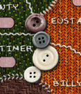
It would be good to somehow increase the contrast between the buttons and the background, to make them stand out a bit better. Right now they seem to kind of blend in when you look at the whole picture...
DiM wrote:not all maps can have pastel colours and soothing textures. sometimes the theme calls for something else. it's a matter of taste afterall. but look at monsters. it has much stronger colours and there's a lot more clutter going on. or look at clandemonium which has very strong textures. or what about conquerman's colours? or midkemdil orgy of bevel and strong textures?
as natty pointed the theme asks for such textures and colours.
Hey! I'm not telling you to change it...I am telling you it gives me a sore head (really it does) to look at. How can I review a map that I can't look at? Hence why I am being honest and letting you know that I will palm it off to someone that CAN look at it
yeah i understand, i was just explaining why the colours and textures were chosen to be like that.
“In the beginning God said, the four-dimensional divergence of an antisymmetric, second rank tensor equals zero, and there was light, and it was good. And on the seventh day he rested.”- Michio Kaku
natty_dread wrote:It would be good to somehow increase the contrast between the buttons and the background, to make them stand out a bit better. Right now they seem to kind of blend in when you look at the whole picture...
i don't know. i actually tried to make them blend to make the image look more realistic. i can surely make them pop out as much as you want but i doubt that would help the image. i mean if i add a neon green glow to them they'll be visible from a mile away (and gimil's throbbing veins will burst) but would that really help the map?
“In the beginning God said, the four-dimensional divergence of an antisymmetric, second rank tensor equals zero, and there was light, and it was good. And on the seventh day he rested.”- Michio Kaku
DiM wrote:i mean if i add a neon green glow to them they'll be visible from a mile away (and gimil's throbbing veins will burst) but would that really help the map?
Well no, it wouldn't, and obviously I'm not asking you to do anything like that. I'm talking about something subtle, barely noticeable, that will simply create a slightly higher contrast between the impassables & rest of the map.
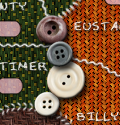
well something subtle that doesn't look out of place and adds more depth to the buttons is the shadow so i tweaked that and i think it looks ok.
now...................with tweaked shadow
“In the beginning God said, the four-dimensional divergence of an antisymmetric, second rank tensor equals zero, and there was light, and it was good. And on the seventh day he rested.”- Michio Kaku