Wow, lots of feedback. Thanks guys. It's nice that so many people are interested in this map.
So, I tweaked the bonus colours for now. I think they should now be distinct enough.
[bigimg]http://img854.imageshack.us/img854/940/londonn6.jpg[/bigimg]
So, let's see... what else?
- title font: I think it fits the map, but I'm not opposed to experimenting with other fonts. Not monotype corsiva though, that's an awful and overused font. I'd rather give pedro's suggestion a shot.
- big ben: it stays. I don't see any reason to remove it.
- renaming "north central" to "north"... hm, why not. Less text on the map, yeah. Same with northeast -> east, why not.
- minimap for bonuses: maybe... I'll see if I can make one that fits the map.
Classic cities: London [19.2.12] p27
Moderator: Cartographers
Forum rules
Please read the Community Guidelines before posting.
Please read the Community Guidelines before posting.
-
natty dread

- Posts: 12877
- Joined: Fri Feb 08, 2008 8:58 pm
- Location: just plain fucked
-
natty dread
- Posts: 12877
- Joined: Fri Feb 08, 2008 8:58 pm
- Location: just plain fucked
Re: London [6.9.11]
How's this title?
[bigimg]http://img14.imageshack.us/img14/940/londonn6.jpg[/bigimg]
Or this alternate:
[bigimg]http://img197.imageshack.us/img197/1170/londonn6a.jpg[/bigimg]
[bigimg]http://img14.imageshack.us/img14/940/londonn6.jpg[/bigimg]
Or this alternate:
[bigimg]http://img197.imageshack.us/img197/1170/londonn6a.jpg[/bigimg]


Re: London [6.9.11]
Menton should be Merton.
Sulton should be Sutton.
Sulton should be Sutton.
-
sannemanrobinson
- Posts: 255
- Joined: Mon Dec 20, 2010 6:35 am
- Gender: Male
Re: London [6.9.11]
The first title is too prominent and is not really an improvement. Smaller, more basic and more depth could work.
The second one has a kind of modern look. Something more exciting is to assemble the letters from landmarks. Like the O's could be an abstract London Eye.
The second one has a kind of modern look. Something more exciting is to assemble the letters from landmarks. Like the O's could be an abstract London Eye.
-
gimil

- Posts: 8599
- Joined: Sat Mar 03, 2007 12:42 pm
- Gender: Male
- Location: United Kingdom (Scotland)
Re: London [6.9.11]
Pedronicus wrote:If you want a proper London font - get the London Underground font
http://www.fonts101.com/fonts/view/Unca ... ondon.aspx
If anyone suggests anything different, get them to pm me and i'll gladly tell them to f*ck off all day long.
I think your wrong...the handwriting font I suggest would work much better for the overall theme of this map. In my opinion.
What do you know about map making, bitch?
Top Score:2403
natty_dread wrote:I was wrong
Top Score:2403
-
koontz1973

- Posts: 6960
- Joined: Thu Jan 01, 2009 10:57 am
Re: London [6.9.11]
As you are looking at the title, may I suggest something like this...

Not sure on the actual font but from a daily newspaper. Should look rather striking at the top.
If you do go with a hand writing font, england looks quite nice or shit happens is also good.
Not sure on the actual font but from a daily newspaper. Should look rather striking at the top.
If you do go with a hand writing font, england looks quite nice or shit happens is also good.

-
Victor Sullivan

- Posts: 6010
- Joined: Mon Feb 08, 2010 8:17 pm
- Gender: Male
- Location: Columbus, OH
- Contact:
Re: London [6.9.11]
gimil wrote:Pedronicus wrote:If you want a proper London font - get the London Underground font
http://www.fonts101.com/fonts/view/Unca ... ondon.aspx
If anyone suggests anything different, get them to pm me and i'll gladly tell them to f*ck off all day long.
I think your wrong...the handwriting font I suggest would work much better for the overall theme of this map. In my opinion.
Yeah, I agree, with Big Ben and the whole color scheme, I'm not sure a modern font like you have above works well.
On a side note:
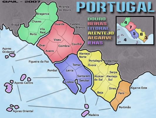
Herbas wrote:Maybe it's just me, but I prefer when bonuses are listed in a mini-map with numbers instead of a text list.
Just like this one:
[bigimg]http://maps.conquerclub.com/Brazil.S.jpg[/bigimg]
Or Portugal***
-Sully
[player]Beckytheblondie[/player]: "Don't give us the dispatch, give us a mustache ride."
Scaling back on my CC involvement...
Scaling back on my CC involvement...
-
gimil
- Posts: 8599
- Joined: Sat Mar 03, 2007 12:42 pm
- Gender: Male
- Location: United Kingdom (Scotland)
Re: London [6.9.11]
What do you know about map making, bitch?
Top Score:2403
natty_dread wrote:I was wrong
Top Score:2403
-
Pedronicus
- Posts: 2080
- Joined: Tue Jan 24, 2006 2:42 pm
- Gender: Male
- Location: Busy not shitting you....
Re: London [6.9.11]
gimil wrote:Pedronicus wrote:If you want a proper London font - get the London Underground font
http://www.fonts101.com/fonts/view/Unca ... ondon.aspx
If anyone suggests anything different, get them to pm me and i'll gladly tell them to f*ck off all day long.
I think your wrong...the handwriting font I suggest would work much better for the overall theme of this map. In my opinion.
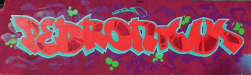
I'm a London graffiti artist, I know what font is 'London'
-
Pedronicus
- Posts: 2080
- Joined: Tue Jan 24, 2006 2:42 pm
- Gender: Male
- Location: Busy not shitting you....
Re: London [6.9.11]
Street name signs around London are cool, but they change from borough to borough.


whereas the London underground font is the same from one side of the city to the other. It is THE London wide font that doesn't change.
whereas the London underground font is the same from one side of the city to the other. It is THE London wide font that doesn't change.
-
gimil
- Posts: 8599
- Joined: Sat Mar 03, 2007 12:42 pm
- Gender: Male
- Location: United Kingdom (Scotland)
Re: London [6.9.11]
Pedronicus wrote:gimil wrote:Pedronicus wrote:If you want a proper London font - get the London Underground font
http://www.fonts101.com/fonts/view/Unca ... ondon.aspx
If anyone suggests anything different, get them to pm me and i'll gladly tell them to f*ck off all day long.
I think your wrong...the handwriting font I suggest would work much better for the overall theme of this map. In my opinion.
I'm a London graffiti artist, I know what font is 'London'
Fair point, but I promise you the metro font isn't going to work on this map. It is simply to different to what this map is aiming for, aesthetically speaking.
What do you know about map making, bitch?
Top Score:2403
natty_dread wrote:I was wrong
Top Score:2403
-
natty dread
- Posts: 12877
- Joined: Fri Feb 08, 2008 8:58 pm
- Location: just plain fucked
Re: London [6.9.11]
I don't know. I tried a handwritten title and IMO the metro font looks better.
[bigimg]http://img163.imageshack.us/img163/5459/londonn7.jpg[/bigimg]
[bigimg]http://img163.imageshack.us/img163/5459/londonn7.jpg[/bigimg]
Last edited by natty dread on Tue Sep 06, 2011 5:47 pm, edited 1 time in total.
-
gimil
- Posts: 8599
- Joined: Sat Mar 03, 2007 12:42 pm
- Gender: Male
- Location: United Kingdom (Scotland)
Re: London [6.9.11]
Could I at least see the handwritten font please?
What do you know about map making, bitch?
Top Score:2403
natty_dread wrote:I was wrong
Top Score:2403
-
natty dread
- Posts: 12877
- Joined: Fri Feb 08, 2008 8:58 pm
- Location: just plain fucked
-
Pedronicus
- Posts: 2080
- Joined: Tue Jan 24, 2006 2:42 pm
- Gender: Male
- Location: Busy not shitting you....
Re: London [6.9.11]
gimil wrote:Pedronicus wrote:gimil wrote:Pedronicus wrote:If you want a proper London font - get the London Underground font
http://www.fonts101.com/fonts/view/Unca ... ondon.aspx
If anyone suggests anything different, get them to pm me and i'll gladly tell them to f*ck off all day long.
I think your wrong...the handwriting font I suggest would work much better for the overall theme of this map. In my opinion.
I'm a London graffiti artist, I know what font is 'London'
Fair point, but I promise you the metro font isn't going to work on this map. It is simply to different to what this map is aiming for, aesthetically speaking.
This is what's wrong with handing too much power to a couple of players in the foundry. they have too much control over all maps that come out of the foundry and everything ends up coming out looking aesthetically pleasing to a handful of people. therefore everything end up looking the same.
gimil wrote:I promise you the metro font isn't going to work on this map
aka - by the time this map is finished I will of beaten the map maker into submission and this map will look like how I want it to.
I've got 3 words for you;
f*ck you gimil
-
gimil
- Posts: 8599
- Joined: Sat Mar 03, 2007 12:42 pm
- Gender: Male
- Location: United Kingdom (Scotland)
Re: London [6.9.11]
natty_dread wrote:What font?
'Monotype Corsiva'.
Sort of a crisp, clean handwritten font. I really thing think this one will make your title fit really well with the overall theme of the map.
If you are happy downloading fonts this one could look good also:
http://www.dafont.com/mk-british-writing.font
What do you know about map making, bitch?
Top Score:2403
natty_dread wrote:I was wrong
Top Score:2403
-
Pedronicus
- Posts: 2080
- Joined: Tue Jan 24, 2006 2:42 pm
- Gender: Male
- Location: Busy not shitting you....
Re: London [6.9.11]
gimil wrote:It is simply to different to what this map is aiming for, aesthetically speaking.
How the hell do you know how or what the map is aiming for? That's the decision of the guy making the map. Not you.
-
Victor Sullivan
- Posts: 6010
- Joined: Mon Feb 08, 2010 8:17 pm
- Gender: Male
- Location: Columbus, OH
- Contact:
Re: London [6.9.11]
Perhaps you can entertain both ideas, natty?
-Sully
[player]Beckytheblondie[/player]: "Don't give us the dispatch, give us a mustache ride."
Scaling back on my CC involvement...
Scaling back on my CC involvement...
-
natty dread
- Posts: 12877
- Joined: Fri Feb 08, 2008 8:58 pm
- Location: just plain fucked
Re: London [6.9.11]
gimil wrote:natty_dread wrote:What font?
'Monotype Corsiva'.
No, stop right there. I am not using Monotype Corsiva anywhere on any of my maps, period. It's a fucking awful font that shouldn't be used anywhere.
Meh... I can try it but I doubt if it really fits the map either.
-
gimil
- Posts: 8599
- Joined: Sat Mar 03, 2007 12:42 pm
- Gender: Male
- Location: United Kingdom (Scotland)
Re: London [6.9.11]
Pedronicus wrote:gimil wrote:It is simply to different to what this map is aiming for, aesthetically speaking.
How the hell do you know how or what the map is aiming for? That's the decision of the guy making the map. Not you.
look there is no need to get offended. I just (as victor said) want my idea to be entertained.
I know that I can sometimes seem to be a little pushy when it comes to commenting on maps, but I don't want people to think that because my name is blue that I am some bureaucrat. My role is purely administrative, I am expected to stamp maps when they are deemed fit. When I leave feedback on a map I am not a moderator. I am jut another community member like everyone else. What I have to say bears no more weight than anyone else. I am bound by this rule:
4. All sound advice must be followed unless a logical rebuttal by the mapmaker or another member of the community is provided.
Which has been the part of an unwritten foundry Constitution since the primitive days of the foundry. Please, I don't want anyone to think that I want all my suggestions implemented and that if you don't listen to me I will slow down your map. I can take a rebuttal.
I hope this ends an anti-mod campaign. I just want to help people make awesome maps. If anyone is not happy with me I would be more than happy to discuss it via PM, so that this map may continue.
Thanks for listening,
gimil
What do you know about map making, bitch?
Top Score:2403
natty_dread wrote:I was wrong
Top Score:2403
-
gimil
- Posts: 8599
- Joined: Sat Mar 03, 2007 12:42 pm
- Gender: Male
- Location: United Kingdom (Scotland)
Re: London [6.9.11]
natty_dread wrote:gimil wrote:natty_dread wrote:What font?
'Monotype Corsiva'.
No, stop right there. I am not using Monotype Corsiva anywhere on any of my maps, period. It's a fucking awful font that shouldn't be used anywhere.
I just realised that I missed a message by you earlier saying you didn't want to use monotype, which seemed reasonable. My bad.
Meh... I can try it but I doubt if it really fits the map either.
Would you at least be open to more experimenting? Metro font is nice but I really feel it doesn't fit. In my opinion.
What do you know about map making, bitch?
Top Score:2403
natty_dread wrote:I was wrong
Top Score:2403
-
Peter Gibbons

- Posts: 1077
- Joined: Wed Sep 10, 2008 9:21 am
- Gender: Male
- Location: Washington, DC
Re: London [6.9.11]
Don't want to get into the font debate developing and don't have entirely too much to add until you're further along, I think. Just want to say I'm a fan of your work, natty (remember your first go at Nordic) and that I enjoy traditional gameplay maps like this, so I'm happy to see you undertaking London.
Two thoughts:
1) Has there been discussion about the Union Jack v. the Cross of St. George? No real opinion on my end, just know it will come up eventually so thought I'd bring it up now. The only benefit I see to the Cross of St. George would be that, if someone wanted to do the other UK capitals later on, they could use the individual national flags. Possibly even for a London-Edinburgh-Cardiff-Belfast map pack (hint, hint). Just thinking ahead a little.
2) I know the entire color scheme will be tweaked, but I just wanted to say that I really don't like the white color for the city proper. Maybe something like incorporating the Coat of Arms for the city as a shield (http://www.flickr.com/photos/jbparker/1381258982/), like you did for the capitals in Nordic?
Also, if you were to go with either of these two suggestions, it might prompt you to re-work the color scheme with some sort of red/white/silver/black combo.
-
DiM

- Posts: 10415
- Joined: Wed Feb 14, 2007 6:20 pm
- Gender: Male
- Location: making maps for scooby snacks
Re: London
i expressed my concern earlier about the bonuses but the discussion was quickly derailed with talk about dirty whores.
now i see everybody is concerned about big ben and fonts which in my opinion is trivial at this point.
right now everybody should focus on the gameplay.
anyway:
and:
now i see everybody is concerned about big ben and fonts which in my opinion is trivial at this point.
right now everybody should focus on the gameplay.
anyway:
DiM wrote:i think the gameplay is really poor.
you have no small continents. no equivalent for australia or south america from classic.
you basically have 3 medium continents and 2 large ones.
such maps lead to 2 types of games:
1. attrition games, where nobody goes for continents and they just kill other people's troops or simply build up
2. drop&dice roulette games, where somebody will take a continent only if the drop and dice help him and from that point he's probably the winner.
and:
DiM wrote:i would personally split one of the big continents or even both. but if that's not doable i'd love to see a whole different gameplay.
more precise, i'd love to see a bleak london taking bombardments from the nazi in ww2. you could even add the unfinished vergeltungswaffe 3 and make it like an alternate reality.
using the new setting you could keep the continents but add more balance by creating bombarded zones that decay or return to neutral and all kinds of interesting stuff. you could even make an objective to hold all the v-3 sites.
“In the beginning God said, the four-dimensional divergence of an antisymmetric, second rank tensor equals zero, and there was light, and it was good. And on the seventh day he rested.”- Michio Kaku
-
natty dread
- Posts: 12877
- Joined: Fri Feb 08, 2008 8:58 pm
- Location: just plain fucked
Re: London [6.9.11]
Cross of st. george: I don't know... London is the capital of the whole UK, so I think the British flag fits better, personally.
Colour scheme: the current colour scheme is actually pretty much what I'm going to use. The city is too small to incorporate any fancy graphics on it, and the army numbers would cover them anyway. I could try a red cross on it though.
Ok, here's what the map looks with the font Gimil was suggesting. I still like the metro font better.
[bigimg]http://img856.imageshack.us/img856/1230/londonn7a.jpg[/bigimg]
-
natty dread
- Posts: 12877
- Joined: Fri Feb 08, 2008 8:58 pm
- Location: just plain fucked
Re: London
DiM wrote:i think the gameplay is really poor.
you have no small continents. no equivalent for australia or south america from classic.
There is a small bonus now. Northwest was split into Northwest & West. And there's the city bonus.
DiM wrote:i would personally split one of the big continents or even both. but if that's not doable i'd love to see a whole different gameplay.
more precise, i'd love to see a bleak london taking bombardments from the nazi in ww2. you could even add the unfinished vergeltungswaffe 3 and make it like an alternate reality.
Sorry but that's not going to happen for this map.