Portland [Quenched]

Care to peruse completed maps? Take a stroll through the Atlas.

Moderator: Cartographers

Forum rules
Please read the Community Guidelines before posting.
User avatar
gimil
Posts: 8599
Joined: Sat Mar 03, 2007 12:42 pm
Gender: Male
Location: United Kingdom (Scotland)

Re: Rose City: Portland (D, GP) v.32 - Final Graphic

Post by gimil »

Hi lostatlimbo,

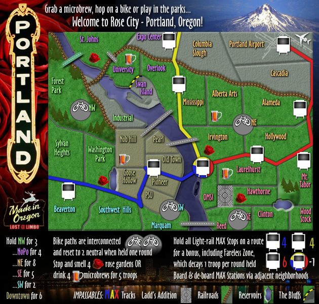
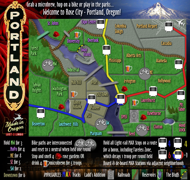
Something has been bugging me about this map for a while I couldn't put my finger on it and didn't want say anything without having something constructive to say. But I think I worked out what has been bothering me. It is the picture you have used in the background. The content picture itself is fine, but it is blurred and doesn't tie in well with everything else on the map. You territory names, legends, the map itself are all very simplistic, crisp and clean. Your map also has some subtle bevels giving the map a nice 3D tone, but you background image is flat and very 2D. Now I don't think that there is anything graphically wrong with the background or the map but I just think together they clash. You know what I mean?

I am not sure there is a quick and easy solution but you seem like a bright guy, I am sure you could work something out, if you agree with that I have said.


p.s. this offends me :(

danfrank wrote:I absolutely love how they have knitpicked this map for YEARS yes YEARS :roll:


Why ? Land and Sea map which graphically is terrible didnt receive a tenth of this . Along with dozens of others..
What do you know about map making, bitch?

natty_dread wrote:I was wrong


Top Score:2403
User avatar
lostatlimbo
Posts: 1386
Joined: Wed Mar 28, 2007 3:56 pm
Location: Portland, OR

Re: Rose City: Portland [17 July 2011] v.33 - Graphics

Post by lostatlimbo »

33rd Draft
I made many of the changes suggested since the last update, including minor cosmetic changes. Of note:
- I cartoonized the beer mugs
- I upped the drop shadow on territory names
- I replaced the Mt Hood picture to give it more depth and opened up the intensity of color. The map was starting to look rather drab and gray and I think this helps. Too much? Just enough?
Image
[bigimg]http://i134.photobucket.com/albums/q102/lostatlimbo/Portland_new9.png[/bigimg]
User avatar
TaCktiX
Posts: 2392
Joined: Mon Dec 17, 2007 8:24 pm
Gender: Male
Location: Rapid City, SD

Re: Rose City: Portland [17 July 2011] v.33 - Graphics

Post by TaCktiX »

Call me dense, but do the offset MAX stations only connect with the neighborhood they're inside of? The distinction can't be drawn by the legend, and there are others that are perfectly situated between.
isaiah40
Posts: 3990
Joined: Mon Aug 27, 2007 7:14 pm

Re: Rose City: Portland [17 July 2011] v.33 - Graphics

Post by isaiah40 »

Looks good, Mt. Rainer doesn't draw my attention away from the playable area now. Just one thing, the "P" and "O" look kind of pixelated and warped a tad
Image.
Is there a something you can do to fix them?
User avatar
lostatlimbo
Posts: 1386
Joined: Wed Mar 28, 2007 3:56 pm
Location: Portland, OR

Re: Rose City: Portland [17 July 2011] v.33 - Graphics

Post by lostatlimbo »

isaiah40 wrote:Looks good, Mt. Rainer doesn't draw my attention away from the playable area now. Just one thing, the "P" and "O" look kind of pixelated and warped a tad
Image.
Is there a something you can do to fix them?


Actually, that's Mt Hood. Rainer is closer to Seattle, but I digress....

I tried to clean that image up and softened it a tad.... hope this helps:

Image
[bigimg]http://i134.photobucket.com/albums/q102/lostatlimbo/Portland_new10.png[/bigimg]
User avatar
lostatlimbo
Posts: 1386
Joined: Wed Mar 28, 2007 3:56 pm
Location: Portland, OR

Re: Rose City: Portland [17 July 2011] v.33 - Graphics

Post by lostatlimbo »

TaCktiX wrote:Call me dense, but do the offset MAX stations only connect with the neighborhood they're inside of? The distinction can't be drawn by the legend, and there are others that are perfectly situated between.


The legend states "Board & De-board MAX stations via adjacent neighborhoods".

So, basically, if a territory is touching a MAX station in any fashion, they are connected and can attack each way.
isaiah40
Posts: 3990
Joined: Mon Aug 27, 2007 7:14 pm

Re: Rose City: Portland [17 July 2011] v.33 - Graphics

Post by isaiah40 »

The 'P' and 'O' look much better now. Now we just wait for any other comments and/or suggestions.
User avatar
cairnswk
Posts: 11510
Joined: Sat Feb 03, 2007 8:32 pm
Gender: Male
Location: Australia

Re: Rose City: Portland [17 July 2011] v.33 - Graphics

Post by cairnswk »

imo - good ^^, this is looking clean and crisp :)
Image
* Pearl Harbour * Waterloo * Forbidden City * Jamaica * Pot Mosbi
User avatar
DiM
Posts: 10415
Joined: Wed Feb 14, 2007 6:20 pm
Gender: Male
Location: making maps for scooby snacks

Re: Rose City: Portland [17 July 2011] v.33 - Graphics

Post by DiM »

i'm not too fond of the whole neon sign title. the image you found is kinda poor quality and the lights are very blurry. this contrasts a lot with the crisp lines on the map. maybe you could either find a better image or even draw one yourself. plus by using a photo found on the net you had to take out the background and this way you lost all the lighting of the neon. now the light ends when the lightbulb ends and it's weird and unnatural.
“In the beginning God said, the four-dimensional divergence of an antisymmetric, second rank tensor equals zero, and there was light, and it was good. And on the seventh day he rested.”- Michio Kaku
User avatar
gimil
Posts: 8599
Joined: Sat Mar 03, 2007 12:42 pm
Gender: Male
Location: United Kingdom (Scotland)

Re: Rose City: Portland [17 July 2011] v.33 - Graphics

Post by gimil »

DiM wrote:i'm not too fond of the whole neon sign title. the image you found is kinda poor quality and the lights are very blurry. this contrasts a lot with the crisp lines on the map. maybe you could either find a better image or even draw one yourself. plus by using a photo found on the net you had to take out the background and this way you lost all the lighting of the neon. now the light ends when the lightbulb ends and it's weird and unnatural.


I have actually already brought this issue up and it has as of yet to be addressed.
What do you know about map making, bitch?

natty_dread wrote:I was wrong


Top Score:2403
User avatar
lostatlimbo
Posts: 1386
Joined: Wed Mar 28, 2007 3:56 pm
Location: Portland, OR

Re: Rose City: Portland [17 July 2011] v.33 - Graphics

Post by lostatlimbo »

DiM wrote:i'm not too fond of the whole neon sign title. the image you found is kinda poor quality and the lights are very blurry. this contrasts a lot with the crisp lines on the map. maybe you could either find a better image or even draw one yourself. plus by using a photo found on the net you had to take out the background and this way you lost all the lighting of the neon. now the light ends when the lightbulb ends and it's weird and unnatural.


Well, I could just change it to Brush Script - that seems to be a hit
Image
User avatar
lostatlimbo
Posts: 1386
Joined: Wed Mar 28, 2007 3:56 pm
Location: Portland, OR

Re: Rose City: Portland [19 July 2011] v.34 - Night or Day?

Post by lostatlimbo »

34th Draft
Played around with a few versions, but this one really grabbed me...
Image
Image
User avatar
natty dread
Posts: 12877
Joined: Fri Feb 08, 2008 8:58 pm
Location: just plain fucked

Re: Rose City: Portland [19 July 2011] v.34 - New sign!

Post by natty dread »

Yeah that looks good. Perhaps you could try adding some shadow under it though.
Image
sannemanrobinson
Posts: 255
Joined: Mon Dec 20, 2010 6:35 am
Gender: Male

Re: Rose City: Portland [19 July 2011] v.34 - New sign!

Post by sannemanrobinson »

The new sign is at daytime. Okay.

If you make the names of the Bike Paths a neutral colour than it would me more clear that they reset to neutral.

The Max stations are not territories right? They don't have names. Then how do you hold Fareless zone? This could only be possible by holding Irvington and DMSI. These don't relly connect to the Max station on the map but to the Max rail. If you give the white Max stations the colour of the line and the Fareless Zone all three colours the Fareless Zone could better connect to adjacent territories.
User avatar
DiM
Posts: 10415
Joined: Wed Feb 14, 2007 6:20 pm
Gender: Male
Location: making maps for scooby snacks

Re: Rose City: Portland [19 July 2011] v.34 - New sign!

Post by DiM »

the new sign looks better but you still need to tweak it.
the inner background of the sign wasn;t completely removed and you still have some pixels here and there (under the D, in the small curves of the neons). also the letters have some spots either from dirt or from wear and tear that could use fixing.
then add a drop shadow to the letter and neons and a nice glow to just the neons.
“In the beginning God said, the four-dimensional divergence of an antisymmetric, second rank tensor equals zero, and there was light, and it was good. And on the seventh day he rested.”- Michio Kaku
User avatar
lostatlimbo
Posts: 1386
Joined: Wed Mar 28, 2007 3:56 pm
Location: Portland, OR

Re: Rose City: Portland [19 July 2011] v.34 - New sign!

Post by lostatlimbo »

sannemanrobinson wrote:The new sign is at daytime. Okay.

If you make the names of the Bike Paths a neutral colour than it would me more clear that they reset to neutral.

The Max stations are not territories right? They don't have names. Then how do you hold Fareless zone? This could only be possible by holding Irvington and DMSI. These don't relly connect to the Max station on the map but to the Max rail. If you give the white Max stations the colour of the line and the Fareless Zone all three colours the Fareless Zone could better connect to adjacent territories.


The MAX stations are territories and are named by the territories with which they connect (i.e. Old Town-Pioneer MAX Stop). Except for the Fareless Zone, which is named Fareless Zone.

I like your other suggestion and have implemented it. Thanks!
User avatar
lostatlimbo
Posts: 1386
Joined: Wed Mar 28, 2007 3:56 pm
Location: Portland, OR

Re: Rose City: Portland [21 July 2011] v.3 - Signs & Stuff

Post by lostatlimbo »

35th Draft
Fixed up the sign as DiM suggested and also re-did the "Made in Oregon" sign.
Changed the bike territory names to neutral color.
I also fixed up some other minor aesthetic things that were bugging me, like the goofy blue MAX line in SW/Downtown.
Image
[bigimg]http://i134.photobucket.com/albums/q102/lostatlimbo/Portland_new14.png[/bigimg]
Last edited by lostatlimbo on Thu Jul 21, 2011 9:09 pm, edited 1 time in total.
User avatar
lostatlimbo
Posts: 1386
Joined: Wed Mar 28, 2007 3:56 pm
Location: Portland, OR

Re: Rose City: Portland [19 July 2011] v.34 - New sign!

Post by lostatlimbo »

DiM wrote:the new sign looks better but you still need to tweak it.
the inner background of the sign wasn;t completely removed and you still have some pixels here and there (under the D, in the small curves of the neons). also the letters have some spots either from dirt or from wear and tear that could use fixing.
then add a drop shadow to the letter and neons and a nice glow to just the neons.


I made most your changes (and very much like the result).

The only one I didn't address is the 'dirt' on the letters. I think these add some texture and make it look older & gives it a little character.

Thanks for your input. You have quite the eye for detail.
sannemanrobinson
Posts: 255
Joined: Mon Dec 20, 2010 6:35 am
Gender: Male

Re: Rose City: Portland [19 July 2011] v.34 - New sign!

Post by sannemanrobinson »

lostatlimbo wrote:
sannemanrobinson wrote:The Max stations are not territories right? They don't have names. Then how do you hold Fareless zone? This could only be possible by holding Irvington and DMSI. These don't relly connect to the Max station on the map but to the Max rail. If you give the white Max stations the colour of the line and the Fareless Zone all three colours the Fareless Zone could better connect to adjacent territories.


The MAX stations are territories and are named by the territories with which they connect (i.e. Old Town-Pioneer MAX Stop). Except for the Fareless Zone, which is named Fareless Zone.


Okay it I understand now and it will be more obvious in the game when there are army numbers on the MAX stations.
User avatar
flexmaster33
Posts: 6194
Joined: Wed Aug 01, 2007 12:24 pm
Gender: Male
Location: Portland, OR

Re: Rose City (Portland, OR) [21 July 2011] v.35 - Signs & S

Post by flexmaster33 »

good work Limbo...the map looks awesome...glad you stuck with the historic Portland signs...those bring a lot of character to the map.
Current tourneys -- 2025 High School Football, 2025 NFL season, 2025 Little League World Series, Punch Out Boxing, Down Under, 2025 MLS season, 2025 MLB season, 2025 WNBA, 4 Star Meats Best of 7.

High rank: Major. Place: 1,056. Points: 2,093
User avatar
lostatlimbo
Posts: 1386
Joined: Wed Mar 28, 2007 3:56 pm
Location: Portland, OR

Re: Rose City (Portland, OR) [21 July 2011] v.35 - Signs & S

Post by lostatlimbo »

flexmaster33 wrote:good work Limbo...the map looks awesome...glad you stuck with the historic Portland signs...those bring a lot of character to the map.


Thanks flex! I'm really happy with the progress. Hoping its finally close to a stamp now.
User avatar
lostatlimbo
Posts: 1386
Joined: Wed Mar 28, 2007 3:56 pm
Location: Portland, OR

Re: Portlandia [22 July 2011] v.36 - Signs & Stuff

Post by lostatlimbo »

36th Draft
I've been considering some other map names and I'm warming up to "Portlandia". Thoughts?
Image
User avatar
Victor Sullivan
Posts: 6010
Joined: Mon Feb 08, 2010 8:17 pm
Gender: Male
Location: Columbus, OH
Contact:

Re: Portlandia [22 July 2011] v.36 - Signs & Stuff

Post by Victor Sullivan »

"Portlandia" seems strange and a little fantasy-esque to me. I much prefer Rose City, especially with the rose gardens being apart of the gameplay.

-Sully
[player]Beckytheblondie[/player]: "Don't give us the dispatch, give us a mustache ride."

Scaling back on my CC involvement...
User avatar
natty dread
Posts: 12877
Joined: Fri Feb 08, 2008 8:58 pm
Location: just plain fucked

Re: Portlandia [22 July 2011] v.36 - Signs & Stuff

Post by natty dread »

What's wrong with just Portland.
Image
User avatar
DiM
Posts: 10415
Joined: Wed Feb 14, 2007 6:20 pm
Gender: Male
Location: making maps for scooby snacks

Re: Portlandia [22 July 2011] v.36 - Signs & Stuff

Post by DiM »

natty_dread wrote:What's wrong with just Portland.


my thoughts exactly.
plus the title on the map says portland not portlandia or rosie city or any other name.
“In the beginning God said, the four-dimensional divergence of an antisymmetric, second rank tensor equals zero, and there was light, and it was good. And on the seventh day he rested.”- Michio Kaku
Post Reply

Return to “The Atlas”