Tisha wrote:The Bison King wrote:natty_dread wrote:IMO, since you have the ships on the map, you can just as well have the horse and the gun.
This is my sentiment exactly.
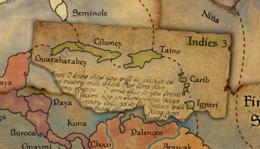
well, I photoshopped the gun out. we can do with the horse?
I even got rid of the horse reins in my most recent save.
Just put the gun back in. Or not. It's fine. The horse is fine too. The fact that this map is clearly a European explorers map of the New world tell's us that white man has been here, and horses have been introduced. You shouldn't need to change the picture.