Victor Sullivan wrote:Okay, so you're definitely gonna need to place starting neutrals on the smaller bonuses so here are my suggestions: ... Idk if this has already been addressed, but I thought I'd say something.
MrBenn wrote:The 3-region bonuses can be split up using starting positions (4 groups of three territories), and the two single-territory areas will start neutral (with either 2 or three armies).
I think you have a lot to thank the original creator for because the graphics are already beautiful. I have no suggestions for the map itself, maybe the top left title could use some work.
Hi, my name is the Bison King, and I am COMPLETELY aware of DaFont!
The Bison King wrote:I think you have a lot to thank the original creator for because the graphics are already beautiful. I have no suggestions for the map itself, maybe the top left title could use some work.
I would make the title as bright as the legends then I would argue that you are pretty much done.
Lovely piece of work.
I'd imagine you mean the title text, rather than all the flags too...
The thing that's causing me the most aggravation right now is adding signatures to the map. I'm currently putting them in the top right corner, but I think they jump out too much. When I make them less obvious, they're harder to read... I'll post something in the next day or so.
PB: 2661 | He's blue...If he were green he would die | No mod would be stupid enough to do that
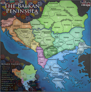
Sorry if this was already posted, I didn't have to patience to read the whole thread. In westernmost region of Romania on your map would be Crisana, not Criasna. Other than that I see no problems.
[bigimg]http://i275.photobucket.com/albums/jj320/bpawley/Balkans04s.jpg[/bigimg]Image for reference
I have always considered this a very nice map, so I'm glad it's back in production. Honestly,I don't see many problems to solve. The flags behind the minimap/legend don't convince me at all, I don't know if it's a good choice ... Also the countries names, they have similar colors, there's a way to make them more distinguishable? I'm not sure about croatia and serbia colors, they look similar running the image with vischeck (see the spolier)
I don't want to argue about how place signatures on a map, but right now yours are really small imo. Pelagonia,Makedonia, Vardar and the mountain (the first on the left of the range between these regions) makes a strange (or unclear) border between makedonia and vardar It's possible to highlight a bit kyklades?
There should be mountains between Pelagonia and Shkoder too (since thats the way it is in reality)...
Also, all mountains on Skopje borders can be removed if needed (for gameplay reasons) since actually fairly easy passes and roads exist on all three borders involved. I'm not suggesting anything here just saying that it would not be a geographical mistake to remove some or all of the involved mountains on these borders.
I was going to try and make an update, but the map files are on a different computer so cannot work on it for another couple of days
Anyway, here's what I'll be looking at:
thenobodies80 wrote:I have always considered this a very nice map, so I'm glad it's back in production. Honestly,I don't see many problems to solve. Good, that's the sort of thing I like to hear
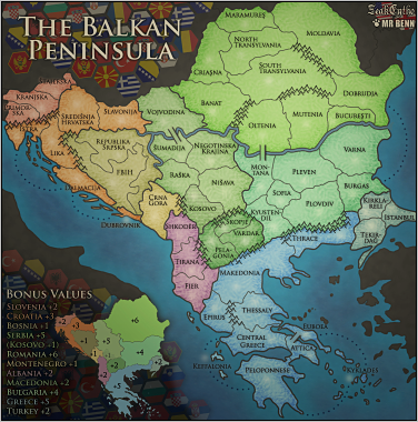
The flags behind the minimap/legend don't convince me at all, I don't know if it's a good choice ... Yeah, well, I like them, and that's what counts Seriously though, I'll tone them down a fraction.
Also the countries names, they have similar colors, there's a way to make them more distinguishable? They're more for reference than anything else - I could try adding callout lines, but there's not a lot of space really.
I'm not sure about croatia and serbia colors, they look similar running the image with vischeck (see the spolier) Yep; good catch. I'll switch the colours of Serbia and Romania.
I don't want to argue about how place signatures on a map, but right now yours are really small imo. I've played around a bit with the signatures in any case - I only included them at that size as a placeholder so I wouldn't forget to put them on later!
Pelagonia,Makedonia, Vardar and the mountain (the first on the left of the range between these regions) makes a strange (or unclear) border between makedonia and vardar I'll extend the mountain range there
It's possible to highlight a bit kyklades? I'll move the name so that the first Kis above and slightly to the right of the existing army circle. I'll try and squeeze things around to make it a better and slightly clearer fit
Looking forward your next update
Nobodies
n.n. wrote:Nice map! Thank you very much
There should be mountains between Pelagonia and Shkoder too (since thats the way it is in reality)... I don;t see any real reason not to extend that mountain range a little
Also, all mountains on Skopje borders can be removed if needed (for gameplay reasons) since actually fairly easy passes and roads exist on all three borders involved. I'm not suggesting anything here just saying that it would not be a geographical mistake to remove some or all of the involved mountains on these borders. Those mountains are actually quite important for gameplay; without them it makes the map too open in the middle. I'm curious to know if it would it be acceptable from a geographical point of view to extend the mountains to cover the border between Nisava and Kyustendil?
PB: 2661 | He's blue...If he were green he would die | No mod would be stupid enough to do that
thenobodies80 wrote:The flags behind the minimap/legend don't convince me at all, I don't know if it's a good choice ... Yeah, well, I like them, and that's what counts Seriously though, I'll tone them down a fraction.
If it means anything to you, MrBenn, I really like the flag hexes. I think it adds some needed flair
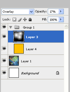
The first is a yellowish wash layer, set to multiply at 18% opacity. This will give the map a warmer feel, and freshen up the colors.
Then I would use some very very subtle highlights. White round gradients on a black background. The white areas should fall on the focus areas. Set this layer to overlay at 17%
Of course - it's just me. I'm all about pastel maps. Just a thought.
Yours
Mine
Both look fine to me, though I don't think MrBenn will agree
I'd agree with what you got RJ, as long as it's just the land.(I know you don't have the .psd file to fiddle with) That deep blue for the sea is really good thew way it is, and the text doesn't look that good with the yellowing.