ender516 wrote:Another set of map image files with the opaque ovals would help me update the XML coordinates to match these latest changes. (I feel better centering on a oval I can easily see.) It might be better to send them by PM rather than posting them here so no one thinks that those white spots will appear on the final product. (natty got a scare last time.)
I don't understand your attachment with the image behind the legend at all. It just looks like a bunch of colors trying to be a pattern that does nothing but take your eyes away from the text.
Might be worth a poll to see where the image in the legend stands among the people. I'm not sure about it myself, I see the artist component and it's nice... but it does generally take away from the map itself and make the legend overly busy which isn't a good thing.
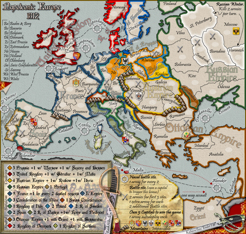
I still think Romanian Principalities can be shortened to just Romania and unclutter that space a bit. Kingdom of Italy could goto Km. of Italy to be shorter, or even just Venice. Put Brittany out in the Bay of Biscay. Piedmont gets lost in the bonus color a bit and I'd look at that a little bit too.
The mountains bother me some and in general can be better. I just get the impression that mountains are floating on the map instead of being on the paper. They could also get a little less uniform.
RedBaron0 wrote:Might be worth a poll to see where the image in the legend stands among the people. I'm not sure about it myself, I see the artist component and it's nice... but it does generally take away from the map itself and make the legend overly busy which isn't a good thing.
I still think Romanian Principalities can be shortened to just Romania and unclutter that space a bit. Kingdom of Italy could goto Km. of Italy to be shorter, or even just Venice. Put Brittany out in the Bay of Biscay. Piedmont gets lost in the bonus color a bit and I'd look at that a little bit too.
The mountains bother me some and in general can be better. I just get the impression that mountains are floating on the map instead of being on the paper. They could also get a little less uniform.
Some changes made:
-changed Romanian Principalities to Romania -changed the Kingdom of Italy -Brittany placed in the Bay of Biscay -Added more glow to Piedmont
I really prefer not to blend the mountains, it would create confusion in this map. They should be intended as metal marks that officers can swing around in the map.
I'd say that the London/Yorkshire border is suffering from the white glow of both text labels, plus the fact that it lines up too well with the vertical stroke of the L in London.
Clear the blue (border) paint in Illyria between the two mountain ranges left and right ( at the upper half of Illyria..just right of the "y" of Italy). From a distance it is not clear that you can pass inbetween up north.
Warsaw (blue in yellow) and Hessen (green in yellow) have the same problem with an appendix provence.
And what is the meaning of the blue spot above Berlin that has affiliation to Malmö ? Better clear that blue beach head
lt_oddball wrote:Clear the blue (border-) paint in Illyria between the two mountain ranges left and right ( at the upper half of Illyria..just right of the "y" of Italy). From a distance it is not clear that you can pass inbetween up north. If it is yellow , it's immediately clear.
Warsaw (blue in yellow) and Hessen (green in yellow) have the same problem with an appendix provence.
And what is the meaning of the blue spot above Berlin that has affiliation to Malmö ? Better clear that blue beach-head
I think all those situations are quite clear. And I rather have those appendixes coloured than having them all in just one colour... like having it all blue in case of Poland.
He, London and Oporta can move a pixel or two to the left.
Oporta could be straightened and put under the numbers, the swords beneath the words.
Everything else looks good... its a ton better than it was. The small map is tight but at least its readable, no worse than the hive small map in my opinion. I think it might be close to time to move on...
I've not checked in on this map for a while; I still think there are some clarity issues relating to the small map, as it is very difficult to see how the overlapping/combination bonuses work. I'm also worried about the colourblind check, as there are so many similar shades. Having looked closely at the map, I wouldn;t say it's unplayable, but I certainly don;t think it'll be easy for people who don't have clickable maps or BOB
In addition to the general legibility issues, I think there is a problem with Istanbul. I know it's the capital of Turkey, and can therefore guess that the territory marked on the map as Istanbul also includes the bit of European Turkey with the capital symbol. Howvere, there is a big brown border around the landmasses, which are clearly separated by the sea. With no attaching lines, it is therefore not clear that Istanbul and Rumelia border one another. Even more concerning is that it is not immediately clear how to occupy the capital. My suggestion would be to fudge the sea barrier so that there is a land bridge between European Turkey and Asian Turkey (see Europa as an example)
PB: 2661 | He's blue...If he were green he would die | No mod would be stupid enough to do that


