Ok well, I hope you like this one.
[bigimg]http://img696.imageshack.us/img696/2922/northeuropev57a.png[/bigimg]
small version still under construction...
Nordic Countries [Quenched]
Moderator: Cartographers
Forum rules
Please read the Community Guidelines before posting.
Please read the Community Guidelines before posting.
-
natty dread

- Posts: 12877
- Joined: Fri Feb 08, 2008 8:58 pm
- Location: just plain fucked

Re: Nordic Countries <v.57> p1,45 [Gp,G] - XML ready.
natty_dread wrote:You're right Beals, I have worked on this map a long time, so forgive me for being skittish about it... I know though there are maps that have been worked on even longer, but I'm not sure if there's any other map in CC history that has gone through 57 different versions before quenching
Anyway, I just want to say, I really do respect you & mibi's opinions, I consider you experts on the subject of mapmaking. Even when I don't agree with you I do my best to address the issues you point out in some way...
Well anyway, I'll see if I can adjust the texture by opacity & HSV settings, but if that doesn't work then I'm just going to pull the "meh" card.
pull the 'meh' card if you want a 'meh' map. there are maps the have gone through many more revisions, even multiple mapmakers.
here is my 54 revisions of Seige, not including minor updates.
http://www.zoomorama.com/JBachman/01-ef ... 80f04db4ba
I was ready to quench it by the 15th version, but thefoundry kept pushing me further.
just ask tacktix, he knows the deal.
-
natty dread
- Posts: 12877
- Joined: Fri Feb 08, 2008 8:58 pm
- Location: just plain fucked
-
natty dread
- Posts: 12877
- Joined: Fri Feb 08, 2008 8:58 pm
- Location: just plain fucked
Re: Nordic Countries <v.57> p1,45 [Gp,G] - XML ready.
...A "meh" map?
You're basically done. Good job
But let us play the map and ajust after some finished games.
I am in for it, mates - bring it on to us !!! ...
I sure are impressed of your work and wish you all the best in your work.
... and finally, I look forward very much to play your game !!
I think the graphics looks nice. It gives a cold feeling to the countries, which is what people in USA think we have it here.
I think it looks fine. I just want it to come soon.
good job looks nice

-
Trekvarten
- Posts: 1
- Joined: Fri Aug 28, 2009 8:16 am
Re: Nordic Countries <v.57> p1,45 [Gp,G] - XML ready.
Love it 
I had some comments, but then I saw WM's comments and he pretty much covered the whole.
Nice job
I had some comments, but then I saw WM's comments and he pretty much covered the whole.
Nice job
Re: Nordic Countries <v.57> p1,45 [Gp,G] - XML ready.
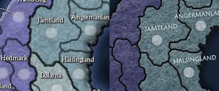
yeah, its an average and 'meh' map, and a major issue is the still blurriness of the land. It makes the whole map look amateurish, even more so than the rediculous mount of bevel and glow going on.
You have managed to turn these crisp nordic countries into a pair of over washed lavender socks. you might just want to blur the entire thing about twenty times and pretend that we are looking through a pair of fogged up ski goggles. at least then it would have some authenticity.
You have managed to turn these crisp nordic countries into a pair of over washed lavender socks. you might just want to blur the entire thing about twenty times and pretend that we are looking through a pair of fogged up ski goggles. at least then it would have some authenticity.

Re: Nordic Countries <v.57> p1,45 [Gp,G] - XML ready.
RjBeals wrote:mibi wrote:its still soft... you know.. blurry.natty_dread wrote:What is blurry? The ocean, the land area? The ocean needs to be a bit blurry... otherwise the texture is too "strong", I hear... As for the land area, I got complaints of pixelation so I softened the outline slightly. Or do you mean the grunge texture of the land area?
I think just overall blurry. The borders look a bit blurred. The land texture looks blurred also, and with the very sharp text on top of that, it makes it look even more blurred. I'm not sure if at this point there's much you can do - but thought I would mock something up real quick to give a comparison.
Awesome mods RJ - and I love it... Everything is so much easier to see and read like this.
C.

Highest score : 2297
-
natty dread
- Posts: 12877
- Joined: Fri Feb 08, 2008 8:58 pm
- Location: just plain fucked
Re: Nordic Countries <v.57> p1,45 [Gp,G] - XML ready.
Mibi, I'm quite tempted to say "f*ck off" right now. I'm not going to, however, because I'm a polite and nice person. Instead I'm just going to post my latest version. If this is not good enough for you and your pals, tough. This is the final forge, it is meant for final tweaks, I'm not going to do a complete graphical rehaul at this point. I'm sorry if I can't meet your divine standards, but PLENTY of people have expressed their liking of the map.
version 57b, large
[bigimg]http://img532.imageshack.us/img532/1479/northeuropev57b.png[/bigimg]
v57b, small

As for yeti_c, your post didn't really add anything of value to the thread... if you wished to tell rjbeals how much you love his work you could've done so by pm.
version 57b, large
[bigimg]http://img532.imageshack.us/img532/1479/northeuropev57b.png[/bigimg]
v57b, small
As for yeti_c, your post didn't really add anything of value to the thread... if you wished to tell rjbeals how much you love his work you could've done so by pm.

Re: Nordic Countries <v.57b> p1,46 [Gp,G] - XML ready.
My concern with the clarity of the land portion is that in JPG (you currently post in PNG), it will be even more blurred.
There's also a juxtaposition of super-crisp capitals with blurry army circles, crisp titles and white dashes with blurred land and borders. Crisp mountains, blurrish trees. I can understand liking the style, and not wanting crisp lines to overpower the bright titles. Since the borders are dark grey instead of black, they won't overpower. I'd most like to see a happy anti-aliasing medium.
There aren't many other maps with blurry bevels as land/sea transitions. Perhaps Midkemdil is the closest comparison. Iceland is crisp on land, but the land/sea is blurry. But most maps have a simple anti-aliasing line between the two. The continental glow does help some, on this one.
And if you can show us how ugly it looks when you sharpen it up, then we'll let you keep it as is
The bridge between Norrbotten and Rovaniemi needs to blend better. There are these bright bits at either end of it which do not fit.
The colour difference between Swealand and Gothland/Norrland could be tweaked a bit more.
Current Map Project: Tokyo
-
natty dread
- Posts: 12877
- Joined: Fri Feb 08, 2008 8:58 pm
- Location: just plain fucked
Re: Nordic Countries <v.57b> p1,46 [Gp,G] - XML ready.
What's the point trying to make anything non-blurry. Everything will be blurry anyway when lack converts the image to jpeg, so why waste time doing details?

Re: Nordic Countries <v.57> p1,45 [Gp,G] - XML ready.
RjBeals wrote:
Not an improvement imo.. makes it look like some flat charcoal lowlands.
Strong/overly sharp textures just look wrong when they don´t represent the actual geological topography at all...
Last edited by snufkin on Mon Apr 05, 2010 4:57 pm, edited 1 time in total.
The comet cometh!
-
natty dread
- Posts: 12877
- Joined: Fri Feb 08, 2008 8:58 pm
- Location: just plain fucked
Re: Nordic Countries <v.57b> p1,46 [Gp,G] - XML ready.
There's also a juxtaposition of super-crisp capitals with blurry army circles, crisp titles and white dashes with blurred land and borders. Crisp mountains, blurrish trees. I can understand liking the style, and not wanting crisp lines to overpower the bright titles. Since the borders are dark grey instead of black, they won't overpower. I'd most like to see a happy anti-aliasing medium.
Capitals need to stand out from other territories. Mountains also need to stand out.
I'll see what I can do to the trees. I'll fix the bridge, which btw seems too bright because there's been texture changes, so the land is darker now. Actually I'll just brighten the land back to the level of the bridge.
As for sharpening the image, I don't have any idea how to make it any "sharper". To me it doesn't look blurry. If I can't see the problem I can't see how am I supposed to fix it.
ps. THANKS SNUFKIN! at least someone is on "my side"...
-
natty dread
- Posts: 12877
- Joined: Fri Feb 08, 2008 8:58 pm
- Location: just plain fucked
Re: Nordic Countries <v.57b> p1,46 [Gp,G] - XML ready.
Ok this should do it.
[bigimg]http://img444.imageshack.us/img444/1517/northeuropev57c.png[/bigimg]

[bigimg]http://img444.imageshack.us/img444/1517/northeuropev57c.png[/bigimg]

Re: Nordic Countries <v.57b> p1,46 [Gp,G] - XML ready.
You're not alone. I too think it is too late for such a major change to the look of the map. Actually, I do like a crisper line between regions, but I also recall the complaints regarding pixellation. The place for this sort of debate was the Graphics Workshop. mibi did raise the issue of blurriness a while back, but he did not pursue it, nor do I recall him garnering any real support from others.
-
natty dread
- Posts: 12877
- Joined: Fri Feb 08, 2008 8:58 pm
- Location: just plain fucked
Re: Nordic Countries <v.57c> p1,46 [Gp,G] - XML ready.
Thanks ender. Funny, how the only ones who have had any complaints for the graphics of this map have all been other mapmakers. Almost all comments from non-mapmakers have been very positive and anxious to see this map in play.
I'm not sure what this could indicate. Perhaps I'm subject to some sort of hazing ritual for a first time mapmaker? Dunno.
Either way, I think the latest version looks crisper. I really hope this will satisfy all parties. Personally I am very satisfied with how the map looks right now. For those who still think it sucks... I don't understand you.
Re: Nordic Countries <v.57c> p1,46 [Gp,G] - XML ready.
I have seen this about 46 times before. Some map maker who doesn't have a quenched map slides through to final forge because no one either gives a shit about the map or just doesn't its obvious faults. Then i or someone else points out the faults and the mapmaker has some chip on their sholder about fixing it. Seriously.. this has happned over and over and over again in the foundry. So i don't fault you for getting all pissy, it's just your inexperience showing, which can't be helped.
But what it comes down too, is if you want a 'good enough' map, or if you want a 'great map', at lease in the graphic departments. Now this map already has a multitude of fugliness going on, so it wont be a great map, but at the very least you can save it from being a blurry stain in the map browser.
if you want an example of map makers who have taken criticism on the chin and have gone on to make some sweet maps, look at tacktix, killing44, and gimil. Infact most of us who have more than a couple of maps have 'been there', so why don't you just tighten your belt buckle, take 45 minutes, and redo the land so it doesn't look like it was taken with a lomographic spy satellite.
if you really have problems figuring out why its blurry, throw up the PSD and one of us will diagnose the issue for you.

Re: Nordic Countries <v.57c> p1,46 [Gp,G] - XML ready.
I like a lot of the changes and I'm glad you changed the font a while back.
I see a little bit of pixelation, but nothing major.
For me the texture seems a little bland, compared to the rest of the effort you've done elsewhere on the map. Can I suggest you add another finer layer and experiment a bit with additional texture layers? Find something you absolutely love.
I see a little bit of pixelation, but nothing major.
For me the texture seems a little bland, compared to the rest of the effort you've done elsewhere on the map. Can I suggest you add another finer layer and experiment a bit with additional texture layers? Find something you absolutely love.
-
natty dread
- Posts: 12877
- Joined: Fri Feb 08, 2008 8:58 pm
- Location: just plain fucked
Re: Nordic Countries <v.57c> p1,46 [Gp,G] - XML ready.
I like a lot of the changes and I'm glad you changed the font a while back.
I see a little bit of pixelation, but nothing major.
Thanks, I appreciate your feedback.
Can you elaborate on the pixelation? I can try doing something about it.
jpcloet wrote:Can I suggest you add another finer layer and experiment a bit with additional texture layers? Find something you absolutely love.
Hmm, it may prove problematic. I've tried this in the past, and usually two texture layers on top of each other just look messy. But I might give it a shot.
-
natty dread
- Posts: 12877
- Joined: Fri Feb 08, 2008 8:58 pm
- Location: just plain fucked
Re: Nordic Countries <v.57c> p1,46 [Gp,G] - XML ready.
Some people might benefit from reading this.
Foundry guidelines wrote: 1. The only way to get a map made that's exactly how you want it is to make it yourself. A mapmaker is making a map they want to make and while your ideas might be great, they might not fit the map that they are making. Keep this in mind if a mapmaker says "no" to an idea of yours.
2. Remember to think from the mapmaker's perspective/goal. This means that giving feedback that starts with, "hey it'd be cool if..." is not always the best thing. They've often already decided the theme and direction of the map, the more stamps the more solid this direction. Really cool ideas are not what they are generally looking for help on. They want help on deciding the details to fit their goal.


-
natty dread
- Posts: 12877
- Joined: Fri Feb 08, 2008 8:58 pm
- Location: just plain fucked
-
porkenbeans

- Posts: 2546
- Joined: Mon Sep 10, 2007 4:06 pm
Re: Nordic Countries <v.57c> p1,46 [Gp,G] - XML ready.
While I am NOT a big fan of mibi's bed side manner, his observation about the "blurriness" has merit. Why must he take up so much time to tell you how hideous it is, when that time would be better spent, and his feedback better received, if he just told you how to fix it. 
I think that this a 2 second fix. I think that if you reduced the scale of the texture, it will come in to focus. Also the size of that bevel could stand to be knocked back just a touch.
I think that this a 2 second fix. I think that if you reduced the scale of the texture, it will come in to focus. Also the size of that bevel could stand to be knocked back just a touch.
Last edited by porkenbeans on Tue Apr 06, 2010 10:24 am, edited 1 time in total.

-
natty dread
- Posts: 12877
- Joined: Fri Feb 08, 2008 8:58 pm
- Location: just plain fucked
Re: Nordic Countries <v.57c> p1,46 [Gp,G] - XML ready.
Well, I have set out to fix this issue. I'm mainly focusing on borders, which I'm now trying to make a bit sharper and thinner.
There's actually very little bevel on the land, there's more of a drop shadow which just looks like bevel.
There's actually very little bevel on the land, there's more of a drop shadow which just looks like bevel.
-
porkenbeans
- Posts: 2546
- Joined: Mon Sep 10, 2007 4:06 pm
Re: Nordic Countries <v.57c> p1,46 [Gp,G] - XML ready.
Thought I would spend a moment or two tweaking around with your map. I only added 1 layer to get this. If you like it I will give you all of the settings that I used. I think that it brightens and cools it at the same time.
[bigimg]http://i665.photobucket.com/albums/vv12/porkenbeans/northeuropev57btest.png[/bigimg]
[bigimg]http://i665.photobucket.com/albums/vv12/porkenbeans/northeuropev57btest.png[/bigimg]
Last edited by porkenbeans on Mon Apr 05, 2010 10:11 pm, edited 1 time in total.
-
natty dread
- Posts: 12877
- Joined: Fri Feb 08, 2008 8:58 pm
- Location: just plain fucked
Re: Nordic Countries <v.57c> p1,46 [Gp,G] - XML ready.
Umm. Thanks, but no thanks... I know "cold" is kinda the theme but there are better ways of achieving it than flat out colouring the whole map blue 