Mongol Empire Map [Quenched]

Care to peruse completed maps? Take a stroll through the Atlas.

Moderator: Cartographers

Forum rules
Please read the Community Guidelines before posting.
User avatar
AndyDufresne
Posts: 24935
Joined: Fri Mar 03, 2006 8:22 pm
Location: A Banana Palm in Zihuatanejo
Contact:

Post by AndyDufresne »

Is that a snake on the map? ;)


--Andy
User avatar
Qwert
SoC Training Adviser
Posts: 9262
Joined: Tue Nov 07, 2006 5:07 pm
Location: VOJVODINA
Contact:

Post by Qwert »

No Andy its a snake wall :wink:
Image
NEW REVOLUTION-NEW RANKS PRESS THESE LINK viewtopic.php?f=471&t=47578&start=0
User avatar
Guiscard
Posts: 4103
Joined: Fri Dec 08, 2006 7:27 pm
Location: In the bar... With my head on the bar

Post by Guiscard »

Ok. Bit thicker and a bit darker...

Image
qwert wrote:Can i ask you something?What is porpose for you to open these Political topic in ConquerClub? Why you mix politic with Risk? Why you not open topic like HOT AND SEXY,or something like that.
User avatar
fisherman5
Posts: 48
Joined: Fri Jan 12, 2007 9:33 pm

Post by fisherman5 »

looks good
Image
KEYOGI
Posts: 1632
Joined: Tue Oct 10, 2006 6:09 am

Post by KEYOGI »

I'm still of the opinion it needs to be of the same perspective as the mountains. What you have really doesn't fit with the rest of the map. It's such a great looking map, it's just this wall holding it back.
User avatar
Guiscard
Posts: 4103
Joined: Fri Dec 08, 2006 7:27 pm
Location: In the bar... With my head on the bar

Post by Guiscard »

I know... I just can't do it! I'd be happy to send someone the photoshop file if they wanted to have a crack... I just can't get it right at the moment. Its driving me insane because this is the last major hurdle (in my opinion).
qwert wrote:Can i ask you something?What is porpose for you to open these Political topic in ConquerClub? Why you mix politic with Risk? Why you not open topic like HOT AND SEXY,or something like that.
Contrickster
Posts: 261
Joined: Tue Jan 23, 2007 7:24 pm

Post by Contrickster »

A thin, white/cream line would minimise the perspective problem and the graphic problem.
User avatar
happysadfun
Posts: 1251
Joined: Mon Jul 10, 2006 9:06 pm
Location: Haundin at DotSco, Being Sad that Mark Green Lost in Suburban Wisconsin

Post by happysadfun »

Image 
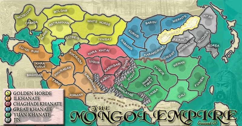
If you use just the front, get rid of the rest, and lighten it a bit, it could work if you copy and paste it and edit it a bit.
ImageChildren, this is what happens to hockey players, druggies, and Hillary Clinton.

Rope. Tree. Hillary. Some assembly required.
User avatar
cairnswk
Posts: 11510
Joined: Sat Feb 03, 2007 8:32 pm
Gender: Male
Location: Australia

Post by cairnswk »

Guiscard, great Map...very professional, and I look forward to playing it.

For the wall, even though it is crude are u after something like this...
Image

:)


PLEASE LEAVE YOUR VOTE AND OPINION - GREAT BARRIER REEF
Image
http://www.conquerclub.com/forum/viewtopic.php?t=13702
User avatar
Guiscard
Posts: 4103
Joined: Fri Dec 08, 2006 7:27 pm
Location: In the bar... With my head on the bar

Post by Guiscard »

Yeh very much after something like that... Just can't get it right graphically drawing it myself, nor can I find a suitable image to use.
qwert wrote:Can i ask you something?What is porpose for you to open these Political topic in ConquerClub? Why you mix politic with Risk? Why you not open topic like HOT AND SEXY,or something like that.
KEYOGI
Posts: 1632
Joined: Tue Oct 10, 2006 6:09 am

Post by KEYOGI »

cairnswk wrote:Image


Something like that would be ideal.
User avatar
cairnswk
Posts: 11510
Joined: Sat Feb 03, 2007 8:32 pm
Gender: Male
Location: Australia

Post by cairnswk »

That was a five minute job in Fireworks...friend of mine just returned from walking the Great Wall, and sent me some photos, so I kinda know what it looks like.

What program are you developing the map in, Guiscard, Photoshop?
User avatar
ViscountGort
Posts: 35
Joined: Mon Jan 22, 2007 7:21 am
Location: University of Durham, England

Post by ViscountGort »

KEYOGI wrote:
cairnswk wrote:Image


Something like that would be ideal.


I absolutely agree - this is exactly what's needed. Nice one cairnswk.
User avatar
Guiscard
Posts: 4103
Joined: Fri Dec 08, 2006 7:27 pm
Location: In the bar... With my head on the bar

Post by Guiscard »

Yeh photoshop... I'll have a crack tonight.
qwert wrote:Can i ask you something?What is porpose for you to open these Political topic in ConquerClub? Why you mix politic with Risk? Why you not open topic like HOT AND SEXY,or something like that.
User avatar
Guiscard
Posts: 4103
Joined: Fri Dec 08, 2006 7:27 pm
Location: In the bar... With my head on the bar

Post by Guiscard »

OK here's my effort at a new '3d' style wall...

Image

Any good?
qwert wrote:Can i ask you something?What is porpose for you to open these Political topic in ConquerClub? Why you mix politic with Risk? Why you not open topic like HOT AND SEXY,or something like that.
User avatar
Guiscard
Posts: 4103
Joined: Fri Dec 08, 2006 7:27 pm
Location: In the bar... With my head on the bar

Post by Guiscard »

Andy I know you're lurking around somewhere...

Image
qwert wrote:Can i ask you something?What is porpose for you to open these Political topic in ConquerClub? Why you mix politic with Risk? Why you not open topic like HOT AND SEXY,or something like that.
User avatar
AndyDufresne
Posts: 24935
Joined: Fri Mar 03, 2006 8:22 pm
Location: A Banana Palm in Zihuatanejo
Contact:

Post by AndyDufresne »

**Sneaks in...but sneaks away.**


--Andy
KEYOGI
Posts: 1632
Joined: Tue Oct 10, 2006 6:09 am

Post by KEYOGI »

Can you take some of the "shine" off it? Seems a little bright.
Contrickster
Posts: 261
Joined: Tue Jan 23, 2007 7:24 pm

Post by Contrickster »

I agree it's blurry. Walls are hard.
User avatar
Ruben Cassar
Posts: 2160
Joined: Thu Nov 16, 2006 6:04 am
Gender: Male
Location: Civitas Invicta, Melita, Evropa

Post by Ruben Cassar »

I like this wall better. I agree with the others though, remove that glow.

I would also try to include another tower in Karakorum in the middle between the first and second tower and see how it looks if it's not a big hassle.
ImageImageImageImageImage
User avatar
Wisse
Posts: 4448
Joined: Fri Oct 13, 2006 2:59 pm
Location: The netherlands, gelderland, epe

Post by Wisse »

the wall looks good to me, remove the glow or make it less
Image Image
User avatar
Guiscard
Posts: 4103
Joined: Fri Dec 08, 2006 7:27 pm
Location: In the bar... With my head on the bar

Post by Guiscard »

Less glow and tried to make it look 'harder', also added a middle tower.

Image
qwert wrote:Can i ask you something?What is porpose for you to open these Political topic in ConquerClub? Why you mix politic with Risk? Why you not open topic like HOT AND SEXY,or something like that.
User avatar
Wisse
Posts: 4448
Joined: Fri Oct 13, 2006 2:59 pm
Location: The netherlands, gelderland, epe

Post by Wisse »

hmm mayby blur it?
Image Image
Arcanos
Posts: 13
Joined: Tue Jan 30, 2007 11:48 pm

Post by Arcanos »

i personally liked the brown wall better
User avatar
Guiscard
Posts: 4103
Joined: Fri Dec 08, 2006 7:27 pm
Location: In the bar... With my head on the bar

Post by Guiscard »

The colour can be changed, its more the actual graphic - this one is a better perspective in my opinion... Also looks reasonably 'run down', as the great wall was at the time.
qwert wrote:Can i ask you something?What is porpose for you to open these Political topic in ConquerClub? Why you mix politic with Risk? Why you not open topic like HOT AND SEXY,or something like that.
Post Reply

Return to “The Atlas”