I think the wall and the mountains look perfect now!
Have you considered adding parts of images to the Seas in the West? They look odd, because they don't have any remnants of lines...
--Andy
Mongol Empire Map [Quenched]
Moderator: Cartographers
Forum rules
Please read the Community Guidelines before posting.
Please read the Community Guidelines before posting.
-
AndyDufresne

- Posts: 24935
- Joined: Fri Mar 03, 2006 8:22 pm
- Location: A Banana Palm in Zihuatanejo
- Contact:
-
Guiscard

- Posts: 4103
- Joined: Fri Dec 08, 2006 7:27 pm
- Location: In the bar... With my head on the bar
They did have images but I deleted them after advise from a few peopl (I forget who...)
Will add some different images though, I think, because I see what you mean.
Will add some different images though, I think, because I see what you mean.
qwert wrote:Can i ask you something?What is porpose for you to open these Political topic in ConquerClub? Why you mix politic with Risk? Why you not open topic like HOT AND SEXY,or something like that.

-
AndyDufresne
- Posts: 24935
- Joined: Fri Mar 03, 2006 8:22 pm
- Location: A Banana Palm in Zihuatanejo
- Contact:
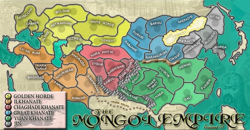
Lets take a quick look at gameplay:
Golden Horde -- 8 Countries, 3 Borders, Bonus of 5.
Ilkhanate -- 8 Countries, 3 Borders, Bonus of 5.
ChagHadi Khanate -- 5 Countries, 4 Borders, Bonus of 4.
Great Khanate -- 6 Countries, 3 Borders, Bonus of 3.
Yuan Khanate -- 8 Countries, 4 Borders, Bonus of 6.
Jin -- 5 Countries, 2 Borders, Bonus of 2.
Well first off, compare the Twins of the West and Great K. Same number of borders, but the Twins have 2 more countries each...and have a bonus of 2 more armies. Do 2 more countries in each justify a bonus that is two higher than Great K.?
Also, might consider adding another attack route from Great K. into Yuan....via break in the wall (may not make sense on account of the time period). Consider adding a route Onggt to Yugor...you could have the wall extend a little further into Henan...so Henan still is a border with KhanBaliq...and make the break so that Henan is also a border with Onggt. This may be unneeded, it might help flow...I.E. a player in Great K. attacks Yugor, grabs Lhasa and then uses the Trade Route to break into a Twin of the West.
Hm, I'll think about more things too.
--Andy
-
Guiscard
- Posts: 4103
- Joined: Fri Dec 08, 2006 7:27 pm
- Location: In the bar... With my head on the bar
Those sound like good ideas. A break in the wall is no problem, was in a pretty un-maintained state at this point in time.
edit: I'm thinking it might be better to just end the wall at the Onggt/Karakorum border, so as to help the flow but not have a slightly pointless impassable between Onggt and Henan.
edit: I'm thinking it might be better to just end the wall at the Onggt/Karakorum border, so as to help the flow but not have a slightly pointless impassable between Onggt and Henan.
qwert wrote:Can i ask you something?What is porpose for you to open these Political topic in ConquerClub? Why you mix politic with Risk? Why you not open topic like HOT AND SEXY,or something like that.
I'm going to have to say I don't like the wall in it's current state or when it was thinner either. I like the mountains and I think it'd work well if the wall was represented from the same perspective. It seems a bit weird to me that the wall is presented from top-down while the mountains are presented from the side.
-
Guiscard
- Posts: 4103
- Joined: Fri Dec 08, 2006 7:27 pm
- Location: In the bar... With my head on the bar
Yeh I'm still not 100% about the wall either, I just can't get a good perspecitve similar to that of the mountains... I'm really stuck for it.
qwert wrote:Can i ask you something?What is porpose for you to open these Political topic in ConquerClub? Why you mix politic with Risk? Why you not open topic like HOT AND SEXY,or something like that.
-
lord twiggy1

- Posts: 1574
- Joined: Wed Feb 14, 2007 2:26 pm
- Location: at exacltly 15 degrees N lattitud and...Ahh who the hell am i kidding I have no idea
-
Ninja-Town

- Posts: 107
- Joined: Thu Jan 04, 2007 1:33 pm
-
Ninja-Town
- Posts: 107
- Joined: Thu Jan 04, 2007 1:33 pm
-
ViscountGort

- Posts: 35
- Joined: Mon Jan 22, 2007 7:21 am
- Location: University of Durham, England
i think the wall's making good progress. it seems to be a surprisingly tricky graphic to get right, but i think it'll be worth all this nitpicking in the end.
i think having stretches of wall with towers interspersed is a good idea, but as keyogi has said, the arial view doesn't fit with the mountains. can't you just alter the shadows and make the towers extend higher, such that it'll look like a side perspective on the wall?
having said that i think there's another reason it just doesn't feel quite right, which is that it's right beside the mountains, and they're clearly on a totally different scale. we've got a great wall that's as tall as the himalayan mountains, and that's never going to sit quite right. clearly i'm not suggesting you draw the wall on the same scale, as this would be invisible, but i think reverting to the thinner wall you had earlier would go some of the way to solving this.


-
Guiscard
- Posts: 4103
- Joined: Fri Dec 08, 2006 7:27 pm
- Location: In the bar... With my head on the bar
I'm considering changing it to a river. I really don't like the whole wall graphic and the yellow river covers mostly the same sort of route...
qwert wrote:Can i ask you something?What is porpose for you to open these Political topic in ConquerClub? Why you mix politic with Risk? Why you not open topic like HOT AND SEXY,or something like that.
-
ViscountGort
- Posts: 35
- Joined: Mon Jan 22, 2007 7:21 am
- Location: University of Durham, England
-
Contrickster
- Posts: 261
- Joined: Tue Jan 23, 2007 7:24 pm
The wall is okay. It's an incredibly beautiful map and you are probably right the wall isn't as beautiful as the rest being almost as large as the mountains, with chunky square bits.
On the plus side it doesn't have to be perfect and the squares complement the triangles of the mountains. Anyone who plays will know instantly what it's supposed to be. You can see the Great Wall from space!
Maybe you'd like to consider making the wall a thin white line, or more like how the wall really looks from low earth orbit.
Also, the Gobi Desert - I don't understand why it's yellow with white stuff inside.
-
Guiscard
- Posts: 4103
- Joined: Fri Dec 08, 2006 7:27 pm
- Location: In the bar... With my head on the bar
The white line idea sounds interesting, I'll have a play around with it.
As for Gobi, the white is actually light yellow (or at least on the monitors I;ve looked at it on), and is meant to look like sand / dunes. The yellow border, well, I dunno I just thought it looked good. Plus it marks it out from the normal territories. Does anyone else have a problem with this? Would be an easy enough fix.
Thanks for the compliments
qwert wrote:Can i ask you something?What is porpose for you to open these Political topic in ConquerClub? Why you mix politic with Risk? Why you not open topic like HOT AND SEXY,or something like that.


-
Lone.prophet
- Posts: 1467
- Joined: Thu Oct 12, 2006 4:37 pm
- Location: Your basement Muahaha

-
Contrickster
- Posts: 261
- Joined: Tue Jan 23, 2007 7:24 pm
Guiscard wrote:As for Gobi, the white is actually light yellow (or at least on the monitors I;ve looked at it on), and is meant to look like sand / dunes. The yellow border, well, I dunno I just thought it looked good. Plus it marks it out from the normal territories. Does anyone else have a problem with this? Would be an easy enough fix.
Looks like cotton buds!
Yep, great map. Can't wait to play it!
-
Guiscard
- Posts: 4103
- Joined: Fri Dec 08, 2006 7:27 pm
- Location: In the bar... With my head on the bar
As per usual, a new wall...
Comments? Gone for the thin line look, which I actually think is the best so far. Looks more in keeping with the scale of the mountains.
Comments? Gone for the thin line look, which I actually think is the best so far. Looks more in keeping with the scale of the mountains.
qwert wrote:Can i ask you something?What is porpose for you to open these Political topic in ConquerClub? Why you mix politic with Risk? Why you not open topic like HOT AND SEXY,or something like that.
-
fisherman5

- Posts: 48
- Joined: Fri Jan 12, 2007 9:33 pm

-
Ruben Cassar

- Posts: 2160
- Joined: Thu Nov 16, 2006 6:04 am
- Gender: Male
- Location: Civitas Invicta, Melita, Evropa


-
Contrickster
- Posts: 261
- Joined: Tue Jan 23, 2007 7:24 pm
I like it. But I think it should be lighter.
Here's a typical photo of the wonder...

Cream/Blue.
Source
Here's a typical photo of the wonder...
Cream/Blue.
Source