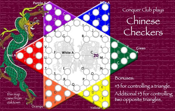
Chinese Checkers [Quenched] May '07 re-opener?
Moderator: Cartographers
Forum rules
Please read the Community Guidelines before posting.
Please read the Community Guidelines before posting.
RjBeals wrote:I know you are trying to represent a true board, but to me they kind of look like they are convex, rather than concave.
I think the main reason for this is that the circles are so much lighter than the board colors... the eye assumes that they are catching more light. Since everyone wants them to have the same texture and color as the surrounding board, then the top left edge of each hole should be darker than the flat board (due to shading). This, of course, will could make it harder to read. If the holes are shallow, the dark could fade very quickly with the lightest part of the gradient on the opposite edge.
My preference, I think, is that thet holes all appear to be a light unpainted wood color (maybe this matches the 'center' area). Some texture would be okay, but too much texture interferes with the gradient and makes the concave shape of the hole less clear.
Also, in the current examples, some of the circles have a slight highlight along the top left edge, where it should be darkest. Center-A, for example, has this highlight. May be a trick of the texture...
EvilOtto wrote:RjBeals wrote:Also, in the current examples, some of the circles have a slight highlight along the top left edge, where it should be darkest. Center-A, for example, has this highlight. May be a trick of the texture...
Every circle is a bit different because of the way the texture fell - the basic image is the same, but some may come off looking a bit lighter or darker ini parts.
I'll play with making them all the same wood color. It probably won't be in the next few days - I gave the map a lot of time this weekend, and right now I'm sick of looking at it.

yeah they definitely need work. Have you tried to keep the circles white with no texture. A darker shade than the triangle to border the white center might work. As of now the board looks like a cloth type material so making the territories 3d'ish might not go so well without a ton of trial and error. Good luck.
Molacole wrote:yeah they definitely need work. Have you tried to keep the circles white with no texture. A darker shade than the triangle to border the white center might work. As of now the board looks like a cloth type material so making the territories 3d'ish might not go so well without a ton of trial and error. Good luck.
That's what i was saying a week ago - that this board looks like it's canvas, not wood - but too many voices kept pushing the shadows! If you look back to page 18 or so you'll see the last incarnation of flat circles, which may not have been perfect but i still think they fit the board better. We had flat white circles a while back, but they seemed to glow against the earth tones.
The 'depth' circles do look more convex than concave, and for the reasons already noted. I can go with darker circles to better achieve the effect, but it makes the numbers harder to read. I'll say again, I'd rather err on the side of playable. I think I may lose the shadows altogether.

- AndyDufresne
- Posts: 24935
- Joined: Fri Mar 03, 2006 8:22 pm
- Location: A Banana Palm in Zihuatanejo
- Contact:
The "depth" circles look like crap. My new approach is to embrace the 'painted canvas' look of the map. These new circles are all examples of Zen Buddhist circles, which should be more in keeping with the overall look of the map.
EDIT: I had posted a new image, but the color was off so it's been removed... don't have time to work in it today, but I'll get something up this week.
EDIT: I had posted a new image, but the color was off so it's been removed... don't have time to work in it today, but I'll get something up this week.
Last edited by oaktown on Sun Feb 25, 2007 3:57 pm, edited 2 times in total.

- AndyDufresne
- Posts: 24935
- Joined: Fri Mar 03, 2006 8:22 pm
- Location: A Banana Palm in Zihuatanejo
- Contact:
Well, the hand-painted circle experiment died an early death this evening... while the circles themselves are very nice, the trouble is making it work with a background against which the army counts are readable. And I can say with complete certainty that this is one map that needs the army circles - numbers are difficult to read and confusing without.
So I'm back to the old style or circle, but I want them to 'pop out' less from the rest of the image. I've toned them down a bit from the last version, and the outside color of each circle is pulled from the color triangle on which it sits. Tell me what you think - as I lose interest in the map I lose the ability to tell if something looks good anymore.
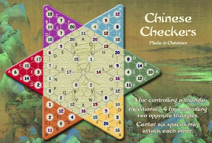
Now that it's loaded I can already see that the cicles may need a bit more texture, but i'm tired and going to bed.
So I'm back to the old style or circle, but I want them to 'pop out' less from the rest of the image. I've toned them down a bit from the last version, and the outside color of each circle is pulled from the color triangle on which it sits. Tell me what you think - as I lose interest in the map I lose the ability to tell if something looks good anymore.

Now that it's loaded I can already see that the cicles may need a bit more texture, but i'm tired and going to bed.

- Captain Crash
- Posts: 252
- Joined: Thu Feb 01, 2007 7:06 pm
- Location: Melbourne
- Guiscard
- Posts: 4103
- Joined: Fri Dec 08, 2006 7:27 pm
- Location: In the bar... With my head on the bar
The title needs a black border to match the legend text below, else it looks 'dimmer', if you catch my drift.
As for the circles, they're OK but as Andy said I wouldn't mind seeing some alternate shades and tones...
As for the circles, they're OK but as Andy said I wouldn't mind seeing some alternate shades and tones...
qwert wrote:Can i ask you something?What is porpose for you to open these Political topic in ConquerClub? Why you mix politic with Risk? Why you not open topic like HOT AND SEXY,or something like that.
at this point, i would be happy with any army circles you decide on. i just want to play the map, and not have it die  .
.
your army numbers look a little off. and i agree with guiscard bout an outline on the title.
other than that, i personally think going back to the original army circles from before the depth ones [light texture and clean border] would be easiest and best, but i dont really think theyre that big a deal.
Do you need an excuse to have a war? I mean, who for? Can't you just say "You got lots of cash and land, but I've got a big sword, so divy up right now, chop chop."
Terry Pratchet
Terry Pratchet
Guiscard wrote:The title needs a black border to match the legend text below, else it looks 'dimmer', if you catch my drift.
As for the circles, they're OK but as Andy said I wouldn't mind seeing some alternate shades and tones...
Hmm... i dropped the border (which isn't black anywhere, but a dark green) from the title at the request of others. Look below at the old map and tell me if it was better before.
Andy's comment about the shades and tones was in reference to the hand-painted zen buddhist circles that I posted briefly and pulled because the colors were off. I scrapped the idea because, as noted above, it only looked good without any army shadow, and this map needs army shadows.
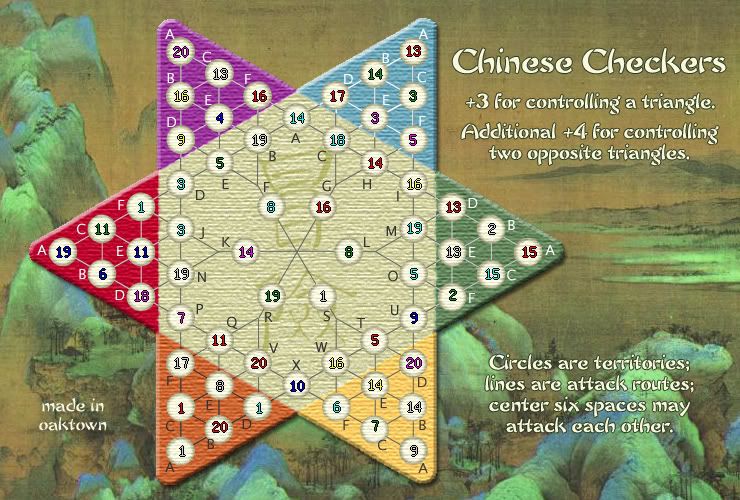
The only map/circle options I'm currently entertaining suggestions on are 1) the new map at the top of this page, and 2) the map, below, from two weeks ago. Keep in mind that I haven't made other changes to the map below, such as moving the legend down and putting the circle in the center. I'm looking for a preference on the circles only at this point.

- DiM
- Posts: 10415
- Joined: Wed Feb 14, 2007 6:20 pm
- Gender: Male
- Location: making maps for scooby snacks
the map looks wonderfulland the only problem is the fact that army numbers are deviated.
keep going, i can't wait to play this map.
PS: in team games players should really be carefull what they type in chat.
imagine this:
green: next turn attack q
red: done q is conquered.
green: damn. i ment w it was a typo

keep going, i can't wait to play this map.
PS: in team games players should really be carefull what they type in chat.
imagine this:
green: next turn attack q
red: done q is conquered.
green: damn. i ment w it was a typo
“In the beginning God said, the four-dimensional divergence of an antisymmetric, second rank tensor equals zero, and there was light, and it was good. And on the seventh day he rested.”- Michio Kaku
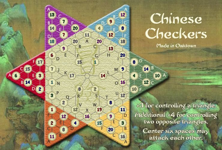
What're these images all about, you ask?
- old version of circles, but the colors muted a bit more so they blend
- text size/arrangement updated to match the more popular, later versions
- kanji brought forward so the center circles don't seem to float above the board
- old version of circles, but the colors muted a bit more so they blend
- text size/arrangement updated to match the more popular, later versions
- kanji brought forward so the center circles don't seem to float above the board

Last edited by oaktown on Thu Mar 01, 2007 12:50 am, edited 1 time in total.

KEYOGI wrote:Why don't you just pick one you like the best and go with that. If that's the ones you just posted, then so be it. You could go backwards and forwards on these damn circles for months and still not everybody would be happy.
I hear that... ultimately it won't matter, because we're talking about subtle differences that don't effect gameplay at all. The circles from a couple of weeks ago are the best in my opinion - not the pure white, but the off-white above. I'll go back to that and end all of this going around in, well, circles.


