The map looks crisp and clean - the only thing that bugs me is the fuzziness of the text. It's bearable on the large map (just about), but if there's any way you could make it clearer (particularly on the small) then that would be great.
Other than that, I can't see anything holding this back from a graphics stamp....
PB: 2661 | He's blue...If he were green he would die | No mod would be stupid enough to do that
MrBenn wrote:The map looks crisp and clean - the only thing that bugs me is the fuzziness of the text. It's bearable on the large map (just about), but if there's any way you could make it clearer (particularly on the small) then that would be great.
Other than that, I can't see anything holding this back from a graphics stamp....
Thanks Mr Benn Here is new version 27 with the bevel removed on the lower legend and a different colour consistent with the over theme, much clearer i hope.
ender516 wrote:The legend looks much clearer to me now. But now the text above the map looks blurry by comparison. Some days it doesn't pay to get out of bed.
I actually didn't want to change the larger top legend text, simply because it was larger and more legible than the smaller stuff at the bottom.
* Pearl Harbour * Waterloo * Forbidden City * Jamaica * Pot Mosbi
ender516 wrote:The legend looks much clearer to me now. But now the text above the map looks blurry by comparison. Some days it doesn't pay to get out of bed.
I actually didn't want to change the larger top legend text, simply because it was larger and more legible than the smaller stuff at the bottom.
Well, I did say "by comparion". If you made it clearer, that would be great for my aging lenses, but I believe it is legible enough as is.
Just a comment, Rivero is not a Portuguese name and I went investigate if he could have served the Portuguese Kingdom as corsary. But I've seen the opposite. He's a spanish pirate so you must change his nationality to Spanish
Just a comment, Rivero is not a Portuguese name and I went investigate if he could have served the Portuguese Kingdom as corsary. But I've seen the opposite. He's a spanish pirate so you must change his nationality to Spanish
Just a comment, Rivero is not a Portuguese name and I went investigate if he could have served the Portuguese Kingdom as corsary. But I've seen the opposite. He's a spanish pirate so you must change his nationality to Spanish
Hi! My sources: http://www.vleonica.com/rivero.htm give him as serving for Spain not mentioning where he has come from. But yours, although refering him as Portuguese, connect him to serving Spain interests so if he served Spain he must be named as a Spanish Corsary. For example Columbus (in Spanish and Portuguese, Colombo) was born either in Italy or Portugal as recent studies show, though he served Spain so it were the Spanish the ones who discovered America because he served Spain and not his home country. It's not in question the nationality of the pirates but the interests/ countries they serve, in my opinion
I can make out the icons on the large version, but not so much on the small. Maybe you would consider enlarging them a bit cairns. There seems to be plenty enough room to me.
porkenbeans wrote:... I can make out the icons on the large version, but not so much on the small. Maybe you would consider enlarging them a bit cairns. There seems to be plenty enough room to me.
Where exactly are you referrring to?
* Pearl Harbour * Waterloo * Forbidden City * Jamaica * Pot Mosbi
porkenbeans wrote:... I can make out the icons on the large version, but not so much on the small. Maybe you would consider enlarging them a bit cairns. There seems to be plenty enough room to me.
Where exactly are you referrring to?
I am talking about all of the rum bottles and food stuffs and such. If you are looking at the small version, the viewer will not be able to tell just what they are. The large map it is not a problem. I suggest just changing the size of the icons to what they are on the large version. And then those on the large version can be even larger than they are now, which will add to the beauty of this map. those icons are wonderful, just make them larger so that they can be seen and appreciated more.
Also the sugar and the gold need a drop shadow like the other icons have. Maybe experiment a little with that drop shadow. I think that you can make the icons stand up a little more from the map surface.


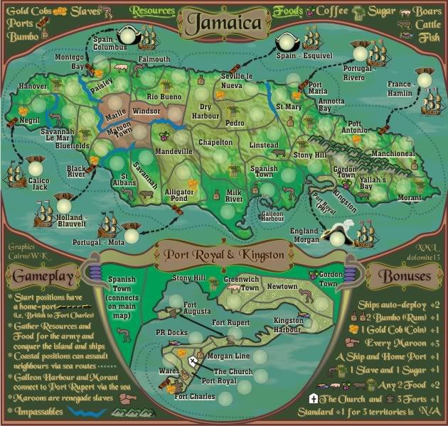

But now the text above the map looks blurry by comparison.


