one more thing the area near salina is kinda barren perhaps some little nothing doodle would go there to fill up some space
Route 66 [Quenched]
Moderator: Cartographers
Forum rules
Please read the Community Guidelines before posting.
Please read the Community Guidelines before posting.
-
Samuraipizzaguy
- Posts: 32
- Joined: Wed Apr 22, 2009 10:35 pm
Re: Route 66: white shields, p. 5
thank you for fixing the yellow 
one more thing the area near salina is kinda barren perhaps some little nothing doodle would go there to fill up some space
one more thing the area near salina is kinda barren perhaps some little nothing doodle would go there to fill up some space
-
AndyDufresne

- Posts: 24935
- Joined: Fri Mar 03, 2006 8:22 pm
- Location: A Banana Palm in Zihuatanejo
- Contact:
Re: Route 66: white shields, p. 5
I was the 1001st view of this topic. Just something I noticed! Anyways, I actually kind of liked the yellow---it gave some additional color to the map which I enjoyed. The white isn't bad, but it just feels more like it's lack something than being purposefully white.
Like the boot and the riverboat. Chimney Rock is still something you could add to Nebraska if you are looking for a landmark.
--Andy
Like the boot and the riverboat. Chimney Rock is still something you could add to Nebraska if you are looking for a landmark.
--Andy
-
sully800

- Posts: 4978
- Joined: Wed Jun 14, 2006 5:45 pm
- Gender: Male
- Location: Bethlehem, Pennsylvania
Re: Route 66: white shields, p. 5
AndyDufresne wrote:I was the 1001st view of this topic. Just something I noticed! Anyways, I actually kind of liked the yellow---it gave some additional color to the map which I enjoyed. The white isn't bad, but it just feels more like it's lack something than being purposefully white.
Like the boot and the riverboat. Chimney Rock is still something you could add to Nebraska if you are looking for a landmark.
--Andy
I agree that the yellow livened up the map a bit and it definitely made the Rte 66 territories stand out more. However visibility of the yellow armies on the yellow background is a real concern, and I think the yellow was a bit too strong judging by the general discontent of everyone posting.
Perhaps a compromise could be reached with white signs and a yellow glow or border to still distinguish them from the other territories?
-
Samuraipizzaguy
- Posts: 32
- Joined: Wed Apr 22, 2009 10:35 pm
Re: Route 66: white shields, p. 5
sully800 wrote:Perhaps a compromise could be reached with white signs and a yellow glow or border to still distinguish them from the other territories?
that sounds good
-
Optimus Prime

- Posts: 9665
- Joined: Mon Mar 12, 2007 9:33 pm
- Gender: Male
Re: Route 66: white shields, p. 5
I am positive that Greenriver should actually be Green River. I live in Utah and I've never seen it spelled the way that you have it right now.
-
sailorseal

- Posts: 2735
- Joined: Sun May 25, 2008 1:49 pm
- Gender: Male
- Location: conquerclub.com
Re: Route 66: white shields, p. 5
AndyDufresne wrote:I was the 1001st view of this topic. Just something I noticed! Anyways, I actually kind of liked the yellow---it gave some additional color to the map which I enjoyed. The white isn't bad, but it just feels more like it's lack something than being purposefully white.
Like the boot and the riverboat. Chimney Rock is still something you could add to Nebraska if you are looking for a landmark.
--Andy
I agree, I don't like the white, it doesn't feel right

Re: Route 66: white shields, p. 5
Optimus Prime wrote:I am positive that Greenriver should actually be Green River. I live in Utah and I've never seen it spelled the way that you have it right now.
You're totally right.
As for yellow vs. white territory "shields" - right now I also feel that something is 'missing' from the map, but I suspect that it's a result of my having gotten used to it one way and now I'm looking at it differently. I've probably spent more time looking at the white signs than anyone, and I have to say I'm getting used to it this way. The other elements of the map are brought out more when your eye isn't pulled to the bright yellow.
It was also pointed out that actual Route 66 signs were white, not yellow; bright yellow road markers are a later invention.
As for the Route 66 cities now looking like all of the other cities, I hope that the combination of the shape and the red route line make them quite distinct.
-
the.killing.44

- Posts: 4724
- Joined: Thu Oct 23, 2008 7:43 pm
- Gender: Male
- Location: now tell me what got two gums and knows how to spit rhymes
- Contact:
Re: Route 66: white shields, p. 5
I think you should make the color somewhere between yellow and white — white makes them blend in too much while the previous yellow stands out too much.
.44
.44

Re: Route 66: fast and furious updates, page 4
[bigimg]http://i141.photobucket.com/albums/r76/ron_parodi/Route%2066/route08.jpg[/bigimg]
Looks good to me OT.
Are you going to spice up those doodles in the background? The mountain range in California (Sierra Nevada I guess?) looks a little bad. I like the fun text you picked out, but I don't really like the yellow glow on it (the legend text that is). I think the white glow looks better. You have 48 territories - why not add more cities? You don't have to worry about bonus regions, since there are none
Do you think it will be too hard to win? I mean if you've got to hold every R66 city to win. If you start getting close, you've got everyone on the whole map breaking your cities. I dunno - I guess I'll let others comment on this.
Hmm.. The more I look at this map, the more I think it could benefit if it were vertically balanced. You have that row of images along the bottom. is there a way to fit a horizontal box along the top of the map also, which you could put your title/legend in?

-
AndyDufresne
- Posts: 24935
- Joined: Fri Mar 03, 2006 8:22 pm
- Location: A Banana Palm in Zihuatanejo
- Contact:
Re: Route 66: white shields, p. 5
Just so you know, "Troops" are official CC language---but I know maps are thematic, and thus can use "armies" or whatever term they find most appropriate.  Just pointing this out to everyone.
--Andy
--Andy

Re: Route 66: white shields, p. 5
The new colour-scheme feels a bit washed out... I'm sure you could add some colour without making the sign overly yellow.... the whites of an old postcard would have aged to a dull creamy beige by now in any case...
Here are some images for inspiration (including one you posted way back when )
Here are some images for inspiration (including one you posted way back when


PB: 2661 | He's blue... If he were green he would die | No mod would be stupid enough to do that
Re: Route 66: white shields, p. 5
AndyDufresne wrote:Just so you know, "Troops" are official CC language---but I know maps are thematic, and thus can use "armies" or whatever term they find most appropriate.
Right... I'm not committed to using either "troops" or "armies." I'm using "Cities" rather than zones because it is thematic, so if anybody has another term that suits the map I'm all ears. Forces?
As for the colors... it's gotten progressively more dull as the map has progressed. I need to inject some life back into it.

Re: Route 66: white shields, p. 5
oaktown wrote:AndyDufresne wrote:Just so you know, "Troops" are official CC language---but I know maps are thematic, and thus can use "armies" or whatever term they find most appropriate.
Right... I'm not committed to using either "troops" or "armies." I'm using "Cities" rather than zones because it is thematic, so if anybody has another term that suits the map I'm all ears. Forces?
As for the colors... it's gotten progressively more dull as the map has progressed. I need to inject some life back into it.
why not call them gas stations?
i say use the colors
blue and red
-
Samuraipizzaguy
- Posts: 32
- Joined: Wed Apr 22, 2009 10:35 pm
Re: Route 66: white shields, p. 5
a.sub wrote:why not call them gas stations?
Or Truck stops, Tourists, etc.

Re: Route 66: white shields, p. 5
Call me a smart ass or what, but isn't Route 66 the main street of the United States?
Sorry it's just don't like a single country being represented as two continents, it's a personal thing. I'm not joking or being sarcastic to clarify, it is personal.
The suggestion is self explanatory, hope you consider it .
Sorry it's just don't like a single country being represented as two continents, it's a personal thing. I'm not joking or being sarcastic to clarify, it is personal.
The suggestion is self explanatory, hope you consider it
MrBenn wrote:On an a side-note, as a child I used to have a recurring nightmare about being chased round a supermarket by a crocodile pushing a shopping trolley and wearing an "I ♥ Shopping" t-shirt...
-----Spanish Civil War: Vacationed
-
dolomite13

- Posts: 1379
- Joined: Mon Aug 18, 2008 5:54 pm
Re: Route 66: white shields, p. 5
I like it non yellow better than yellow. How about adding some good old american red, white & blue to it ...
http://people.smu.edu/iaberle/ian_icons ... sample.jpg
http://www.telegraph.co.uk/telegraph/mu ... 41862c.jpg
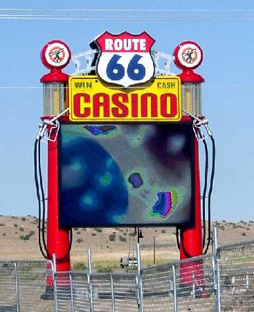
http://www.zianet.com/mmason/Casinos/Ph ... e66_11.jpg
Fantastic job on this map though. I am itchin to play it =)
--D
http://people.smu.edu/iaberle/ian_icons ... sample.jpg
http://www.telegraph.co.uk/telegraph/mu ... 41862c.jpg
http://www.zianet.com/mmason/Casinos/Ph ... e66_11.jpg
Fantastic job on this map though. I am itchin to play it =)
--D
Where Have I Been? ... Testing a prototype board game that I co-designed called Alien Overrun!
-
lostatlimbo

- Posts: 1386
- Joined: Wed Mar 28, 2007 3:56 pm
- Location: Portland, OR
Re: Route 66: white shields, p. 5
Map is looking great Oaktown. I like "Attractions" better than cities or gas stations, etc. - especially with some of my suggestions below. I also like "Rest Stops" as an alternative.
I noticed you have ELY spelled ETY on the map. However, I think you should drop Ely in favor of Elko. Ely is in the middle of nowhere and Carson City would more accurately link with Winnemucca and Elko, well north of Ely. I think you should drop Wendover and use those two cities instead.
Speaking of Carson City - I think you should replace it with Reno. Its bigger, better known and more geographically accurate. In Nevada, consider dropping Beatty for Yosemite. It would then extend into California, but you seem to have the space and Yosemite is certainly a more exciting stop than Beatty!
I also don't understand San Bernadino. Geographically (and even thematically), that should be Barstow - or at the very least, Victorville. I see that you intended it as the crux between I-15 and I-10, but I think it would be more interesting to have 10 connect with LA and add Palm Springs in between, and then replace San Bernadino with Mojave. I've had the misfortune of spending some time in San Bernadino, so forgive my prejudice.
Lastly, I really like the 'pencil' drawings, though I agree that the Sierras could look a little more imposing (as they well are in person). While the nuclear symbol in Northern New Mexico is cute, I wonder whether a simple Indian Pueblo might be more accurate. There are some beautiful ruins in that part of the state and that is much more a part of the "Land of Enchantment" 's identity than Los Alamos is.
While I'm not so offended as this poster, I do think "Main Street USA" is a better tagline than "Main Street of America".
I noticed you have ELY spelled ETY on the map. However, I think you should drop Ely in favor of Elko. Ely is in the middle of nowhere and Carson City would more accurately link with Winnemucca and Elko, well north of Ely. I think you should drop Wendover and use those two cities instead.
Speaking of Carson City - I think you should replace it with Reno. Its bigger, better known and more geographically accurate. In Nevada, consider dropping Beatty for Yosemite. It would then extend into California, but you seem to have the space and Yosemite is certainly a more exciting stop than Beatty!
I also don't understand San Bernadino. Geographically (and even thematically), that should be Barstow - or at the very least, Victorville. I see that you intended it as the crux between I-15 and I-10, but I think it would be more interesting to have 10 connect with LA and add Palm Springs in between, and then replace San Bernadino with Mojave. I've had the misfortune of spending some time in San Bernadino, so forgive my prejudice.
Lastly, I really like the 'pencil' drawings, though I agree that the Sierras could look a little more imposing (as they well are in person). While the nuclear symbol in Northern New Mexico is cute, I wonder whether a simple Indian Pueblo might be more accurate. There are some beautiful ruins in that part of the state and that is much more a part of the "Land of Enchantment" 's identity than Los Alamos is.
Merker wrote:Call me a smart ass or what, but isn't Route 66 the main street of the United States?
While I'm not so offended as this poster, I do think "Main Street USA" is a better tagline than "Main Street of America".
-
rjz115dude
- Posts: 52
- Joined: Sun Dec 07, 2008 7:10 pm
Re: Route 66: white shields, p. 5
The game has nice gameplay but looks like you put this together in a couple of minutes. As if you thought about the idea had it all planned out and then decided to upload something ASAP. The tourist attractions on the bottom don't fit well with the map. Is it supposed to be a 'postcard' like map?
-115
-115
-
thenobodies80

- Posts: 5400
- Joined: Wed Sep 05, 2007 4:30 am
- Gender: Male
- Location: Milan
Re: Route 66: white shields, p. 5
I am pleased to issue this map the draft stamp on behalf of the foundry community

Welcome to the Foundry Proper!
TNBDS
Welcome to the Foundry Proper!
TNBDS

Re: Route 66: white shields, p. 5
I think we need some resuscitation in this map thread, stat! It's going limp, I'm not feeling a pulse!
Re: Route 66: white shields, p. 5
[bigimg]http://i141.photobucket.com/albums/r76/ron_parodi/Route%2066/route09.jpg[/bigimg]
Sorry, my foundry attention has been on the maps that are getting closer to completion.
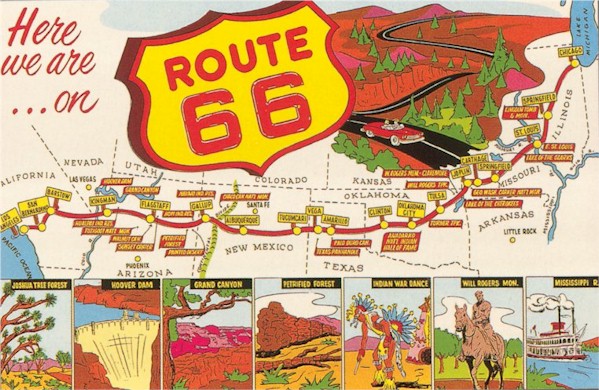
I hope that I've addressed the city location concerns. I'm still not pleased with any of the options for rebranding cities and armies - the cities are cities, and that works with the road trip theme. Plus I've tried to name cities on the Route after cities in the song that we all know and love, with the obvious exception of Wynona which is only in there because they needed a rhyme for Arizona.
Color: my intention is to add more color to the image. I've already begun adding color to the images across the bottom of the postcard, in an attempt to make them look like 1950s colorized images. The color is not intended to look realistic - it should look like paint. But color can come over time; right now I'd like everybody's opinion on how this map will play.
Well, this is update nine, and each update has taken between one and three hours. For instance, the silly little line-art pictures on the map may not have the flash of elements on other maps, but they were all hand-drawn and, I hope, help take the viewer back to 1950.
Sorry, my foundry attention has been on the maps that are getting closer to completion.
I hope that I've addressed the city location concerns. I'm still not pleased with any of the options for rebranding cities and armies - the cities are cities, and that works with the road trip theme. Plus I've tried to name cities on the Route after cities in the song that we all know and love, with the obvious exception of Wynona which is only in there because they needed a rhyme for Arizona.
Color: my intention is to add more color to the image. I've already begun adding color to the images across the bottom of the postcard, in an attempt to make them look like 1950s colorized images. The color is not intended to look realistic - it should look like paint. But color can come over time; right now I'd like everybody's opinion on how this map will play.
The game has nice gameplay but looks like you put this together in a couple of minutes. As if you thought about the idea had it all planned out and then decided to upload something ASAP.
Well, this is update nine, and each update has taken between one and three hours. For instance, the silly little line-art pictures on the map may not have the flash of elements on other maps, but they were all hand-drawn and, I hope, help take the viewer back to 1950.

-
AndyDufresne
- Posts: 24935
- Joined: Fri Mar 03, 2006 8:22 pm
- Location: A Banana Palm in Zihuatanejo
- Contact:
Re: Route 66: page 7 update
I'm a big fan of the color you've added to the post-cards---though I wonder if "Polaroids" would maybe be even more fitting with a Road Trip theme (see endless flickr webstreams of polaroid road trip pictures that I'm too fond of). Polaroids would unfortunately distory the image, or shorten and cut it, but a thought nonetheless.
As for game play, I've never been very good looking at these build bonus maps...so I'll have to give it some thought.
--Andy
As for game play, I've never been very good looking at these build bonus maps...so I'll have to give it some thought.
--Andy
-
the.killing.44
- Posts: 4724
- Joined: Thu Oct 23, 2008 7:43 pm
- Gender: Male
- Location: now tell me what got two gums and knows how to spit rhymes
- Contact:
Re: Route 66: page 7 update
This isn't really a comment (I'll pop in another time), but I just want to say that the color you added is perfectly perfect. Kudos kudos kudos.
.44
.44
-
lostatlimbo
- Posts: 1386
- Joined: Wed Mar 28, 2007 3:56 pm
- Location: Portland, OR
Re: Route 66: page 7 update
love the postcards! very authentic looking.
a few creases or bent edges would really bring those to life.
one minor typo: Pocahontas - no i
a few creases or bent edges would really bring those to life.
one minor typo: Pocahontas - no i
-
jesusfreak16

- Posts: 203
- Joined: Wed May 20, 2009 6:10 pm
- Location: classified
Re: Route 66: page 7 update
This would be one of my absolute favorites! Great job!! 
