
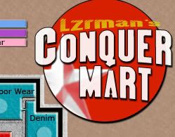
[Abandoned] - Conquer Mart!
Moderator: Cartographers
Forum rules
Please read the Community Guidelines before posting.
Please read the Community Guidelines before posting.
Re: Conquer Mart! - [V17]
I've played around with the title... you could try going for something like this:

PB: 2661 | He's blue... If he were green he would die | No mod would be stupid enough to do that
-
barterer2002

- Posts: 6311
- Joined: Mon Jul 02, 2007 11:51 am
- Gender: Male
- Contact:
Re: Conquer Mart! - [V17]
OK so it looks like there are two differences. The floor pattern and the cart/path attack routes.
Personally I prefer the floor in Map 1 and the paths in Route 2, I've never particularly like the cart attack routes.
Personally I prefer the floor in Map 1 and the paths in Route 2, I've never particularly like the cart attack routes.


Re: Conquer Mart! - [V17]
MrBenn wrote:I've played around with the title... you could try going for something like this:
Awesome!!! I seriously am gonna do something very similar! You've sparked my inspiration 10 Fold

Re: Conquer Mart! - [V17]
OoooOoooo, you get to call it Lzrman's Conquer Mart!
Re: Conquer Mart! - [V17]
Well we have to personalize it somehow *l*
-
Merciless Wong
- Posts: 199
- Joined: Wed Feb 06, 2008 8:12 pm
Re: Conquer Mart! - [V17]
On continent balance, aren't appliances and furniture particularly good?
They look easier to hold for a large bonus than others..
If you don't have continent bonuses balanced, a random start positions can result in the player with the most randomly allocated turf in the strong continents winning...
They look easier to hold for a large bonus than others..
If you don't have continent bonuses balanced, a random start positions can result in the player with the most randomly allocated turf in the strong continents winning...
Re: Conquer Mart! - [V17]
We can simplify that by adding more connection points, I will review and add that to my list of modifications to implement on the map.
-
tlane
- Posts: 309
- Joined: Wed Oct 22, 2008 7:11 pm
- Gender: Male
- Location: NYC - sint maarten(sometimes)
Re: Conquer Mart! - [V17]
This looks great!!
I think the title in V17.2 is cool and the on that Benn put on is cool, but they both give a totally different feel to the map so I think that is your choice.
In terms of gameplay I would split the checkouts into 2 territs
tlane
will be back!
I think the title in V17.2 is cool and the on that Benn put on is cool, but they both give a totally different feel to the map so I think that is your choice.
In terms of gameplay I would split the checkouts into 2 territs
tlane
will be back!
Re: Conquer Mart! - [V18]
[bigimg]http://www3.telus.net/lzrman/misc/conquerclub/conquer_mart18.jpg[/bigimg]
Update: March 11/2009 = Version 18
- Split Checkouts into Checkouts and Self Checkouts
- Color Variance from Legend to Actual Territories was off too!
- Changed floor coloring and made it more floor like.
- Added little cartoonish characters shopping with Carts
- Added fancy Logo (suggested by MrBenn)
- Drew Department Ariel Diagrams
- solid/dotted line by the dress ware area, removed.
- Removed Money Symbols
- Corrected Bonuses
Any thoughts?! from
http://www3.telus.net/lzrman/misc/conqu ... mart17.jpg
to
http://www3.telus.net/lzrman/misc/conqu ... mart18.jpg
-
hoschke118

- Posts: 33
- Joined: Wed Aug 27, 2008 2:21 am
Re: Conquer Mart! - [V18]
Hi! I'm just gonna stop by and give an opinion.
Nice map! V18 looks much nicer than V17 although:
- I do prefer those shopping carts used in V17
- That new logo looks a bit out of place. It looks a bit too... umm, evil (?) for the rest of the map imo. (it looks good, but not for this map)
- I think the bonuses could use some work (eg children's wear looks a lot easier to hold than service)
hope this helps!
-
rishaed

- Posts: 1052
- Joined: Fri Jul 20, 2007 8:54 pm
- Location: Somewhere in the Foundry forums looking for whats going on!
Re: Conquer Mart! - [V18]
personally because every area in the service area connects to every other area, I think it should be bumped up to a bonus of 2
aage wrote: Maybe you're right, but since we receive no handlebars from the mod I think we should get some ourselves.

-
sailorseal

- Posts: 2735
- Joined: Sun May 25, 2008 1:49 pm
- Gender: Male
- Location: conquerclub.com
Re: Conquer Mart! - [V18]
I like the new texture. Will be back with more support
Re: Conquer Mart! - [V18]
rishaed wrote:personally because every area in the service area connects to every other area, I think it should be bumped up to a bonus of 2
Next Revision will include a increase of 1 to the Service Area.

Re: Conquer Mart! - [V18]
Ooooh, who's that in the Women's Wear Fitting Rooms? And who's that guy peeking in? Whoa there! 
natty_dread wrote:Do ponies have sex?
(proud member of the Occasionally Wrongly Banned)Army of GOD wrote:the term heterosexual is offensive. I prefer to be called "normal"
Re: Conquer Mart! - [V18]
I like the little people, they add a bit of kitsch charm to the map, although I'm sure others will dislike them 
The new title doesn't really do anything for me - your name should be a lot smaller...
The little lines in the background are a great touch - it might be worth splitting the sections onto different layers and tweaking the transparency so that they're fractionally darker on some areas where they don't show up as clearly.
Anyway, let's get this boat on the road:

Welcome to the Foundry Proper... Onwards and upwards!
The new title doesn't really do anything for me - your name should be a lot smaller...
The little lines in the background are a great touch - it might be worth splitting the sections onto different layers and tweaking the transparency so that they're fractionally darker on some areas where they don't show up as clearly.
Anyway, let's get this boat on the road:
Welcome to the Foundry Proper... Onwards and upwards!
PB: 2661 | He's blue... If he were green he would die | No mod would be stupid enough to do that
-
LED ZEPPELINER
- Posts: 1088
- Joined: Tue Nov 25, 2008 10:09 pm
Re: Conquer Mart! - [V18]
MrBenn wrote:I like the little people, they add a bit of kitsch charm to the map, although I'm sure others will dislike them
The new title doesn't really do anything for me - your name should be a lot smaller...
The little lines in the background are a great touch - it might be worth splitting the sections onto different layers and tweaking the transparency so that they're fractionally darker on some areas where they don't show up as clearly.
Anyway, let's get this boat on the road:
Welcome to the Foundry Proper... Onwards and upwards!
congrats, its taken a while, but the time spent has been worth it
Re: Conquer Mart! [D] - [V18]
W00t! Thanks Mr. Benn  !
!
Next Update Will Have:
1. Connection from Infants > Foot Wear
2. Change on the Floor Background to Raise the Opacity of the lines slightly.
3. Service bonus increased to +2
4. Different Colored Logo to match the map colors, (not so evil)
If you could add another connection point, where would you add it? to assist in balancing the bonus?
Last edited by lzrman on Thu Mar 12, 2009 7:09 pm, edited 2 times in total.
-
sailorseal
- Posts: 2735
- Joined: Sun May 25, 2008 1:49 pm
- Gender: Male
- Location: conquerclub.com
Re: Conquer Mart! [D] - [V18]
Glad to see you brought back some cool drawings and that you are in the main foundry!
Re: Conquer Mart! [D] - [V19]
[bigimg]http://www3.telus.net/lzrman/misc/conquerclub/conquer_mart19.jpg[/bigimg]
Any thing else you guys can think of before I start XML?
Any thing else you guys can think of before I start XML?
Last edited by lzrman on Thu Mar 12, 2009 9:14 pm, edited 1 time in total.
-
LED ZEPPELINER
- Posts: 1088
- Joined: Tue Nov 25, 2008 10:09 pm
Re: Conquer Mart! [D] - [V19]
right now i don't realy like your background, maybe add a parking lot outside or something
Re: Conquer Mart! [D] - [V19]
LED ZEPPELINER wrote:right now i don't realy like your background, maybe add a parking lot outside or something
Like a darker-light gray with yellow lines for the parking dividers?
Re: Conquer Mart! [D] - [V19_2]
LED ZEPPELINER wrote:right now i don't realy like your background, maybe add a parking lot outside or something
[bigimg]http://www3.telus.net/lzrman/misc/conquerclub/conquer_mart19_2.jpg[/bigimg]
Something like so?!
-
LED ZEPPELINER
- Posts: 1088
- Joined: Tue Nov 25, 2008 10:09 pm
Re: Conquer Mart! [D] - [V19]
yes but it would be better if you kept your lines consistent, and maybe make the doorway and actual door

Re: Conquer Mart! [D] - [V19]
too gray imo
Re: Conquer Mart! [D] - [V19]
Congratulations on making it to the main foundry!
But your colour scheme still does nothing for me. The colours simply do not go together, they are not pleasing to look at. Look at other maps - Cairns Metro or Coral Coast, Duck and Cover, Egypt Upper, NYC, Puget Sound, Mongol Empire. The colours go together, they jive. They're arranged in a pleasant manner, and look professional.
Can we try something different?