[Abandoned] - Conquer CLUB Golf

Abandoned and Vacationed maps. The final resting place, unless you recycle.

Moderator: Cartographers

Forum rules
Please read the Community Guidelines before posting.

Which path is better?

 
Total votes: 0

User avatar
MrBenn
Posts: 6880
Joined: Wed Nov 21, 2007 9:32 am
Location: Off Duty

Re: Conquer CLUB Golf - New paths - poll

Post by MrBenn »

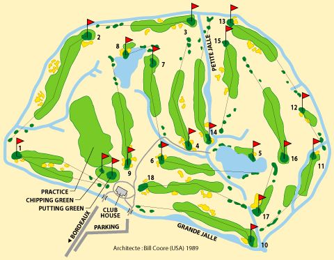
The consensus seems to be that the graphics need a bit of work... Here are some pictures from google:

Image
Image

More importantly than the graphics however, is the gameplay... I'm still not convinced by the way that everything is set up and laid out at the moment... get the structure right first, and then let the graphics improve ;-)
Image
PB: 2661 | He's blue... If he were green he would die | No mod would be stupid enough to do that
User avatar
TaCktiX
Posts: 2392
Joined: Mon Dec 17, 2007 8:24 pm
Gender: Male
Location: Rapid City, SD

Re: Conquer CLUB Golf - New paths - poll

Post by TaCktiX »

I research this thing for the Newsletter and I get my name invoked. Geez, people expect me to lurk in threads or something. ;)

So on the trees. Here's the basis that DiM gave me for how to change the brush. You end up with what I term an "inconsistent brush", giving you half-tones of the original color all over the place.

DiM wrote:shape dynamics>
> size jitter 100%
> minimum diameter 0%
> angle jitter 0%
> roundness jitter 68%
> min roundness 25%


scatter> adjust as you please dependng on what you need

colour dynamics>
>fore/back 100%
> saturation 50%
the rest at 0%

and check smoothing.


I made my brush color straight black and used a decent size of this brush preset above. Then I painted around in what I considered a tree to look like, varying the shapes as much as I felt like (I was able to come up with 21 or so different trees on The Citadel, so it's do-able). Then I adjusted the tree layer's hue to be some shade of green. To complete the effect, I would switch to a smaller and more consistent brush, keep the black, and add in random specks of black to make it look more like a tree with some shadow on it. Note that all the trees I made were made at a scale 4-5 times larger than the version that actually appeared on the map. That way I could reduce their size to Small and Large and experience no quality loss at all.

Best of luck on it, and look for my write-up on your map tomorrow in the 8th Issue.
User avatar
laci_mae
Posts: 404
Joined: Tue Jan 08, 2008 6:08 pm
Gender: Female
Location: Arkansas

Re: Conquer CLUB Golf - New paths - poll

Post by laci_mae »

So sorry Tac. I meant to copy you on that comment, but I got busy and forgot.

I stand behind the sentiment though. You had several trials with your trees, and they turned out fantastic.

Best,
Laci
User avatar
mibi
Posts: 3350
Joined: Thu Mar 01, 2007 8:19 pm
Location: The Great State of Vermont
Contact:

Re: Conquer CLUB Golf - New paths - poll

Post by mibi »

I have no idea how the gameplay will turn out, but graphically, this is one of the most cohesive maps out there. Well done.

The title needs sprucing up though.
User avatar
Ethitts
Posts: 220
Joined: Tue Jul 03, 2007 3:53 am

Re: Conquer CLUB Golf - New paths - poll

Post by Ethitts »

mibi wrote:I have no idea how the gameplay will turn out, but graphically, this is one of the most cohesive maps out there. Well done.

The title needs sprucing up though.


Cheers mibi. It's comments like that, mixed with others on the opposite perspective, that confuse me as to where I should go with this map (graphics-wise). Looks like the wooden paths were most popular, so I will incorporate those in certain places. I think a new poll may be needed though - Stating: "Are the graphics on the right track? Or is a complete revamp needed?"

EDIT: Of course the tree's need replacing though.
ImageImage
User avatar
mibi
Posts: 3350
Joined: Thu Mar 01, 2007 8:19 pm
Location: The Great State of Vermont
Contact:

Re: Conquer CLUB Golf - New paths - poll

Post by mibi »

Ethitts wrote:
mibi wrote:I have no idea how the gameplay will turn out, but graphically, this is one of the most cohesive maps out there. Well done.

The title needs sprucing up though.


Cheers mibi. It's comments like that, mixed with others on the opposite perspective, that confuse me as to where I should go with this map (graphics-wise). Looks like the wooden paths were most popular, so I will incorporate those in certain places. I think a new poll may be needed though - Stating: "Are the graphics on the right track? Or is a complete revamp needed?"

EDIT: Of course the tree's need replacing though.


The graphics are fine. They have a 80's pastel, pixelated feel, and it fits perfectly with the map. Golf courses are for relaxation and leisure, this maps says that.

I am not sure who your detractors are but they may be trying to fit a square peg in a round hole.
User avatar
e_i_pi
Posts: 1775
Joined: Tue Feb 12, 2008 2:19 pm
Location: Corruption Capital of the world
Contact:

Re: Conquer CLUB Golf - New paths - poll

Post by e_i_pi »

First time I've posted in this thread I believe.

I don't like golf, but I like this map. The gameplay would be really good, I don't think we have a map with attack routes like the tees, so that would make for interesting gameplay and tactics. The name of the holes are fantastic.

I think the trees need some work, maybe just more types of trees. The tree stamps themselves look fine, but there's only two types that I can see, need a fair few more if you're going to use 150-200 trees.

I think the fairway texture could use a bit of work, maybe a new texture completely. You do get the feel for it being grassy, but it all runs in a WNW-ESE direction, which doesn't give each hole a sense of being a continent by itself.

The beaches and docks looks great, as well as the club house. It's a nice style, very laid back and neat.

The concrete path leading from the Golf Cart Depot to Classic Tee almost looks bevelled, but I think thats from the trees and shadows. Maybe shift those trees out the way of the path a tiny bit to give the path the same aesthetic as the other paths?

Some of the bunkers and beaches look a little bit pixelly, but that's because of the colours dark green and bone/cream being next to each other. I've had this very same problem myself, I've had to use completely different layer styles and blur filters to resolve it due to the big difference in hue.

Keep going with this. I haven't seen it move forward much lately which is a shame. This is the sort of map I could see myself playing again and again.
User avatar
Natewolfman
Posts: 4599
Joined: Wed Aug 29, 2007 6:37 pm
Gender: Male
Location: omaha, NE

Re: Conquer CLUB Golf - New paths - poll

Post by Natewolfman »

definately wooden
User avatar
dolomite13
Posts: 1379
Joined: Mon Aug 18, 2008 5:54 pm

Re: Conquer CLUB Golf - New paths - poll

Post by dolomite13 »

I am an avid golfer and have been for more than 30 years. I love this idea and hope to be able to play it someday.
User avatar
wcaclimbing
Posts: 5598
Joined: Fri May 12, 2006 10:09 pm
Location: In your quantum box....Maybe.
Contact:

Re: Conquer CLUB Golf - New paths - poll

Post by wcaclimbing »

MrBenn, why is this thread still stickied?
Ethitt's most recent post was on September 26th....
Almost a month without the mapmaker commenting, shouldn't this be going to the Scrap Heap?
Image
User avatar
MrBenn
Posts: 6880
Joined: Wed Nov 21, 2007 9:32 am
Location: Off Duty

Re: Conquer CLUB Golf - New paths - poll

Post by MrBenn »

This map has been moved into retirement.

It would appear that development of this map has stalled, as there have not been any updates for some time.

If the mapmaker wants to continue with the map, then one of the CAs will be able to help put the thread back into the Foundry system ;-)

Mr B
Image
PB: 2661 | He's blue... If he were green he would die | No mod would be stupid enough to do that
User avatar
phantomzero
Posts: 827
Joined: Fri Dec 28, 2007 7:13 pm
Location: 2742 high score 122710

Re: Conquer CLUB Golf - New paths - poll

Post by phantomzero »

It's too bad this map has been stalled for nearly a year. A Golf Map seems like a great idea.
Image
Post Reply

Return to “Recycling Box”