Rail Australia [Quenched]

Care to peruse completed maps? Take a stroll through the Atlas.

Moderator: Cartographers

Forum rules
Please read the Community Guidelines before posting.
Post Reply
User avatar
iancanton
Foundry Foreman
Foundry Foreman
Posts: 2452
Joined: Fri Jun 01, 2007 5:40 am
Location: europe

Post by iancanton »

cairnswk wrote:what would make the eruopean map look more european?


that's a difficult one. europe is very diverse and, since some places on the map aren't in the european union, u can't even use an eu flag image. however, this is a bit off-topic.

hope ur feet are dry now.

u have two city codes for darwin: DWN on the map and DRW in the legend. putting "darwin dwn" into google produces darwin, minnesota as the first link, while "darwin drw" gives darwin, northern territory. i conclude that DRW is more logical.

it's not 100% clear which route to port the minerals must take between mount isa and townsville. i assume there's meant to be an orange box at hughenden to show the way.

while on the subject of mount isa, i suggest that ISA will be more recognisable than MTI as the city code.

i agree that a hub isn't necessary for this map. however, if u put one in, then would using a square prism as the adelaide hub work better than the curious half-hub in version 10?

ian. :)
User avatar
cairnswk
Posts: 11510
Joined: Sat Feb 03, 2007 8:32 pm
Gender: Male
Location: Australia

Post by cairnswk »

iancanton wrote:
cairnswk wrote:what would make the eruopean map look more european?


that's a difficult one. europe is very diverse and, since some places on the map aren't in the european union, u can't even use an eu flag image. however, this is a bit off-topic.

hope ur feet are dry now.

u have two city codes for darwin: DWN on the map and DRW in the legend. putting "darwin dwn" into google produces darwin, minnesota as the first link, while "darwin drw" gives darwin, northern territory. i conclude that DRW is more logical.

it's not 100% clear which route to port the minerals must take between mount isa and townsville. i assume there's meant to be an orange box at hughenden to show the way.

while on the subject of mount isa, i suggest that ISA will be more recognisable than MTI as the city code.

i agree that a hub isn't necessary for this map. however, if u put one in, then would using a square prism as the adelaide hub work better than the curious half-hub in version 10?

ian. :)


ian...nope...still wet feet, been raining here for 5 days...monsson season, but at least we are not flooded.
Thanks for the comments. I'll attend to those suggestions re ISA and DRW.
The hub i am trying to work something into that meeting place symbol.
Most likely to be a quad with rounded edges. :)
Image
* Pearl Harbour * Waterloo * Forbidden City * Jamaica * Pot Mosbi
User avatar
FreeMan10
Posts: 152
Joined: Wed Jan 23, 2008 12:48 pm
Location: On The Road

Post by FreeMan10 »

Well, I've managed to stop spending so much time staring at a stupid monitor! :)

Cairns, sorry to hear about your flooding, but that brings up a good point. Maybe you should elevate all the rail lines so we don't have any washouts. That'd put a real crimp in the game, and might even cause players to miss turns waiting for the tracks to be repaired! :lol:

I think it was Oaktown who guessed that the hub was panned because of graphical issues, not game play. I'd agree with that statement.

Quick ad for Prohibition Chicago: Great map - it's gonna be a fun game!
User avatar
cairnswk
Posts: 11510
Joined: Sat Feb 03, 2007 8:32 pm
Gender: Male
Location: Australia

Post by cairnswk »

OK VErsion 12 update.

1. Finally figureed out the Adelaide hub to look like a digeridoo - fits map and retains link to other rail maps.
2. still have to re-work the eastern half of the station boxes in the eastern states.
3. Bonus long distance background will look like a glass station.

EDIT\\\ Those eastern station boxes are now fixed and re-configured.

Image

Image
Last edited by cairnswk on Sun Mar 23, 2008 6:19 am, edited 1 time in total.
Image
* Pearl Harbour * Waterloo * Forbidden City * Jamaica * Pot Mosbi
User avatar
Tieryn
Posts: 781
Joined: Mon May 28, 2007 7:30 am
Gender: Male
Location: Generation One
Contact:

Post by Tieryn »

Oh bravo... I LOVE the didge... that's top notch dude. I'll update the XML soon to include new hub-logic and territories.
User avatar
cairnswk
Posts: 11510
Joined: Sat Feb 03, 2007 8:32 pm
Gender: Male
Location: Australia

Post by cairnswk »

Tieryn wrote:Oh bravo... I LOVE the didge... that's top notch dude. I'll update the XML soon to include new hub-logic and territories.


Yeh...i'm happy with it also...i might see if i can add some wood grain markings to add a bit of authenticity to it later.....

do you have sig image like mine that i can add to the map Tieryn...like my butterfly

Image

Image
Image
* Pearl Harbour * Waterloo * Forbidden City * Jamaica * Pot Mosbi
User avatar
Tieryn
Posts: 781
Joined: Mon May 28, 2007 7:30 am
Gender: Male
Location: Generation One
Contact:

Post by Tieryn »

BNE is missing an [X]

The Ghan territs list is hard to read.

Could possibly P/M go on one side/position consistent for all stations, and the O/X/S/G/I go on the other side? to differentiate between "long distance" and "port/min" or perhaps use a triangle for one or something along those lines?
User avatar
edbeard
Posts: 2501
Joined: Thu Mar 29, 2007 12:41 am

Post by edbeard »

I'll look over the gameplay some other time cairnswk, but one thing I notice right away is the text in the lower left legend being hard to read. Most of it is probably fine, but the pink is unreadable, and the yellow and orange are both difficult to read at best.


Could you maybe add extra Ms to the stations that are part of the 'direct route' for mineral pairs?

Also, could you make the colours a bit more distinguishable between the P - M for TSV - ISA and MKY - EMD. I know they're right next to each other and a mistake is unlikely. But, from a visual P.O.V. it seems quite weird to have those right next to each other.
User avatar
oaktown
Posts: 4451
Joined: Sun Dec 03, 2006 9:24 pm
Location: majorcommand

Post by oaktown »

could just be me, but I find the legend text next to "The Ghan" almost impossible to read against the background.

Periods at the end of 2nd and 3rd legend lines, to stay consistent.

Is the "+4 I:Indian-Pacific" etc. line against a different background for a reason?

ADL looks like a giant sperm swimming out at us. :shock:
Image
User avatar
Tieryn
Posts: 781
Joined: Mon May 28, 2007 7:30 am
Gender: Male
Location: Generation One
Contact:

Re:

Post by Tieryn »

oaktown wrote:ADL looks like a giant sperm swimming out at us. :shock:


See!! take -that- voldemort! :P Bwahaha on the sperm...

Didge needs to look more wood, more oldschool classic.

Image

Try something with that
User avatar
Tieryn
Posts: 781
Joined: Mon May 28, 2007 7:30 am
Gender: Male
Location: Generation One
Contact:

Re: RAIL AUSTRALIA V12 (p14) [I]- new design elements

Post by Tieryn »

Here's another thought. It's very distinguishable what stations are in what territories... Even if you were to make all the rails a single colour (black/grey/something) you would be able to tell what stations are in what states. Borders plus colouring makes that easy. Also each territ name will have its xRail component in the name. So how about we make all the rail lines a single colour

EXCEPT: have coloured long-distance lines... Choose 4 new colours, that will look good on a didge... Or for an aussie feel... Green and Gold (maybe true blue?) or Red Black Yellow, or somethign that will fit with the map, but don't have all coloured lines. The only coloured rails would be
Per - Adl - Bhl - Org - Syd indian pacific - will be one coloured rail.
Adl - Drw Ghan will be another colour (no rails overlap so this is fine)
Adl - Bdt - Mel Overlander will be a third... again still no overlap coming out from adelaide on rail lines

Mel - Gbn - Syd - Nwc - Bne (no overlap of rails passing through sydney, only of the station, which is it state colour

Bne - Gls - Cns Sunlander (No overlap, rails on opposite sides of BNE)

Dude... I think this is the solution we're looking for :) can you give it a go? make all rail lines doubles (they just look so much better) but make them all black or grey, Make the long distance rails (none of which overlap anywhere) their own unique colours - on the rail lines. This will EASILY display them... Then use those colours in the legend, rather than having 3 colours per long distance service.
User avatar
lord voldemort
Posts: 9596
Joined: Sat Oct 20, 2007 4:39 am
Gender: Male
Location: Launceston, Australia
Contact:

Re:

Post by lord voldemort »

oaktown wrote:ADL looks like a giant sperm swimming out at us. :shock:

:evil: die evil man we in adelaide are proud, very clean, and hate victoria (actually everyone hates them)
and we are no giant sperm

oh on topic. i wouldnt mind seeing wat tieryn proposed
Image
User avatar
TaCktiX
Posts: 2392
Joined: Mon Dec 17, 2007 8:24 pm
Gender: Male
Location: Rapid City, SD

Re: RAIL AUSTRALIA V12 (p14) [I]- new design elements

Post by TaCktiX »

Cairns, I know you're going for a more "aussie" look for this one compared to your other two Rail maps, but I don't see why the hub station on this one has to be oblong instead of being a perfect circle. Seems out of place and draws my attention to the deformed part thinking "this looks wrong."
User avatar
cairnswk
Posts: 11510
Joined: Sat Feb 03, 2007 8:32 pm
Gender: Male
Location: Australia

Re: RAIL AUSTRALIA V12 (p14) [I]- new design elements

Post by cairnswk »

I want to thank everyone for their opinion on this map so far.....i know it has been a while a since i did anything to it.....but i am waiting on Rail Europe to be quenched before i start work on this one again. :)
Image
* Pearl Harbour * Waterloo * Forbidden City * Jamaica * Pot Mosbi
User avatar
Tieryn
Posts: 781
Joined: Mon May 28, 2007 7:30 am
Gender: Male
Location: Generation One
Contact:

Re: RAIL AUSTRALIA V12 (p9) [I]- Slowed production!

Post by Tieryn »

That works well for me :) I've been really busy lately anyway :D But have a read through my ideas, I tink I've cracked the nut of this problem for how to colour rails/territs
User avatar
TaCktiX
Posts: 2392
Joined: Mon Dec 17, 2007 8:24 pm
Gender: Male
Location: Rapid City, SD

Re: RAIL AUSTRALIA V12 (p9) [I]- Slowed production!

Post by TaCktiX »

Presently doing the stats on this map, and I saw a few things that were comment-worthy:

- The text describing the long distance routes gets washed out pretty heavily by the terminal background on it, especially the brown which I can't read at all. I suggest changing colors of either to make them show up.
- Could you use different symbols for the Port/Mineral pairs and the overland routes? Perhaps a triangle or diamond for the overlands instead of a box? As it stands it seems like you need the overland routes to get P/M bonus, even though the legend says otherwise. Rail USA is great for its understandable simplicity, keep it up with Rail Australia as I know you already did that for Rail Europe. ;)
User avatar
zimmah
Posts: 1652
Joined: Fri Jun 01, 2007 12:43 pm
Gender: Male
Location: VDLL

Re: RAIL AUSTRALIA V12 (p14) [I]- new design elements

Post by zimmah »

cairnswk wrote:I want to thank everyone for their opinion on this map so far.....i know it has been a while a since i did anything to it.....but i am waiting on Rail Europe to be quenched before i start work on this one again. :)


when will you start again? i pretty much like to play rail maps and rail australia might be nice. however i don't like the graphics.
[bigimg]http://sense4seo.nl/signatures/sig-zimmah.jpg[/bigimg]
User avatar
cairnswk
Posts: 11510
Joined: Sat Feb 03, 2007 8:32 pm
Gender: Male
Location: Australia

Re: RAIL AUSTRALIA V12 (p14) [I]- new design elements

Post by cairnswk »

Current Version 12.
Image

[bigimg]http://i155.photobucket.com/albums/s282/cairnswk/RAIL%20AUST/rail_austraila_V12L.jpg[/bigimg]
Last edited by cairnswk on Thu Jul 24, 2008 1:08 pm, edited 1 time in total.
Image
* Pearl Harbour * Waterloo * Forbidden City * Jamaica * Pot Mosbi
User avatar
zimmah
Posts: 1652
Joined: Fri Jun 01, 2007 12:43 pm
Gender: Male
Location: VDLL

Re: RAIL AUSTRALIA V12 (p14) [I]- new design elements

Post by zimmah »

cairnswk wrote:
zimmah wrote:
cairnswk wrote:I want to thank everyone for their opinion on this map so far.....i know it has been a while a since i did anything to it.....but i am waiting on Rail Europe to be quenched before i start work on this one again. :)


when will you start again? i pretty much like to play rail maps and rail australia might be nice. however i don't like the graphics.


Thanks Zimmah for comments. I waas just thinking what to work on next....this of course.

Can you expand on what part of graphics you don't like....i would like to keep the aboriginal theming, but naturally there is lots of work still to be done on the stations etc.

Current Version 12.
Image

[bigimg]http://i155.photobucket.com/albums/s282/cairnswk/RAIL%20AUST/rail_austraila_V12L.jpg[/bigimg]


the background looks like someone's has been sick all over it (don't like the color, don't really like the image either, don't know what the image in fact is supposed to be.

aborignals or so are fine, but make them look like aboriginals and not like sick people who puked all over your map please (sorry but i couldn't hink of better wording)
hmm i'll see if i can find any other images that might be suitable as a background underlay/ovelray whatever you call it.

also the 'army circles' aren't looking as nice as the other rail maps, i think you can easily fix that though.

ADL looks nice but i don't like the 'hippie rainbow thingy"

i don't actually like the water and the borders either (the borders connecting the land to the sea)

Oceania (australia) has such nice water around it, why don't you show it in your map? it's a pity you can't see the nice water surrounding the continent really.

also, you are using awefull colors, try to pick something flashier and not those brownish, sick colors, make the colors look more alive and make them stand out more, also make the territorie names stand out more as they now almost blur into the background. they're hardly even readable in the small version.

as for the legend: a lot of names in there and even though they are somewhat 'color coded' (most of them with the same puke-brown/greenwhatever color (i hardly even knew such a color existed, lol :lol: ) i can still hardly find the territories you're talking about in the legend. so i think you should find a way to make them more clear and make them stand out more.

as for all the small letters next to some territories (apperently not all off them) i don't know what the're supposed to mean, and they are kinda small anyways (especially on the small map again)

(i'm not trying to insult you or your map but really i'd expect better from you, the map idea is great but the grapics are really shit, especially from you i'd expect something better, i know it's a first draft but really, you can do much much better, i know you can)

btw, what are all those UFO's doing in the water?

short version: i think it needs a mayor graphical changeover

maybe this will fit in btw.

Image

maybe you can also add some of the animals like koala bears or kangeroos or something. dunno.

either way, checkup list:

-army circles
- color
- background (color or image, or both)
- water
- get rid of the UFO's (as well as the radiation they seem to leave on the map)
- ehm did i forget something?

well i'm gunna sleep anyways, check again later. bye.

hope you find my comment usefull and not too insulting, since i don't want to offent you, i'm just saying you could do much better :D
[bigimg]http://sense4seo.nl/signatures/sig-zimmah.jpg[/bigimg]
User avatar
cairnswk
Posts: 11510
Joined: Sat Feb 03, 2007 8:32 pm
Gender: Male
Location: Australia

Re: RAIL AUSTRALIA V12 (p14) [I]- new design elements

Post by cairnswk »

zimmah wrote:the background looks like someone's has been sick all over it (don't like the color, don't really like the image either, don't know what the image in fact is supposed to be.

aborignals or so are fine, but make them look like aboriginals and not like sick people who puked all over your map please (sorry but i couldn't hink of better wording)
hmm i'll see if i can find any other images that might be suitable as a background underlay/ovelray whatever you call it.


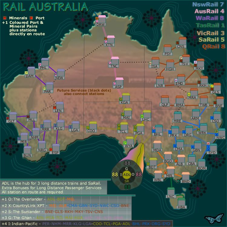
Well the background is an image of the Indian Pacific rolling across the Nullabour Plain....not of aboiriginals, that is a kanagaroo on the left.

Now that image won't change as there are plenty of people who like this and don't think it looks like puke. so please don't bother looking for another image.

also the 'army circles' aren't looking as nice as the other rail maps, i think you can easily fix that though.
yes agreed they need fixing.

ADL looks nice but i don't like the 'hippie rainbow thingy"
a didgeridoo for ADL, but needs work.

i don't actually like the water and the borders either (the borders connecting the land to the sea)
i like this and so do others, so it stays.
Oceania (australia) has such nice water around it, why don't you show it in your map? it's a pity you can't see the nice water surrounding the continent really.
the object of this map is not to show that. this map has a certain style and i'd like to retain it.

also, you are using awefull colors, try to pick something flashier and not those brownish, sick colors, make the colors look more alive and make them stand out more, also make the territorie names stand out more as they now almost blur into the background. they're hardly even readable in the small version.
i think the colours are reflective of our continent. the continent is not flashy and doesn't need flashy colours to look good. sorry to disagree but i am fairly strong on this one.
The territory names will be worked on.


as for the legend: a lot of names in there and even though they are somewhat 'color coded' (most of them with the same puke-brown/greenwhatever color (i hardly even knew such a color existed, lol :lol: ) i can still hardly find the territories you're talking about in the legend. so i think you should find a way to make them more clear and make them stand out more.

yes agreed, that needs work.

as for all the small letters next to some territories (apperently not all off them) i don't know what the're supposed to mean, and they are kinda small anyways (especially on the small map again)

taken note of. needs work.

(i'm not trying to insult you or your map but really i'd expect better from you, the map idea is great but the grapics are really shit, especially from you i'd expect something better, i know it's a first draft but really, you can do much much better, i know you can)

i know you're not trying to insult me or the map, if i didn't know any better however you're style is doing a pretty good job of it so far. Using words like puke and telling me it looks like shit doesn't help, regardless of how honest you want to be. But if that's you're style then you're entitled to your opinion. It is not mine and not that of others, from what i can tell of previous posts. All your opinions don't necessarily add up to "Zimmah is totally right", although your posting attitude gives me the impression that you think you are.
This is far from first draft it is V12 afterall. If you expect better than you obviously don't know my style at all. I do appreciate you positiveness, but perhaps you should hold back a little to see where I take this, eh?

btw, what are all those UFO's doing in the water?

If you read back through the thread you'd see where a lot of this has come from.
This is part of the aboriginal design for this map. refer back a couple of page and you'll find out.

short version: i think it needs a mayor graphical changeover

Short version, i disagree, and there will be some changes but not the major ones you ask for. Sorry.

maybe this will fit in btw.
maybe you can also add some of the animals like koala bears or kangeroos or something. dunno.
either way, checkup list:
-army circles
- color
- background (color or image, or both)
- water
- get rid of the UFO's (as well as the radiation they seem to leave on the map)
- ehm did i forget something?
well i'm gunna sleep anyways, check again later. bye.
hope you find my comment usefull and not too insulting, since i don't want to offent you, i'm just saying you could do much better :D

Mmmm hope you have a good night....i don't like the image of the aboriginal as this is not what the map is about, it's also not about kangaroos or animals or other things, that's why there is a train crossing the Nullabour in the centre with a kangaroo very faintly watching on over a desert of wild grasses (your so called puke). We have such a sparse continent (very different from Europe) and i was hoping to convey that message and i think this image does that very well, although not for you.
Thanks you for you confidence that i can do much better, but this map will have the certain style that i am aiming for, not some tourist representation. :)
Image
* Pearl Harbour * Waterloo * Forbidden City * Jamaica * Pot Mosbi
User avatar
lord voldemort
Posts: 9596
Joined: Sat Oct 20, 2007 4:39 am
Gender: Male
Location: Launceston, Australia
Contact:

Re: RAIL AUSTRALIA V12 (p9) [I] - Starting Again!

Post by lord voldemort »

zimmah a very stereotypical view of australia u gave there....the dig in adl better stay :(

ill wait for a new update but im really looking forward to this
Image
User avatar
cairnswk
Posts: 11510
Joined: Sat Feb 03, 2007 8:32 pm
Gender: Male
Location: Australia

Re: RAIL AUSTRALIA V12 (p9) [I] - Starting Again!

Post by cairnswk »

lord voldemort wrote:zimmah a very stereotypical view of australia u gave there....the dig in adl better stay :(

ill wait for a new update but im really looking forward to this


Yes lord V... i agree. The dig in adl will stay, but i gotta "better it up". I know i said i'd get back to this after Rail Europe, and have been working on new stations, but artistic creativity is limited at present and i'm having a hard time... so i will attempt something again in a few weeks after the Egypt series is completed. ;)
Image
* Pearl Harbour * Waterloo * Forbidden City * Jamaica * Pot Mosbi
User avatar
yeti_c
Posts: 9624
Joined: Thu Jan 04, 2007 9:02 am
Gender: Male

Re: RAIL AUSTRALIA V12 (p9) [I] - Starting Again!

Post by yeti_c »

I think the sides of the map are too close - a bit cramped - could you grow the image - but keep the map the same size to give it a bit of breathing space on either side?

C.
Image
Highest score : 2297
User avatar
cairnswk
Posts: 11510
Joined: Sat Feb 03, 2007 8:32 pm
Gender: Male
Location: Australia

Re: RAIL AUSTRALIA V12 (p9) [I] - Starting Again!

Post by cairnswk »

yeti_c wrote:I think the sides of the map are too close - a bit cramped - could you grow the image - but keep the map the same size to give it a bit of breathing space on either side?

C.

For you C...mosts things are possible...Hehehe! :twisted:
Image
* Pearl Harbour * Waterloo * Forbidden City * Jamaica * Pot Mosbi
User avatar
Blitzaholic
Posts: 23050
Joined: Wed Aug 09, 2006 11:57 pm
Location: Apocalyptic Area

Re:

Post by Blitzaholic »

coming along, looking good cairns, you all put a lot of work in these maps, how do find the time
Image
Post Reply

Return to “The Atlas”