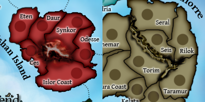
Version 10!
Version 10 (Large)
[bigimg]http://smg.photobucket.com/albums/v238/Rhiannonaecastilla/CC/Maps/Archipelago/ArchMap10.png[/bigimg]
What you need to know
Number of territories: 42
Number of continents: 7
Gameplay Info: Classic gameplay
Updates in This Version:
1) Changed the legend
2) Renamed Iori and Rol Islands to Rol and Iori Keys
3) Decided bonus: Isris at +4
4) Moved blue territ circles to the water for visibility
5) Curved the attack lines
6) Redrew the top of the Kalwar Peninsula so that Inton could be contained within the territory
Points of Discussion:
1) Mountains? Are they hideous and should be changed? If so, any suggestions?
To Do:
1) Some minor stuff
Archipelago [Quenched]
Moderator: Cartographers
Forum rules
Please read the Community Guidelines before posting.
Please read the Community Guidelines before posting.
Re: Archipelago v9 (Pg. 1&16) [I, Gp] - UPDATED June 11
Reputation cleared.  Never let it be said that Team CC don't investigate fairly.
Although they take bloody forever to do it...
Although they take bloody forever to do it...
Re: Archipelago v9 (Pg. 1&16) [I, Gp] - UPDATED June 11
I think that legend keeps the flow a bit better, dontcha?
Reputation cleared. Never let it be said that Team CC don't investigate fairly.
Although they take bloody forever to do it...
Although they take bloody forever to do it...

Re: Archipelago v10 (Pg. 1&17) [I, Gp] - June 13
At least you should change the Vienlorre's monts.
Use 2 or 3 different drawings and alternate them.
You will avoid the dotted line effect.
Use 2 or 3 different drawings and alternate them.
You will avoid the dotted line effect.
De gueules à la tour d'argent ouverte, crénelée de trois pièces, sommée d'un donjon ajouré, crénelé de deux pièces
Gules an open tower silver, crenellated three parts, topped by a apertured turret, crenellated two parts
Gules an open tower silver, crenellated three parts, topped by a apertured turret, crenellated two parts

Re: Archipelago v9 (Pg. 1&16) [I, Gp] - UPDATED June 11
Mjinga wrote:I think that legend keeps the flow a bit better, dontcha?
much much nicer Mj!
yeap i like what you have done there a lot!
Last edited by jiminski on Fri Jun 13, 2008 5:36 pm, edited 1 time in total.

Re: Archipelago v10 (Pg. 1&17) [I, Gp] - June 13
I think perhaps the elevation of the mountains may be wrong? (certainly with the Bisham)
you have taken a a birdseye view of the island and placed a mountain from the perspective of only slight elevation.... i am not sure it is an all purpose cure but i 'might' help?
you have taken a a birdseye view of the island and placed a mountain from the perspective of only slight elevation.... i am not sure it is an all purpose cure but i 'might' help?
-
Mr. Squirrel

- Posts: 157
- Joined: Fri Nov 02, 2007 3:18 pm
- Location: up a tree
Re: Archipelago v10 (Pg. 1&17) [I, Gp] - June 13
I don't mind the mountains in Vienlorre, in fact I like them, it's only the mountains in Bishan that I dislike. With the other mountains, the original ones, they took up the whole center of the island, making it look like a wheel of territories. Can you make it look like that again? The way is looks now just doesn't make the island look the same.
Re: Archipelago v10 (Pg. 1&17) [I, Gp] - June 13
I can have a go at it. And I think that's precisely the problem, Jiminski. I'll work on that too. pamoa, I think you're right as well; I'll have a go at fixing it.
Reputation cleared. Never let it be said that Team CC don't investigate fairly.
Although they take bloody forever to do it...
Although they take bloody forever to do it...

Re: Archipelago v9 (Pg. 1&16) [I, Gp] - UPDATED June 11

Stamp-licker post
Mjinga and Zeak....some observations which you can choose to ignore if you want, but i'll make them anyways.
1. i find my eyes are constantly distracted by the strong red and purple colors on this map. i don't know if you'd want to change them at this stage, but that's what i see anyways.
2. i agree the large Vishan mountain is out of place compared to the others Veinlorre.
3. i'd like to see this map with with some arrangement of coloured army numbers on it to determine if they will sit well on the present dark army circles.
Use Arial 14 to create your 88 numbers and the different colours are:
#ff0000
#009a04
#0000ff
#ffff00
#ff00ff
#00ffff
#ff9922
#7f7f7f
4. Also would like to see the small version soon if possible.
Good work...keep going, almost there.

* Pearl Harbour * Waterloo * Forbidden City * Jamaica * Pot Mosbi

Re: Archipelago v10 (Pg. 1&17) [I, Gp] - June 13
jiminski wrote:I think perhaps the elevation of the mountains may be wrong? (certainly with the Bisham)
you have taken a a birdseye view of the island and placed a mountain from the perspective of only slight elevation.... i am not sure it is an all purpose cure but i 'might' help?
The original mountains had better elevation, but didn't fit with the style of the map. For the next version, we'll have a few different mountain options.
Mr. Squirrel wrote:I don't mind the mountains in Vienlorre, in fact I like them, it's only the mountains in Bishan that I dislike. With the other mountains, the original ones, they took up the whole center of the island, making it look like a wheel of territories. Can you make it look like that again? The way is looks now just doesn't make the island look the same.
I agree that the Bishan one is worse than the Vienlorre ones, but I think changing the Bishan one to something drastically different while leaving Vienlorre's alone would look odd. If one changes majorly, the other needs to. That being said, perhaps one of the newer mountains we'll post in the near future will solve the problem. I agree that the "wheel" look was better than the current one.
cairnswk wrote:1. i find my eyes are constantly distracted by the strong red and purple colors on this map. i don't know if you'd want to change them at this stage, but that's what i see anyways.
Hmm. No one else has had that problem yet, so I'm inclined to leave things the way they are now. Does anyone else find the colors problematic?
cairnswk wrote:2. i agree the large Vishan mountain is out of place compared to the others Veinlorre.
Yup, we're working on that.
cairnswk wrote:3. i'd like to see this map with with some arrangement of coloured army numbers on it to determine if they will sit well on the present dark army circles.
We had a version with 88s a while ago:
[bigimg]http://s5.photobucket.com/albums/y176/ZeakCytho/Version788s.png[/bigimg]
There were problems with the visibility of blue armies on the Isris territories. We moved the army circles completely onto the water to fix the problem, since the blue numbers on water-circles appear fine to us. The next version will have 88s with randomly spread colors, since we've proved that all continents except Isris are visible with their respective colors.
cairnswk wrote:4. Also would like to see the small version soon if possible.
We'll get to work on that as soon as the mountain problem is solved.
cairnswk wrote:Good work...keep going, almost there.
Thanks
Re: Archipelago v10 (Pg. 1&17) [I, Gp] - June 13
cairnswk wrote:1. i find my eyes are constantly distracted by the strong red and purple colors on this map. i don't know if you'd want to change them at this stage, but that's what i see anyways.
Please do not Change the Colour Scheme! it is bloody beautiful! ..sorry if i am being too technical!
Last edited by jiminski on Sat Jun 14, 2008 8:25 am, edited 1 time in total.
Re: Archipelago v10 (Pg. 1&17) [I, Gp] - June 13
ZeakCytho wrote:[bigimg]http://s5.photobucket.com/albums/y176/ZeakCytho/Version788s.png[/bigimg]
Just me being an old romantic .. but I do so like this version!
.. the mountains are practically perfect in style and elevation (and i love the organic nature of the Legend ... but you did some great work on the newer version and that has definitely won me over!!!)
Re: Archipelago v10 (Pg. 1&17) [I, Gp] - June 13
Version 11!
Here’s what I did. I made up a bunch of options for the mountains and stuff, and used my favourite Vienlorre mountains and Zeak’s favourite Bishan mountains (which is a lake, as it turns out). I’m thinking that we could mix and match from the options I’ll put beneath the updated thing.
Oh, and Zeak will have another go with putting up a poll, but if it doesn’t work… please be patient and voice your opinions in a post.
Version 11 (Large)
[bigimg]http://smg.photobucket.com/albums/v238/Rhiannonaecastilla/CC/Maps/Archipelago/ArchMap11.png[/bigimg]
What you need to know
Number of territories: 42
Number of continents: 7
Gameplay Info: Classic gameplay
Updates in This Version:
1) Changed the mountains
Points of Discussion:
1) Still the mountains
2) I personally like them, but does anyone have trouble with the colours?
To Do:
1) Add sample armies
2) Make small version
Poll Options:
Please remember if you like one set from one and another from another, you can vote for that by specifying.
Option A
Option B
Option C
Reputation cleared. Never let it be said that Team CC don't investigate fairly.
Although they take bloody forever to do it...
Although they take bloody forever to do it...
Re: Archipelago v10 (Pg. 1&18) [I, Gp] - June 13
Big surprise, the poll didn't work. Again. 
Just post your votes here again, guys.
P.S. my favorite set is Bishan C and Vienlorre B
Just post your votes here again, guys.
P.S. my favorite set is Bishan C and Vienlorre B
Re: Archipelago v11 (Pg. 1&18) [I, Gp] - June 15
Here's version 11 with randomly distributed 88s. Pardon the lack of centering.
[bigimg]http://s5.photobucket.com/albums/y176/ZeakCytho/Version1188s.png[/bigimg]
I'm partially colorblind and everything is visible to me. Anyone having problems seeing certain colors/locations?
[bigimg]http://s5.photobucket.com/albums/y176/ZeakCytho/Version1188s.png[/bigimg]
I'm partially colorblind and everything is visible to me. Anyone having problems seeing certain colors/locations?
Re: Archipelago v11 (Pg. 1&18) [I, Gp] - June 15
ZeakCytho wrote:Here's version 11 with randomly distributed 88s. Pardon the lack of centering.
[bigimg]http://s5.photobucket.com/albums/y176/ZeakCytho/Version1188s.png[/bigimg]
I'm partially colorblind and everything is visible to me. Anyone having problems seeing certain colors/locations?
truly truly beautiful work people!!
I absolutely love:
-the lake in place of the Mountain (once more evocative of circular motion and is in perfect harmony with the map!)
-the new Legend box (as above; if you get anymore perfect i may cry just a little)
-the Mountain Range in Vienlorre (correct for elevation, size and graphic)
(i do think that the blue numbers are tough to see against he dark green Island)
... just an aimless thought but perhaps you could put a river from the mountain to the see in Vienlorre: along the border between Luron coast : Kelata Torim. This would create a little cul de sac in Luron Coast.
-
Mr. Squirrel
- Posts: 157
- Joined: Fri Nov 02, 2007 3:18 pm
- Location: up a tree
Re: Archipelago v11 (Pg. 1&18) [I, Gp] - June 15
I prefer option A for bishan, but I really don't like any on vienlorre. Why can't you go back to the original mountains you had? Sure, they didn't fit with the rest of the graphics, but they looked better than any you have come up with so far.
As for colors, I think they are fine. I can see everything perfectly.
As for colors, I think they are fine. I can see everything perfectly.
Re: Archipelago v11 (Pg. 1&18) [I, Gp] - June 15
jiminski wrote:truly truly beautiful work people!!
I'll take the credit, since Mjinga isn't here
jiminski wrote:I absolutely love:
-the lake in place of the Mountain (once more evocative of circular motion and is in perfect harmony with the map!)
-the new Legend box (as above; if you get anymore perfect i may cry just a little)
-the Mountain Range in Vienlorre (correct for elevation, size and graphic)
Thanks! I don't love the mountains, but then again, I've never really loved the mountains choices. They're so hard to do!
jiminski wrote:(i do think that the blue numbers are tough to see against he dark green Island)
How bad is it? Like, you think we need to move the army circles off the islands like we did in Isris?
jiminski wrote:... just an aimless thought but perhaps you could put a river from the mountain to the see in Vienlorre: along the border between Luron coast : Kelata Torim. This would create a little cul de sac in Luron Coast.
I think the gameplay is pretty solid now, and adding that impassable just serves to make Vienlorre more linear. Right now that's the only really open continent, and I'd like to keep it that way.
Mr. Squirrel wrote:I prefer option A for bishan, but I really don't like any on vienlorre. Why can't you go back to the original mountains you had? Sure, they didn't fit with the rest of the graphics, but they looked better than any you have come up with so far.
I agree that the mountains aren't great, but the originals didn't work well either. We'll just keep trying new stuff until we get it right.
Mr. Squirrel wrote:As for colors, I think they are fine. I can see everything perfectly.
Yay
Keep the comments coming, guys.
-
Mr. Squirrel
- Posts: 157
- Joined: Fri Nov 02, 2007 3:18 pm
- Location: up a tree
Re: Archipelago v11 (Pg. 1&18) [I, Gp] - June 15
Mr. Squirrel wrote:As for colors, I think they are fine. I can see everything perfectly.
Yay
Keep the comments coming, guys.[/quote]
Just to be sure, (I only noticed this now) can you place some green 88's on the Caen islands? You don't have any on there currently.
Re: Archipelago v11 (Pg. 1&18) [I, Gp] - June 15
Mr. Squirrel wrote:Just to be sure, (I only noticed this now) can you place some green 88's on the Caen islands? You don't have any on there currently.
The green ones are there from this version, and the colors haven't changed:
[bigimg]http://s5.photobucket.com/albums/y176/ZeakCytho/Version788s.png[/bigimg]
-
Mr. Squirrel
- Posts: 157
- Joined: Fri Nov 02, 2007 3:18 pm
- Location: up a tree
Re: Archipelago v11 (Pg. 1&18) [I, Gp] - June 15
I had forgotten about that. Yeah, they all look fine. Great job. All that is left is to come up with a mountain/river system that looks good with everything else. Good luck with that! 
-
AndyDufresne

- Posts: 24935
- Joined: Fri Mar 03, 2006 8:22 pm
- Location: A Banana Palm in Zihuatanejo
- Contact:
Re: Archipelago v11 (Pg. 1&18) [I, Gp] - June 15
There has always been something I just couldn't put my finger on about this map...and now I think I know. I have the odd feeling that the water is in fact sky with a mix clouds...a little disorienting.
--Andy
--Andy
-
pepperonibread

- Posts: 954
- Joined: Sun Jan 28, 2007 4:33 pm
- Location: The Former Confederacy
Re: Archipelago v11 (Pg. 1&18) [I, Gp] - June 15
I agree with Andy... too deep of a blue might not work for this map, but you could definitely make the water more ocean-like.

Re: Archipelago v11 (Pg. 1&18) [I, Gp] - June 15
Okay, we can try darkening the water. I agree that a deep blue would probably make the map look too dark, but I think we can go darker than what we have now without having that problem.
Any other thoughts on the mountains problem?
Any other thoughts on the mountains problem?
Re: Archipelago v11 (Pg. 1&18) [I, Gp] - June 15
Will get right on the mentioned things.
Reputation cleared. Never let it be said that Team CC don't investigate fairly.
Although they take bloody forever to do it...
Although they take bloody forever to do it...
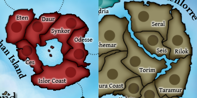
Re: Archipelago v12 (Pg. 1&19) [I, Gp] - June 17
Here's version 12! The mountains poll is still going on, but there were enough fixes to call for a new version now.
Version 12 (Large)
[bigimg]http://smg.photobucket.com/albums/v238/Rhiannonaecastilla/CC/Maps/Archipelago/ArchMap12.png[/bigimg]
Version 12 (Large) with 88s
[bigimg]http://s5.photobucket.com/albums/y176/ZeakCytho/Version1288s.png[/bigimg]
Updates in This Version:
1) Ocean made darker
2) Some misplaced dots in various attack lines fixed
3) Some odd-looking coasts redrawn to look more natural
4) Text of "Bishan Island" curved the other way to fit the flow of the island better
Points of Discussion:
1) Still the mountains
2) Ocean color dark enough? Or is it too dark? Comments on the new ocean in general.
To Do:
1) Make small version