Conquer 4 [Quenched]
Moderator: Cartographers
Forum rules
Please read the Community Guidelines before posting.
Please read the Community Guidelines before posting.
Re: Conquer 4. Page 1 + 4
[quote="cicero"]Space wise the right edge of the board looks a little cramped where it meets the legend .../quote]
I agree. If you move some of the holes closer together, like Cairns suggested, you could add a vertical divider - a thin red line, like your horizontal dividers between the title and names, or between the sections of the bonus area.
I guess the holes look okay now. The drop shadow is better. There's still a lot of contrast between the white parts of the hole and the board, but barring the addition of an image to the circle, I don't think you can really get around that...Unless, you could just make the background color behind the holes a very very light gray, just slightly off white.
Is there a way to get rid of the drop shadow that's at the bottom of the board while maintaining it for each hole? I don't think it looks especially good at the bottom.
- cicero
- Posts: 1358
- Joined: Wed Mar 07, 2007 1:51 pm
- Location: with the infected neutrals ... handing out maps to help them find their way to CC
Re: Conquer 4. Page 1 + 4
Further to my thought that the map is little cramped near the key I find myself thinking ...
"Combo making" is the art/skill of playing this map ... explicitly spelling out so many of the combos in the key might detract from the fun or , it could be argued, be somewhat redundant.
It seems there are only 2 rules which needs to be explicity stated:
(a) line of 4 = +2
(b) two bonuses may only share one space
... and if anything it's (b) that needs careful explanation - not extra space spent on (a).
FREE M-E-Mbership and simple rules. Conquer Club - it's not complicated.
random me statistic @ 13 December 2008 - 1336 posts : 232nd most public posts (not counting Tower of Babble) of all time.
random me statistic @ 13 December 2008 - 1336 posts : 232nd most public posts (not counting Tower of Babble) of all time.
- gimil
- Posts: 8599
- Joined: Sat Mar 03, 2007 12:42 pm
- Gender: Male
- Location: United Kingdom (Scotland)
Re: Conquer 4. Page 1 + 4
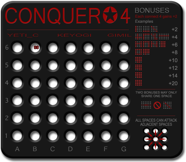
Added some more space and shuffled things around a little.
What do you know about map making, bitch?
Top Score:2403
natty_dread wrote:I was wrong
Top Score:2403
Re: Conquer 4. Page 1 + 4
The title looks like it was stretched up, while the names look like they were stretched sideways. Its not bad, it just looks strange next to each other.
- gimil
- Posts: 8599
- Joined: Sat Mar 03, 2007 12:42 pm
- Gender: Male
- Location: United Kingdom (Scotland)
Re: Conquer 4. Page 1 + 4
cicero wrote:Further to my thought that the map is little cramped near the key I find myself thinking ...
"Combo making" is the art/skill of playing this map ... explicitly spelling out so many of the combos in the key might detract from the fun or , it could be argued, be somewhat redundant.
It seems there are only 2 rules which needs to be explicity stated:
(a) line of 4 = +2
(b) two bonuses may only share one space
... and if anything it's (b) that needs careful explanation - not extra space spent on (a).
Ill get onto this for the next update
What do you know about map making, bitch?
Top Score:2403
natty_dread wrote:I was wrong
Top Score:2403
Re: Conquer 4. Page 1 + 4
I'm noticing that all the text washes out when there's any glare on my monitor. Perhaps make the red less subdued to avoid this problem?
Re: Conquer 4. Page 1 + 4
I still think a vertical divider separating the bonuses from the map and title would be good.
I agree with Kaplo on the title/names stretching. It's not a major point, but is there anything that can be done to fix this short of using a different font/shrinking the current one?
I agree with Kaplo on the title/names stretching. It's not a major point, but is there anything that can be done to fix this short of using a different font/shrinking the current one?
- AndyDufresne
- Posts: 24935
- Joined: Fri Mar 03, 2006 8:22 pm
- Location: A Banana Palm in Zihuatanejo
- Contact:
Re: Conquer 4. Page 1 + 4
I think a better placement of your signatuares may be in the right bottom corner, perhaps going along the base and then up the vertical in the corner. 
--Andy
--Andy
- gimil
- Posts: 8599
- Joined: Sat Mar 03, 2007 12:42 pm
- Gender: Male
- Location: United Kingdom (Scotland)
Re: Conquer 4. Page 1 + 4
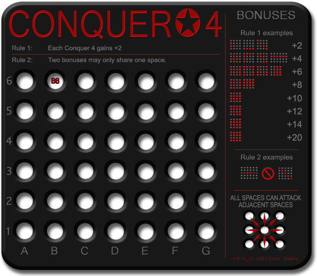
What do we all think of the reshuffle?
What do you know about map making, bitch?
Top Score:2403
natty_dread wrote:I was wrong
Top Score:2403
Re: Conquer 4. Page 1 + 4
Critique...
First up - I like the changes - everything seems to be slotting into place a lot more...
Rules - great idea. - consider having the red line above, below (or both) them.
Cicero's point about more space for rule 2 is still valid...
Consider dropping +8, +12, +14...
Then you have 3 lines of extra examples for Rule 2 -> which is the harder one to understand (also - the last example on +4 -> is also a rule 2 example.)
C.
PS -> Why is this still in ideas?

Highest score : 2297
- gimil
- Posts: 8599
- Joined: Sat Mar 03, 2007 12:42 pm
- Gender: Male
- Location: United Kingdom (Scotland)
Re: Conquer 4. Page 1 + 4
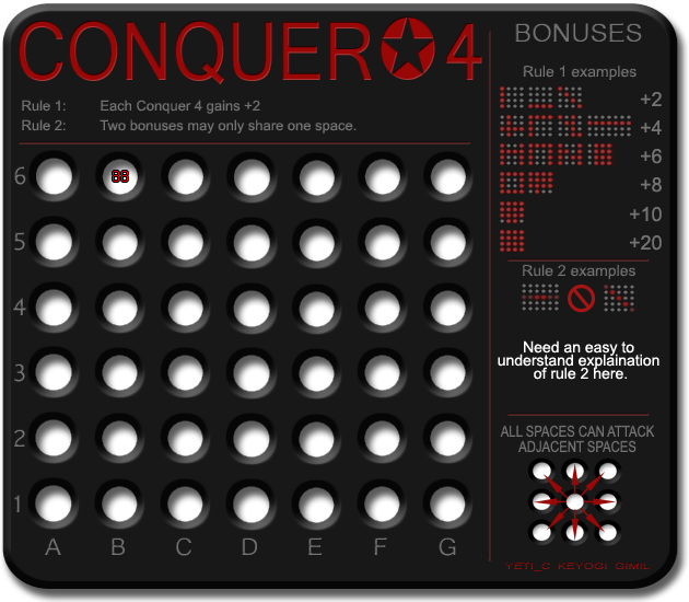
Some changes . . .

What do you know about map making, bitch?
Top Score:2403
natty_dread wrote:I was wrong
Top Score:2403
Re: Conquer 4. Page 1 + 5
Gimil....luv the last version, which is what i was alluring to in my first comments on design space.
The "buttons" now look more like holes, to my eyes anyway.
Sorry, i can't move it for you.
The "buttons" now look more like holes, to my eyes anyway.
Sorry, i can't move it for you.

* Pearl Harbour * Waterloo * Forbidden City * Jamaica * Pot Mosbi
Re: Conquer 4. Page 1 + 5
Explanation:
Two lines of four spaces in a row may only intersect in one place.
Is that good?
And the holes look better btw
Two lines of four spaces in a row may only intersect in one place.
Is that good?
And the holes look better btw
Re: Conquer 4. Page 1 + 5
This seems pretty "advanced" to me.
Can you do something with the colors of the circles in the legend examples? I have to look closely to tell them apart - the circles demonstrating what it takes to give a bonus should really pop out.
Any thought of making a 4x4 square a victory condition? Unless it's an advanced escalating game, anybody who holds a block of 16 should win anyway.
Re: Conquer 4. Page 1 + 5
oaktown wrote:Can you do something with the colors of the circles in the legend examples? I have to look closely to tell them apart - the circles demonstrating what it takes to give a bonus should really pop out
I have the same problem, maybe make the circles there all red, and the others bright red
Re: Conquer 4. Page 1 + 5
oaktown wrote:Any thought of making a 4x4 square a victory condition? Unless it's an advanced escalating game, anybody who holds a block of 16 should win anyway.
Personally I really dislike this idea... for a number of reasons.
a) I don't think a +20 bonus is all seeing all powerful on this board (also proved by your "unless" comment)
b) I think this is completely against the ethos of the idea.
c) It would look like shit in the XML
d) It would look like shit in BOB's Objective summary
C.

Highest score : 2297
- gimil
- Posts: 8599
- Joined: Sat Mar 03, 2007 12:42 pm
- Gender: Male
- Location: United Kingdom (Scotland)
Re: Conquer 4. Page 1 + 5
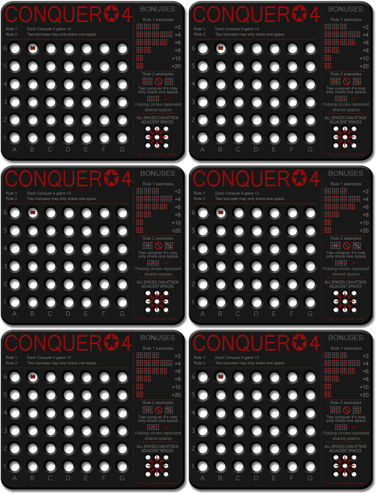
Some reorganisation for rule 2 explaination using animation
What do you know about map making, bitch?
Top Score:2403
natty_dread wrote:I was wrong
Top Score:2403
Re: Conquer 4. Page 1 + 5 - Animated!
The checkmark is a little too oblique, especially next to the bold crossed-out circle. Really good explanation of the rules now. There's plenty of room for creativity bonus-wise, and that's a good thing.
Re: Conquer 4. Page 1 + 5 - Animated!
actually it still really confuses me.... but i like the animation!!
Re: Conquer 4. Page 1 + 5 - Animated!
I think at least 1 more example of a good bonus (i.e. the N) would be good...
As that shows - it is 1 shared space between 2 different lines...
If you use the N - then oscillate the animation so the pulse at different times -to imply that they are different.
C.
As that shows - it is 1 shared space between 2 different lines...
If you use the N - then oscillate the animation so the pulse at different times -to imply that they are different.
C.

Highest score : 2297
- gimil
- Posts: 8599
- Joined: Sat Mar 03, 2007 12:42 pm
- Gender: Male
- Location: United Kingdom (Scotland)
Re: Conquer 4. Page 1 + 5 - Animated!
yeti_c wrote:I think at least 1 more example of a good bonus (i.e. the N) would be good...
As that shows - it is 1 shared space between 2 different lines...
If you use the N - then oscillate the animation so the pulse at different times -to imply that they are different.
C.
I didnt even think about the "N" ill put it in.
What do you know about map making, bitch?
Top Score:2403
natty_dread wrote:I was wrong
Top Score:2403
Re: Conquer 4. Page 1 + 5 - Animated!
The animation is cool. It took me a long time to interpret though because I thought it was one example. I thought since they both were next to the same no set symbol that the example was saying that the diagonal on right and straight line on left were incompatible because they shared two spaces. Only they obviously don't. lol. I would remove one and keep one. Probably the diagonal. Or remove the checkmark one and have the top left one be one check four and the top right another that conflicts (uses two of the same). Then have the bottom one be the combination with the flashing illegals with the no set sign.
Re: Conquer 4. Page 1 + 5 - Animated!

Carry on.
- gimil
- Posts: 8599
- Joined: Sat Mar 03, 2007 12:42 pm
- Gender: Male
- Location: United Kingdom (Scotland)
Re: Conquer 4. Page 1 + 5 [I]

Reworked rules 2 a little more.
What do you know about map making, bitch?
Top Score:2403
natty_dread wrote:I was wrong
Top Score:2403
- cicero
- Posts: 1358
- Joined: Wed Mar 07, 2007 1:51 pm
- Location: with the infected neutrals ... handing out maps to help them find their way to CC
Re: Conquer 4. Page 1 + 5 [I]
Gimil
My thoughts, illustrated below, are that:

[Excuse my rough graphic work, done by pixel manipulation rather than something more sophisticated ... and breaking your flashing spaces in the process. Some of the fonts/font sizes are certainly wrong too.]
My thoughts, illustrated below, are that:
- effectively stating the rules twice is redundant, hence my removing them from below the "CONQUER * 4" title.
- removing one of the "=4" examples reduces clutter
- the mixing of a "tick" with a "no entry sign" - when explaining rule 2 - is slightly confused. Perhaps the "=" and struck through opposite are better ?
- "indicate" is more appropriate than "represent" in the flashing spaces text

[Excuse my rough graphic work, done by pixel manipulation rather than something more sophisticated ... and breaking your flashing spaces in the process. Some of the fonts/font sizes are certainly wrong too.]
FREE M-E-Mbership and simple rules. Conquer Club - it's not complicated.
random me statistic @ 13 December 2008 - 1336 posts : 232nd most public posts (not counting Tower of Babble) of all time.
random me statistic @ 13 December 2008 - 1336 posts : 232nd most public posts (not counting Tower of Babble) of all time.
