Also, in the legend, you have 'wheel' in lowercase, while everything else is in uppercase.
--Andy
Moderator: Cartographers

AndyDufresne wrote:The map is looking nice,! One thing you could do (but I'm not sure it is necessarily needed), is in the legend ... instead of describing 'longhorns,' 'wheels,' 'arrows,' etc in words, you could place miniature images. But they all may not fit, and may just add clutter. Just one idea, as usually images talk louder than words.
Also, in the legend, you have 'wheel' in lowercase, while everything else is in uppercase.
--Andy
AndyDufresne wrote:The map is looking nice,

oaktown wrote:AndyDufresne wrote:The map is looking nice,
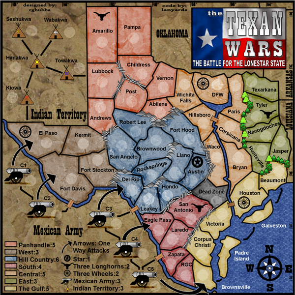
I agree - but what troubles me more is that the legend has gotten less clear over time, and the colored boxes are now closer to the bullets on the right than they are to the territory titles with which they correspond. What if the colored boxes were to the left of the titles, running down the edge of the map? Then you wouldn't have to right justify the bonuses, they could just follow the colons as they do in the right half of the legend.
instead of this:
Panhandle:_____5 [color]
You would have this:
[color] Panhandle: 5
And if you really wanted to make the legend text shorter, you could drop "Texas" from each of the territory titles in the legend... "Central Texas" becomes simply "Central" since they're all a part of texas anyway. It should be pretty clear that it's not Central Arkansas!
If you did this it would create more room between the two columns of the legend, and you could replace the bullets with a small arrow, star, longhorn, wheel, cannon, and teepee.
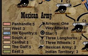
rgbubba wrote:Oaktown I have not move anything any thing from the last time we spoke. The only thing I added was "Arrows are one way attacks". Everything else stad the same nothing was touched.
So what you are saying it that words complecates things. Use Symbles!

lanyards wrote:The letters on the compass all need to be equal-distant from the center part.
I like the way the arrows from cannons one-way attacks to other territories look, I suggest making all the black lines connecting territories through sea routes and connecting indian territories have a white edge like the cannons' arrows.
--lanyards
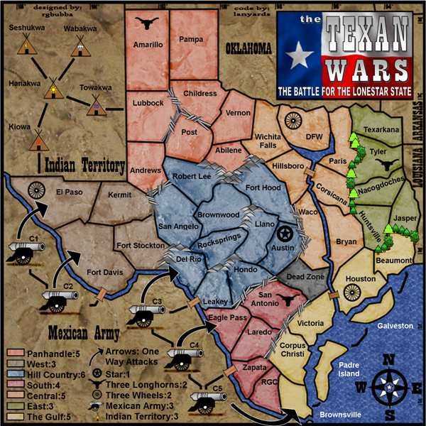
Elijah S wrote:I've checked in on this one from time to time since it was started and think this map demonstrates some genuine talent and graphics ability.
The layout, colors, textures, etc. are very suiting and the gameplay should be intriguing.
I agree with Oaky that you could work on that sig a little though... After the time you've put into this I think you owe it to yourself to come up with something a little more creative and distinctive.
Other than that, congratulations on creating a very unique map!
QUENCH!