Rail Europe [Quenched]

Care to peruse completed maps? Take a stroll through the Atlas.

Moderator: Cartographers

Forum rules
Please read the Community Guidelines before posting.
User avatar
cairnswk
Posts: 11510
Joined: Sat Feb 03, 2007 8:32 pm
Gender: Male
Location: Australia

Post by cairnswk »

iancanton wrote:in the legend, the colons and initial letters of the route names don’t line up with each other. this looks a bit untidy.

move the box for LVP by 5mm southward to be closer to liverpool’s actual location.

i think the STATIONS text ought to read “station names (not stations names) are 3-letter city code (not 3 letter station code), full city name, 1-letter (not 1 letter) service code”. this will make it consistent with the ATTACKING text, which includes the phrase “stations in same city”, implying that the 3-letter code is a city code, not a station code.

otherwise neat.

ian. :)


Thanks ian...i'll attend to those tomorrow in new version.

Ian, here are the change requested on the small version 31
I won't change the position of LVP station, it's too close to that line and too much to shift it all.
The large version will be along shortly.

Image :wink:
Last edited by cairnswk on Thu Mar 13, 2008 6:24 am, edited 1 time in total.
Image
* Pearl Harbour * Waterloo * Forbidden City * Jamaica * Pot Mosbi
User avatar
Tracita
Posts: 87
Joined: Tue Jun 19, 2007 10:03 pm
Location: Arizona

Post by Tracita »

are "lines" which separate other lines at the station those only w/ 3 letter abbreviations or any line which separates them from the others at the station ?
User avatar
cairnswk
Posts: 11510
Joined: Sat Feb 03, 2007 8:32 pm
Gender: Male
Location: Australia

Post by cairnswk »

Tracita wrote:are "lines" which separate other lines at the station those only w/ 3 letter abbreviations or any line which separates them from the others at the station ?


Tracita...thanks for asking.

On the Important Gameplay text:

All coloured boxes (your armies) belong to BUD Budapest (City)

At BUD, I cannot attack D (across the lines, the space where the city name is.

But BUD D can attack BGD D and VIE D

BUD I can attack BUD P

BUD I can attack BUC I and PRG I

BUD P cannot attack BUD D.

Got the picture?
Image
* Pearl Harbour * Waterloo * Forbidden City * Jamaica * Pot Mosbi
User avatar
cairnswk
Posts: 11510
Joined: Sat Feb 03, 2007 8:32 pm
Gender: Male
Location: Australia

Post by cairnswk »

Version 31

Tidied up:
1. The Station Names text
2. The Colons in the legend
3. The text in the attack legend

Image

Image

http://h1.ripway.com/cairnswk/_RAIL_EUROPE.xml
Image
* Pearl Harbour * Waterloo * Forbidden City * Jamaica * Pot Mosbi
User avatar
Forza AZ
Posts: 4546
Joined: Thu Oct 19, 2006 9:27 am
Gender: Male
Location: Alkmaar, Netherlands

Post by Forza AZ »

Still a few mistakes in the latest version (they were OK in V30 I think?):

-Paris B is missing in Benelux Expres bonus
-London D is missing in Sim-Orient bonus
-Rome K: border with Rome L is missing
-Rome L: border with Rome K is missing
Highest score: 3130 (9 July 2009)
User avatar
cairnswk
Posts: 11510
Joined: Sat Feb 03, 2007 8:32 pm
Gender: Male
Location: Australia

Post by cairnswk »

Forza AZ wrote:Still a few mistakes in the latest version (they were OK in V30 I think?):

-Paris B is missing in Benelux Expres bonus
-London D is missing in Sim-Orient bonus
-Rome K: border with Rome L is missing
-Rome L: border with Rome K is missing


Those xml errors fixed now. I have also checked the file in Jota's xml tool and KevinC's tool.

Please have another look over the xml when you get a chance with fresh eyes.

I have sent lackattack a message querying Jota's XML tool as it is gives an error message when one places Köln in the xml instead of Koeln.
Image
* Pearl Harbour * Waterloo * Forbidden City * Jamaica * Pot Mosbi
User avatar
Forza AZ
Posts: 4546
Joined: Thu Oct 19, 2006 9:27 am
Gender: Male
Location: Alkmaar, Netherlands

Post by Forza AZ »

cairnswk wrote:
Forza AZ wrote:Still a few mistakes in the latest version (they were OK in V30 I think?):

-Paris B is missing in Benelux Expres bonus
-London D is missing in Sim-Orient bonus
-Rome K: border with Rome L is missing
-Rome L: border with Rome K is missing


Those xml errors fixed now. I have also checked the file in Jota's xml tool and KevinC's tool.

Please have another look over the xml when you get a chance with fresh eyes.

No mistakes found any more now.
Highest score: 3130 (9 July 2009)
User avatar
iancanton
Foundry Foreman
Foundry Foreman
Posts: 2453
Joined: Fri Jun 01, 2007 5:40 am
Location: europe

Post by iancanton »

the colons and route names line up perfectly now.

when i look at the small map, i see what u mean about LVP. LON is in the way of shifting it southward, as there's no room for the railway line itself, so i agree with leaving it as it is. i still favour a move southward for LVP on the large map if possible, since its current position is closer to scotland than to its actual location. however, i shan't push it if u think it makes the large map look too different from the small map in that area.

small map: change text from “Budapest and similar stations” to “Budapest and similar cities”.
large map: change text from “STATIONS NAMES” to “STATION NAMES”.
large map: change text from “3 Letter CITY Code” to “3 Letter City Code”.
large map: change text from “Budapest and similar stations” to “Budapest and similar cities”.

i like the 3-d effect on the ironwork. is it intended for the title to be a slightly different colour from the ornamental swirls?

everything else looks good.

ian. :)
User avatar
cairnswk
Posts: 11510
Joined: Sat Feb 03, 2007 8:32 pm
Gender: Male
Location: Australia

Post by cairnswk »

iancanton wrote:the colons and route names line up perfectly now.

when i look at the small map, i see what u mean about LVP. LON is in the way of shifting it southward, as there's no room for the railway line itself, so i agree with leaving it as it is. i still favour a move southward for LVP on the large map if possible, since its current position is closer to scotland than to its actual location. however, i shan't push it if u think it makes the large map look too different from the small map in that area.

small map: change text from “Budapest and similar stations” to “Budapest and similar cities”.
large map: change text from “STATIONS NAMES” to “STATION NAMES”.
large map: change text from “3 Letter CITY Code” to “3 Letter City Code”.
large map: change text from “Budapest and similar stations” to “Budapest and similar cities”.

i like the 3-d effect on the ironwork. is it intended for the title to be a slightly different colour from the ornamental swirls?

everything else looks good.

ian. :)


Ian...i think i captured all those changes above including the shifting of LVP station....same version so f5 please.

Image

Image

Armies

Image

[IMG]http://i155.photobucket.com/albums/s282/cairnswk/RAIL%20EUROPE/_RAIL_EUROPE_V31LT

.jpg[/IMG]

XML

http://h1.ripway.com/cairnswk/_RAIL_EUROPE.xml
Image
* Pearl Harbour * Waterloo * Forbidden City * Jamaica * Pot Mosbi
User avatar
iancanton
Foundry Foreman
Foundry Foreman
Posts: 2453
Joined: Fri Jun 01, 2007 5:40 am
Location: europe

Post by iancanton »

cairnswk wrote:Ian...i think i captured all those changes above including the shifting of LVP station....same version so f5 please.


that looks better. i'm not sure how i missed it before.

the city codes for HEL and OSL touch the bottom of their boxes on the small map only. on both maps, the same applies to MRS.

on both maps, service codes A (except for LON) and E seem to be a pixel too high in their boxes, as is C for LON.

for BRU, the lines from top down are B dark green, H light green and O purple, but the boxes from top down are B dark green, O purple and H light green (the H is also a pixel too high in its box). it's logical to swap the positions of the H and O boxes. there's a similar situation with the O and P boxes at MOW.

on both maps, the box for the LAU city code is very tall. is there a reason for this, or is it just a hangover from a previous attempt at arranging vertically the service colours?

ian. :)
User avatar
cairnswk
Posts: 11510
Joined: Sat Feb 03, 2007 8:32 pm
Gender: Male
Location: Australia

Post by cairnswk »

iancanton wrote:
cairnswk wrote:Ian...i think i captured all those changes above including the shifting of LVP station....same version so f5 please.
that looks better. i'm not sure how i missed it before.

the city codes for HEL and OSL touch the bottom of their boxes on the small map only. on both maps, the same applies to MRS.

Fixed.

on both maps, service codes A (except for LON) and E seem to be a pixel too high in their boxes, as is C for LON.

Fixed

for BRU, the lines from top down are B dark green, H light green and O purple, but the boxes from top down are B dark green, O purple and H light green (the H is also a pixel too high in its box). it's logical to swap the positions of the H and O boxes. there's a similar situation with the O and P boxes at MOW.

Fixed, and xml swapped.

on both maps, the box for the LAU city code is very tall. is there a reason for this, or is it just a hangover from a previous attempt at arranging vertically the service colours?

ian. :)

yes, this is a hangover from the previous attempts, but it also relates to the fact that four lines rune through there os i think it deserves a bigger city code. It stays the way it is/

ian... appreciate the detailed going over of the map, but please give it to me in one go, not over several stages thanks, i don't want to be here all week.

Still same version V31....please refresh to c changes.

Image

Image

http://i155.photobucket.com/albums/s282 ... E_V31S.jpg

http://i155.photobucket.com/albums/s282 ... E_V31L.jpg


http://h1.ripway.com/cairnswk/_RAIL_EUROPE.xml
Image
* Pearl Harbour * Waterloo * Forbidden City * Jamaica * Pot Mosbi
User avatar
AndyDufresne
Posts: 24935
Joined: Fri Mar 03, 2006 8:22 pm
Location: A Banana Palm in Zihuatanejo
Contact:

Post by AndyDufresne »

The legend text on the left side of the map bothers me a little. I liked how in RAIL USA the legend text was nestled into a bottom corner--it seemed like a perfect fit there.

But the legend text on this map doesn't look so appealing free floating in its current area. I'd almost rather have it set in some sort of box, just so it doesn't look like it was typed onto the map as an after thought.

One thing I enjoyed visually about the RAIL USA map was the contrast between the dull gray and the dark blue. It made the map stand out and catch my eye, but the over all gray tone blends together too much for my taste...

Also, in regards to the gameboard, are you going to add any texture or subtle hue changes? The even toned black looks a little too perfect and 'Microsoft Paint Filled'.

But that said, RAIL USA has enjoyed a nice fan base, and I can see those enjoying this map also!


--Andy
User avatar
cairnswk
Posts: 11510
Joined: Sat Feb 03, 2007 8:32 pm
Gender: Male
Location: Australia

Post by cairnswk »

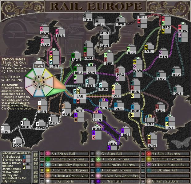
AndyDufresne wrote:The legend text on the left side of the map bothers me a little. I liked how in RAIL USA the legend text was nestled into a bottom corner--it seemed like a perfect fit there.

But the legend text on this map doesn't look so appealing free floating in its current area. I'd almost rather have it set in some sort of box, just so it doesn't look like it was typed onto the map as an after thought.

Thanks Andy.
To start this is not Rail USA, so please i think it would be disastrous to compare Rail USA and Rail Europe...also two different mapmakers as you realise.

While it can be tidied up and re-positioned, i think the legend text floats in Rail USA also, it is not boxed. There is no room left on this map to place a box for the legend text.

One thing I enjoyed visually about the RAIL USA map was the contrast between the dull gray and the dark blue. It made the map stand out and catch my eye, but the over all gray tone blends together too much for my taste...

Also, in regards to the gameboard, are you going to add any texture or subtle hue changes? The even toned black looks a little too perfect and 'Microsoft Paint Filled'.

I can add that if you think it is needed. I don't think it is needed and would be disastrous because there is not the same eye-space real estate on this map as there is on Rail USA.

In regard to the overall gray tones, i think it is necessary to compliment the colours of the cities and lines. I have tried to change the back ground colours and tones and it doesn't work well with all the other colours in this map. Any more colour and it will start looking like a gay mardi gras.
I also wanted this map to have overall olden day appeal to it...afterall this is where rail was first started way back when, thus the colours of grays and browns and yellow-sandstone and black.

But that said, RAIL USA has enjoyed a nice fan base, and I can see those enjoying this map also!
I agree, but perhaps the Europeans who enjoyed Rail USA will now migrate to their own territory.
:)
Image
* Pearl Harbour * Waterloo * Forbidden City * Jamaica * Pot Mosbi
User avatar
iancanton
Foundry Foreman
Foundry Foreman
Posts: 2453
Joined: Fri Jun 01, 2007 5:40 am
Location: europe

Post by iancanton »

cairnswk wrote:Any more colour and it will start looking like a gay mardi gras.


it's possible that texture (unless very subtle) and more colour will lessen the visual dominance of the stations and lines.

cairnswk wrote:ian... appreciate the detailed going over of the map, but please give it to me in one go


i see what u're saying. my previous post was just after i'd tried, for the first time on this map, to look actively for every last niggle. even so, i missed a couple.

on both maps, service code M for HEL is a pixel too high in its box.

on the small map only, the letters i and l in the bonus key are virtually indistinguishable.

have a good easter!

ian. :)
User avatar
cairnswk
Posts: 11510
Joined: Sat Feb 03, 2007 8:32 pm
Gender: Male
Location: Australia

Post by cairnswk »

iancanton wrote:
cairnswk wrote:Any more colour and it will start looking like a gay mardi gras.


it's possible that texture (unless very subtle) and more colour will lessen the visual dominance of the stations and lines.

cairnswk wrote:ian... appreciate the detailed going over of the map, but please give it to me in one go


i see what u're saying. my previous post was just after i'd tried, for the first time on this map, to look actively for every last niggle. even so, i missed a couple.

on both maps, service code M for HEL is a pixel too high in its box.

on the small map only, the letters i and l in the bonus key are virtually indistinguishable.

have a good easter!

ian. :)


ian...you too enjoy Easter!

Version 32 below

I fixed:
1. HEL code placement
2. changed the font to arial in the legend instructions but no in the bonus boxes
3. tidied up the that area
4. added a slight background to the landmass

Image

Image
Image
* Pearl Harbour * Waterloo * Forbidden City * Jamaica * Pot Mosbi
User avatar
Unit_2
Posts: 1834
Joined: Sun Jan 14, 2007 12:59 pm
Gender: Male
Location: Pennsylvania, U.S.A, North America, Earth, Milky Way, Universe.

Post by Unit_2 »

Love the new texture ;)
Image
User avatar
gimil
Posts: 8599
Joined: Sat Mar 03, 2007 12:42 pm
Gender: Male
Location: United Kingdom (Scotland)

Post by gimil »

I love the new texture also. Could you soften it just a little with a blur of something. Just so it fit a little better with hte rest of the map.
What do you know about map making, bitch?

natty_dread wrote:I was wrong


Top Score:2403
User avatar
pepperonibread
Posts: 954
Joined: Sun Jan 28, 2007 4:33 pm
Location: The Former Confederacy

Post by pepperonibread »

gimil wrote:Could you soften it just a little with a blur of something. Just so it fit a little better with hte rest of the map.


Agreed. The texture is definitely an improvement, though.
User avatar
cairnswk
Posts: 11510
Joined: Sat Feb 03, 2007 8:32 pm
Gender: Male
Location: Australia

Post by cairnswk »

gimil wrote:I love the new texture also. Could you soften it just a little with a blur of something. Just so it fit a little better with hte rest of the map.


So for this version:
1. Added soft gaussian blur to the plaster background
2. added a glow to the edges of the land mass.

Any good?

Image
Image
* Pearl Harbour * Waterloo * Forbidden City * Jamaica * Pot Mosbi
User avatar
cairnswk
Posts: 11510
Joined: Sat Feb 03, 2007 8:32 pm
Gender: Male
Location: Australia

Post by cairnswk »

Has anyone got any comments on this version above?
Image
* Pearl Harbour * Waterloo * Forbidden City * Jamaica * Pot Mosbi
User avatar
edbeard
Posts: 2501
Joined: Thu Mar 29, 2007 12:41 am

Post by edbeard »

seems done to me


edit: repost of latest version

Image
bryguy
Posts: 4381
Joined: Tue Aug 07, 2007 8:50 am
Location: Lost in a Jigsaw

Post by bryguy »

question, could u increase the size of the text in the lower left corner? it is readable but very hard to read
User avatar
cairnswk
Posts: 11510
Joined: Sat Feb 03, 2007 8:32 pm
Gender: Male
Location: Australia

Post by cairnswk »

bryguy wrote:question, could u increase the size of the text in the lower left corner? it is readable but very hard to read


bryguy...i have tried to increase it a little however there is not a lot of room, so i don't know if what i did is am improvement....anyway here is

Version 33 Large and Small

Image

Image
Image
* Pearl Harbour * Waterloo * Forbidden City * Jamaica * Pot Mosbi
User avatar
AndyDufresne
Posts: 24935
Joined: Fri Mar 03, 2006 8:22 pm
Location: A Banana Palm in Zihuatanejo
Contact:

Post by AndyDufresne »

              Final Forge

---The Rail Europe Map has reached the ‘Final Forge’ Stage. I've revived this thread from the pits of the Foundry Furnace (okay, maybe not) and have examined the contents. Nearly every major concern has been addressed. If there are any other current concerns, please make your voice heard. If after a reasonable amount of time there has not been any objection or protest, the map will be deemed finished with the 'Foundry Brand' of approval and will be submitted for live play. As long as there is still discussion or posts that have yet to be commented on, the map will remain in Final Forge until said discussion has reached the conclusion that the map has reached its final and polished version.

Post questions and concerns if any.

              Image


--Andy
User avatar
InkL0sed
Posts: 2370
Joined: Sat Jun 23, 2007 4:06 pm
Gender: Male
Location: underwater
Contact:

Post by InkL0sed »

Three in a row! This exciting!

How much for a banana?
Post Reply

Return to “The Atlas”