Re: Feudal Epic, L&S, Pg. 45 [D, Gp, Gr]
Posted: Sun Dec 06, 2009 3:59 pm
I think we are done 
Conquer Club, a free online multiplayer variation of a popular world domination board game.
http://www.tools.conquerclub.com/forum/
http://www.tools.conquerclub.com/forum/viewtopic.php?t=61409

porkenbeans wrote:Since your talking about numbers, please take a closer look and tell me which ones are more clear.
Please do not make me tell you that I am a member of the Foundry, and I am allowed my opinions and suggestions. gimil can do what he wishes, but i can make my suggestions, without your harassment. He does not have to take my advice, but he does have to listen to it, and provide a good reason for his decision. ...Just like the rest of us.the.killing.44 wrote:porkenbeans wrote:Since your talking about numbers, please take a closer look and tell me which ones are more clear.
We are talking about which numbers go where to avoid any dropdown confusion. Please do not make me quote the times gim said that he was done editing the image except for official or gameplay issues.
porkenbeans wrote:Please do not make me tell you that I am a member of the Foundry, and I am allowed my opinions and suggestions. gimil can do what he wishes, but i can make my suggestions, without your harassment. He does not have to take my advise, but he does have to listen to it, and provide a good reason for his decision. ...Just like the rest of us.the.killing.44 wrote:porkenbeans wrote:Since your talking about numbers, please take a closer look and tell me which ones are more clear.
We are talking about which numbers go where to avoid any dropdown confusion. Please do not make me quote the times gim said that he was done editing the image except for official or gameplay issues.
In my opinion either one of the two examples that I put up are clearly better than the current version. If you can not see that, or disagree, then please state your case. Do not try to hinder me from stating mine.
yeti_c wrote:No...
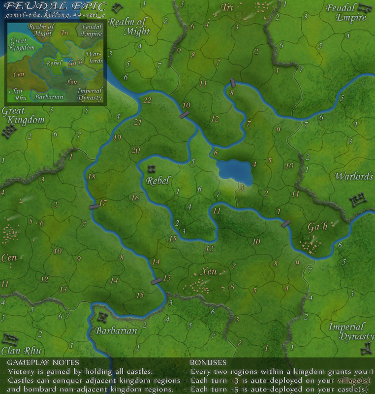
8 -> 6
7 -> 8
6 -> 7
Correct
Wrong
C,
I do not think that it is really a case of enlarging the text. It is only a very small adjustment on the contrast, saturation, brightness, etc. settings. The most critical in this case, is the contrast settings. If you look at the current version, you will notice that all of the colors in the map are the same tonal value. this makes for a "muddy" looking canvas. Take note of the boundary lines. They are not contrasted against the background at all, and the text is muddy and hard to read. At first I thought that the map was just too dark, but after I got it to the editing room at photobucket, I realized that this was not the case at all. If you notice the darker of the two examples that I provided, you will see that it has more darkness in it than the current version. Just check out the boundaries. But it also has some lighter tones in it as well. This variation in tonal value is what "contrast" is all about. It helps to distinguish one thing from another.danryan wrote:Second Incandenza's post. Regardless of the way the point was made, the "brighter" map is much easier to read. Please consider using something like the lettering from the "brighter" version.

Yes, those finer details are exactly what I am talking about. It is also very true that the saturated army numbers will stand out more on a mono-tone, drab, and muddy canvas. Ironically this is due to contrast as well. This map does not have a whole lot of bright colors going on, that it should be any problem though. The adjustments that I made were very slight, and will not produce any problems with the army numbers.yeti_c wrote:On a different note - Porks last image actually brings out some of the finer details a lot more...
One other thing to consider though is how the actual army numbers look on the images as well...
Sometimes changing the contrast etc can make some numbers less visible...
C.
porkenbeans wrote:Yes, those finer details are exactly what I am talking about. It is also very true that the saturated army numbers will stand out more on a mono-tone, drab, and muddy canvas. Ironically this is due to contrast as well. This map does not have a whole lot of bright colors going on, that it should be any problem though. The adjustments that I made were very slight, and will not produce any problems with the army numbers.yeti_c wrote:On a different note - Porks last image actually brings out some of the finer details a lot more...
One other thing to consider though is how the actual army numbers look on the images as well...
Sometimes changing the contrast etc can make some numbers less visible...
C.
It's all about the fine tuning. This is a perfectly good map, and it only needs to be fine tuned. This is NOT something that needs to cause any hold up in rolling this puppy out. It is only a matter of a few moments spent, dialing it in.
I spent no more than 5 or 6 min. to make the two examples that I posted.Jace22 wrote:porkenbeans wrote:Yes, those finer details are exactly what I am talking about. It is also very true that the saturated army numbers will stand out more on a mono-tone, drab, and muddy canvas. Ironically this is due to contrast as well. This map does not have a whole lot of bright colors going on, that it should be any problem though. The adjustments that I made were very slight, and will not produce any problems with the army numbers.yeti_c wrote:On a different note - Porks last image actually brings out some of the finer details a lot more...
One other thing to consider though is how the actual army numbers look on the images as well...
Sometimes changing the contrast etc can make some numbers less visible...
C.
It's all about the fine tuning. This is a perfectly good map, and it only needs to be fine tuned. This is NOT something that needs to cause any hold up in rolling this puppy out. It is only a matter of a few moments spent, dialing it in.
I'm sure it's a bit more complicated than that
porkenbeans wrote:I spent no more than 5 or 6 min. to make the two examples that I posted.Jace22 wrote:porkenbeans wrote:Yes, those finer details are exactly what I am talking about. It is also very true that the saturated army numbers will stand out more on a mono-tone, drab, and muddy canvas. Ironically this is due to contrast as well. This map does not have a whole lot of bright colors going on, that it should be any problem though. The adjustments that I made were very slight, and will not produce any problems with the army numbers.yeti_c wrote:On a different note - Porks last image actually brings out some of the finer details a lot more...
One other thing to consider though is how the actual army numbers look on the images as well...
Sometimes changing the contrast etc can make some numbers less visible...
C.
It's all about the fine tuning. This is a perfectly good map, and it only needs to be fine tuned. This is NOT something that needs to cause any hold up in rolling this puppy out. It is only a matter of a few moments spent, dialing it in.
I'm sure it's a bit more complicated than that