Page 27 of 39
Posted: Wed May 23, 2007 12:15 pm
by andreweberman
You might also consider making the cannon start with more than 3 people just to make sure no one can rush to early in the game; say 5-7.
Posted: Wed May 23, 2007 12:37 pm
by johloh
You might also consider making the cannon start with more than 3 people just to make sure no one can rush to early in the game; say 5-7.
in my understanding of the new xml this is not possible. wait till i get a real map up here...i think youll see how unlikely it is for this to happen...
Posted: Wed May 23, 2007 12:50 pm
by lunchmeat
Mapping where every university is would be a massive undertaking, and would give the map so many territories that it would be unplayable (think a higher number than World 2.1)
I agree, listing all colleges would be overkill, but it would be interesting to add those that make sense to divide the map, give detail or give bonuses, etc. - something that would add to the gameplay (just a suggestion really, you could do appellate districts or tourist attractions or whatever - how cool would it to have Mt. Rumpke as a bonus?).
I thought your input on the highways was very insightful. As a Buckeye (Auglaize, Butler and Franklin counties in different points of my life), I hope this map gets made regardless of whether my suggestions are taken seriously.
Posted: Wed May 23, 2007 4:13 pm
by Kaplowitz
Spockers wrote:but it's not completely without potential.

I think thats the nicest thing ive ever heard u say about a map!

Posted: Wed May 23, 2007 4:32 pm
by gimil
are the funny letters suppose to be teh stargates? if so tehy should be changed to a small graphic of teh actual star gate. This might help them stand out a little
Posted: Wed May 23, 2007 5:36 pm
by jnd94
This may be too much like the Siege! map, but what if you put an X in the middle of the map, surrounded by other territories, and its +1 army? O BTW, thanks for making this themed map, Ive been waiting a long time.....
Posted: Wed May 23, 2007 5:39 pm
by RobinJ
That is the roughest draft I've ever seen!

I think I'll just wait until I see a proper version before I start forming ignorant opinions.

Posted: Wed May 23, 2007 5:45 pm
by onbekende
shall I find you an actually represintation of where everything should be
and which alpha site is it?
Posted: Wed May 23, 2007 6:34 pm
by johloh
but what if you put an X in the middle of the map, surrounded by other territories, and its +1 army?
that doesnt seem like siege to me...we'll see...im good to add fun flair to it, but i need to get the base image down first....of course i brought this on myself by posting a preliminary sketch...
That is the roughest draft I've ever seen! I think I'll just wait until I see a proper version before I start forming ignorant opinions.
i know. you cant get any rougher than a terrible hand drawn sketch. i just had to post it to get it off my chest and see what people think...im fixing up graphics as we speak...
Posted: Wed May 23, 2007 7:47 pm
by Hamster1800
I like the concept of this map a lot. Obviously the borders within planets will need to be reworked, and the line between the two planets in the top right is bad, as are the stargate symbols, but the background is nice, and the spheres themselves look really good. Keep it up.
Posted: Wed May 23, 2007 7:58 pm
by Hamster1800
I'd like to put an idea out there. I think it'd be interesting if you had more than one cannon on the same ship. So like
Cannon 1 attacks A+B
Cannon 2 attacks B+C
Cannon 3 attacks C+D
Cannon 4 attacks D+E
Cannon 5 attacks E+F
Cannon 6 attacks F+A
You could also do similar things with more ships per cannon, but I think this would be interesting, as it becomes inherently harder to defend your ship.
Posted: Wed May 23, 2007 9:20 pm
by JW_Lenori
My plan for this map is to get it as good as I can do myself, and then turn it over to someone else for polishing work-there's only so much that I can do and accplish in my time and with my expearance.
As for map issues:
From gmil:
are the funny letters suppose to be teh stargates? if so tehy should be changed to a small graphic of teh actual star gate. This might help them stand out a little
The symbole for Stargate is a close aproximation of Earth Point of Orgin: Å
The other funny looking letter is what I've chosen to be symbole for shipyard wich is the lettor 'D' tranposed into 'the Achient Language' for examples see
http://forum.gateworld.net/showthread.php?t=13522 I chose it because out of the language, it was the one that look the cloest to being a ship.
I'm using letters instead of gate or ship graphics due to concerns regarding size, being able to see it and general skills limitations.
onebekende wrote:
shall I find you an actually represintation of where everything should be
and which alpha site is it?
If you want to go ahead, but I make no promises about using it. The planets are not being placed based on their real life location, but in a us vs. them fasion. As stated in the first post, left side is "the good guys" earth and allies, right side is "the bad guys" System Lords. in the middle will be the non-helpfull or uninvolved planets.
As far as which Alpha Site goes, pick one, its not going to really matter. I orginally had two planets that were Alpha Sites slated, but ended up droping one due to numbers.
Posted: Thu May 24, 2007 4:56 am
by JW_Lenori
update, have added army circles, rest of the planets and arranged to create space for Legand- hopefully I can get it to fit in there.
[NEW MAP] The Three Kingdoms
Posted: Thu May 24, 2007 6:10 am
by gimil
Subject:
The three kingdoms of China after teh fall of teh Han Dynsaty
Body:
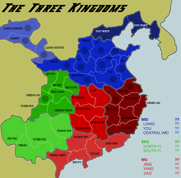
42 Countries
i took an intrest in this after playing dynsaty warrior 5 all day.
for playability its like a baby 2.1. a bonus for teh kingdom and a bonus for a sub continent inside the kingdom. i plan on puttin in boraders such as defensive gates and river i just havent located then yet
Posted: Thu May 24, 2007 6:11 am
by gimil
and it seems my compression was wasted around teh kingdom borders. whats teh best format for the maximum quality? im currently using PNG
Posted: Thu May 24, 2007 6:14 am
by DiM
png is perfect.
Posted: Thu May 24, 2007 6:18 am
by gimil
I always thought PNG was better but it still seems to pixalate teh borders with white around them : \
Posted: Thu May 24, 2007 6:30 am
by Skittles!
"Teh" means 'cool' in Thai. Or so I've read.
Posted: Thu May 24, 2007 6:34 am
by gimil
Skittles! wrote:"Teh" means 'cool' in Thai. Or so I've read.
no teh is a typo for the lol im ive got a habit of trying that lol
Posted: Thu May 24, 2007 6:36 am
by hulmey
we already have Wisse's china map, with both looking vey simliar

Posted: Thu May 24, 2007 6:36 am
by Skittles!
gimil wrote:Skittles! wrote:"Teh" means 'cool' in Thai. Or so I've read.
no teh is a typo for the lol im ive got a habit of trying that lol
I know, but it also means cool in Thai.
Anyway, with the map, I think the dark blue northern-most continent needs to be a lighter shade of blue.
Also with the whole blue continent, it only takes 4 countries to defend whatever bonus you're going to go there, while Red and Green both have 8.
Posted: Thu May 24, 2007 6:39 am
by gimil
ill change the continet colour and ive still to add unpassable stuff once i identify where is to put them
Posted: Thu May 24, 2007 6:39 am
by Skittles!
gimil wrote:ill change the continet colour and ive still to add unpassable stuff once i identify where is to put them
Ah I see. That's good then
Posted: Thu May 24, 2007 6:40 am
by gimil
hulmey wrote:we already have Wisse's china map, with both looking vey simliar
theres parts of china that arnt on this map but ill take a look and see what i can change
Posted: Thu May 24, 2007 7:28 am
by Hotdoggie
cheers for the comments people, new map should be up fairly soon
