Page 21 of 45
Re: Nordic Countries <v.47> p1,33 [Gp] compass discussion
Posted: Thu Mar 11, 2010 9:00 am
by natty dread
Thanks Gillipig.
Here's the XML test results. Compass updated to small map as well.
XML test large:
[bigimg]http://img714.imageshack.us/img714/9458/northeuropev47atr.png[/bigimg]
XML test small:
[bigimg]http://img535.imageshack.us/img535/3498/northeuropev47asmalltr.png[/bigimg]
everyone uses 88:s. I wanted to be different so I put 83:s
 Extra! Extra! Read all about it! Russia building a huge compass near the Finnish border.
Re: Nordic Countries <v.47> p1,33 [Gp] compass discussion
Posted: Thu Mar 11, 2010 11:35 am
by Gillipig
natty_dread wrote:Extra! Extra! Read all about it! Russia building a huge compass near the Finnish border.
Don't forget the headline, Mysterical force moved 2 islands in northern europe over 200 miles overnight! A real life equivalent of the Lost island! All inhabitants missing! Scientists in disbelief!

Oh wait this wasn't the headline! The headline and most important newsarticle of the day; Paris Hilton says she's not wearing Gucci or Prada for tomorrows big fashion show! According to her worst best friend she'll be wearing a t-shirt saying -Fuck me or I'll sue!

Re: Nordic Countries <v.47> p1,33 [Gp] compass discussion
Posted: Thu Mar 11, 2010 5:13 pm
by natty dread
Gillipig wrote:Mysterical force moved 2 islands in northern europe over 200 miles overnight!
But they told me no one would notice!

On another note... I noticed that since the army circle edges were blurred they seemed kinda distorted on places where the circle is partially over water. I think this solution fixes it:
[bigimg]http://img535.imageshack.us/img535/4743/northeuropev47btr.png[/bigimg]
ps. I wonder if I'll get to version 50 before beta... what's the highest version number any map has had? I think I'm making some kind of record here
Re: Nordic Countries <v.48> p1,34 [Gp] coordinate test on pg 34
Posted: Thu Mar 11, 2010 8:18 pm
by natty dread
Slight tweaks to the bridge, and the impassables legend. All changes also exported to small version. No army numbers this time (they haven't changed...)
v.48 large
[bigimg]http://img294.imageshack.us/img294/9395/northeuropev48.png[/bigimg]
v.48 small

Re: Nordic Countries <v.48> p1,34 [Gp] gfx tweaks
Posted: Fri Mar 12, 2010 6:11 pm
by natty dread
This is the Torniojoki bridge:
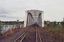
I put it on the map.
[bigimg]http://img714.imageshack.us/img714/6374/northeuropev48a.png[/bigimg]
How does it look?
Re: Nordic Countries <v.48> p1,34 [Gp] gfx tweaks
Posted: Fri Mar 12, 2010 10:22 pm
by ender516
Pretty good. Too bad there's no room to label it without confusing people about territory names.
Re: Nordic Countries <v.48> p1,34 [Gp] gfx tweaks
Posted: Sat Mar 13, 2010 12:48 am
by Gillipig
natty_dread wrote:This is the Torniojoki bridge:
I put it on the map.
[bigimg]http://img714.imageshack.us/img714/6374/northeuropev48a.png[/bigimg]
How does it look?
The bridge looks good! Keep it.
Re: Nordic Countries <v.48> p1,34 [Gp] gfx tweaks
Posted: Sat Mar 13, 2010 1:05 am
by RedBaron0
The bridge looks good, but clashes with the theme, you should go back to the old one.
You've gotta run
vischeck... its really difficult to tell where bonuses end, especially in areas where the extra strong black border is really short, like between north/south Norway & Finland central/south Sweden. Either you've got to get a bit stronger with your bonus colors, or you get innovative with your bonus boundaries.
Re: Nordic Countries <v.48> p1,34 [Gp] gfx tweaks
Posted: Sat Mar 13, 2010 7:31 am
by natty dread
Vischeck was ran a couple of pages ago, and people seemed to be satisfied with it... (I checked, they're on page 30)
Like I said earlier, the problem with making the bonus area colours more different is that it would make it harder to see which bonus areas belong to the same country.
I'll have to think on this...

Re: Nordic Countries <v.48> p1,34 [Gp] gfx tweaks
Posted: Sat Mar 13, 2010 8:02 am
by natty dread
Possible solution: stronger borders b/w bonus areas. Although this has the side-effect of also making the drop shadow stronger... but not that much, so it shouldn't be a problem.
[bigimg]http://img373.imageshack.us/img373/9125/northeuropev48b.png[/bigimg]
As for the bridge... I'll try to come up with something that fits the style of the map better. There's another bridge over Torniojoki (the non-railway bridge) with a simpler design, I'm thinking I could do something like that...
Picture of another Torniojoki bridge:
[bigimg]http://upload.wikimedia.org/wikipedia/commons/thumb/0/09/PanoTorne.jpg/800px-PanoTorne.jpg[/bigimg]
Man, Lapland is beautiful...
Re: Nordic Countries <v.49> p1,34 [Gp] gfx tweaks
Posted: Sat Mar 13, 2010 1:42 pm
by natty dread
New bridges.
v49 large
[bigimg]http://img18.imageshack.us/img18/3448/northeuropev49.png[/bigimg]
v49 small

Re: Nordic Countries <v.49> p1,35 [Gp] gfx tweaks, new bridge
Posted: Sat Mar 13, 2010 1:57 pm
by ender516
Yes, these bridges are more suited to the maps.
Re: Nordic Countries <v.49> p1,35 [Gp] gfx tweaks, new bridge
Posted: Sat Mar 13, 2010 2:07 pm
by natty dread
And the bonus areas? Are they clear enough now?
Re: Nordic Countries <v.49> p1,34 [Gp] gfx tweaks
Posted: Sat Mar 13, 2010 2:17 pm
by Gillipig
natty_dread wrote:New bridges.
v49 large
[bigimg]http://img18.imageshack.us/img18/3448/northeuropev49.png[/bigimg]
v49 small
The other one was better! It gave the map some added style. This one is too flat!
Re: Nordic Countries <v.49> p1,35 [Gp] gfx tweaks, new bridge
Posted: Sat Mar 13, 2010 6:02 pm
by natty dread
The other one was better! It gave the map some added style. This one is too flat!
Argh... perhaps I should put the bridges on a poll?
Although I kinda agree with Rb0, the previous bridge did look really cool, but it kinda looked like it didn't belong on the map, like it was just pasted on top of the map... This one fits in with the rest of the map better.
Also I'm not sure how well that other bridge would have shrunk down...
Anyway, how's the borders/bonus areas now? Still need clarification??
Re: Nordic Countries <v.49> p1,35 [Gp] gfx tweaks, new bridge
Posted: Sun Mar 14, 2010 3:40 pm
by natty dread
Inspired by a recent post by MarshalNey, I decided to add this to the first post:
First post wrote:Current feedback/comment requests:
- bridge between Finland/Sweden, which is best
- bonus areas: are they clear enough now?
- fonts, army circles: do they look good
- territory borders / connections: are all of them clear enough?
Of course you are welcome to comment on other topics as well.
I think all map threads could have something similar in their first post. This will help the casual commenter get in with the discussion without reading all 20+ pages of a map thread...
Re: Nordic Countries <v.49> p1,35 [Gp] gfx tweaks, new bridge
Posted: Sun Mar 14, 2010 5:04 pm
by isaiah40
To be honest natty there is a ... nah never mind. It is looking way better, and unfortunately I have no comments right now. Keep up the good work!!!
Re: Nordic Countries <v.49> p1,35 [Gp] gfx tweaks, new bridge
Posted: Sun Mar 14, 2010 5:08 pm
by natty dread
isaiah40 wrote:To be honest natty there is a ... nah never mind. It is looking way better, and unfortunately I have no comments right now. Keep up the good work!!!
No no, tell me what you were going to say! I can take it!
Re: Nordic Countries <v.49> p1,35 [Gp] gfx tweaks, new bridge
Posted: Sun Mar 14, 2010 5:36 pm
by Industrial Helix
This might not be what you want to hear at the moment, but you're pretty good at accepting criticism. That said, I want to petition for different colors.
I don't know if you have Orbit chewing gum in Finland, but the colors on this map seriously remind me of it way to strongly. The tone of the map literally says minty to me. Iceland and Denmark are good in terms of color. But the mainland needs a color change.
[bigimg]http://www.futureshipwreck.com/pics/orbit-gum.jpg[/bigimg]
I highly recommend doing something along the same lines as the flag of the countries. Blue White for Finland, Yellow and Blue for Sweden, Norway Red and White. If you place them correctly you can do it so that each bonus area does not touch and avoid any confusion. In terms of saturation and tone, I'd say keep it in that same sort of glow you've got going now.
As always, keep up the good work!
Re: Nordic Countries <v.49> p1,35 [Gp] gfx tweaks, new bridge
Posted: Sun Mar 14, 2010 6:06 pm
by natty dread
Thanks IH for the feedback... here's a few points:
- The flag colours were tried like 20 versions ago, and everyone agreed they looked crappy.
- We do have Orbit chewing gum in Finland.

- The general consensus & agreement has been to use cold colours for the map. Every time I have tried to use any warm tones, they have been shot down by most. So I'm not going to go that route either...
Now keeping these points in mind... Do you have any suggestions for a new colour scheme?
I feel like I have to further expand on the flag colour issue, I don't want to shoot down your suggestions without giving an explanation... If we look at the colours, there's:
- Blue & white for Finland
- Blue & yellow for Sweden
- Red, White & Blue for Norway
- Blue, white & red for Iceland
- Red & white for Denmark
Now... For Finland & Denmark this could work. But then the problems begin... Blue & yellow as country colours really don't look very good. I think I tried it both ways last time, blue-on-yellow & yellow-on-blue, and they both looked like someone had pissed in the swimming pool. Then we run into problems with iceland and norway... their flag colours are identical, so separating the two would be problematic.
All in all, we'd end up with a jumble of colours that would be more confusing than what we have now...
Anyway, can you elaborate what exactly you see as problematic in the current colour scheme? I know you said it seemed "minty", but I don't exactly see what the problem is with that... doesn't that give out an impression of coolness, and arctic atmosphere? Cool mint?
I'm all for trying a colour change, but to be honest, all previous tries have always come back to the current scheme, more or less. So I hope we can discuss this a bit and come up with something that would work both esthetically and thematically...
So, the current colour scheme is as follows:
Iceland: grey
Norway: blue-cyan
Sweden: blue-indigo
Finland: green
Denmark: blue-green (like norway but more green)
So, bottom line: these current ones seem good colours to me, but perhaps we could jumble them up a bit. If you can come up with a better scheme, using mostly cold colours, bring it on... I'm willing to give it a shot
Re: Nordic Countries <v.49> p1,35 [Gp] gfx tweaks, new bridge
Posted: Sun Mar 14, 2010 7:11 pm
by natty dread
Alternate colour scheme, and weird things done to the bonus borders...
[bigimg]http://img682.imageshack.us/img682/4183/northeuropev49a.png[/bigimg]
- the idea here was, that the borders were made so strong that the colour-distinction between bonus areas of same country was no longer needed...
Re: Nordic Countries <v.49> p1,35 [Gp] gfx tweaks, new bridge
Posted: Sun Mar 14, 2010 7:59 pm
by Industrial Helix
Well, I can agree with using cool colors but these current use of these colors just strikes me as not right. A color can be dark and still be cool, for example, purple and blue will be cool no matter how dark or light they are. In the case of your map, you're using cool colors in addition to light colors (tonally speaking). All the colors you've used are of a pastel tone and they don't need to be. I think having pastels for this map hurts it rather than helps. You can still have cool colors and vibrancy at the same time.
Does this make sense?
As for a color scheme... well, I don't really have a suggestion and I guess it doesn't matter. Its the tone that I find awkward rather than the color and I think I've finally placed my finger on what bugged me. Purple for sweden is great, but it would work a lot better as Plum rather than an easter egg shade.
This might help illustrate my point as well:
http://www.doityourself.com/scat/coolcolorsc
Re: Nordic Countries <v.49> p1,35 [Gp] gfx tweaks, new bridge
Posted: Mon Mar 15, 2010 1:53 am
by Gillipig
natty_dread wrote:Alternate colour scheme, and weird things done to the bonus borders...
You said it yourself, it looks weird! If anyone wants to butcher a good map, that's how to do it!! Looks like giant rift valley sized impassables!! Not anywhere near good looking. Awful horrendus and actually a bit disgusting!!!

And it's actually not even practicall. It's too hard to distinguish the river from just borders who are very easy to take for impassables! It makes my eyes hurt and my mind confused! I hope you didn't seriously consider using that border thickness!

Re: Nordic Countries <v.49> p1,35 [Gp] gfx tweaks, new bridge
Posted: Mon Mar 15, 2010 3:27 am
by natty dread
Does this make sense?
Yes, somewhat.
As for a color scheme... well, I don't really have a suggestion and I guess it doesn't matter. Its the tone that I find awkward rather than the color and I think I've finally placed my finger on what bugged me. Purple for sweden is great, but it would work a lot better as Plum rather than an easter egg shade.
Gotcha. I'm going to try that.
I hope you didn't seriously consider using that border thickness!
No worries, I'm going back to the previous version, with variations on central sweden's colour. Then we'll see where we go from there.
Re: Nordic Countries <v.49> p1,35 [Gp] gfx tweaks, new bridge
Posted: Mon Mar 15, 2010 3:53 am
by natty dread
Here''s a shot
[bigimg]http://img692.imageshack.us/img692/6544/northeuropev50.png[/bigimg]